Re-imagining the ABC iView experience
Re-imagining
the ABC iView experience
Re-imagining the ABC iView experience
Reimagining the ABC iView experience
Re-imagining the ABC iView experience
PROJECT TYPE
Native app
TEAM
1 Product Designer, 2 Engineers
MY ROLE
Lead Product Designer
ABC
iView App
Redesigning an iconic experienced used by millions.
OVERVIEW
The iView experience needed a refresh, and I had the priviledge of leading the visual design on the project.
Used by millions of Australians each day, the app and website need to offer an intuitive, engaging experience while allowing users to easily discover content. The project involved multiple user testing sessions to establish which models proved best suited to the user needs.
MY RESPONSIBILITIES
UI Design, UX, Interaction Design, User Testing

OVERVIEW
An established player
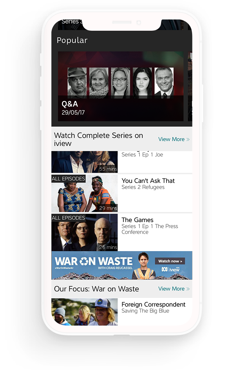
ABC iView serves more than three million users across Australia and is a central platform for delivering the broadcaster’s on-demand content. With a broader refresh of ABC’s digital products underway, the iView app needed to be updated to align with the wider ecosystem and meet modern user expectations.
The existing experience felt dated and made it difficult for viewers to find content. Navigation was unclear, discovery was limited, and the overall interface no longer reflected contemporary streaming standards. The video player also lacked functionality that users had come to expect from modern platforms, such as resuming playback when returning to the app or automatically playing the next episode in a series.
As a result, the app was struggling in an increasingly competitive streaming market where commercial platforms offered smoother discovery and more advanced playback features.
GOAL
Business objectives
The redesign aimed to modernise the experience and bring the product in line with both user expectations and the wider ABC digital ecosystem.
- Improve first time user experience
- Improve content discovery, helping users find programmes quickly and easily
- Modernise the video playback experience, including resume playback and next-episode autoplay
- Simplify navigation and information hierarchy across the app
- Align the product with the wider ABC digital refresh
- Deliver a competitive streaming experience that matched contemporary video platforms
These goals guided the design work, focusing on clearer navigation, stronger content discovery, and a modernised player that supports the way audiences now watch television.
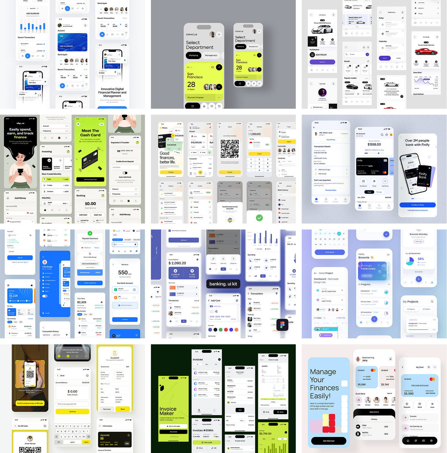
PROCESS
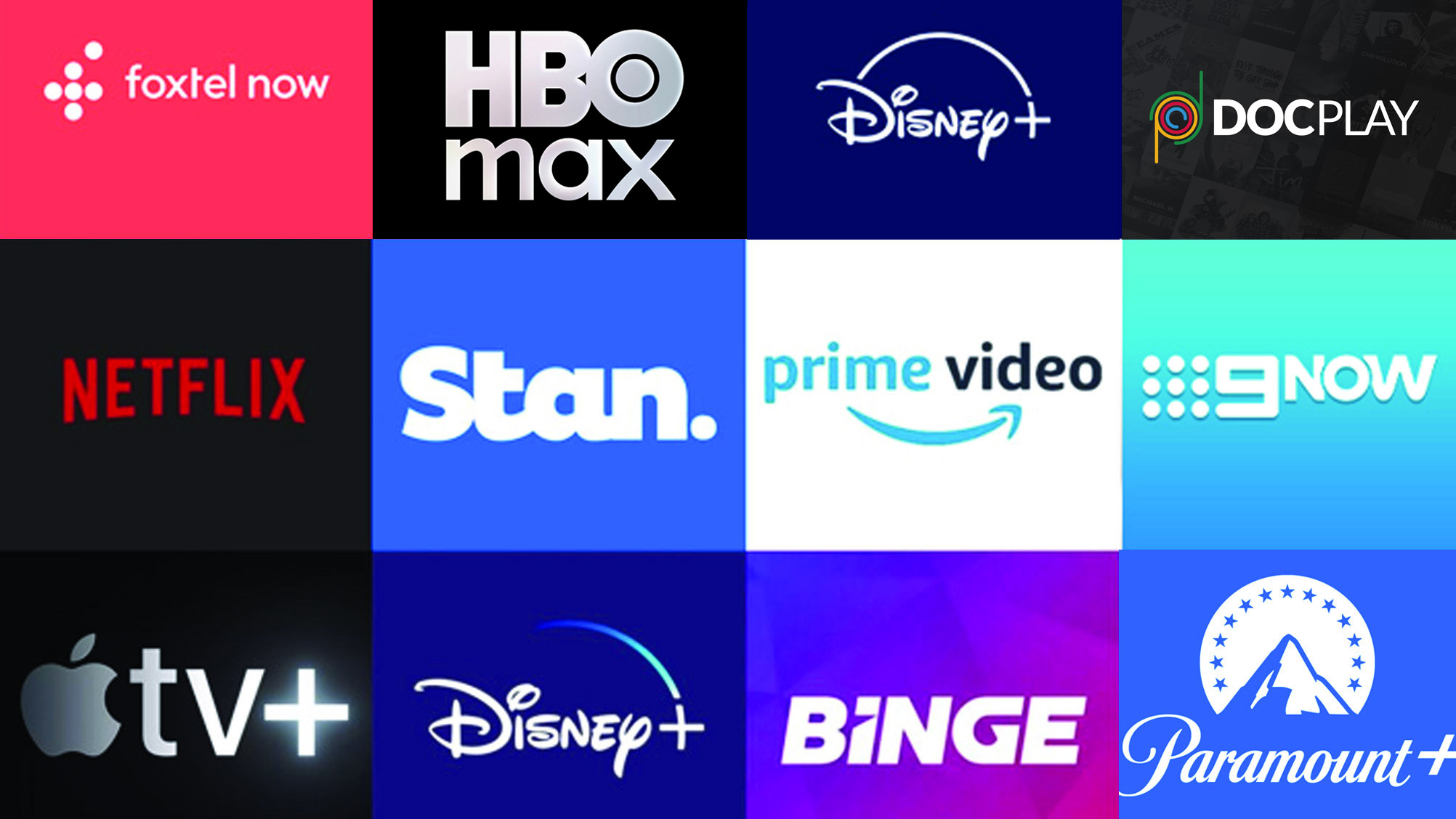
Researching competitor products
When looking at redesigning a VOD service it is important to carry out a detailed analysis of current and emerging patterns and interactions across the space. I signed up for multiple competing VOD services, and began exploring how they solved similar problems to the ABC, and which of those solutions worked (or didn't).
i documented common journeys, UI decisions, and language and icon use to ensure I was fluent in the VOD design landscape.
THE PROBLEM
Understanding the programme lifecycle
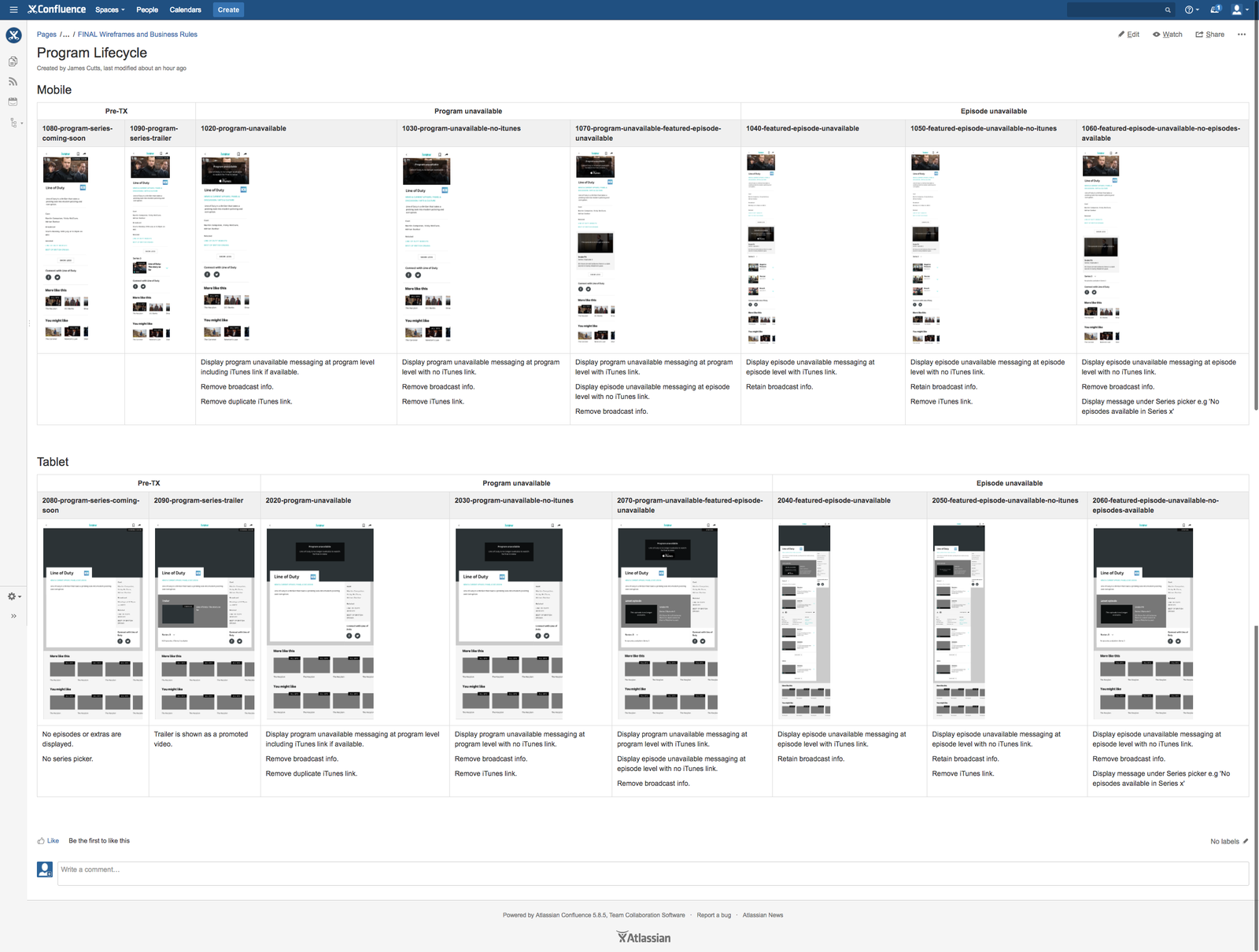
One of the major challenges in designing the iView platform was understanding the complex relationship between the ABC, content licensing and the way these impact the user experience.
Each programme and feature has a lifecycle - when it first gets promoted, when it becomes live, when each episode becomes available and when each episode is no longer available.
Additionally, some programmes move from being free to view to being purchasable on iTunes.
This creates user experience issues, for example when a programme ceases to be available before a user has finished watching the series.
DESIGN
Prototyping and validating the solutions
I came up with three main solutions that I wanted to validate with users, so I created protoypes in InVision using screens from Sketch. These were stitched together and a series of tasks was settled on which would adequetly test the prototypes.

RESEARCH
Testing the prototypes
Based on the research and required functionality I came up with several variations of iView series and episode screens. These designs covered scenarios such as landing on a programme page, landing on an episode page and returning to a programme page with an unfinished episode.
To help validate these concepts I carried out guerrilla testing sessions with members of the public in the ABC foyer. These sessions helped inform the design and I finally arrived at two interaction models I wanted to test more thoroughly.
Tasks that were tested included finding a particular programme, finding a particular episode, finding who the director is and watching an episode.
The simplest interaction model proved most successful. This solution presented a single page for a programme, with a latest episode thumbnail. This allowed the design to retain a consistent brand heading across various user scenarios and ensure the programme metadata was easily discoverable.
View the prototypes
RESEARCH
Validating the solutions
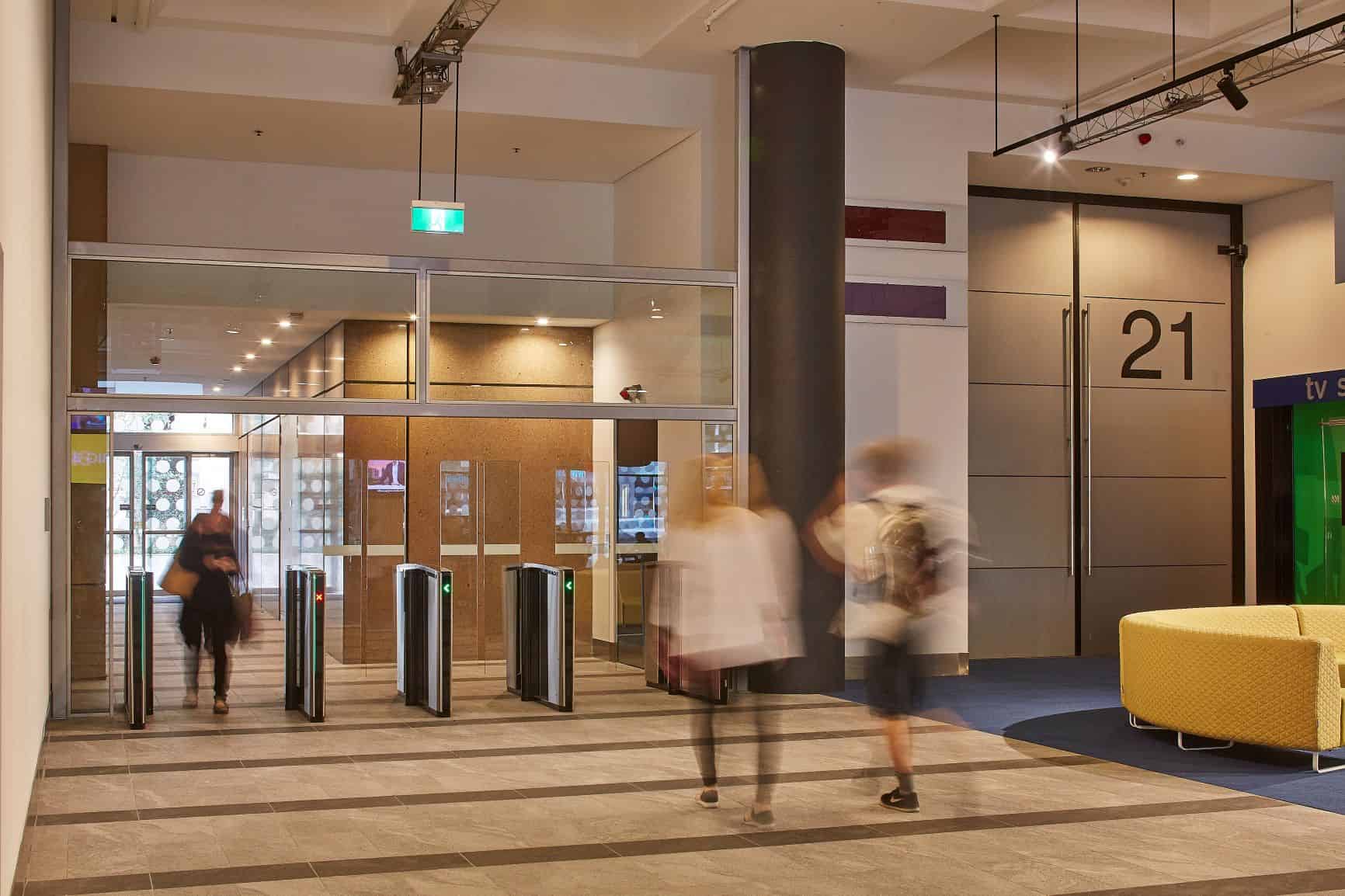
I carried out guerilla testing in the ABC lobby, which at the time acted as a throughfare for pedestrians travelling between The goods Line and Harris Street in Ultimo, Sydney. There was plenty of room, with sofas and low tables to help facilitate testing sessions.
I used these guerilla testing sessions frequently, as they required little planning and I could get feedback almost continuously on the varous solutions.
As well as these informal testing sessions, I also set up in-office testing sessions, where I would have a much more controlled environment and be able to record video of the sessions. I ran several user testing sessions, and the resulting insights were invaluable in ironing out any last issues, and also provided more convincing evidence for senior stakeholders.
ABC
The onboarding experience
Serviving users relevant content on first launch.
PROBLEM
The existing experience
The existing onboarding flow gave new users very little reason to engage. First-time launches dropped straight into a generic home screen with no personalisation, no indication of what to watch, and no mechanism to capture viewing preferences. Internal analytics showed that a significant proportion of new installs became dormant within the first week — users who never made it past the home screen.
APPROACH
Leveraging behavioural hooks
Capturing a user's preferences up front would allow us to tailor the first time user experience, increasing activation and reducing dormant accounts. A clunky onboarding experience, or one that feels like boring box-ticking, squanders the narrow window between installation and abandonment.
I explored how behavioural design principles could transform iView's onboarding and establish who our users are, and what kind og content and viewing preferences ould keep them coming bacvk. My goal was to create psychological investment that would increase activation, retention, and long-term engagement.
I developed two distinct approaches, each grounded in different behavioural frameworks and optimised for different user motivations. Both share a common foundation: onboarding should feel like the experience has already started, not like a step blocking the user from using the app.
DESIGN
Designing the experience
I ran an internal workshop to help establish what our users wanted from the iView app, and how we could capture data to help shape that experience. I also researched behavcioural design patterns that could be carefully employed to make the process painless, and maybe even enjoyable.
KEY FUNCTIONAL QUESTIONS
When do we ask people to sign up?
Should users create an account before or after they've picked their preferences? Asking later means they get to the good stuff faster. Asking first means their choices are saved from the start.
Profile sharing/switching
If multiple people share a device (common in households), do we support profiles from day one, or introduce this later?
Implicit vs. explicit preference updates
How aggressively do we infer preferences from viewing behaviour vs. periodically asking users to update their profile?
APPLICABLE BEHAVIOURAL HOOKS
Endowed progress
Progress bar starts at 20%, visually accelerates as you advance
Progressive disclosure
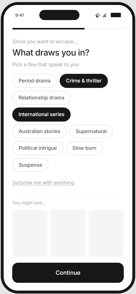
Sub-genre screen content changes based on mood selections
Variable reward preview
Content thumbnails appear after making sub-genre selections
IKEA effect
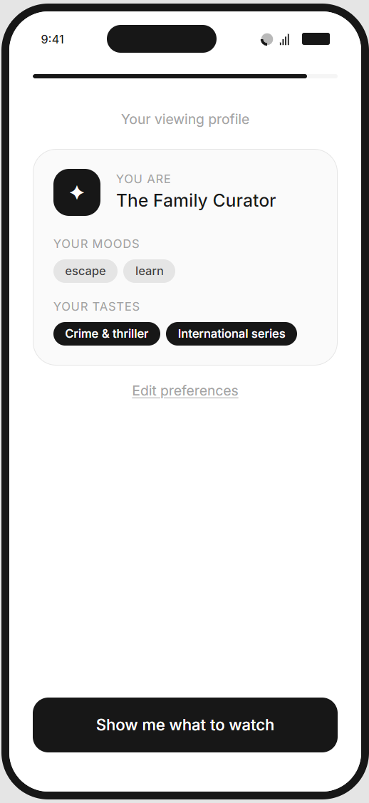
Profile card consolidates all choices into an "artefact" the user built
Identity reinforcement
Personalised label ("The Curious Explorer") gives them a name for their viewing self
SOLUTION 01
The Profile Builder
Concept
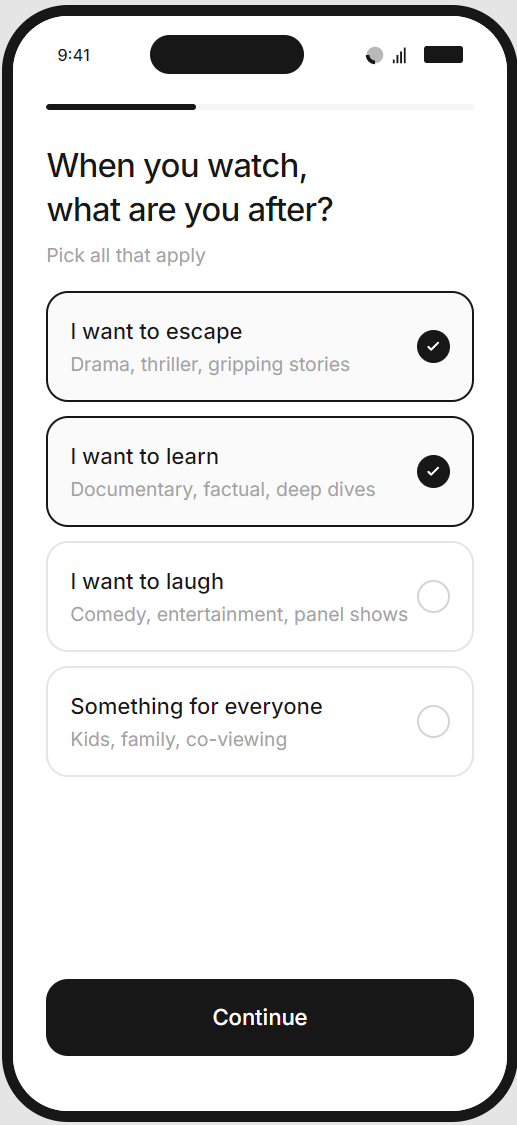
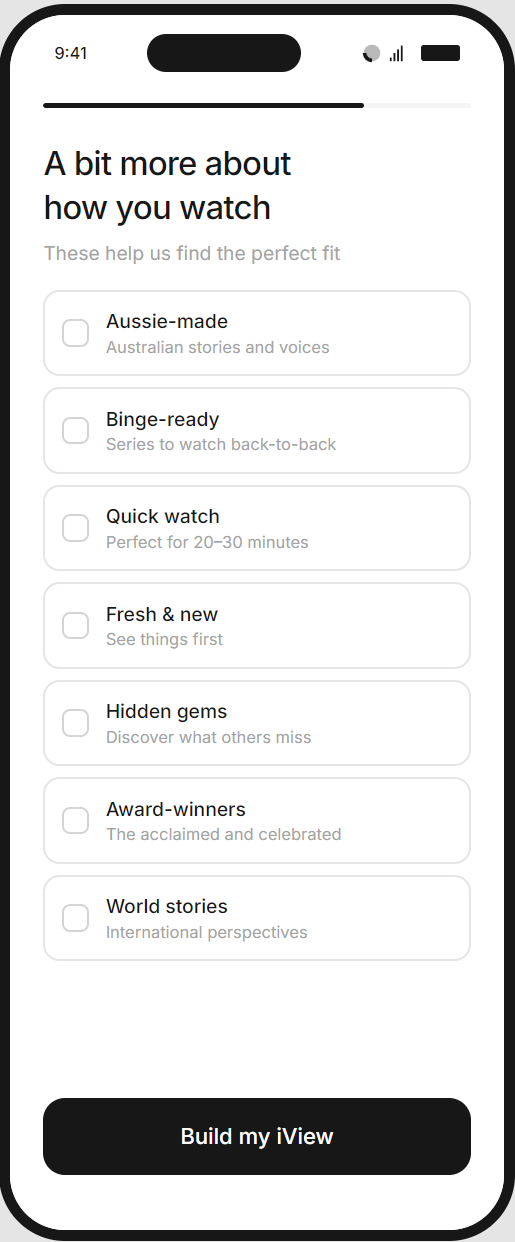
Users answer a series of questions about their viewing preferences - starting with broad mood-based categories ("I want to escape", "I want to learn"), then drilling into sub-genres and content attributes. The journey culminates in a personalised "viewing profile" that reflects their choices back to them, complete with a generated label like "The Curious Explorer."
Behavioural Framework
This approach leans on identity reinforcement and the IKEA effect. By asking users to articulate who they are as viewers, we activate consistency bias; people act in accordance with their stated identity. The profile becomes a psychological anchor, and the effort invested in creating it raises switching costs.
Pros
- Captures rich, explicit preference data that powers accurate recommendations from day one
- Creates emotional resonance - users feel understood, not processed
- The profile artefact provides a memorable moment and a reason to return ("my iView")
- Works well for users who enjoy self-reflection and appreciate personalisation
- Scales cleanly across content categories without needing extensive media assets
Cons
- Relies on users accurately knowing and articulating their preferences (which research suggests is unreliable)
- Longer flow with more steps - higher risk of abandonment
- May feel effortful for casual viewers who just want to watch something
- Abstract categories can be difficult to map to actual content decisions
PROTOTYPE
The Profile Builder
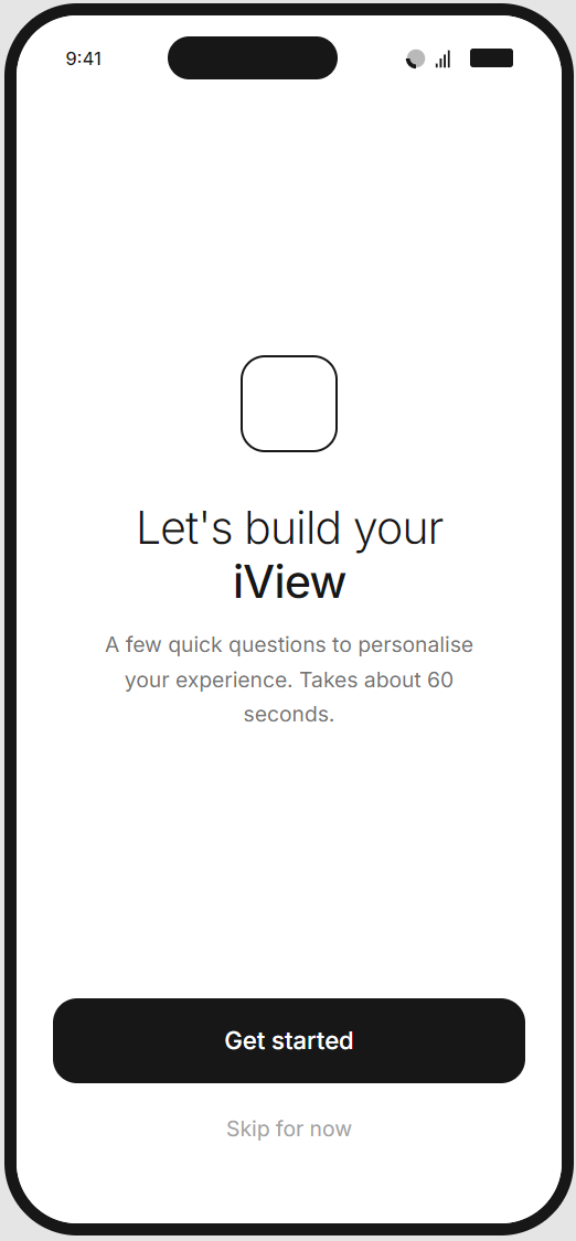
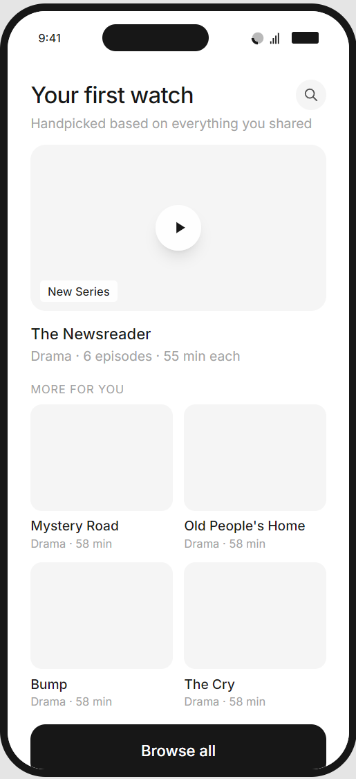
The flow guides users through a short series of mood-based questions, building a viewing profile that iView uses to personalise the home screen from the first session.
Welcome screen
Mood selection
Genre selection
Viewing preferences
Profile reveal
Personalised home screen
SOLUTION 02
The Taste Test
Concept
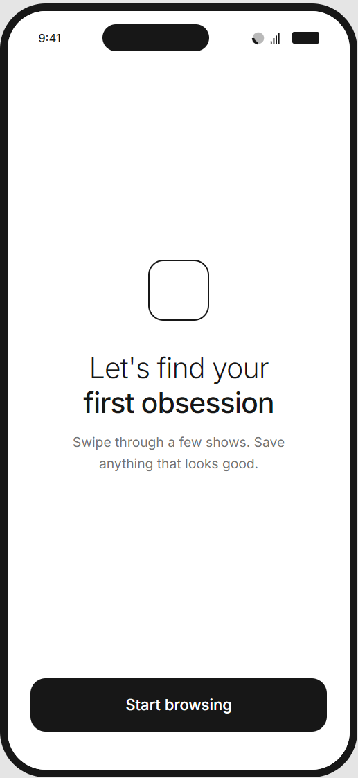
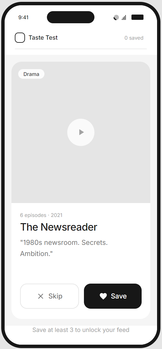
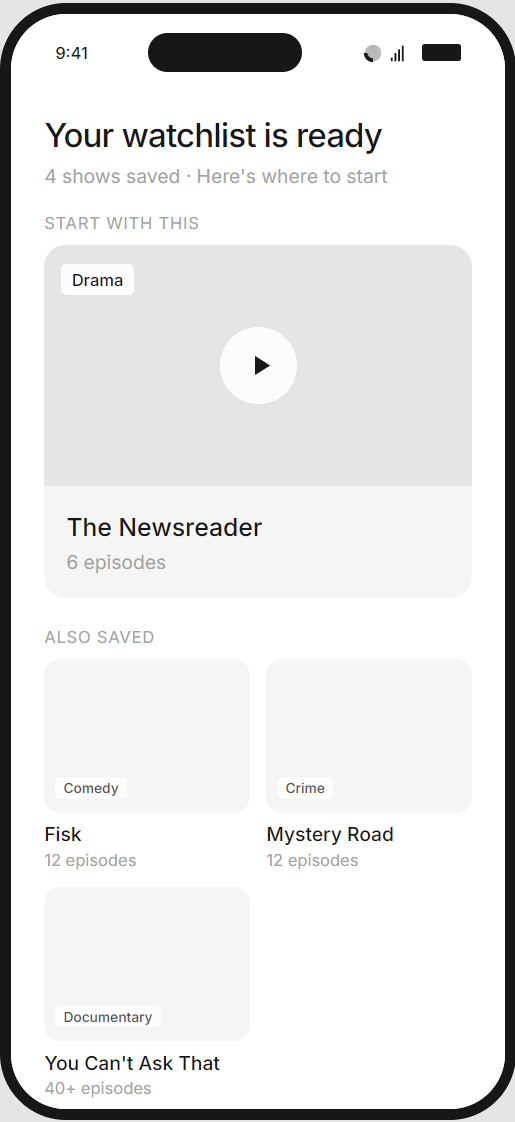
Users swipe through a curated sequence of content cards, saving what interests them and skipping what doesn't. There's no explicit preference capture - instead, the system infers taste from behaviour. Users leave onboarding with a functional watchlist ready to play.
Behavioural Framework
This approach leverages recognition over recall - people are far better at reacting to concrete options than articulating abstract preferences. The swipe mechanic introduces variable reward psychology (each card is a small surprise), while the growing watchlist creates visible progress and immediate utility.
Pros
- Lower cognitive load - users react rather than reflect
- Captures implicit preferences that may be more accurate than self-reported data
- Delivers tangible value immediately (a watchlist they can use tonight)
- Gamified interaction feels lighter and more engaging
- Natural content discovery mechanism that doubles as marketing
Cons
- Relies on users accurately knowing and articulating their preferences (which research suggests is unreliable)
- Longer flow with more steps - higher risk of abandonment
- May feel effortful for casual viewers who just want to watch something
- Abstract categories can be difficult to map to actual content decisions
PROTOTYPE
The Taste Test
A swipe-based mechanic where users browse through a curated set of content cards, saving shows that catch their eye. Three saves unlocks a personalised watchlist to get them started.
Label
Label
Label
Label
VALIDATION
User testing
Validating the designs.
VALIDATION
User testing
I ran moderated remote sessions through UserTesting.com with 12 participants across two rounds. Participants were Australian adults aged 25–54 who had used at least one streaming service in the past month but were not current iView users. This ensured familiarity with streaming conventions without existing expectations of iView specifically
Each participant was randomly assigned to one of the two prototypes. Sessions lasted 15–20 minutes and included a think-aloud walkthrough followed by a short post-task interview.
Tasks
- Open-ended start: "You've just downloaded the ABC iView app. Go ahead and set it up however feels natural to you."
- Comprehension check: "In your own words, what was that experience trying to do?"
- Preference articulation: "How confident are you that iView now understands what you like to watch?" (1–5 scale)
- Immediate intent: "What would you do next - watch something now, or come back later?"
- Comparative reflection (post-task): Participants were shown a brief walkthrough of the alternate approach and asked which they'd prefer if downloading the app today.
INSIGHTS
User testing
Testing revealed clear differences in how users engaged with each approach. The Taste Test drove higher immediate activation, while the Profile Builder created stronger return intent. These findings directly shaped the recommendation and subsequent refinements.
The Taste Test was faster, but the Profile Builder felt more personal
Participants who used the Profile Builder described the experience as "thoughtful" and "like it actually cared what I wanted." Taste Test users completed faster and with less friction, but several noted it felt "a bit random" or "like Tinder for TV." Speed didn't translate directly to satisfaction.
"I liked picking the categories because it felt like I was teaching it about me. The swiping thing - I wasn't sure if it was learning or just showing me stuff."
- P02, Profile Builder
The swipe mechanic drove immediate action; the profile drove return intent
Taste Test users were significantly more likely to say they'd "watch something now" (83% vs 50%). However, Profile Builder users more often mentioned coming back - they felt they'd invested in something worth returning to. This suggests the approaches may optimise for different parts of the funnel.
"I saved a bunch of stuff and honestly just wanted to start watching. I didn't really stop to think about it."
- P04, Taste Test
Minimum save threshold caused hesitation
In the Taste Test, requiring 3 saves before unlocking the feed created a small but noticeable friction point. Two participants saved content they weren't genuinely interested in just to proceed. One described it as "forced liking." This risks polluting preference data.
"I saved one I wasn't sure about just to move on. It felt a bit like being forced to like things."
- P05, Taste Test
Sub-genre fatigue appeared in multi-mood selections
Profile Builder participants who selected 3+ moods showed visible fatigue by the second or third sub-genre screen. Two participants began selecting randomly to "just get through it." The dynamic screen count - intended to capture richer data - backfired when it extended the flow.
"By the third screen I was just tapping things to get through. I'd already said I like crime dramas - why does it need more detail?"
- P04, Profile Builder
The profile reveal was a moment of delight
The generated label ("The Curious Explorer", etc.) consistently prompted positive reactions - smiles, screenshots mentioned, one participant read it aloud. This was the most emotionally resonant moment across either flow.
"Oh that's fun! 'The Drama Devotee.' I'd actually share that."
P03, Profile Builder
Sliders were misunderstood
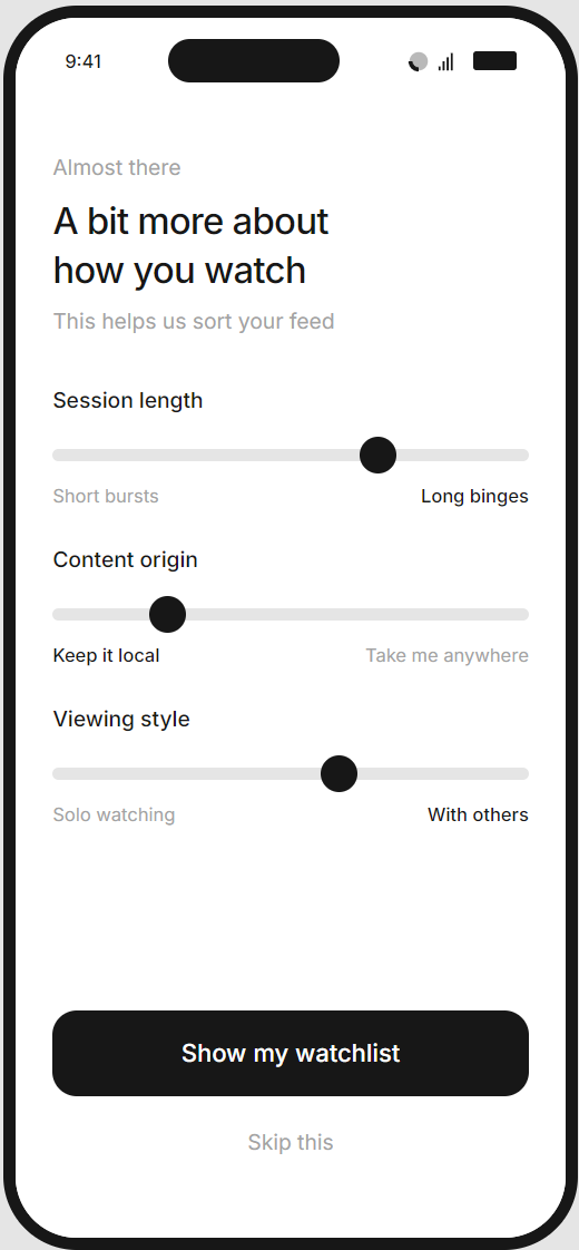
In the Taste Test's context screen, the binary sliders ("Short bursts ↔ Long binges") confused several participants. They expected a neutral midpoint to mean "no preference" but weren't sure if the system interpreted it that way. Two participants skipped the screen rather than guess.
"I wasn't sure if leaving the slider in the middle meant I had no preference or that it would mix both. I just skipped it."
- P02, Taste Test
PROCESS
Decision
Based on testing, I recommended proceeding with the Taste Test as the primary onboarding experience, with targeted refinements to address its weaker points.
The data made a compelling case: 100% completion rate, nearly a minute faster to complete, and significantly higher immediate activation intent (83% vs 50%). Users who watch something on day one are far more likely to return on day seven.
The Profile Builder's strengths were optimised for a user who's already committed. The Taste Test wins the users who aren't sure yet, and in a competitive landscape, that's the bigger win.
Refinements to the Taste Test based on insights:
- Lower the save threshold to 2 and change the framing: "Save a couple that catch your eye" rather than "Save at least 3 to unlock." This removes the forced-liking behaviour I observed.
- Cut the context screen entirely. The sliders confused users and the skip rate was high. We can infer these preferences from viewing behaviour within the first few sessions - no need to ask upfront.
- Add a single confidence-building moment after the swipe sequence: a brief screen that summarises what we learned ("You're into drama, true crime, and local stories"). This borrows the Profile Builder's "reflection" moment without the overhead of building an entire profile.
- Retain the swipe mechanic for ongoing discovery. Multiple participants mentioned they'd use it again. I recommended surfacing "More to discover" swipe sessions in the home feed after the first week - turning the onboarding mechanic into a re-engagement feature.
- The Profile Builder remains a viable future addition for power users who want more control, but as a settings feature.
DESIGN
A complete redesign
Extebding the design language for mobile.
DESIGN
Utilising the Design Language System
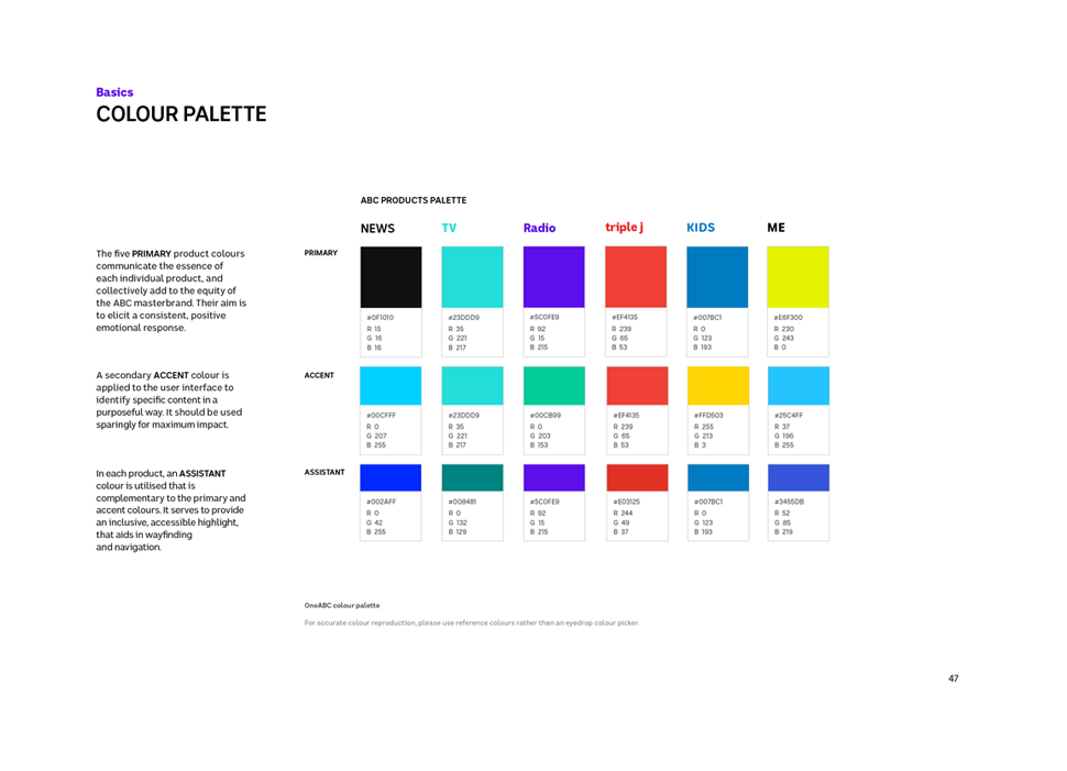
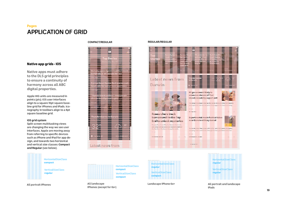
A major part of the ABC web refresh was the Design Language System (DLS). This was a work in progress, and I began looking at elements and patterns I could use across the iView app, and working on new patterns that could be fed back into the system.
Structure

Colours
Structure

Structure
DESIGN
An improved iView player
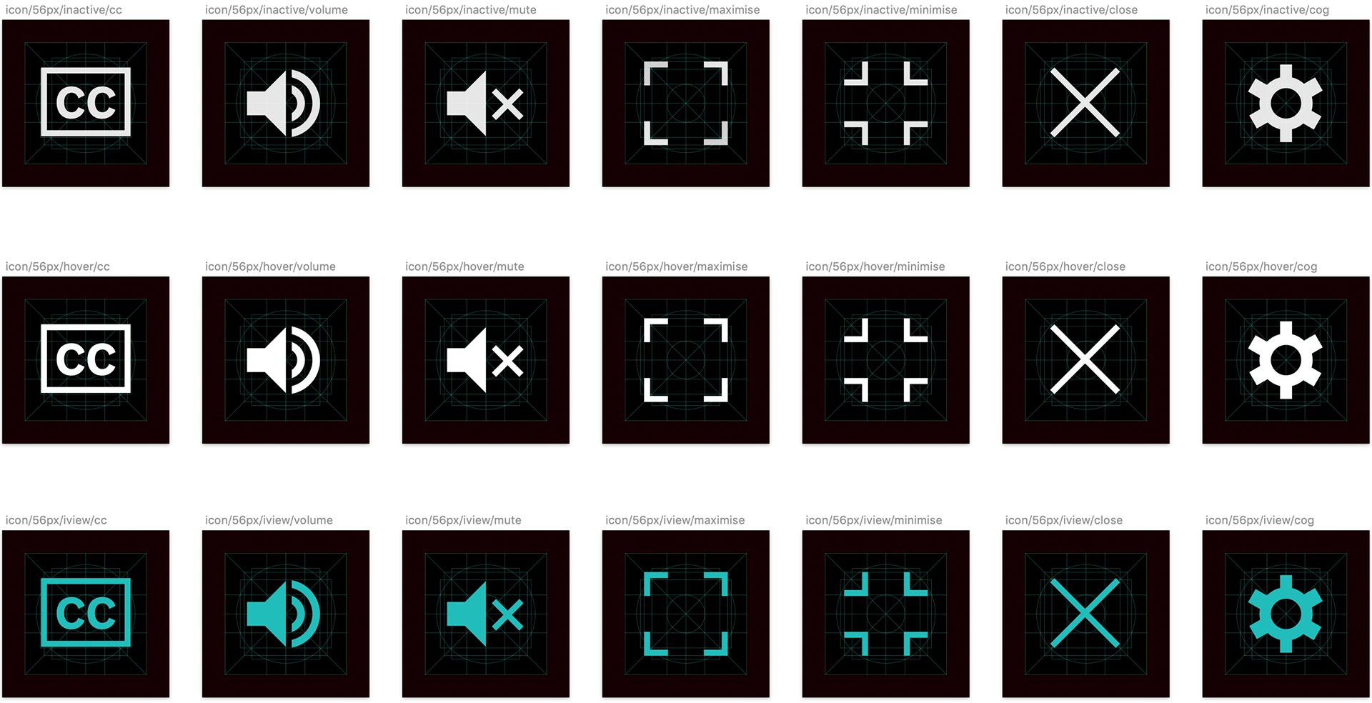
An important component the new iView app was working on an improved media player, and this required a fresh look at the visual language. As part of this project I designed a contemporary icon set that would be used across mobile, web and TV.
INTERACTION
Player interaction models
I worked on several interaction models for the iView player, both for mobile and desktop. Key parts of the functionality were 'Up Next' and 'Suggested Videos', features that had been missing from the old player and that users had consistently requested in our early research sessions.
iView interaction exploration
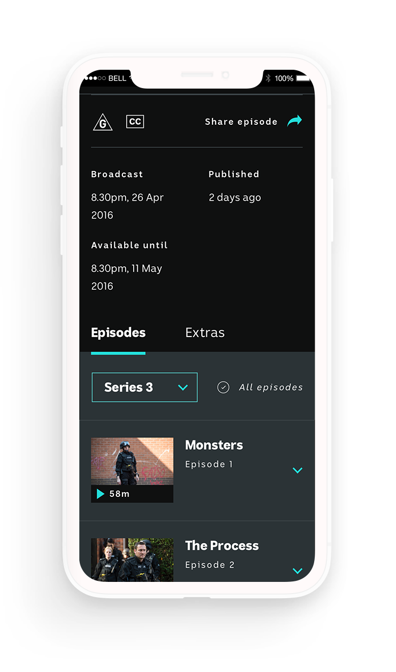
iView interaction exploration
DESIGN
Final designs
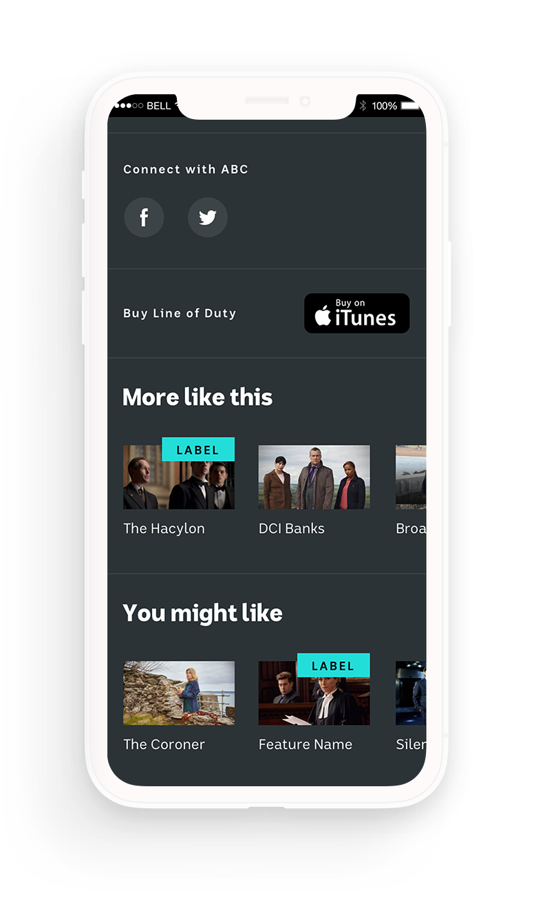
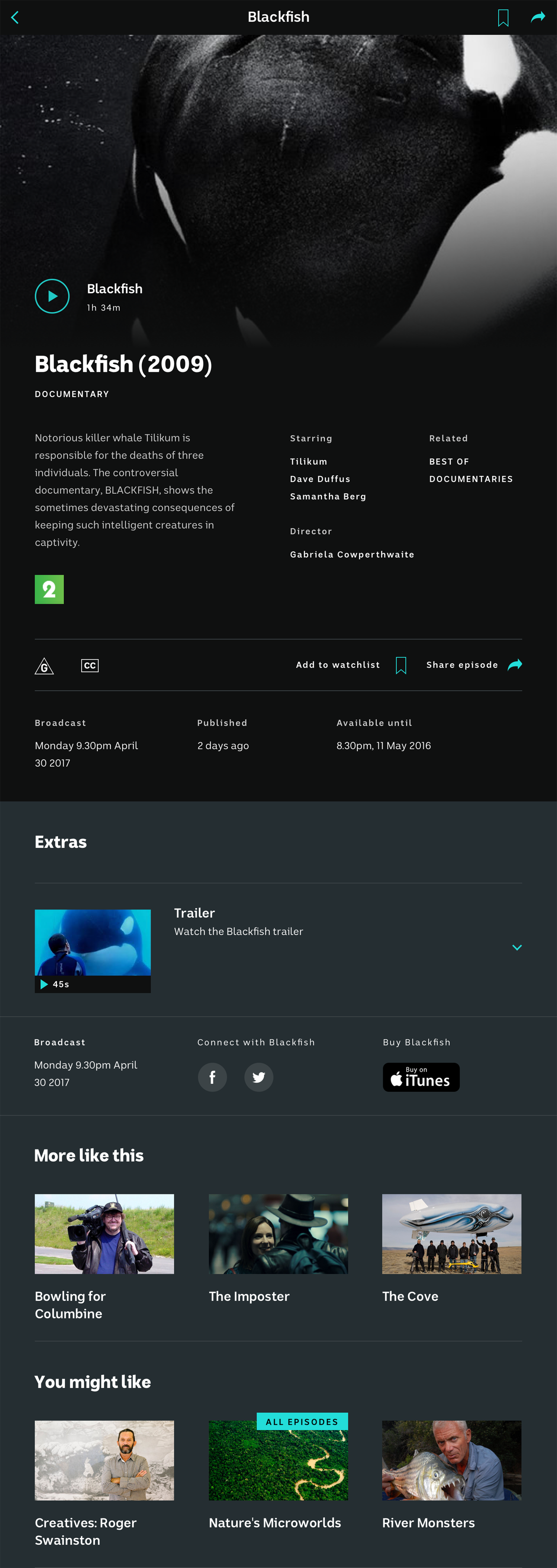
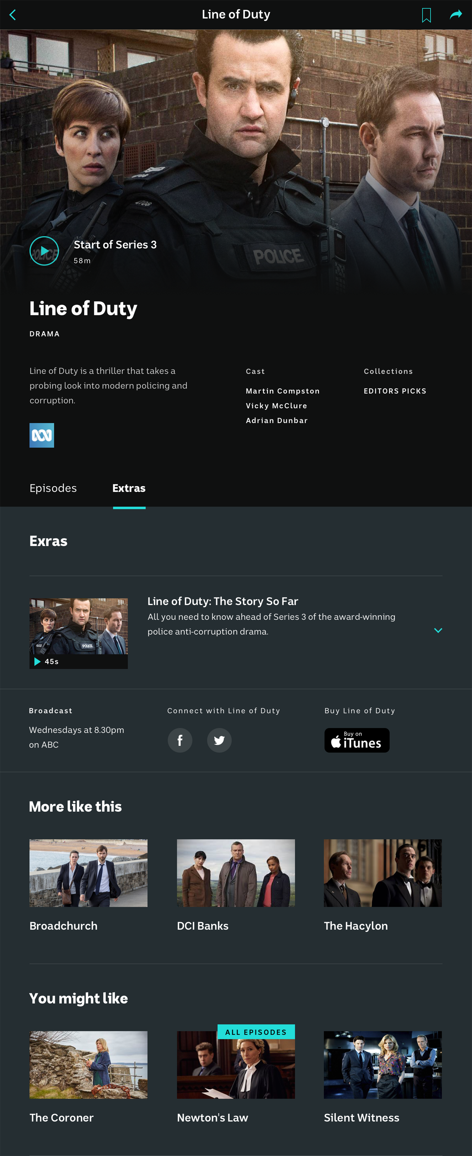
A selection of the redesigned iView screens.
DESIGN
Mobile
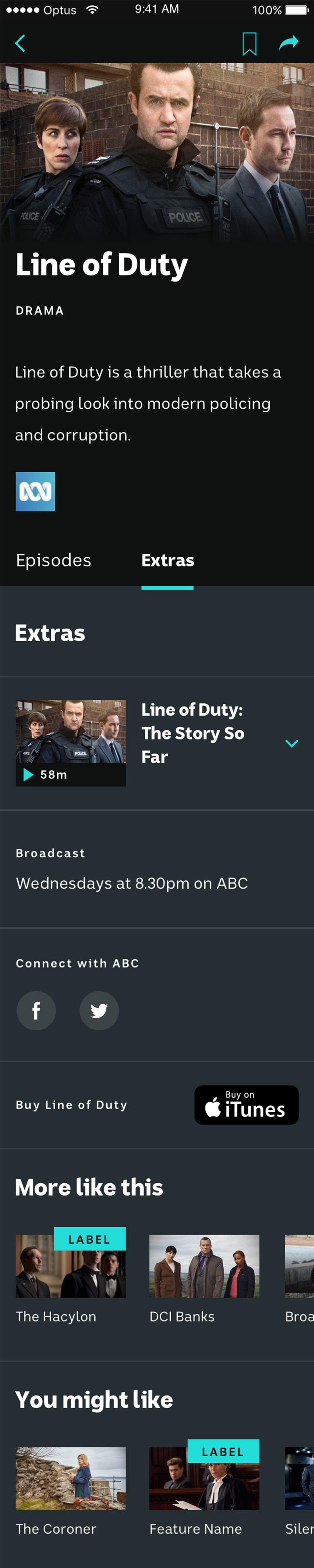
Below is a selection of the mobile screens.
Mobile: Programme

Mobile: Episode

Mobile: Extras
Mobile: Film

DESIGN
Tablet
Below is a selection of the tablet screens.
Tablet: Film
Tablet: Programme
Selected Projects