PROJECT TYPE
Saas · B2B Fintech · Platform Redesign · Desktop
CLIENT
Milestone Group (via Lab49 Sydney)
MY ROLE
Lead Product Designer
TIMELINE
6 weeks discovery + design (2019)
OVERVIEW
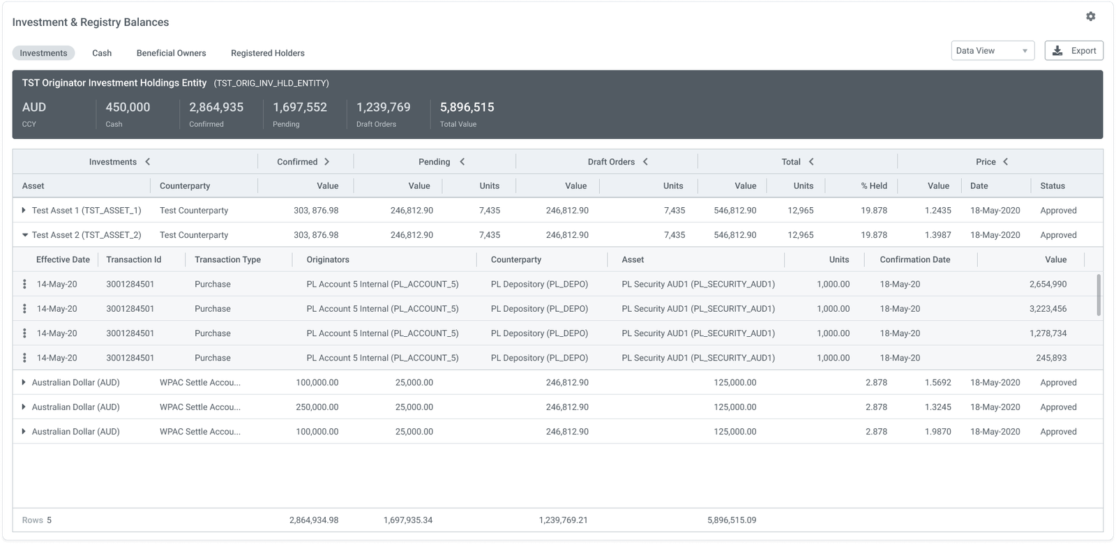
pControl is Milestone Group’s platform for institutional investment operations, used by superannuation funds, life companies, pension providers, outsourced CIOs and fiduciary managers to manage the full trade lifecycle: from cash allocation and rebalancing through to order placement, settlement and outbound message processing. The platform spans multiple custodians, transfer agencies and asset managers, with its order management module tracking transactions through nine sequential process stages.
MY RESPONSIBILITIES
Discovery, IA, UX, interaction design and visual design
OBJECTIVES
Turning a table refresh into a monitoring platform
Milestone Group commissioned Lab49 for a UX refresh of pControl's data tables. The goal was to modernise the UI and address growing client dissatisfaction with the product's usability. Through discovery, the scope expanded as I realised the real opportunity was to give Investment Operations teams a way to see the health of their entire trade book at a glance, something the platform had never offered. The project delivered both: a redesigned table and a new monitoring dashboard.
IMPACT
~16%
Increase in sales attributed to the redesign
$2M
In additional work commissioned from Lab49
THE PROBLEM
A platform built entirely on tables
The existing pControl UI had one navigational pattern throughout: a tabular list of records, click a row, get another table of records. Every screen was a table. Getting any piece of information meant navigating to it.
pControl’s Operations Dashboard is designed to be Service Level Aware. It tracks whether transactions are meeting their operational cut-offs across nine process stages, from Inbound Message Processing through to Outbound Message Processing. But there was no UI surface that showed this. Users had no aggregate view of where their trades stood. The system gave equal visual weight to every row, regardless of urgency, volume or proximity to an SLA breach. Missed SLAs in this domain carry significant financial consequences. The platform was built to prevent them, but couldn’t show when they were at risk.
Investment Operations teams need to manage exceptions and escalations across the entire investment process. The platform gives them no way to see the whole picture at once.
PROBLEM
The existing experience
- User opens the platform and lands on a top-level table of trade records
- User clicks a row to open a detail table for that trade
- User inspects status columns manually to look for exceptions
- User navigates back to the top-level table to check the next trade
- Repeated for every active trade, every time
PROBLEM
User pain points
No aggregate view of trade status across the book
Exceptions only visible through sequential row inspection
No time-based orientation: SLA position not visible anywhere
High cognitive load: users had to build the full picture themselves, record by record
RESEARCH
The business impact
Without a way to see the trade book as a whole, operations teams were spending their time navigating the system rather than managing the exceptions the system existed to flag. As trade volumes grew, so did the risk of missed SLAs: more trades meant more rows to check, more stages to visit, more chances for something urgent to go unnoticed.
Meanwhile, the platform's own Service Level Aware architecture was generating exactly the data needed to prevent this - it just had no way to surface it. The result was a product that looked dated, felt cumbersome, and wasn't delivering on its own capabilities.
- Operations teams spending time navigating rather than managing exceptions
- Missed SLA risk increasing as trade volumes grew
- A UI that didn’t reflect the platform’s own Service Level Aware capabilities
- Client dissatisfaction with the visual quality and usability of the product
RESEARCH
Business goals
Redesign the pControl UI to:
- Modernise the data tables visually
- Reduce the navigation required to identify exceptions
- Give Investment Operations teams, Portfolio Managers and Compliance Teams a clear view of trade lifecycle status
- Surface SLA risk before users have to go looking for it
How do we give operations teams a real-time view of trade status across all nine process stages, without rebuilding the platform?
DISCOVERY
Understanding the domain before designing the solution
Direct access to end users wasn’t available. Milestone Group’s clients (institutional funds and life companies) couldn’t be approached for research. Instead, I worked with a domain expert: a retired investment operations specialist who had previously worked on pControl brought in by Milestone Group to support the project.
The SME was deeply experienced but also sceptical about the need for significant change. Her position coming in was that the tables were fine: operations professionals knew how to read them, so winning her over was part of the challenge.
Rather than mapping feature requirements, I focused on understanding how experienced operations staff actually perform their roles: what counts as urgent, how time and SLA position factor into every decision, and where the table-driven UI was helping, and where it fell short.
CONSTRAINTS
Key challenges

No direct user access
Milestone Group’s clients couldn’t be made available for research. All domain understanding came through a single expert. That meant being clear throughout about the difference between what the sessions had confirmed, what they’d made plausible, and what remained untested.
A sceptical domain expert
The SME didn’t think the UI needed significant work. Building the case for a new direction was a real challenge, and since I had no users to validate my designs I had to appeal to the wider team for insights, and to bring the SME on-board.
A defined engagement scope
The project was commissioned as a UI refresh. Proposing a net-new dashboard meant building the case from the discovery findings and getting explicit client sign-off before any design work on the new concept could begin.
DESIGN
Mapping the journey
The first step was to understand the current user tasks and common journeys. This was really a feature mapping exercise rather than trying to understand pain points and touch points. It was a complex platform, and extremely challenging to empathise with users when the process was so complex, and the users were domain experts rather than retail customers.
DESIGN
The pControl Attention Status Monitor
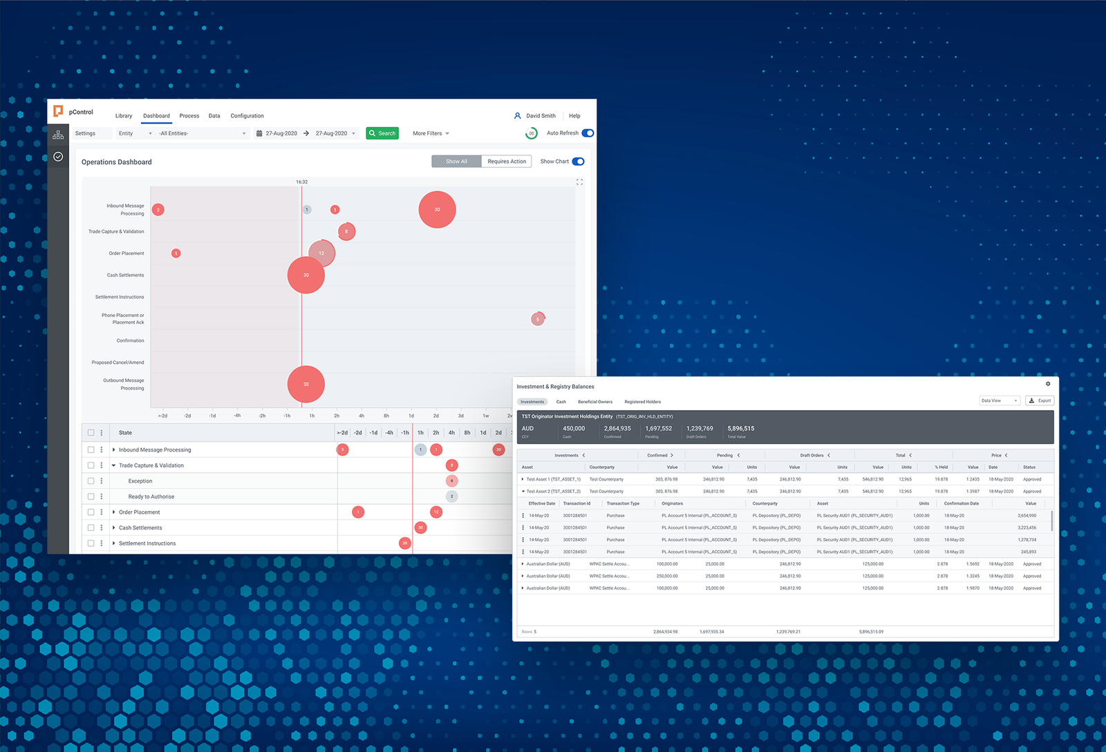
How do you let a user answer what needs their attention, and how serious the issue is? And how do you best convey this information so it's readable at a glance? My solution was a time based bubble matrix.
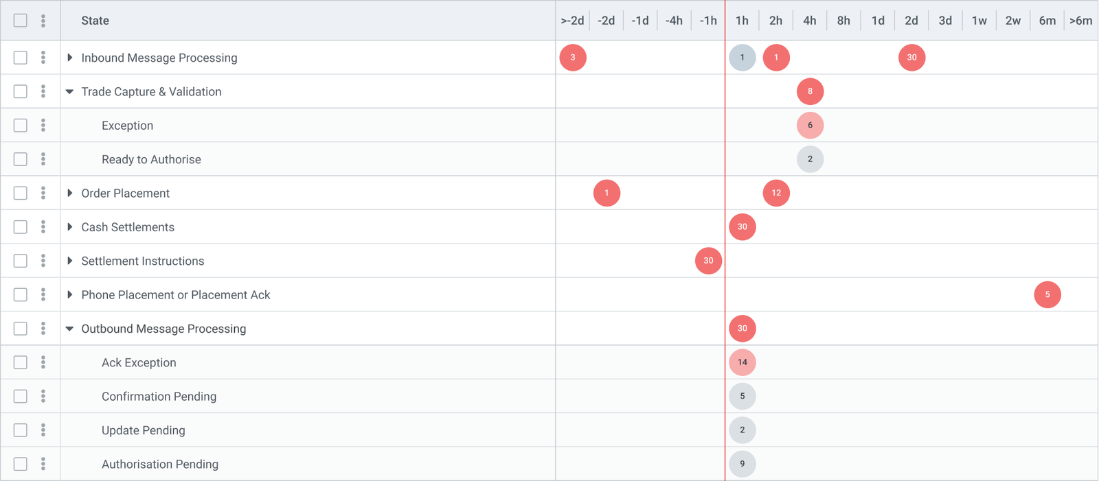
The Y-axis lists the nine process stages of pControl's Order Management lifecycle, in sequence: Inbound Message Processing, Trade Capture & Validation, Order Placement, Cash Settlements, Settlement Instructions, Phone Placement or Placement Ack, Confirmation, Proposed Cancel/Amend, and Outbound Message Processing. Each row is a named stage, not a numeric value. The X-axis shows time remaining until each trade's SLA deadline for its current stage. A trade that has just entered a stage starts on the right with time to spare. As the deadline approaches, it moves left. Crossing the line means the SLA has been breached. Right is future trades, left is more urgent trades.
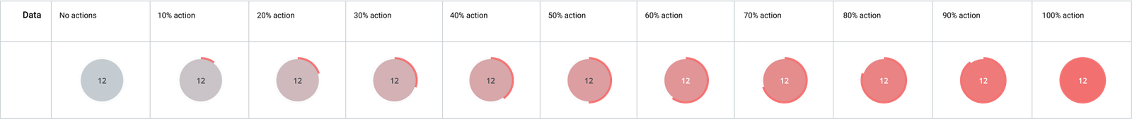
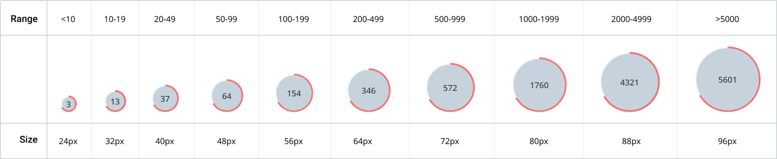
Each bubble groups trades sharing the same stage and SLA position, so that the relevant experts could process the trades that were in their domain. Size translates as volume: a large bubble means many trades in that position. Colour translates as status: red for trades in breach or at risk, grey for those within their deadline. The time axis is non-linear: more granular near the deadline (hours and minutes), compressed further out (days, weeks, months). This keeps the operationally critical zone large on the canvas.
The dashboard shows every active trade in the system on a single screen, organised by two things: which process stage the trade is currently in, and how much time it has left before its SLA deadline for that stage. The nine process stages run down the left side as rows, from Inbound Message Processing at the top to Outbound Message Processing at the bottom.
Time runs left to right along the bottom axis, but it does not represent clock time: it represents time remaining until each trade's SLA cutoff. A trade with two hours left to meet its deadline sits at the 2h mark. A trade with a day left sits at 1d. The further right a bubble is, the more time the trades inside it have to spare.
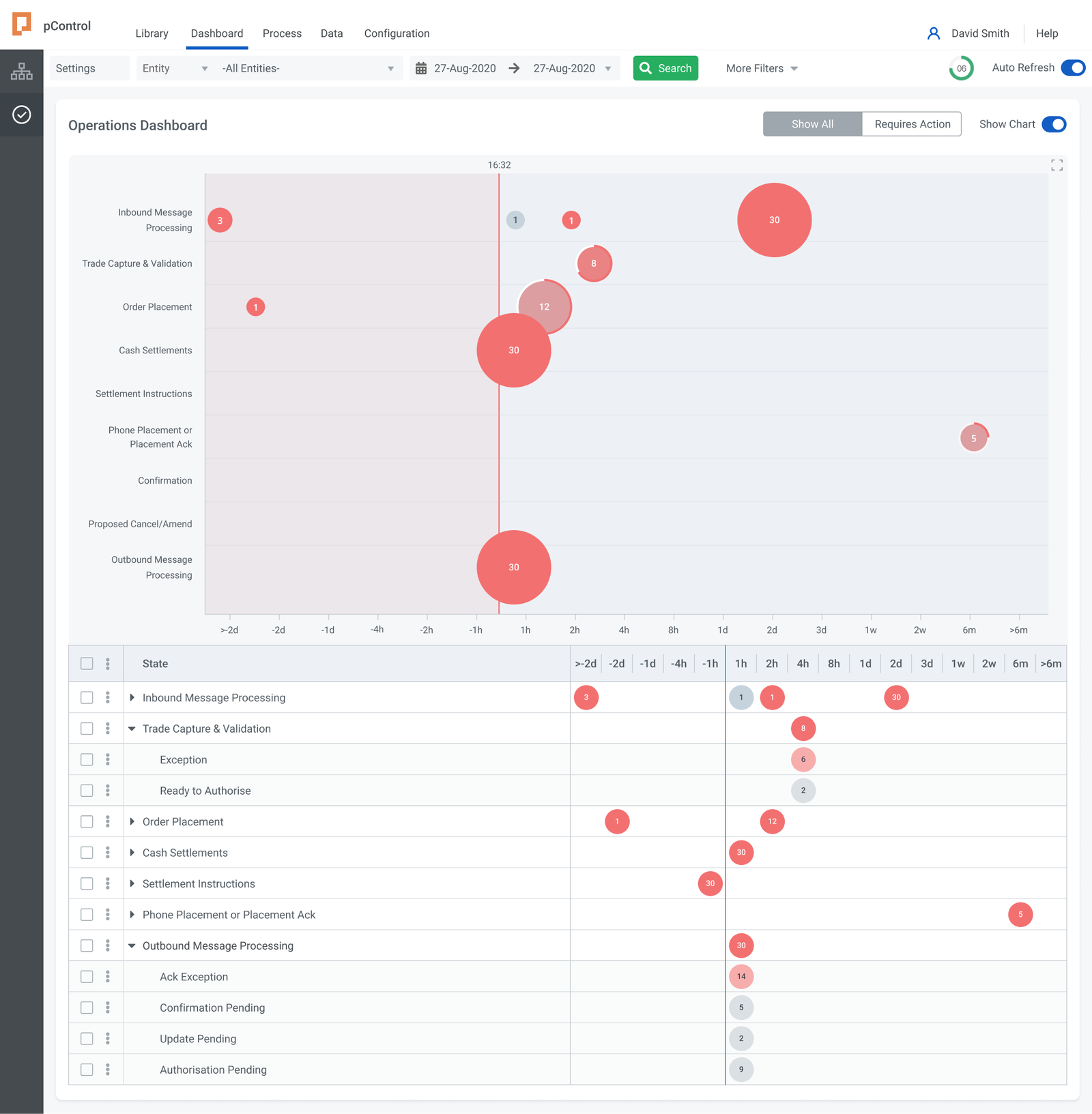
The vertical red line running through the canvas screen is the SLA deadline boundary, marked with the current time (16:32 in the design). Everything to the right of that line is within SLA. Everything to the left has already breached it. The shaded pink zone extending to the left of the line makes that boundary immediately obvious: any bubble sitting in that zone represents trades that are already overdue for their current stage.
The time axis is not evenly spaced: the intervals are much smaller near the deadline (1h, 2h, 4h) and expand progressively further out (1d, 2d, 3d, 1w, 2w, 6m). This deliberately stretches the critical zone around the deadline so it takes up more of the screen, keeping the hours that matter most visible and legible.
DESIGN
Why a bubble matrix?
A Kanban board captures process stage but loses the time dimension. A status table captures both but requires more cognitive load - the user still has to translate the data to assess what to prioritise. A bubble matrix makes stage and time-to-deadline simultaneously visible, which aligns with how operations teams work.
Because each bubble aggregates a group of trades rather than plotting individual records, the view stays readable at any volume. A book with 500 active trades looks the same as one with 50, just with larger bubbles. Adding more trades doesn't add more rows or columns.
The design uses a non-linear scale from minus two days to ensure the chart provides resolution where it matters.
DESIGN
The bubble model
Each bubble on the grid represents a group of trades that share the same process stage and the same SLA position. The number inside the bubble shows how many trades are in that group. The size of the bubble reflects that count visually: 30 trades produces a large bubble, 1 trade produces a small one. Colour indicates status: red bubbles are at risk or already in breach, grey bubbles are comfortably within their deadline. Rows with no bubbles, such as Settlement Instructions and Confirmation, have no active trades at that stage and are simply empty.
To act on what the dashboard shows, a user clicks a bubble. This opens the detail table for that specific combination of process stage and time window, pre-filtered so only the relevant trades are visible. From there the user can inspect individual records, see their specific SLA times, and take action. The dashboard does not replace the table: it tells the user which table to open and why. Without it, the user would have to open each process stage manually and scan through rows to find the same information. The dashboard compresses that into a single view where the most urgent situations, the largest red bubbles closest to or left of the deadline line, are visible immediately without any navigation.
DESIGN
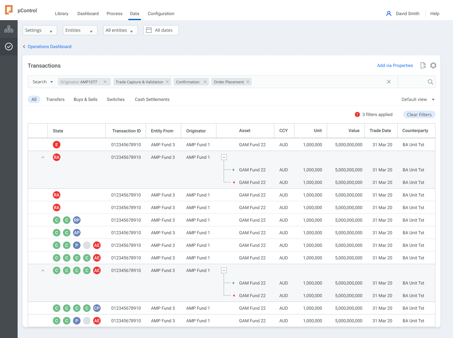
The detail table
Clicking a bubble opens the corresponding table, pre-filtered to that process stage and time window. The context from the dashboard carries through: no manual searching, no resetting filters.
The table redesign addressed the original brief. The typographic hierarchy was rebuilt with clear weight and size distinctions. Status indicators were moved to the row level rather than buried in secondary columns. The selected row state holds context while a detail panel opens alongside, which avoids the navigate-and-return pattern of the original. Row-level controls appear on hover to keep the default state clean.
The dashboard and table are designed as a pair: one shows where to look, the other shows what to do. Interacting on one also highlights the other, so it's clear they are just different views of the same data.
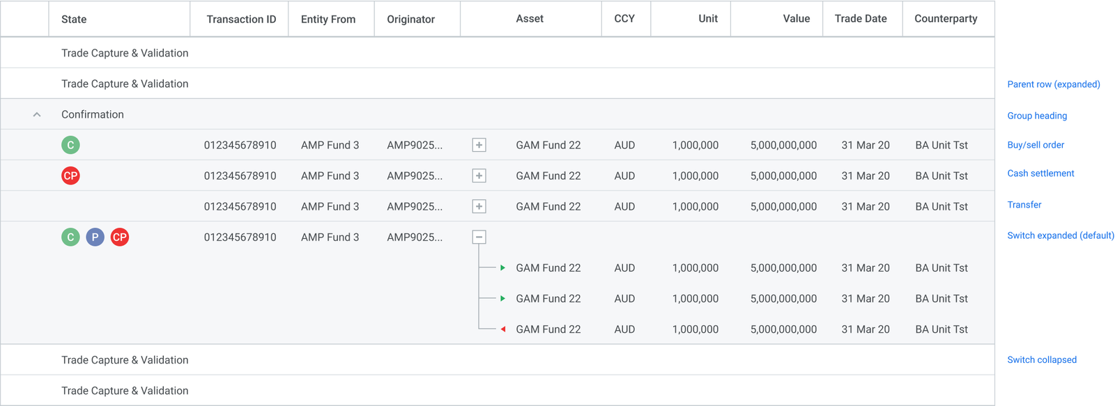
DESIGN
Expanding table rows
Each row in the table represents a process stage. Some stages contain multiple transaction types - for example, a switch involves a sell leg and a buy leg - so those rows expand to show the individual components. Expanding a row doesn't navigate away; the parent row stays visible as a reference point, and child rows appear inline beneath it.
Switches are expanded by default because the legs are operationally separate: each has its own counterparty, settlement instruction, and SLA. Other transaction types - transfers, buy/sell orders, cash settlements - are shown as single rows, since they don't have sub-components that need to be acted on independently.
The expand/collapse control sits in the row, not in a separate column, so it doesn't compete with the checkbox or action menu.
DESIGN
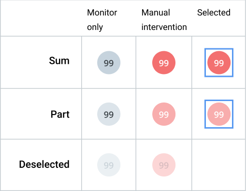
Table cell states
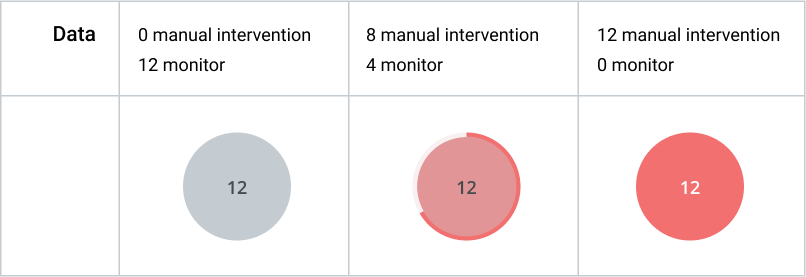
Each cell in the table shows a trade count for a specific combination of process stage and time window. The count alone doesn't tell the user whether that number requires attention - so colour carries that meaning. Grey cells are within SLA and can be monitored without action. Red cells indicate that manual intervention is needed, either because SLA is approaching or already breached.
When a user selects one or more rows, the cell states update to reflect the selection: selected cells get a distinct border, and counts split into selected and unselected portions. This lets users confirm what they're about to act on without losing sight of the rest of the table.
A cell showing a partial count - where some trades in that group are selected and some aren't - uses a distinct visual treatment to make the partial state obvious rather than ambiguous.
DESIGN
Navigation and information architecture
The global navigation (Library, Dashboards, Process, Data, Configuration) reflects pControl's scope as a platform. Order management is one module within a system that also covers portfolio management, compliance, fund accounting and data operations. The Attention Status Monitor sits within that structure as a named dashboard, not a standalone screen.
A filter bar lets users scope the view by fund, entity or date range without losing their place.
DESIGN
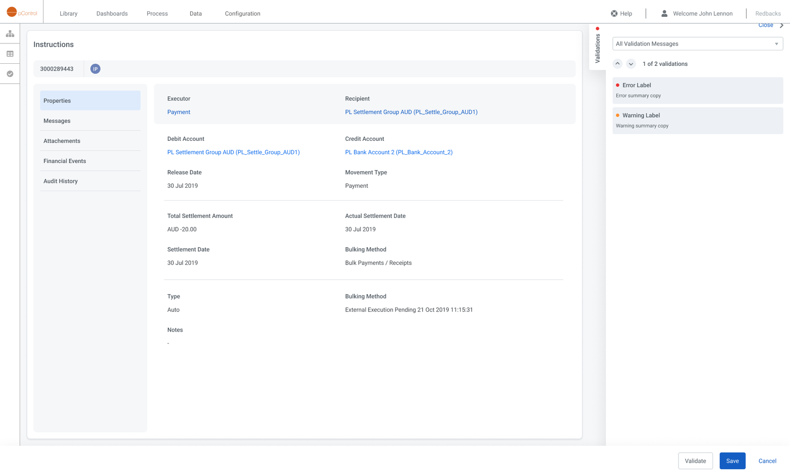
Instructions
Each instruction represents a single settlement event - a payment from one account to another, routed through a custodian or transfer agency. The detail view consolidates everything an operations user needs to act: counterparty routing, settlement dates, bulking method, and movement type sit alongside a live validation panel that surfaces errors and warnings without requiring a separate screen. Tabs for Messages, Attachments, Financial Events, and Audit History keep the full lifecycle of the instruction in one place.
DESIGN
Transactions properties
Selecting any transaction opens the Transaction Properties screen, giving Investment Operations and Fund Accounting teams a full, structured view of every attribute associated with that transaction. All properties are surfaced in an expandable table, allowing users to quickly inspect settlement details, order lifecycle status, counterparty data, and accounting fields without leaving the transaction context.
DESIGN
Transactions panel
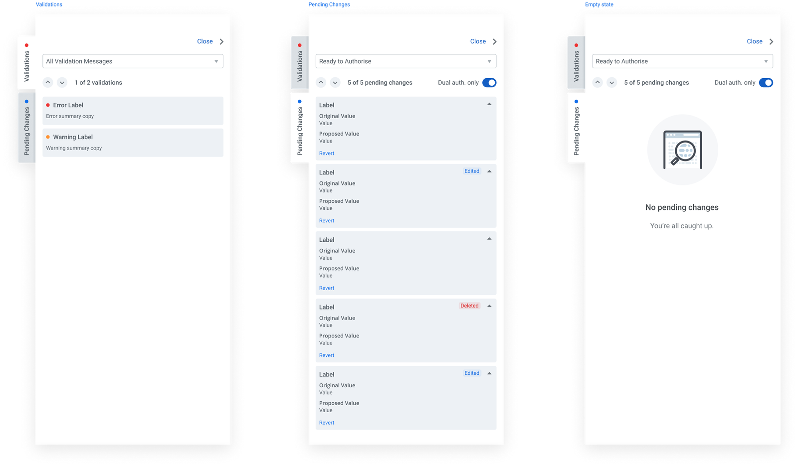
The side panel surfaces two contextual views for each instruction: Validations and Pending Changes. The Validations tab lists errors and warnings generated by the platform's rule engine, each with a severity indicator and summary. The Pending Changes tab shows a field-level diff of any edits awaiting authorisation - original value, proposed value, and change type - with individual Revert controls and a Dual auth. only toggle for instructions requiring two-person sign-off. When there is nothing to action, the panel shows a clean empty state rather than hiding the tab entirely.
IMPACT
Before / After
The redesign shifted the platform from a tool that performed poorly, and lacked basic usability to one that directly helped sell the platform, and that the users projected onto screens in their office to facilitate operations.
PROBLEM
A platform you had to navigate to understand
- All information in uniform data tables with no visual hierarchy
- No aggregate view of trade status across the book
- Exceptions only findable through manual row inspection
- SLA position not visible at any level
- Every insight required deliberate navigation
- Visual design dated and inconsistent
SOLUTION
A platform that shows you what to do
- Exception clusters visible across all nine process stages without any navigation
- Bubble size and colour show volume and urgency at a glance
- The "now" line and overdue zone give immediate SLA orientation
- Clicking a bubble opens a pre-filtered table: no context lost in the transition
- Redesigned tables with clearer hierarchy and row-level status indicators
- Consistent visual system across navigation, filter bar, dashboard and tables
- Users requested a fullscreen monitor mode: the format worked as ambient information, not just a screen to visit
IMPACT
Expanding the brief by making the case
The project contributed to a roughly 16% increase in sales for Milestone Group and generated $2M in follow-on work for Lab49, both tied to the decision to extend the scope. I was engaged by the client to upskill their newly hired in-house designer in design thinking and Figma hard skills, so they could apply the new design language across the rest of the platform.
Milestone Group named the dashboard the Attention Status Monitor and referenced it across all four of their Asset Allocation solution profiles. The most concrete validation, though, came from users: Milestone Group’s clients asked for a fullscreen version to run on dedicated office monitors. No one requests that for a data table. It confirmed what the research had suggested but couldn’t prove: that the bubble matrix works as ambient information, readable at a glance without active engagement.
The format is also durable. As trade volumes grow, the layout stays stable: only the bubbles change size. The nine-stage Y-axis maps directly to pControl’s Order Management lifecycle, so the visualisation reflects the platform’s actual data structure rather than a layer of design abstraction on top of it.
KEY LEARNING
A narrow brief can hide a bigger problem
The table refresh request was a narrow brief, but discovery revealed a wider issue, and a better opportunity for the business.
Extending the scope required evidence: a specific account of what the existing UI wasn't doing, and why better-looking tables wouldn't fix it. That case was built in the discovery phase, before any design work started.
KEY LEARNING
Internal scepticism can present a unique lens
The SME's conservative position presented an interesting challenge. Every hypothesis and experiment required more rigour, and more grounding in user requirements.
It also involved a high level of diplomacy, and establishing a wider consensus in order to move forward. SMEs provide insights, but they can also be quite myopic - it's important to understand where their expertise has limitations.
KEY LEARNING
Design without user insights requires balance
Relying on a single expert required separating confirmed facts from assumptions and pre-existing beliefs.
This allowed me room to design an alternative solution, and left room for adjustments once real users tested it.
Selected Projects
Bolt AppFintech · Mobile app · B2C · Startup
AmaysimTelco · Native app · B2C
Shift · Credit Limit IncreaseFintech · Responsive web · B2B
ABC · iView appVOD · Native app · B2C
Shift · Edit InstallmentsFintech · Responsive web · B2B
CBA · DisputesBanking · Native app · B2C
Sydney Airport · VIPTravel · Responsive web · B2C
CBA · SDLC NavigatorFintech · Web app · B2B
NickelcloudOperations · SaaS · B2B · Startup
CBA · Transaction Banking PortalFintech · Responsive web · B2B
P&O Cruises · Cruise Booking SiteTravel · Responsive web · B2C
All of UsFintech · Mobile app · B2C · Startup
CBA · System Architecture VisualisationFintech · Responsive web · B2B
DTA · Relationship Authorisation ManagerGovernment · Responsive web · B2B
Standard Chartered · Trade Finance AppFintech · Mobile app · B2B
Advice IntelligenceFintech · SaaS · B2B
