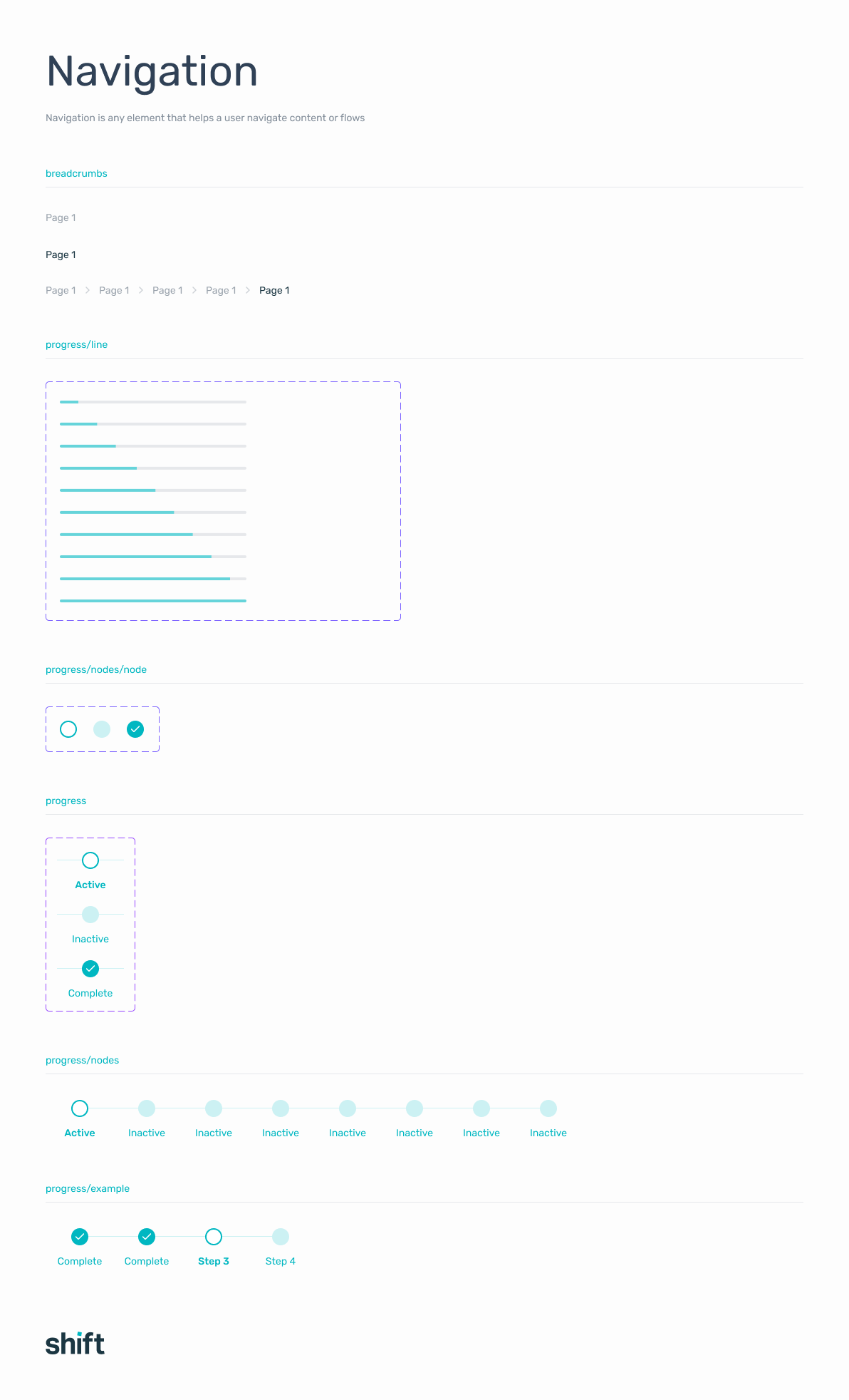
PROJECT TYPE
B2B Fintech · Feature Design · Desktop & Mobile
CLIENT
Shift
MY ROLE
Lead Product Designer
TIMELINE
3 months (Apr 2023 - Jun 2023)
OVERVIEW
Shift allows businesses to manage repayments through installment schedules. However, the edit installments feature was creating confusion and anxiety, especially for customers trying to manage cashflow.
I led the redesign of this experience to make repayment changes clear, predictable, and trustworthy, while aligning with internal system and compliance requirements.
MY RESPONSIBILITIES
Creative Direction, Visual Design, Design Language, UX, Interaction Design
IMPACT
Giving businesses control
The redesign addressed a core trust gap in how businesses managed their repayments.
-18%
Significant reduction in support calls related to repayment changes
High
Confidence in self-serve task completion
Zero
Ambiguity in repayment impact. Users can see the full financial effect before confirming
PROBLEM
Changing a repayment schedule felt risky
The existing edit installments experience made it difficult for businesses to confidently manage their repayments. Changing installments is a high-stakes action - it directly impacts cashflow, costs, and financial planning. However, the product did not provide enough clarity or reassurance for users to feel in control of these decisions.
Users didn't know if their changes had gone through. There was no clear explanation of what would happen next. The impact on repayments - schedule, cost, and interest - was unclear. Terminology was confusing and inconsistent, and system feedback was delayed or missing entirely.
"Users aren't sure if their changes have gone through, what happens next, or how adjustments will affect their payments."
- Head of Product, Shift Credit Platform
PROBLEM
The existing experience
- Users don't know if their changes had gone through
- No clear explanation of what will happen next
- Impact on repayments (schedule, cost, interest) is unclear
- Terminology is confusing and inconsistent
- System feedback is delayed or missing
Customer pain points
- Hesitation when making changes
- Repeated actions or abandonment
- Increased support calls
PROBLEM
The business impact
- Support team fielding calls that should have been self-serve
- User anxiety undermining trust in the platform
- Repayment errors caused by unclear feedback and repeated actions
- Compliance risk from users misunderstanding financial implications
CONTEXT
Business goals
Redesign the edit installments experience to:
- Reduce support calls related to repayment changes
- Increase adoption of self-serve repayment management
- Ensure all repayment changes remain compliant with lending regulations
- Maintain accuracy and integrity of repayment schedules and interest calculations
The solution needs to restore confidence through clearer messaging and real-time feedback.
DISCOVERY
Understanding the problem before designing the solution
To understand why users were losing confidence, I started with usability testing before any design decisions were made.
The key questions driving the research: why were users hesitating at the point of confirmation, what information did they need to feel confident making a change, and where was the system failing to communicate what had happened and what would happen next.
KEY FINDINGS
Users couldn't tell if their changes had been processed successfully.
The absence of real-time feedback and confirmation eroded trust, prompting unnecessary calls to customer support. Users would repeat actions or abandon the flow entirely rather than risk making an error.
KEY FINDINGS
The financial impact of a change was invisible until after it was made.
Users struggled to understand how a deferred payment would affect their schedule, total cost, and interest over time. Without visibility of the financial implications upfront, making a change felt like a risk rather than a choice.
CONSTRAINTS
Three factors shaped what the solution could and couldn't do
Designing within this space meant working around fixed requirements from compliance, engineering, and the nature of financial data itself - none of which could be simplified away.
Compliance owned what messaging had to appear and when. Engineering was responsible for backend services that introduced latency and inconsistent states. The financial data itself had to be accurate to the cent; any mismatch between what the UI showed and what the system calculated was a compliance and trust risk.
Getting the redesign right meant all three were embedded in the process from the start.

Compliance
Repayment changes required strict validation. Messaging had to accurately communicate financial implications - cost, interest, and schedule - at every stage.

Backend complexity
Repayment calculations depended on multiple backend services running sequentially. This caused latency and inconsistent system states that the UI had to account for.

Financial accuracy
Any errors in how repayment impacts were displayed could affect customer trust and create compliance risk. The UI had to reflect real financial outcomes, not approximations.
How can we make repayment changes feel predictable and trustworthy without removing the controls that compliance and risk require?
RESEARCH
Usability testing
Usability testing quickly exposed why users were feeling anxious about the edit installments process. People weren't sure if their changes had gone through, what would happen next, or how adjustments would affect their payments.
Terminology was confusing, and poor system feedback led to hesitation or calls to customer support. The sessions made it clear this wasn't just a UX flaw - it was a trust issue. The fix would be about restoring confidence through clearer messaging and real-time feedback.
User testing revealed pain points in the current journey
RESEARCH
Research synthesis
Following the usability testing sessions, I ran a synthesis workshop to group insights and identify patterns. Observations were sorted into what was working, what needed to improve, open questions, and early design ideas - giving the team a shared view of the problem before any design decisions were made.
Insights from each session were grouped by theme - what triggered a change request, what information users needed before confirming, where feedback was missing or misleading, and what language was causing confusion.
Surfacing these patterns helped build a shared understanding of the problem before any design decisions were made.
RESEARCH
Surfacing opportunities
Mapping the existing experience made it clear that the anxiety wasn't caused by a single point of failure. Users were being asked to make financially significant decisions with almost no information about the consequences, and with no confirmation that the system had registered what they'd done.
The opportunity was to give users sight of the financial impact before they committed, and clear confirmation that their change had been processed. Both could be achieved within the existing compliance and system constraints. It was a design problem, not a technical one.
RESEARCH
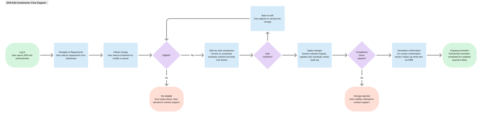
Mapping the full lifecycle
To address the complexity of the existing edit installments flow, I created detailed journey maps that captured every step, decision point, and system interaction within the process.
By mapping the journey across key states - request initiation, eligibility check, schedule recalculation, confirmation, and follow-up - I identified where users were losing confidence and where systems were introducing unnecessary friction. The maps were refined closely with engineering to align with existing notification and repayment frameworks, ensuring technical feasibility and consistency.
The redesigned installment journey mapped across user actions, system processes, and internal teams.
DESIGN
Rebuilding trust through transparency and real-time feedback
The research pointed to a clear design direction: users needed to understand what would happen before they committed to a change, and they needed confirmation that it had worked after. Neither of these required removing compliance requirements or restructuring the backend - they required better communication at every stage of the flow.
The redesign focused on three things: making the financial impact of a change visible upfront, introducing real-time system feedback throughout the flow, and simplifying the language so users could act with confidence rather than anxiety.
DESIGN
A simplified, transparent repayment flow
Fewer system touchpoints, clearer feedback, and visible financial impact at every stage.
The redesigned flow
DESIGN
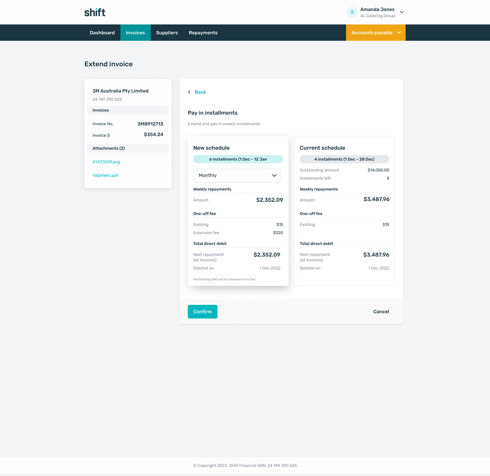
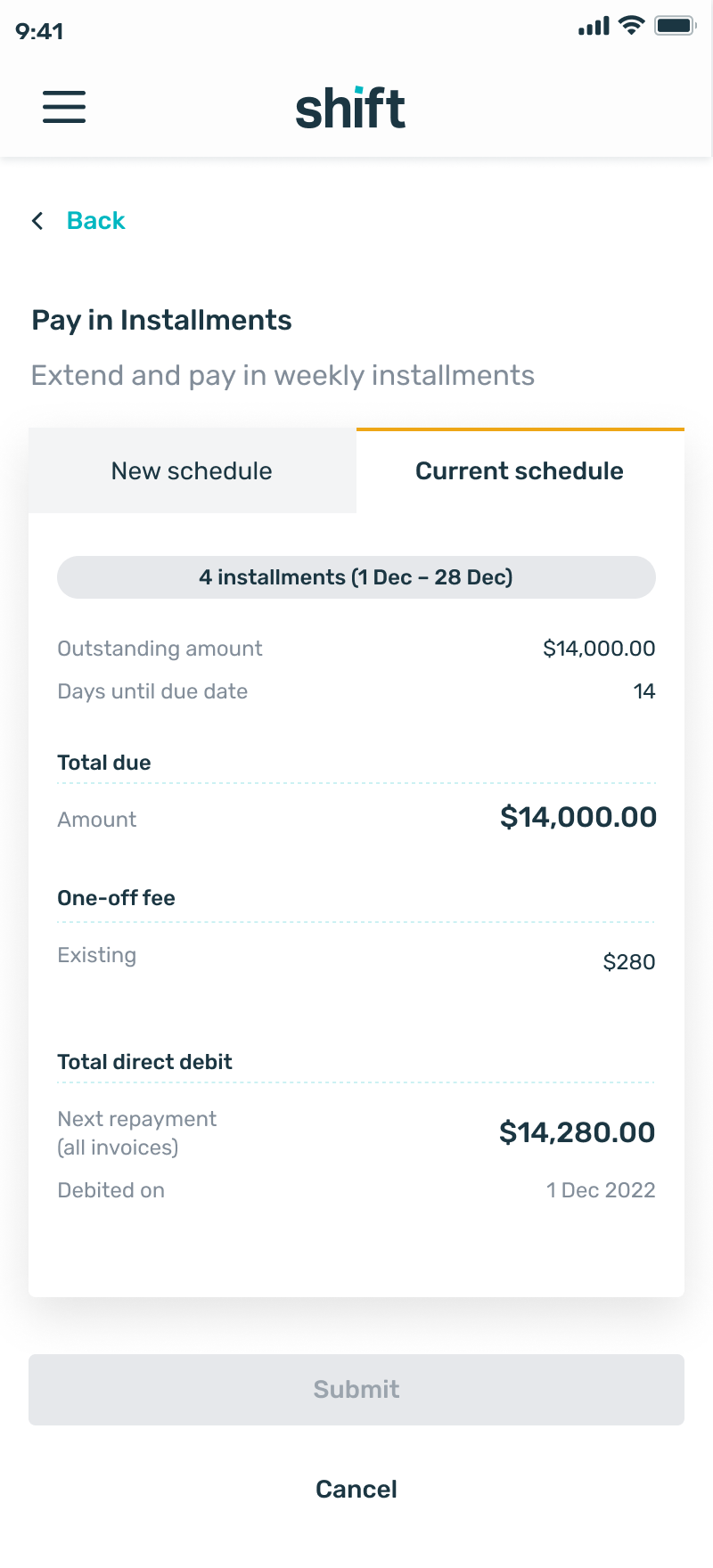
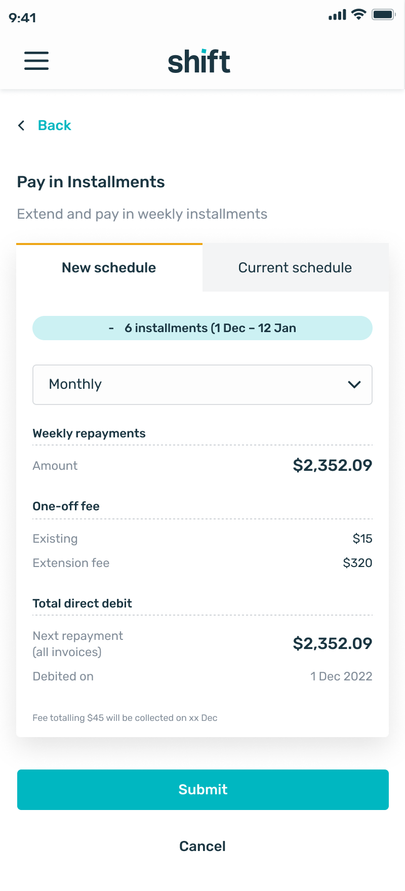
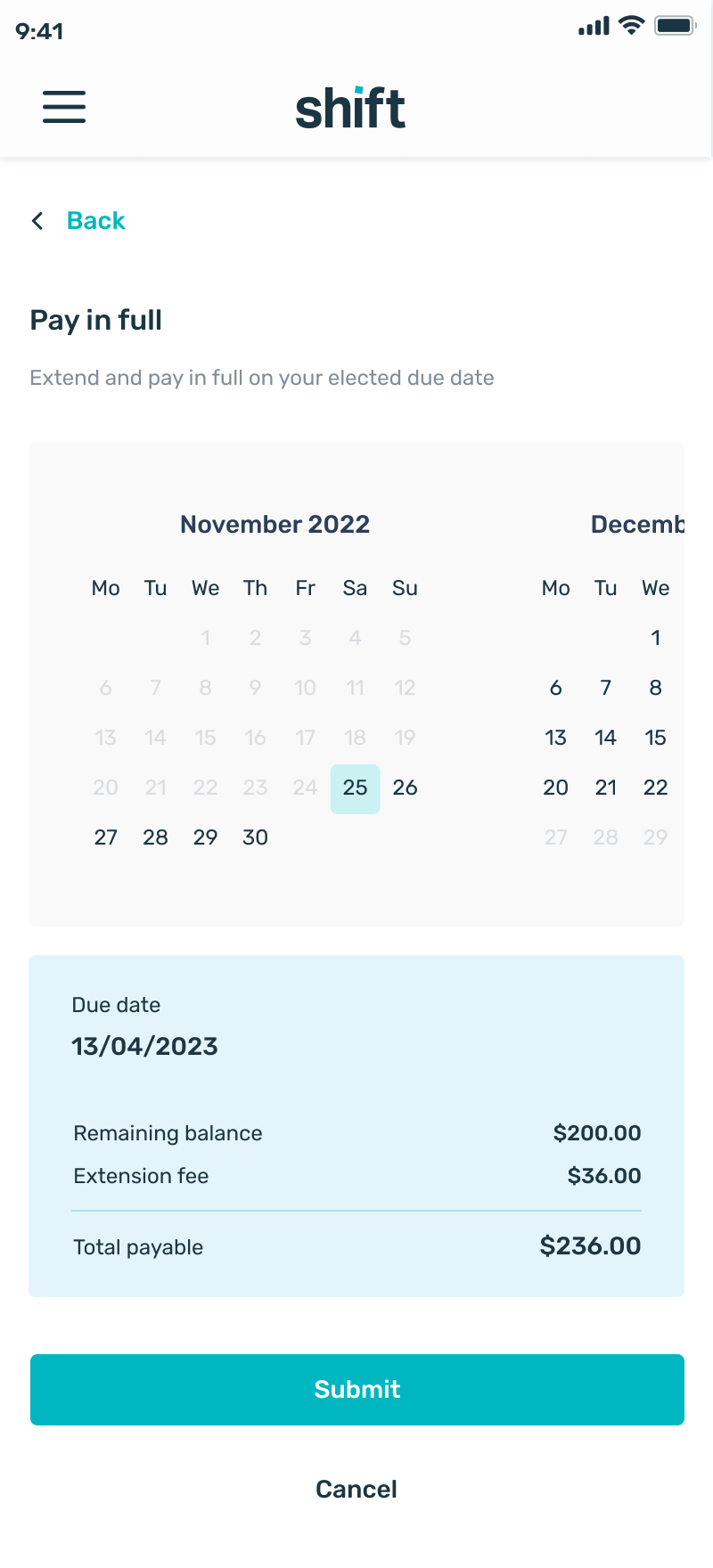
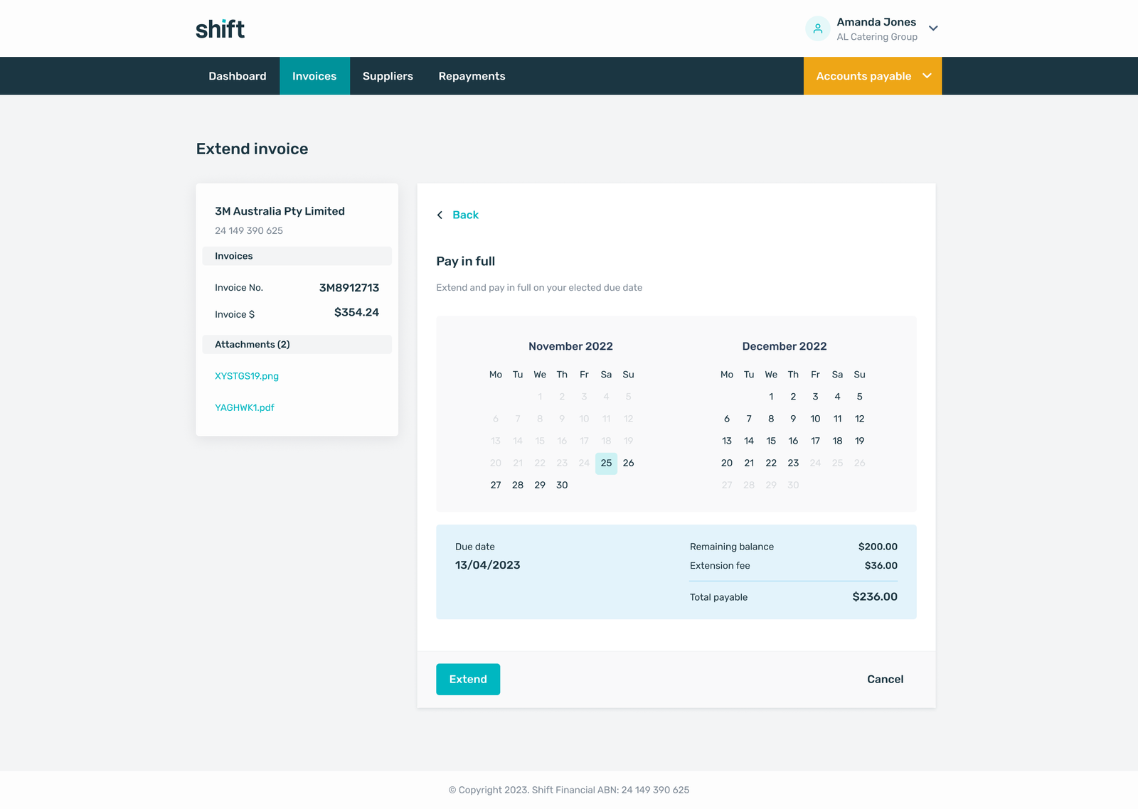
Seeing the impact before committing
The most significant design decision was introducing a side-by-side comparison that allowed users to see the full financial impact of their installment change before confirming - current schedule versus proposed schedule, repayment amounts, and interest figures presented in a clear, scannable layout.
This removed the ambiguity that had previously caused hesitation. By making the financial implications visible upfront, users could assess the change, understand what it meant for their cashflow, and proceed with confidence. Early testing showed a noticeable reduction in uncertainty and a marked improvement in task completion rates.
DESIGN
Mobile
Analysis of user behaviour showed that a significant proportion of customers accessed their accounts while away from a desk - travelling, on site, or during short breaks. Repayment changes were often prompted by immediate cashflow needs rather than planned sessions at a laptop.
To support this, the redesigned experience was fully responsive and mobile-optimised. The side-by-side comparison adapted to a tabbed layout on smaller screens. Interactive elements were refined for touch input, with increased hit areas, improved spacing, and mobile-friendly feedback states.
DESIGN
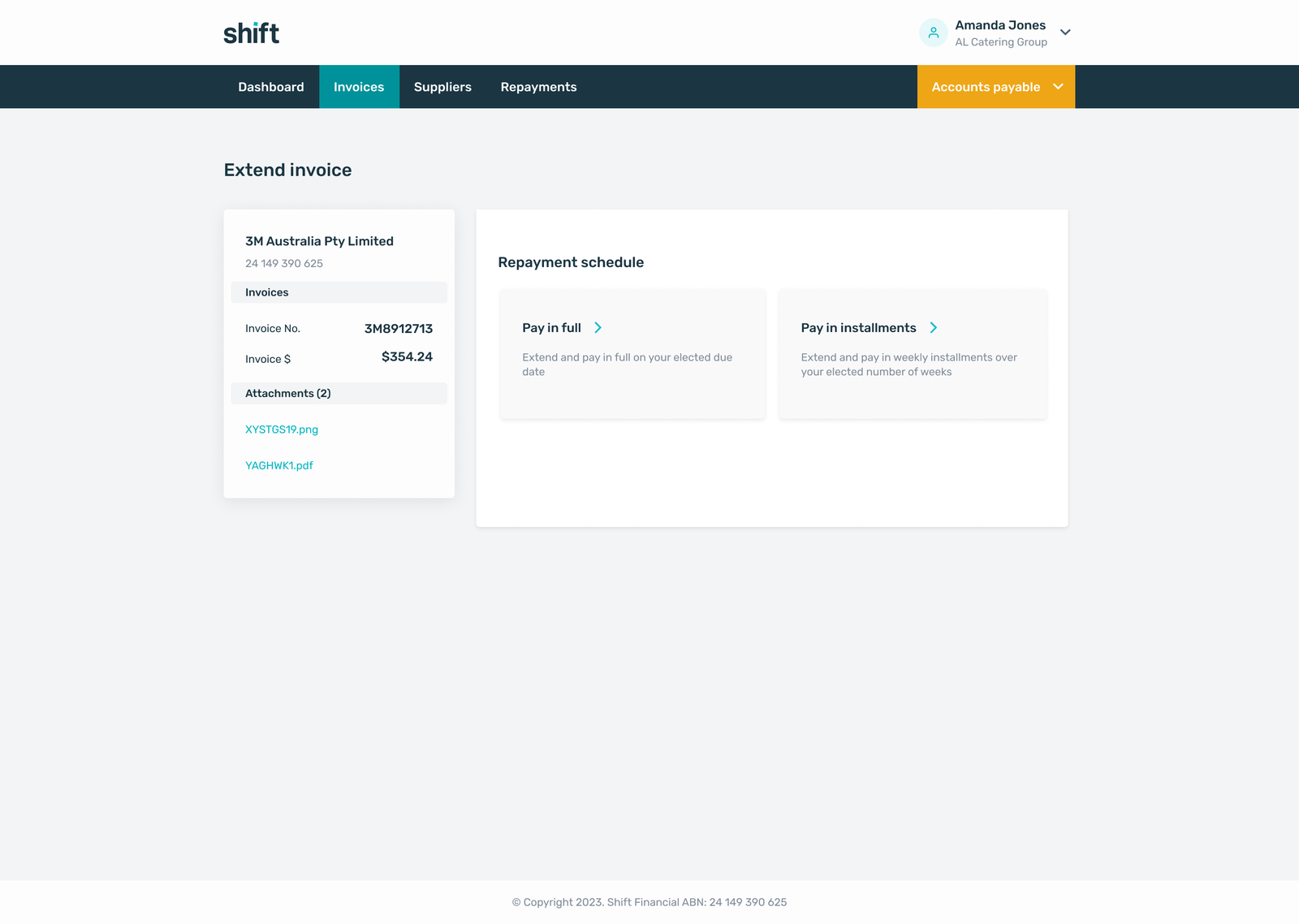
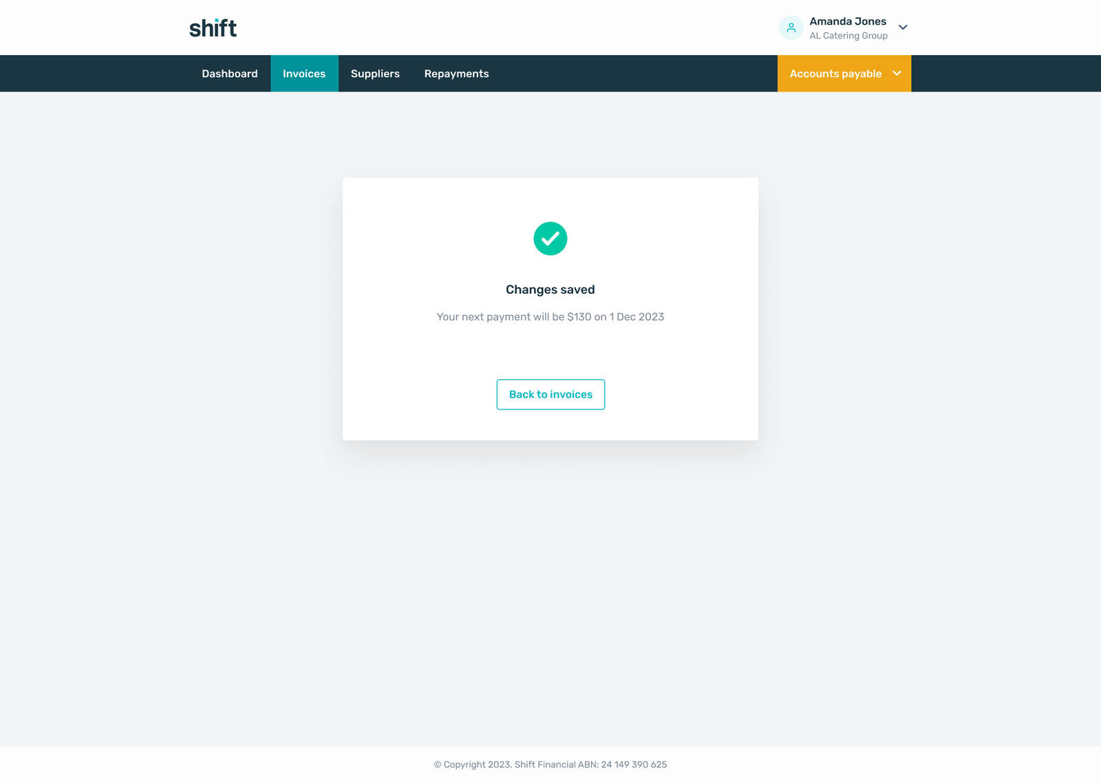
Desktop
A selection of the desktop UI designs
DESIGN
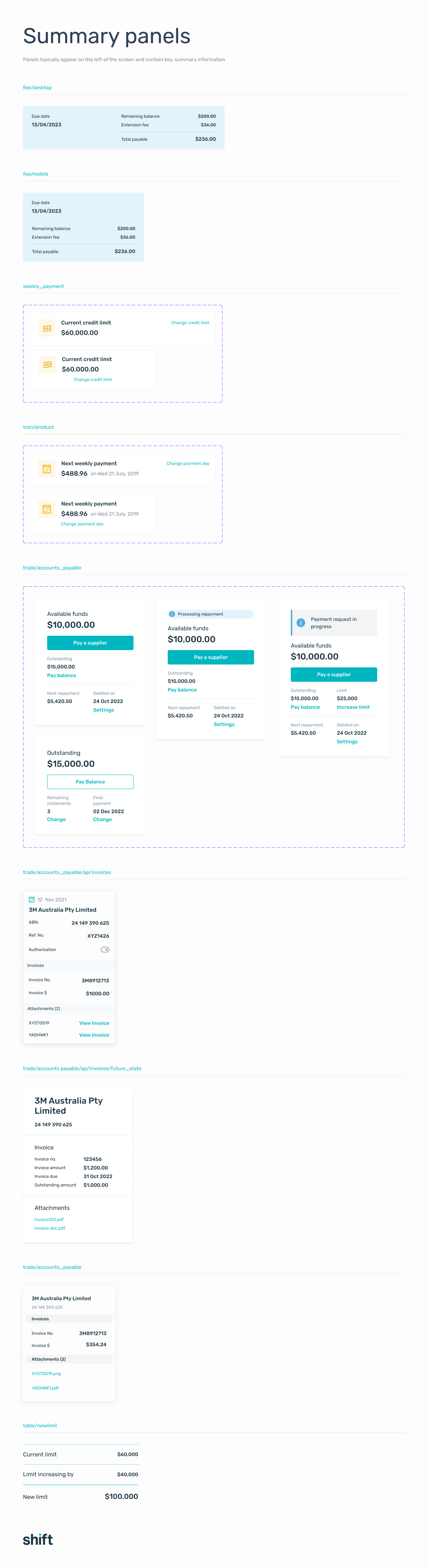
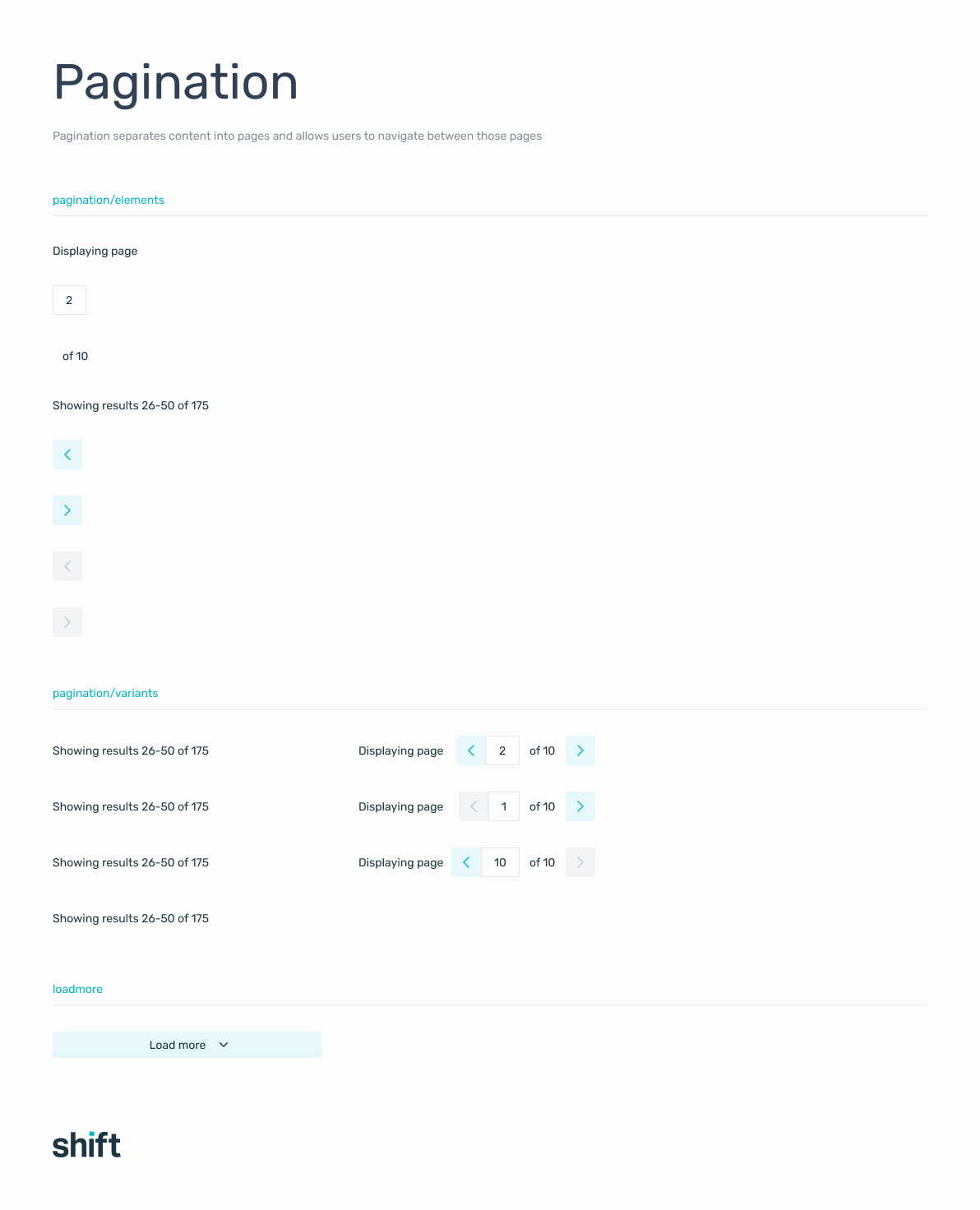
Updating the component library
Implementing the redesigned journey highlighted gaps in the existing component library. Notifications, progress indicators, and status messages lacked the flexibility to support the richer feedback states the new flow required.
I initiated an update to the library, introducing new variants for banners, inline alerts, and confirmation patterns that could scale across both web and native platforms. This work formed part of a broader design language refresh - modernising the visual system, tightening typographic hierarchy, and unifying interaction behaviours across the product.
BEFORE
A confusing, high-anxiety process
- Users unsure if changes had gone through
- No visibility of financial impact before confirming
- Inconsistent terminology and delayed system feedback
- Repeated actions, abandoned flows, and support calls
- Compliance and risk requirements applied late in the process
AFTER
A clear, trustworthy, self-serve experience
- Side-by-side comparison shows full financial impact before confirmation
- Real-time feedback at every stage of the flow
- Consistent, plain-language terminology throughout
- Clear confirmation states - users know their change has been processed
- Compliance embedded from the start - accurate financial outcomes reflected in the UI
IMPACT
Turning anxiety into confidence
The redesigned experience significantly improved both user confidence and operational efficiency, addressing a core trust gap in how businesses managed their repayments.
Users were able to clearly understand the impact of their changes before committing, which removed uncertainty at critical decision points. Support call volume for repayment-related queries fell as the self-serve route handled cases that had previously required a human handoff.
Beyond the immediate outcomes, the redesign established a pattern for handling complex financial interactions clearly and transparently. The updated component library and journey framework created a foundation for scaling other self-serve financial capabilities; reducing long-term reliance on manual processes and giving the product team a consistent system to build on.
KEY LEARNINGS
Trust is built through transparency
Users don't need simpler decisions - they need better information. Showing the full financial impact of a change upfront removed anxiety without reducing user control.
KEY LEARNINGS
Compliance and good UX aren't in conflict
Every regulatory requirement was preserved. The redesign worked within the constraints, not around them - better communication, not fewer rules.
KEY LEARNINGS
System feedback is a design problem
The backend complexity was real, but the user's experience of it was a design choice. Real-time feedback and clear confirmation states transformed a technically complex flow into a predictable one.
REFLECTION
Designing within constraints
This project was less about inventing new patterns and more about getting the fundamentals right. The flows existed. The backend worked. The compliance requirements were clear. What was missing was the layer of communication that made users feel in control - confirmation that things had worked, visibility of what they were agreeing to, and language that meant something.
The component library work was a natural extension of that thinking. Fixing the journey exposed the gaps in the system, and addressing those gaps meant the next feature built on Shift's platform would start from a stronger foundation.
The latency introduced by sequential backend services is still an issue - users still experience a delay between action and confirmation that a loading state partially addresses but doesn't fully resolve. Reducing that dependency on sequential processing is the next engineering and design problem worth solving.
Selected Projects
Bolt AppFintech · Mobile app · B2C · Startup
AmaysimTelco · Native app · B2C
Shift · Credit Limit IncreaseFintech · Responsive web · B2B
ABC · iView appVOD · Native app · B2C
Milestone · pControlFintech · Responsive web · SaaS · B2B
CBA · DisputesBanking · Native app · B2C
Sydney Airport · VIPTravel · Responsive web · B2C
CBA · SDLC NavigatorFintech · Web app · B2B
NickelcloudOperations · SaaS · B2B · Startup
CBA · Transaction Banking PortalFintech · Responsive web · B2B
P&O Cruises · Cruise Booking SiteTravel · Responsive web · B2C
All of UsFintech · Mobile app · B2C · Startup
CBA · System Architecture VisualisationFintech · Responsive web · B2B
DTA · Relationship Authorisation ManagerGovernment · Responsive web · B2B
Standard Chartered · Trade Finance AppFintech · Mobile app · B2B
Advice IntelligenceFintech · SaaS · B2B
