DIGITAL TRANSFORMATION AGENCY
Relationship Authorisation Manager
The Relationship Authorisation Manager (RAM) is an ATO product that allows a business to authorise agents to interact with the ATO on their behalf. Working with a small team at the DTA I guided and implemented major changes to both the UI and IX, delivering a prototype that performed significantly better across all users tested.
The Relationship Authorisation Manager (RAM) is an ATO product that allows a business to authorise agents to interact with the ATO on their behalf. Working with the DTA I guided and implemented major changes to both the UI and IX, delivering a prototype that performed significantly better across all users tested.
RESPONSIBILITIES
UI Design, UX, Interaction Design, User Testing

Humble beginnings
Humble beginnings
The ATO's Relationship Authorisation Manager (RAM) was an existing product in private beta that had been testing poorly with users. The initial brief from the client was to add some polish to the UI, but it was immediately apparent that this would not solve the serious UX issues that were causing the users so much frustration.
I decided to establish what UX issues were contributing to this poor performance, and to deliver an improved experience that would test well with users while still being feasible. The UI redesign would be part of this wider piece of work.
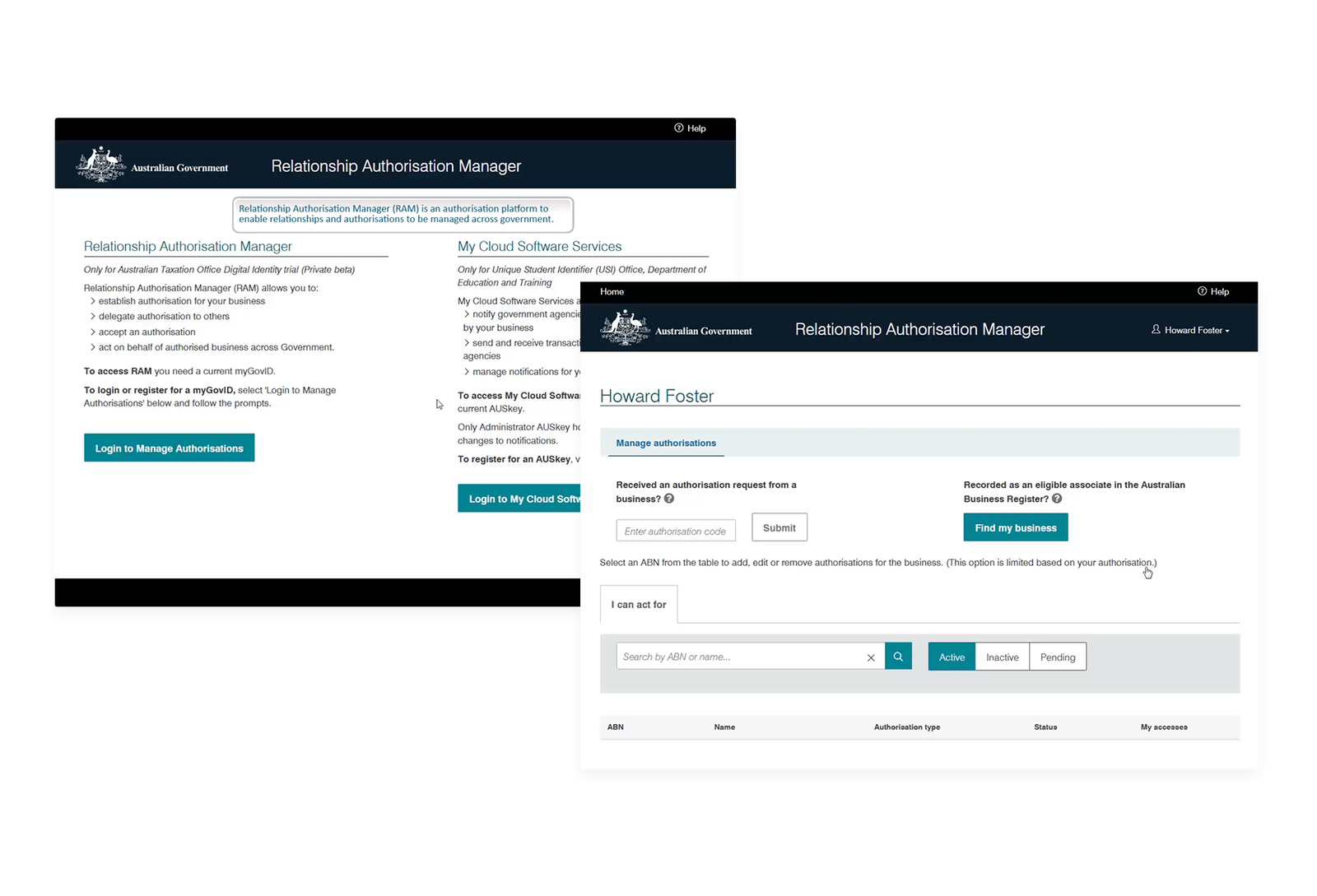
The existing RAM beta was not testing well with users.
The existing RAM beta was not
testing well with users.
Establishing a baseline
Establishing a baseline
After observing several user testing sessions it became clear that the users were struggling with many aspects of the existing experience. Copy lacked clarity, the interface was cluttered and inconsistent, and established UI patterns were not being followed. To document these issues I decided to carry out a UX audit of each component screen, highlighting issues and providing suggested improvements.
After observing several user testing sessions it became clear that the users were struggling with many aspects of the existing experience. Copy lacked clarity, the interface was cluttered and inconsistent, and established UI patterns were not being followed. To document these issues I decided to carry out a UX audit of each component screen, highlighting issues and providing suggested improvements.
View the full UX review


Improving the flow
Improving the flow
The first step was to analyse the flow and look at areas where interactions could be either simplified or removed entirely. In particular the onboarding process and overview screens were performing poorly with users getting confused over what they needed to do next.

Finessing the interface
Finessing the interface
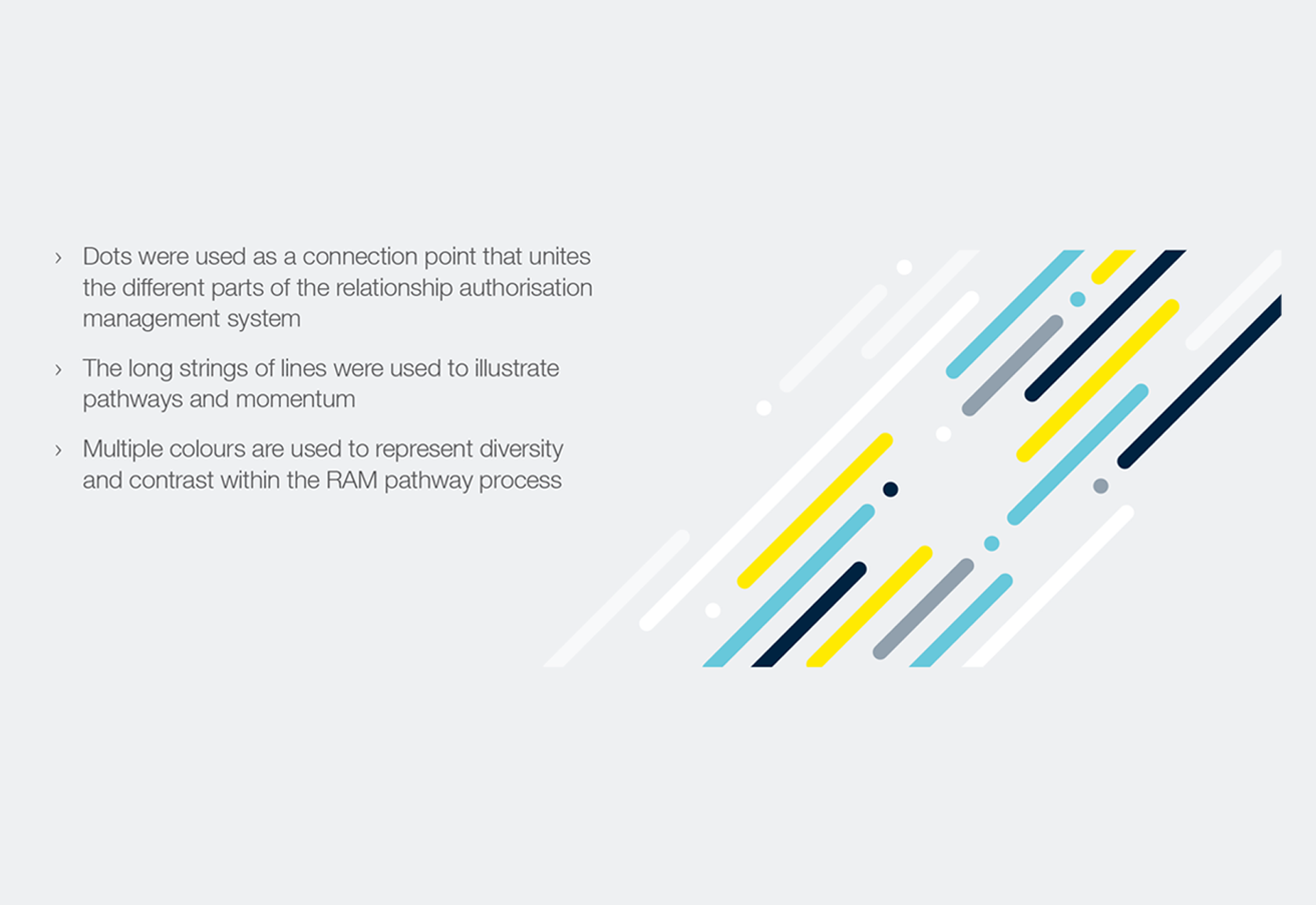
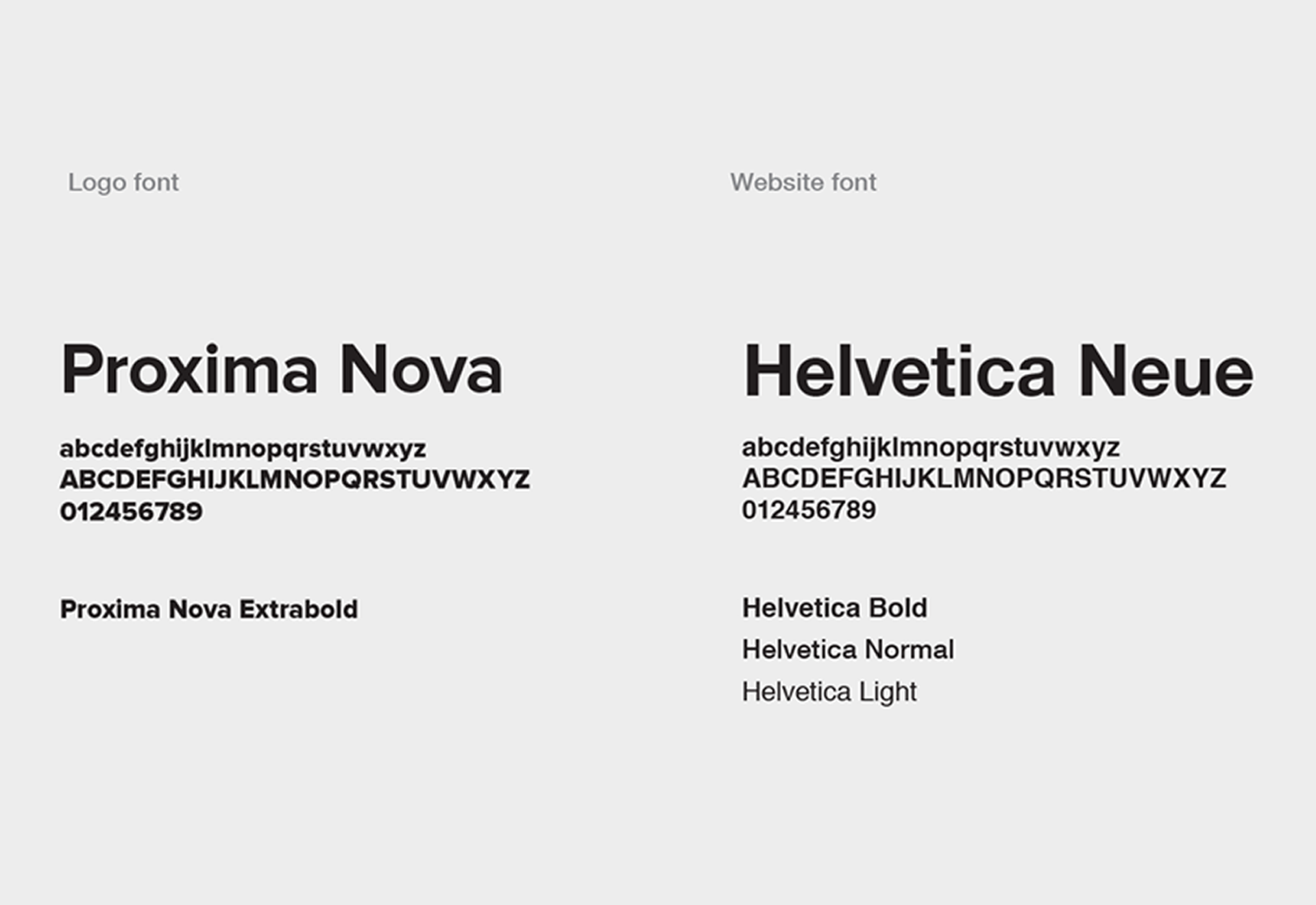
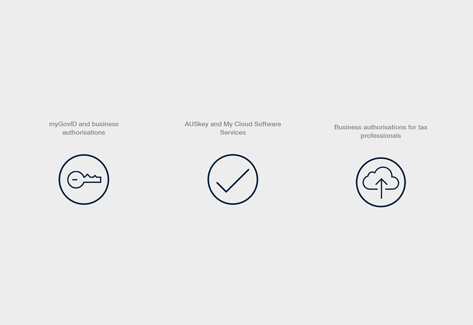
In order to help uplift the product I worked with the ATO to establish a new visual identity that would work with the DTA's design language, creating a style-guide with typography, colours and iconography that would assist in making the interface appear more modern and accessible.
Graphic Identity
Typography
Brand Iconography
Brand Iconography
Colours

Testing the prototypes
Testing the prototypes
I used Sketch, Craft and InVision to build the first two prototypes as this afforded us the agility to make quick changes as and when issues were discovered. We ran three rounds of user testing on the new design and there were immediate improvements on user task completion on the first round, and subsequent refinements to the interface showed that we were on the right track, with test scores steadily increasing on each round of testing.
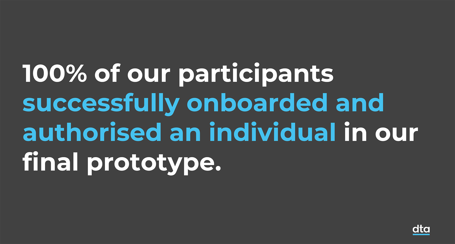
One major insight was that users struggled even with the most basic of tasks when presented with data that was not their own - one of the drawbacks of using static screens in a prototype. In one test 4 out of 5 users failed to log out.
I decided we should build an HTML prototype and then use it to capture user information at the start of each test session, such as their name and business names, and that this would help make the product more relatable to them.
We engaged a developer to create this final prototype, and the last round of testing was extremely successful, with every task being passed easily by all users.
After observing several user testing sessions it became clear that the users were struggling with many aspects of the existing experience. Copy lacked clarity, the interface was cluttered and inconsistent, and established UI patterns were not being followed. To document these issues I decided to carry out a UX audit of each component screen, highlighting issues and providing suggested improvements.
View the final prototype
Analysing the results
Analysing the results
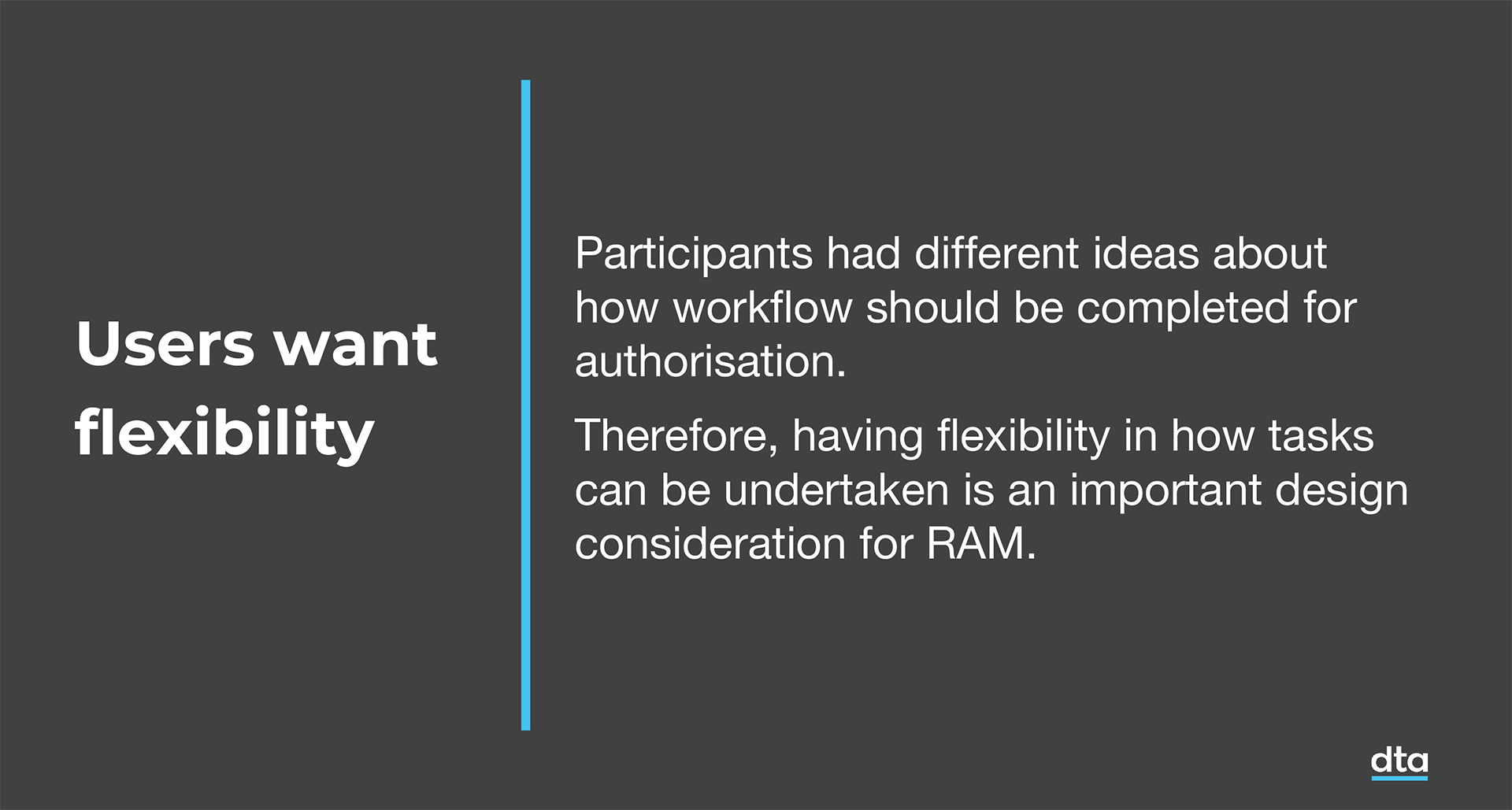
After the third round of testing we put together a document for the ATO which summarised our methodology, user demographics and key findings. This was handed over with the final proposed design. We also put together a more in depth report which went into more detail around specific tasks and recommendations.
After observing several user testing sessions it became clear that the users were struggling with many aspects of the existing experience. Copy lacked clarity, the interface was cluttered and inconsistent, and established UI patterns were not being followed. To document these issues I decided to carry out a UX audit of each component screen, highlighting issues and providing suggested improvements.
View the User Testing summary
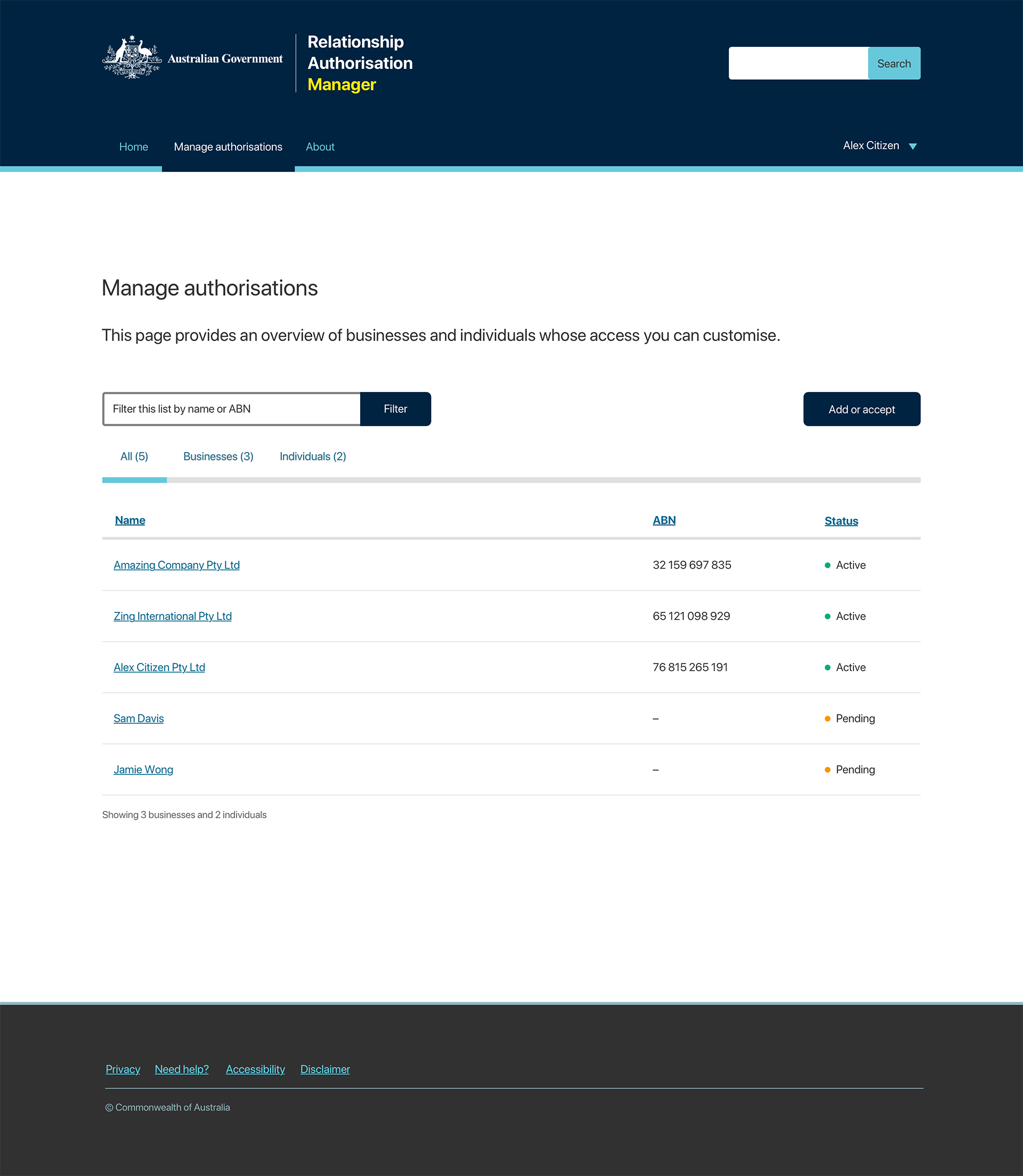
Final designs
Final designs
Below is a small selection of the final screens.
Login screen

Add an authorisation

Manage authorisations
Edit permissions

Selected Projects
Bolt AppFintech · Mobile app · B2C · Startup
AmaysimTelco · Native app · B2C
Shift · Credit Limit IncreaseFintech · Responsive web · B2B
ABC · iView appVOD · Native app · B2C
Milestone · pControlFintech · Responsive web · SaaS · B2B
Shift · Edit InstallmentsFintech · Responsive web · B2B
CBA · DisputesBanking · Native app · B2C
Sydney Airport · VIPTravel · Responsive web · B2C
CBA · SDLC NavigatorFintech · Web app · B2B
NickelcloudOperations · SaaS · B2B · Startup
CBA · Transaction Banking PortalFintech · Responsive web · B2B
P&O Cruises · Cruise Booking SiteTravel · Responsive web · B2C
All of UsFintech · Mobile app · B2C · Startup
CBA · System Architecture VisualisationFintech · Responsive web · B2B
Standard Chartered · Trade Finance AppFintech · Mobile app · B2B
Advice IntelligenceFintech · SaaS · B2B
