PROJECT TYPE
Redesign and UX uplift
TEAM
1 Product Designer
MY ROLE
Lead Product Designer
TIMELINE
5 days
OVERVIEW
I was hired by the client to look at their booking solution for Sydney Airport's VIP service, and uplift the experience and visual design.
Over 5 days I redesigned the platform’s core flows, created a small component library with colour variables, applied the product's brand colours of gold and black, and designed a modern, scalable and responsive solution that got the thumbs up from the client.
MY RESPONSIBILITIES
UX design, UI design, Component library
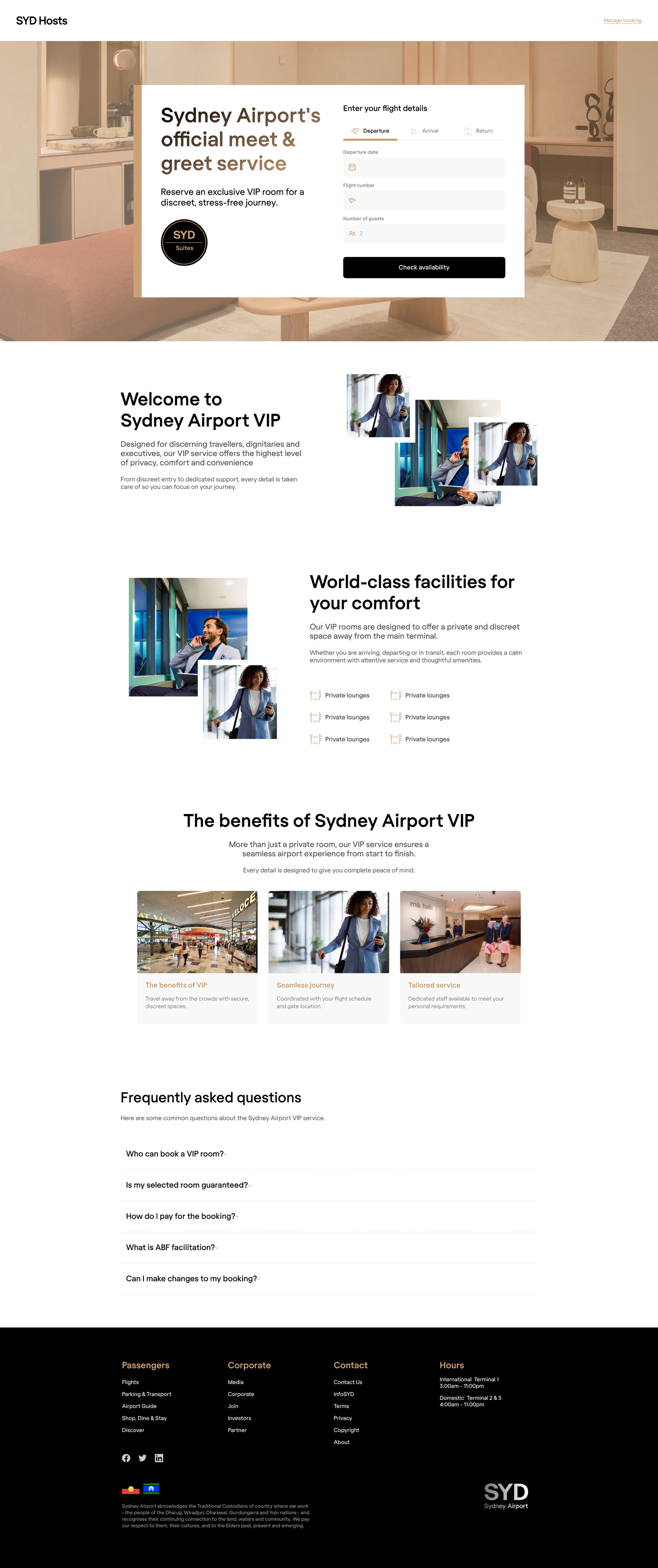
RESEARCH
The landing page was dated and lacked polish
The new platform leaned to heavily on a dated component library and design direction. Form elements felt old-school, typography was conservative, and the overal impression did not meet the luxury expectations of the brand.
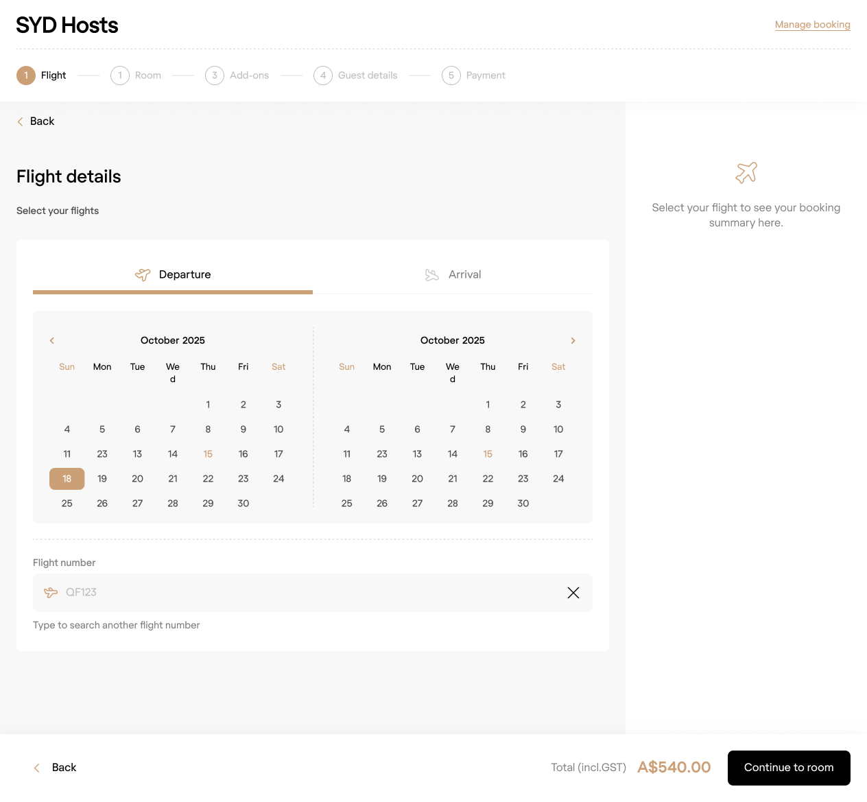
BOOKING ENGINE
A confusing and unpolished journey
The existing booking funnel designs were functional, but suffered from some confusing navigation tools, poor scalability, and a very traditional design that didn't meet brand expectations.
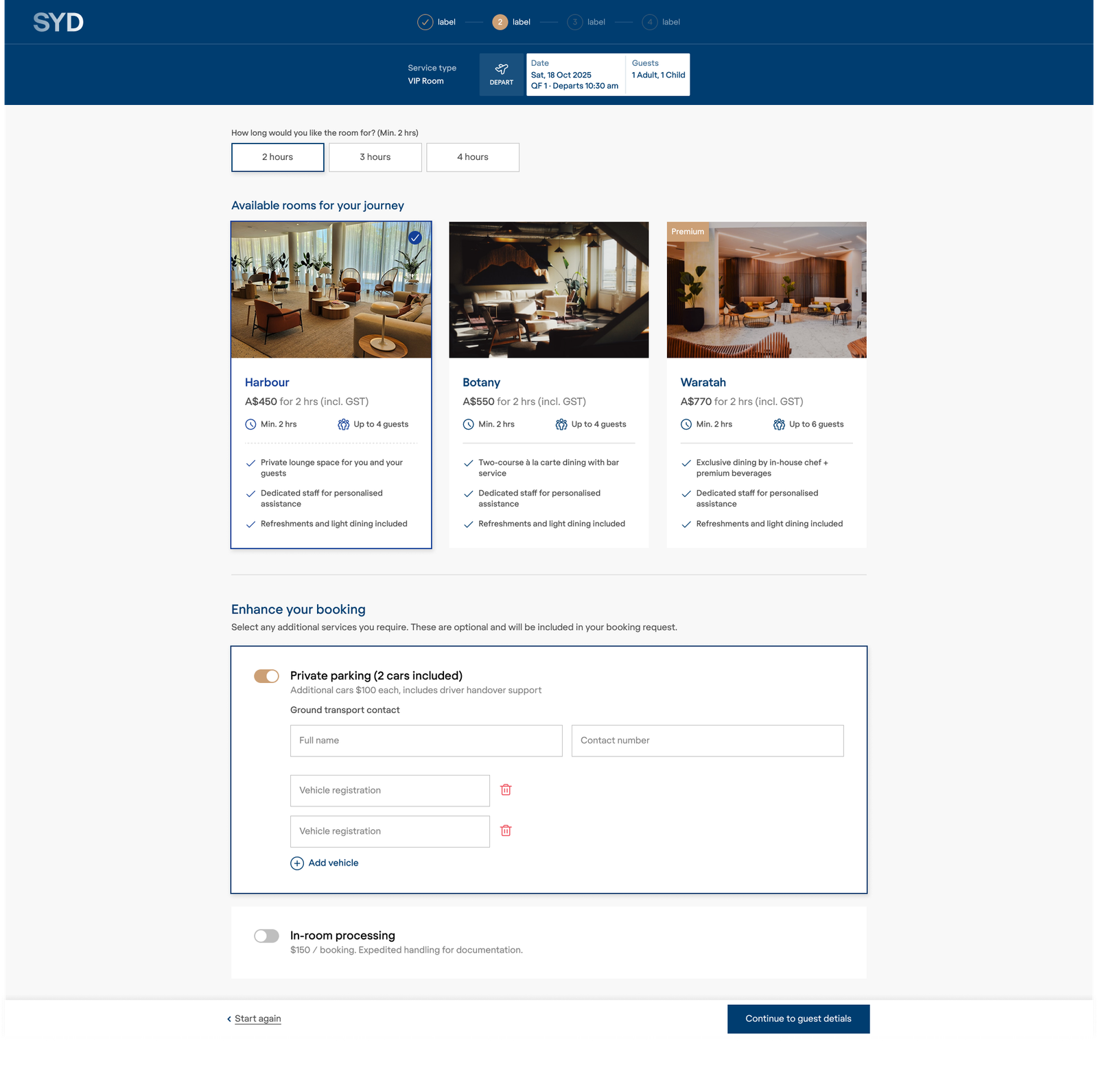
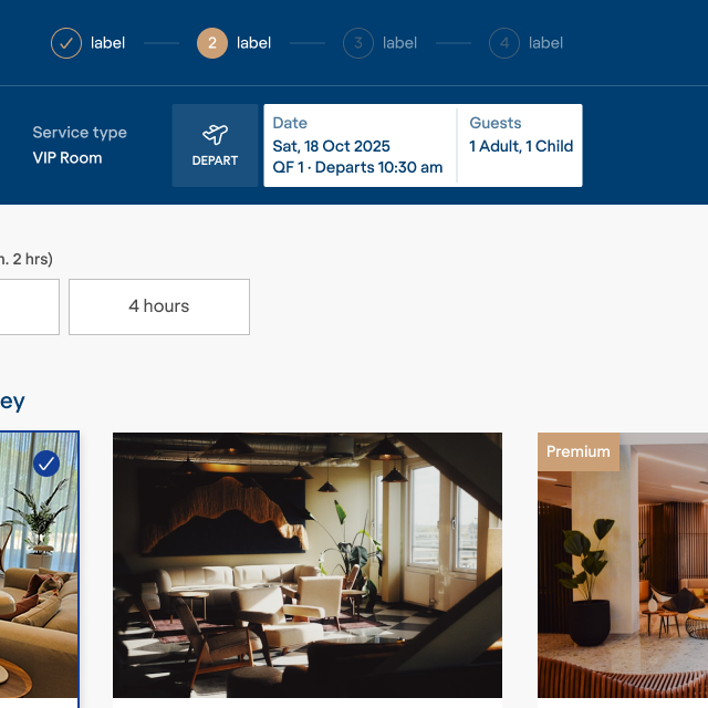
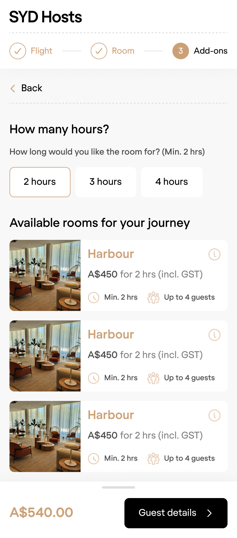
ROOM CAROUSEL
Scalability challenge
The room selection used a horizontal carousel that did a poor job of surfacing all options at once, and it was unclear how it would scale with more rooms.
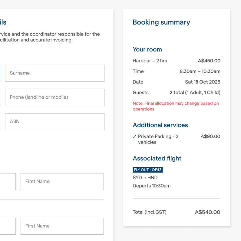
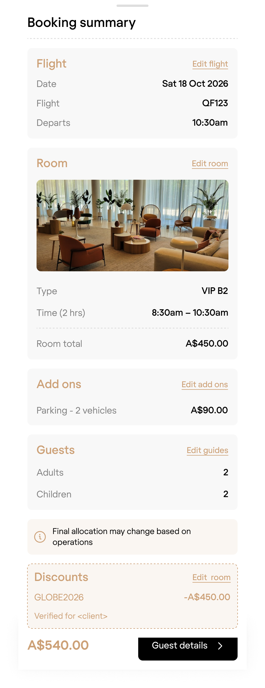
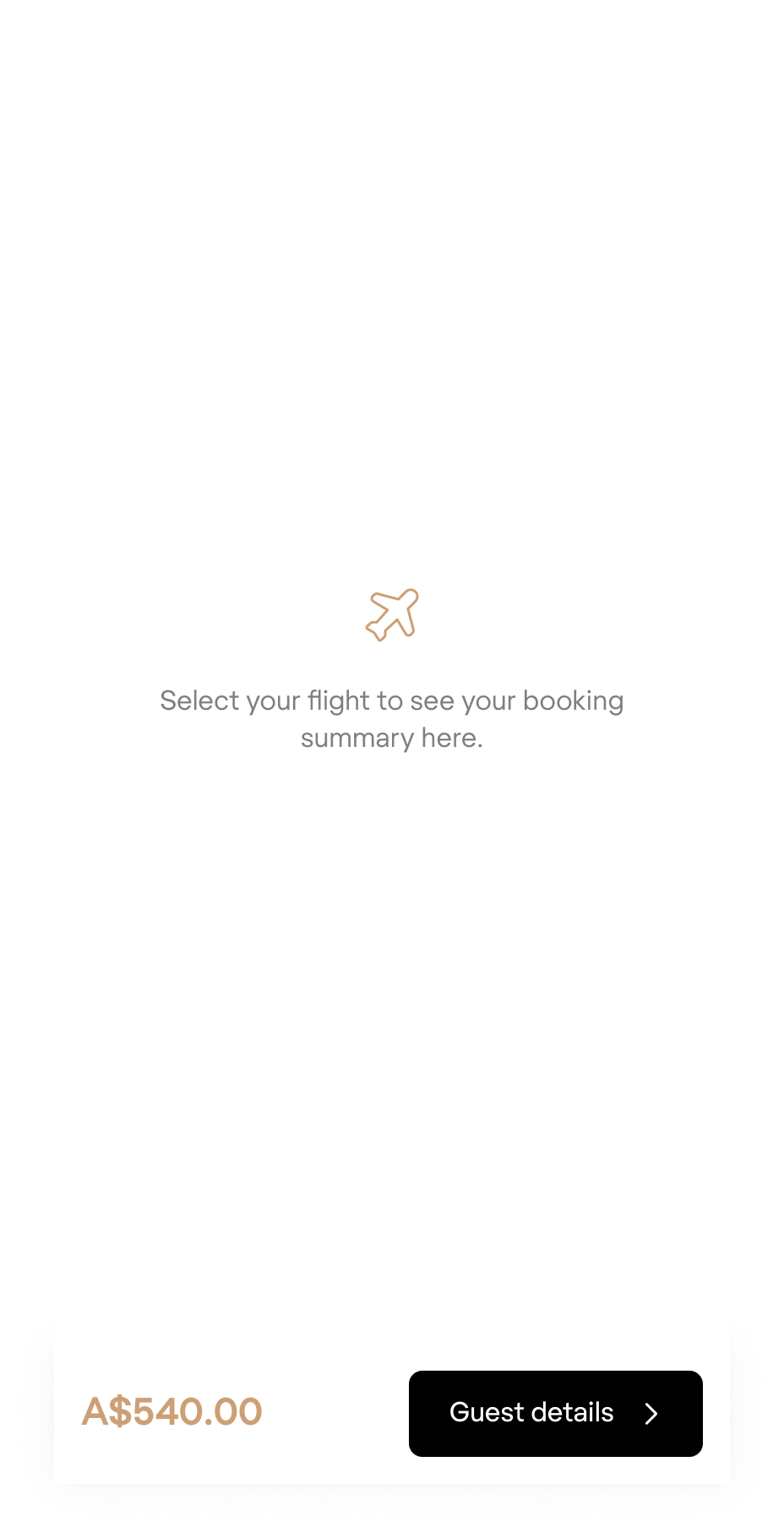
SUMMARY PANEL
Inconsistent position
The summary panel felt unfinished, and was not consistently positioned through the process, only appearing after the user has selected a room.
STATUS BAR
Confusing navigation
The status bar acted as navigation, but the summary text here duplicated the content of the summary panel. Users didn't realise it was a navigation tool.
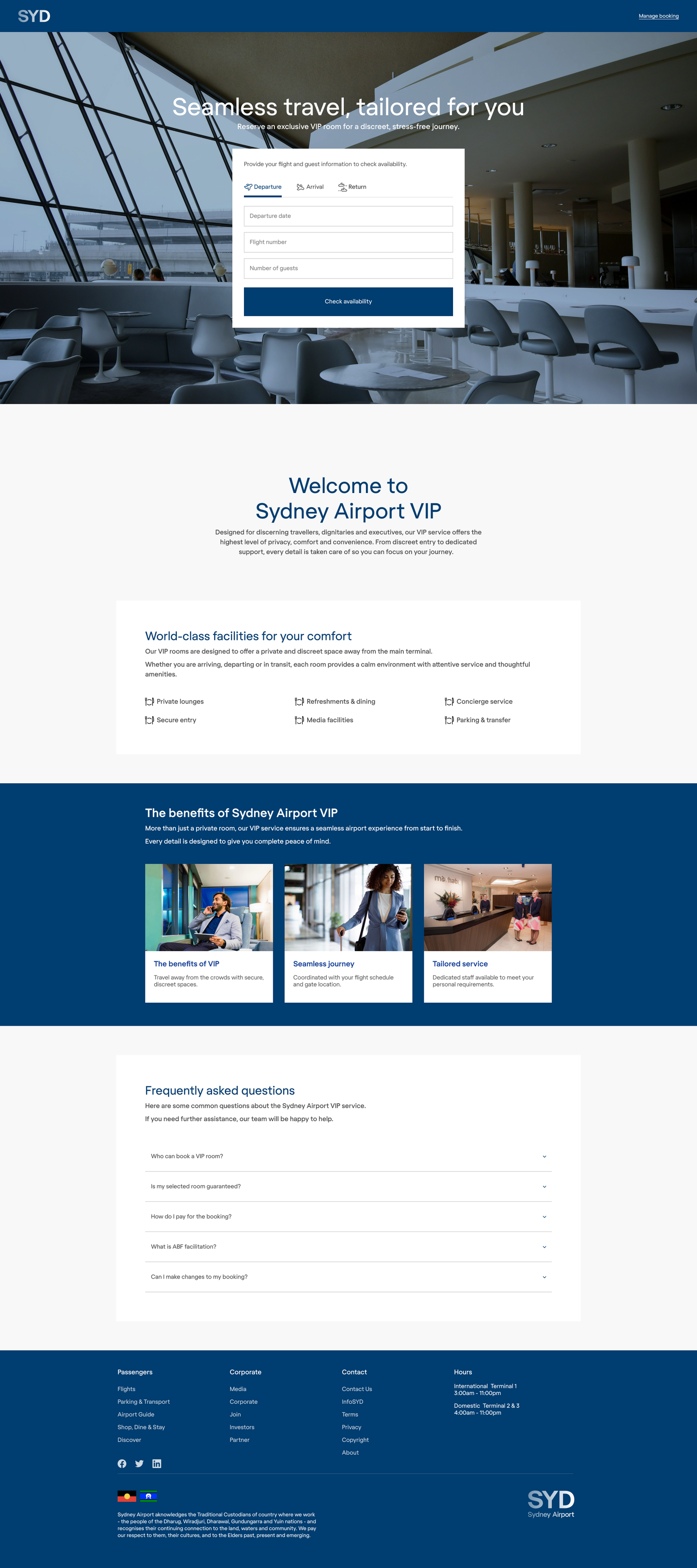
LANDING PAGE
A brand-aligned experience
I revamped all the form components to create a versatile library that would work across multiple surfaces. I removed the borders to help simplify and clean up the design, rounded the corners, and introduced the brand black for primary CTAs.
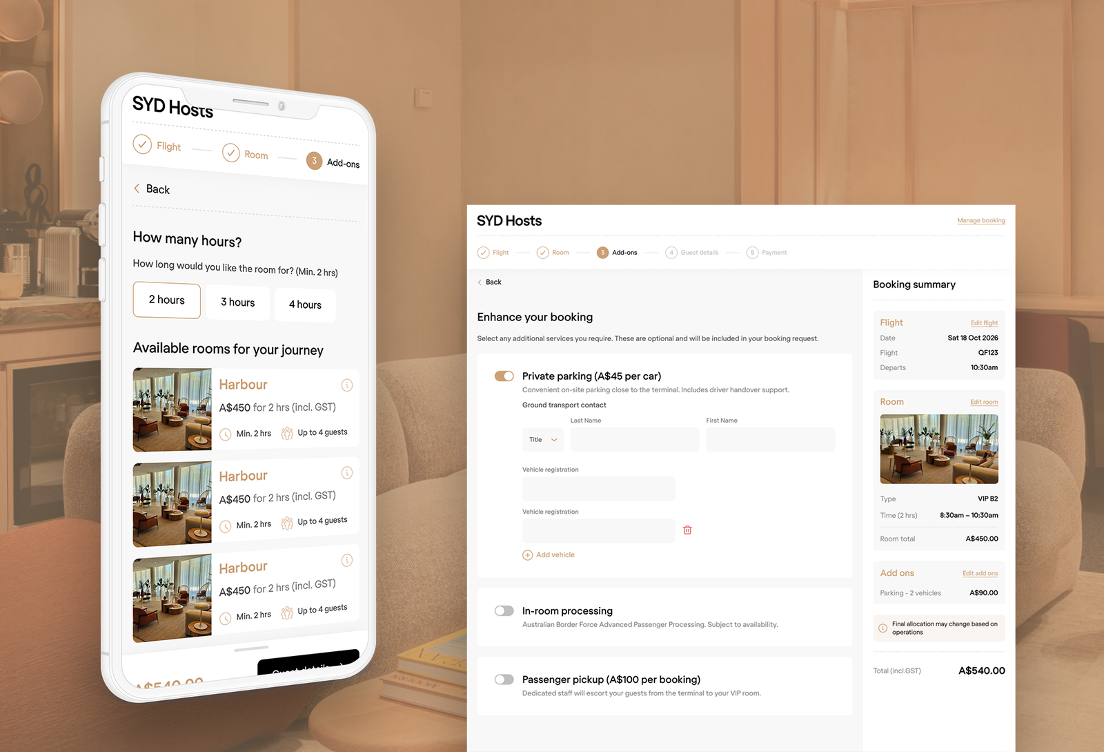
BOOKING ENGINE
A cleaner, responsive solution
I similfied the status-bar area, keeping just the progress stepper, and moving the summary text and navigation into the summary panel, which became a consistent, always-visible tool. I simplified the typographic scale, tokenised spacing, corners, and colours, and removed drop shadows and outlines acxross the design. This helped create a cleaner, more modern experience that better reflected the luxury positioning of the product.
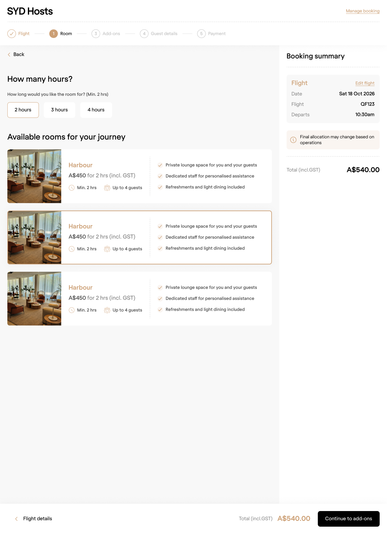
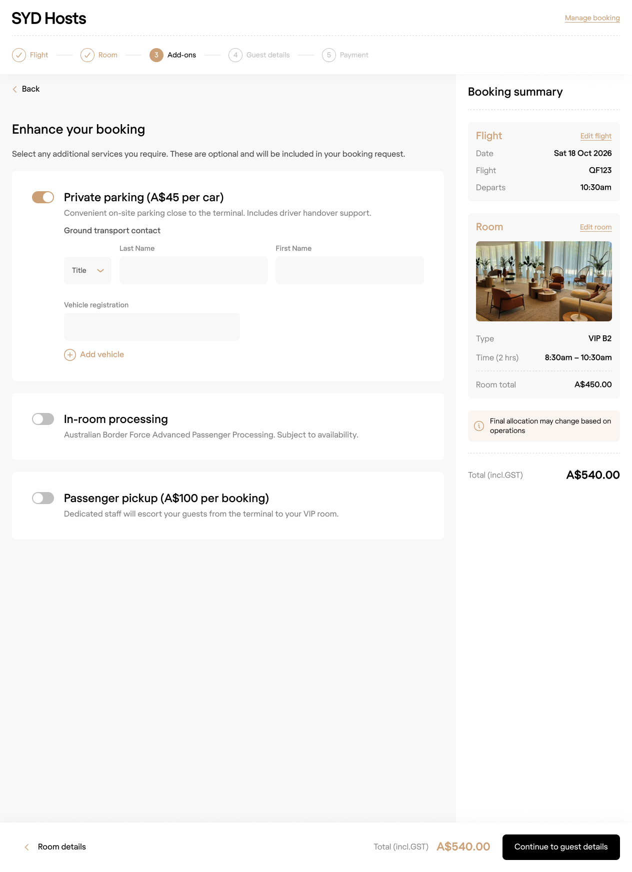
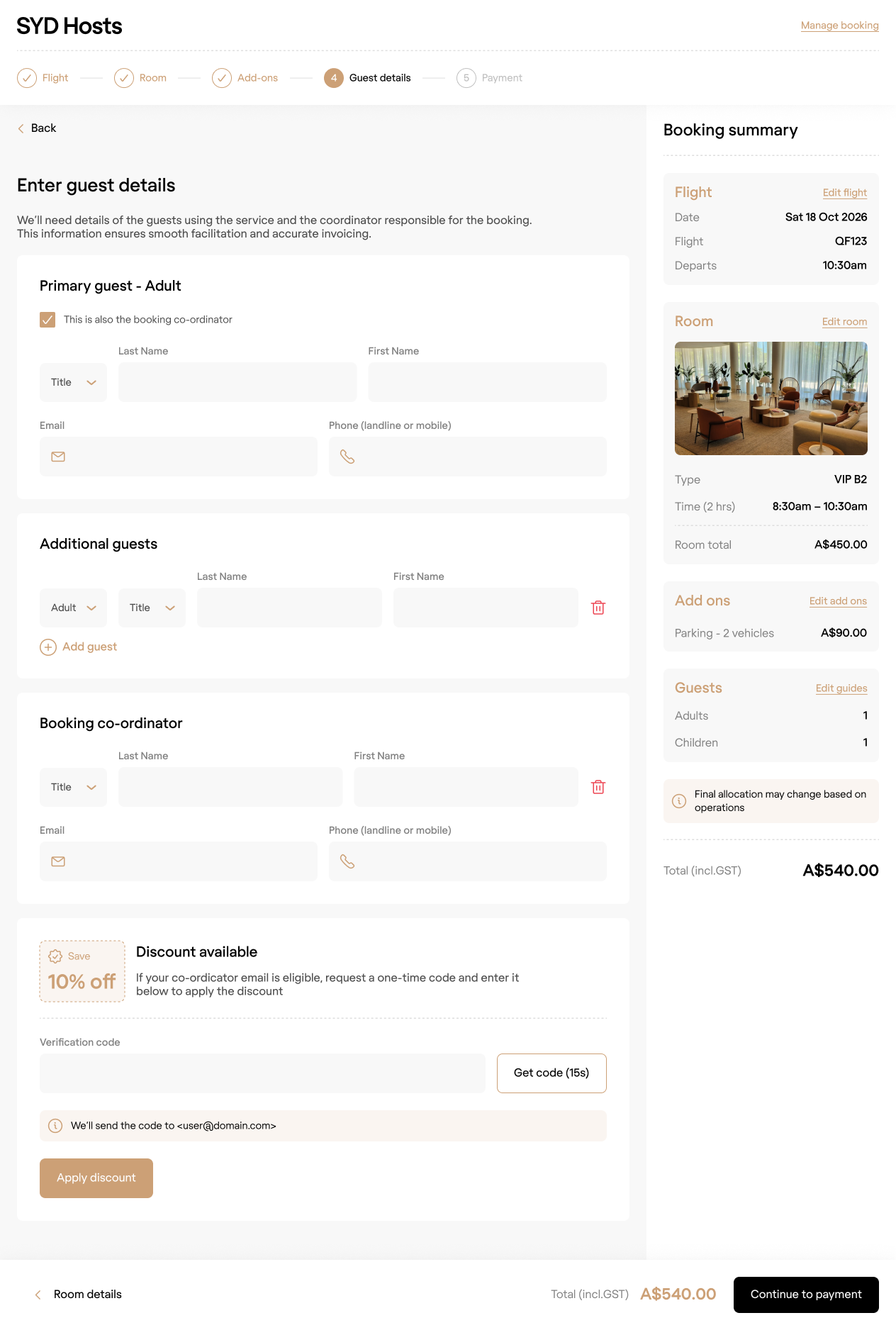
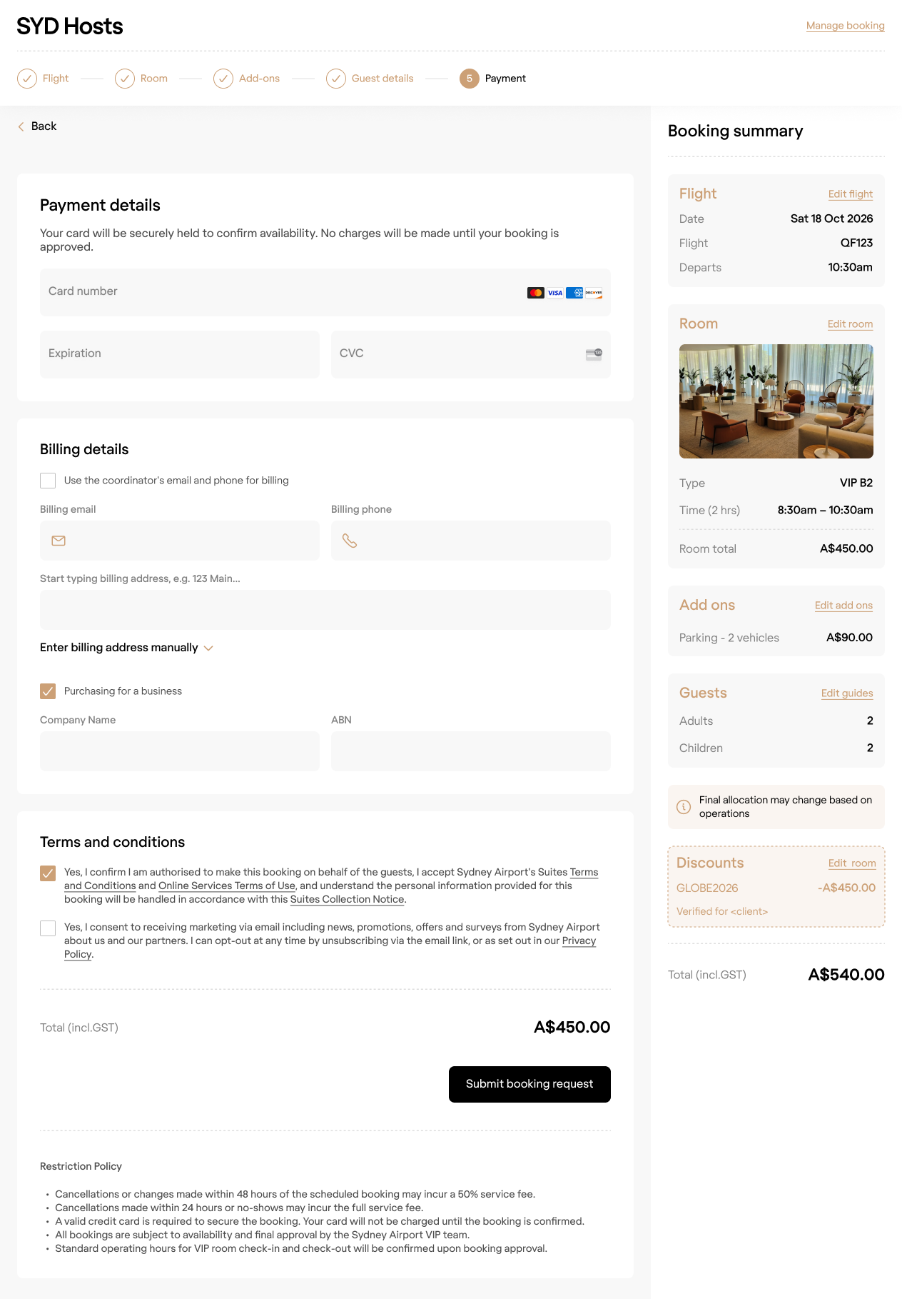
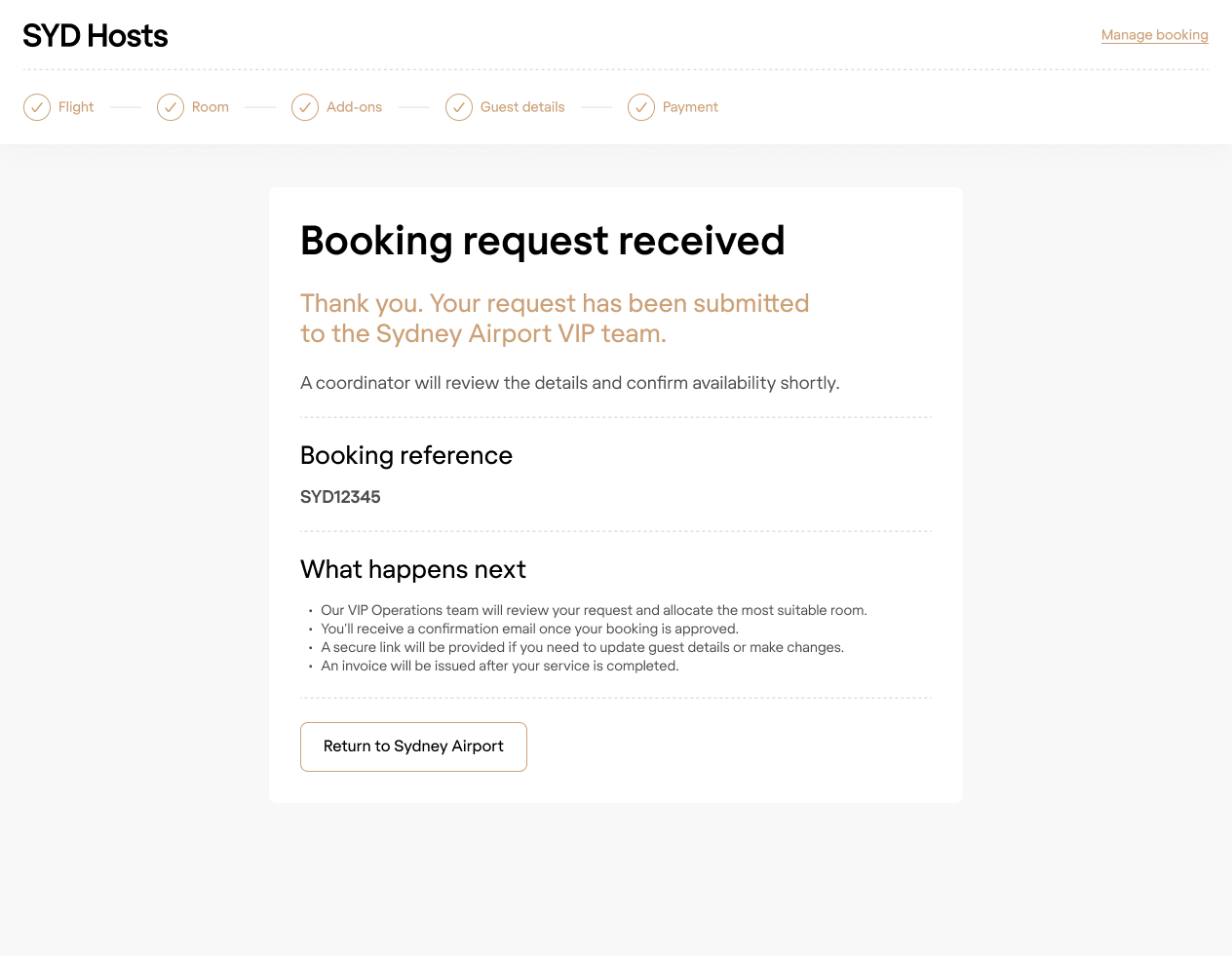
DESIGNS
Desktop
Below are a selection of the desktop designs. The summary panel builds out as the user moves through the process, always providing a contextual way to amend any selection.
DESIGNS
Mobile
I utilised a bottom draw interaction to expand the booking summary panel on mobile. Tapping a link would close the panel, and navigate the uiser to the relavant screen in the process.
Selected Projects
Bolt AppFintech · Mobile app · B2C · Startup
AmaysimTelco · Native app · B2C
Shift · Credit Limit IncreaseFintech · Responsive web · B2B
ABC · iView appVOD · Native app · B2C
Milestone · pControlFintech · Responsive web · SaaS · B2B
Shift · Edit InstallmentsFintech · Responsive web · B2B
CBA · DisputesBanking · Native app · B2C
CBA · SDLC NavigatorFintech · Web app · B2B
NickelcloudOperations · SaaS · B2B · Startup
CBA · Transaction Banking PortalFintech · Responsive web · B2B
P&O Cruises · Cruise Booking SiteTravel · Responsive web · B2C
All of UsFintech · Mobile app · B2C · Startup
CBA · System Architecture VisualisationFintech · Responsive web · B2B
DTA · Relationship Authorisation ManagerGovernment · Responsive web · B2B
Standard Chartered · Trade Finance AppFintech · Mobile app · B2B
Advice IntelligenceFintech · SaaS · B2B
