Re-designing the Amaysim mobile experience
Re-designing the Amaysim mobile experience
Re-designing the Amaysim mobile experience
Re-designing the Amaysim mobile experience
Re-designing the Amaysim mobile experience
PROJECT TYPE
Scale-up, Telco, re-design
TEAM
1 Product Designer, 3 Engineers
MY ROLE
Lead Product Designer
PROJECT
Amaysim Mobile App
Designing a clear starting point that can scale over time.
OVERVIEW
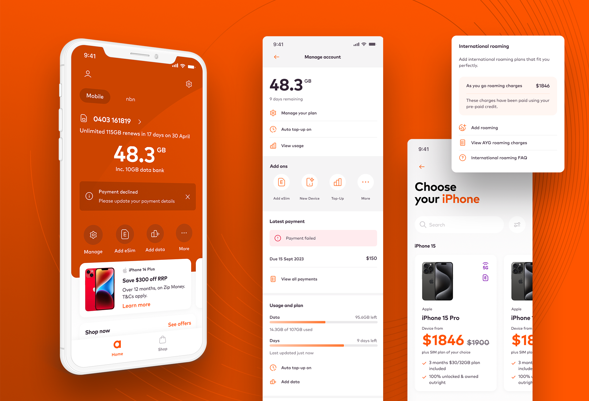
I was hired to lead the product design of the new Amaysim mobile app experience. As part of this engagement I worked closely with the internal brand team, the engineering team, and the sales team to ensure all user and business objectives were met.
I delivered multiple testable user journeys, a full interaction language, and a scalable and responsive component library and design language.
MY RESPONSIBILITIES
Visual Design, UX, Interaction Design, User Testing
GOAL
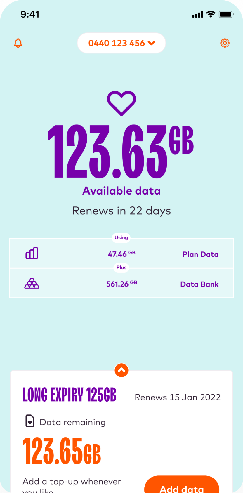
The existing experience
The current app takes a playful approach to the design language. It is functional and well engineered, and users are overall pleased with the experience. However the design does come with some inherent limitations.
The interaction model doesn't scale well for future growth, the old brand font presents accessibility challenges, the colour language is inconsistent, and the design makes placing promotions challenging.
These issues collectively impact the overall user experience and need to be addressed in order to create a more usable, scalable platform.
RESEARCH
Business goals
The Amaysim mobile app was the main place customers managed their service, but the existing design focused almost entirely on account management. It did little to support the company’s growth or sales channels.
Important commercial journeys were happening outside the app. The device shop existed as a separate web experience, creating a fragmented journey for customers who wanted to browse or purchase a phone. Promotions were also difficult to surface, which meant the product missed opportunities to encourage upgrades, plan changes, and device sales.
The redesign aimed to strengthen the app’s role as both a service and sales platform, while also improving clarity and reducing churn in a highly competitive mobile market.
In practical terms, the product needed to:
- Reduce customer churn, particularly in cancellation flows
- Improve clarity of plan value and usage, helping users understand what they are getting
- Integrate sales channels, including device purchases and plan upgrades
- Enable promotions and offers to appear at relevant moments in the journey
- Simplify core tasks such as checking data, managing plans, and making payments
These goals shaped the design approach, focusing on clearer information, visible plan value, and integrated upgrade and purchase opportunities within the app experience.
RESEARCH
Understanding the main challenges
After talking to the apps team, customer service team, and senior stakeholders, I established three key challenges the current app was facing. These would help support the primary definition of done, alongside a host of other usability and experience issues.
CHALLENGE 01
Restrictive interaction model
The interaction model is not scalable, and does not support future business growth.
Risk
The existing app was built around rigid, one-off flows, lacked a clear navigation hierarchy, and did not support new features or evolving user needs.
CHALLENGE 02
The mobile app does not support sales channels
The existing app was built around rigid, one-off flows, lacked a clear navigation hierarchy, and did not support new features or evolving user needs.
Risk
The existing app was built around rigid, one-off flows, lacked a clear navigation hierarchy, and did not support new features or evolving user needs.
CHALLENGE 03
Strict regulatory and security requirements
The user experience lacks personalisation and offers no support for marketing channels
Risk
The existing app was built around rigid, one-off flows, lacked a clear navigation hierarchy, and did not support new features or evolving user needs.
RESEARCH
Guiding UX and brand principles
Amaysim had some existing experience principles which I leveraged and expanded on, specifically focused on the mobile app experience. These would provide a sounding board for the experience going forward, ensuring the app always met with the user and business expectations, and adequetly refelcted the Amaysim brand.

Trust
Establish trust through transparency, reliability, and security, ensuring users feel confident in their interactions, transactions, and understanding of the app's policies.

Simplicity
Create a uniform user experience through reductive design, use of common patterns, clear communication, and a logical and intuitive interaction model.

Inclusivity
Embrace and empower all users by making the app accessible, customizable, user-friendly, and offering clear and and useful support whenever needed.

Innovation
Remain agile and forward-thinking by adapting to emerging market and user demands, listen to user feedback, and continuously working to implement new and valuable features.
PROTOTYPE
Above and below the line
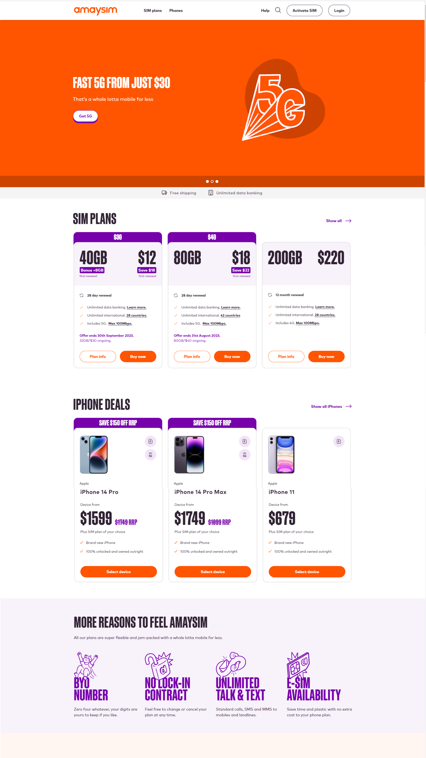
The existing brand was tailored to an above the line experience. The tone of voice and design language was very sales oriented, and not really suitable for a transactional app experience.
One of my main challenges was to create a design language that was clean and modern, but still aligned with the wider brand.
Retail website
EDM

Ad tile

PROCESS
A lean, strategic approach
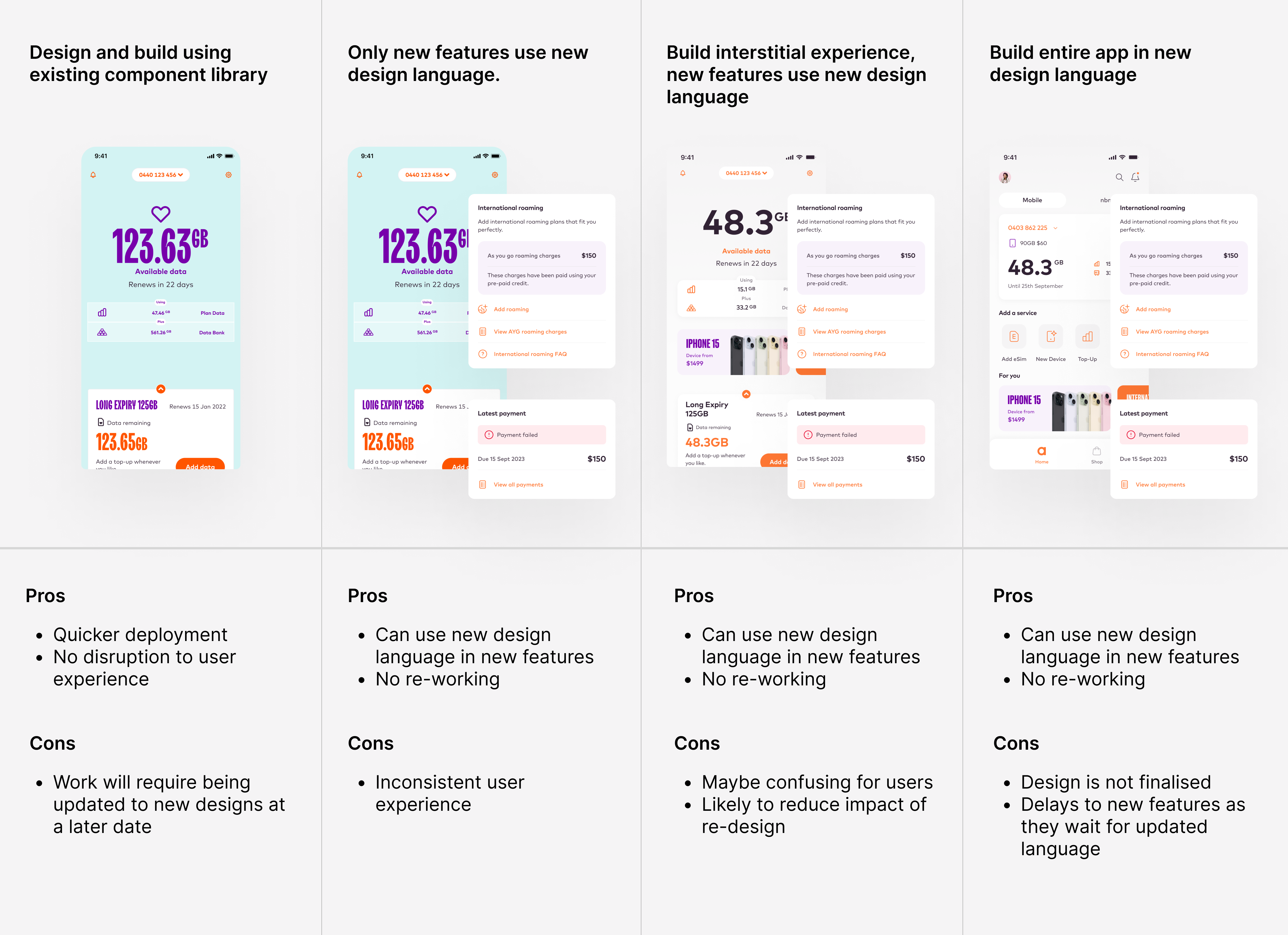
In order to improve the experience in the most efficient way possible, I came up with four potential approaches.
I then worked with the engineering team to figure out which made the most sense, both from a business and user experience perspective.
We decided to use the fourth approach; wait for me to finalise the design system, then strategically re-skin the existing build and add new features using this new design language. Although this meant a longer delivery timeline, it required the least re-work, and so it was the most efficient approach.
DESIGN
Build trust and money habits
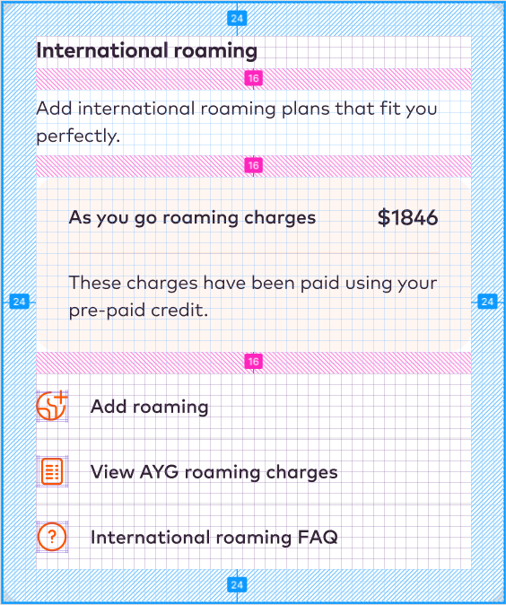
I design using the 8px grid, and a matching layout grid that is also divisible by 8. This provides numberous benefits:
- It helps create consistent spacing and layout which enhances design and usability
- It allows the building of snap-together components, almost like a LEGO set
- It facilitates dev hand-off and QA
When sharing design files, using numbers divisible by four and eight becomes a universal language.
It reduces confusion and ensures that everyone is on the same page when discussing design elements and their measurements.
DESIGN
Ensuring accessibility
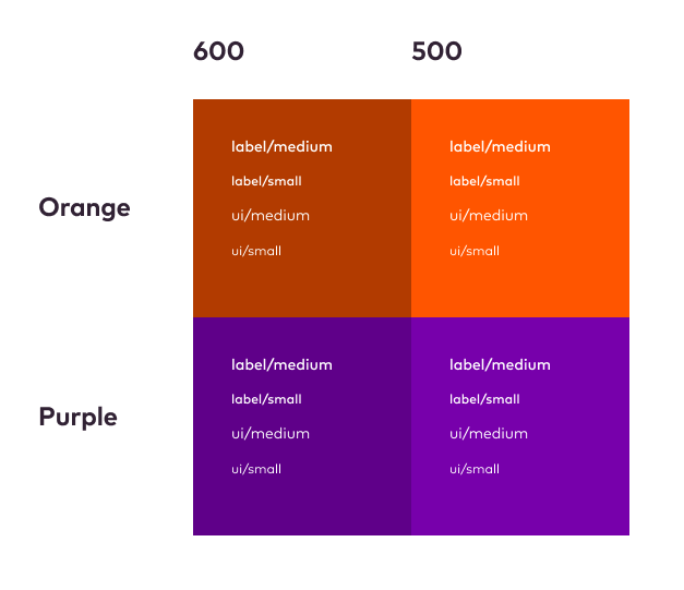
To help align to the brand colours while meeting accessibility guidelines I created a matrix as a guide for font use within the app.
All interactions and buttons use the iOS human interaction guideline size of 48px high.
Tab order and alt-text help users with screen readers navigate the product on both mobile and desktop.
PROCESS
Achieving stakeholder buy-in
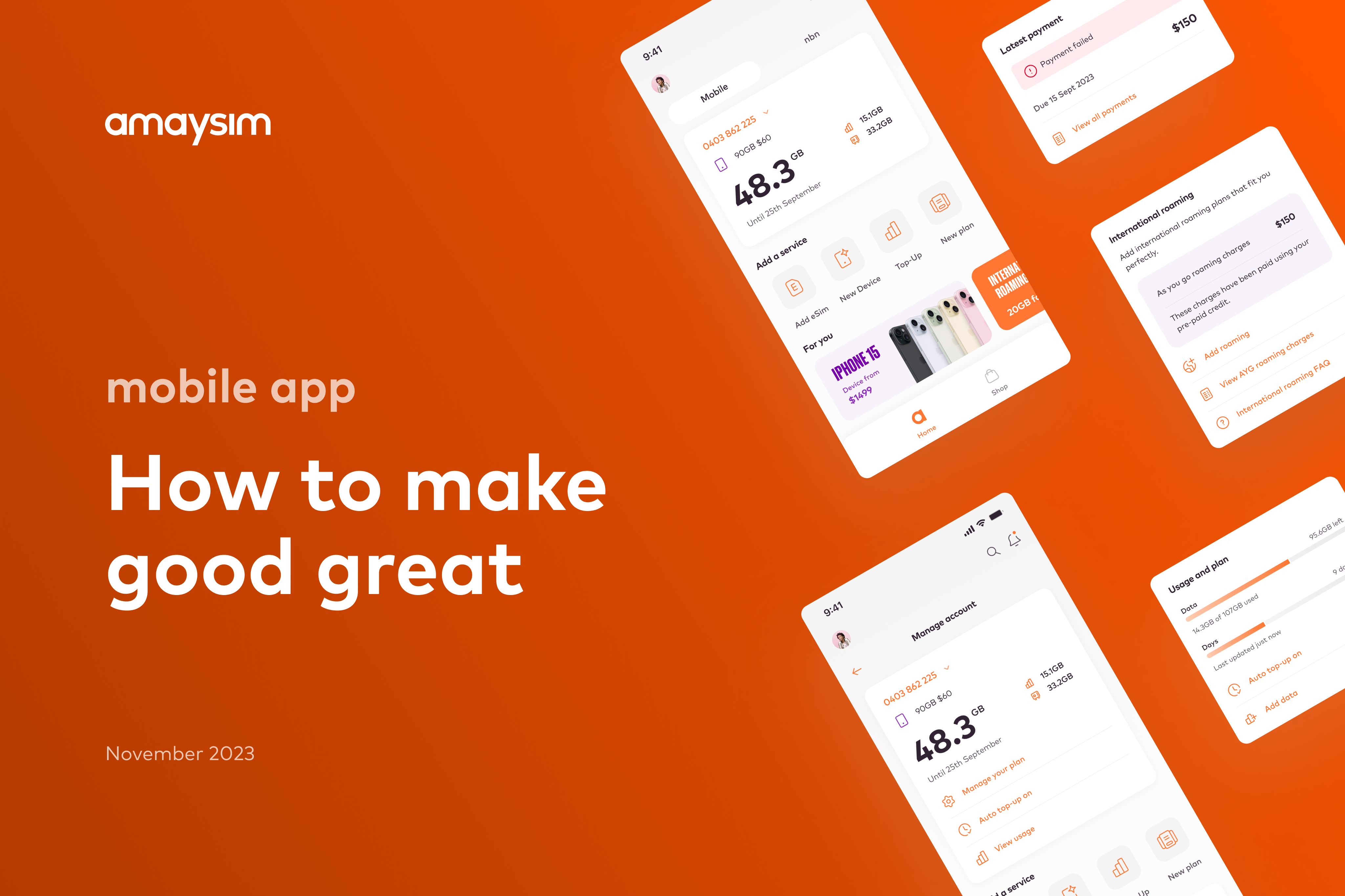
To get the various members of the leadership team on board, I put together an internal pitch document that explained the problem space, and clearly articulated the approach and benefits of a new app design.
To get the go ahead and budget to proceed, I had to convince the heads of marketing, sales, engineering, and brand that my solution made financial sense, that it succesfully integrated the brand, and that it met the business strategy and objectives.
RESEARCH
User testing
Designing a clear starting point that can scale over time.
RESEARCH
Initial designs and user testing sessions
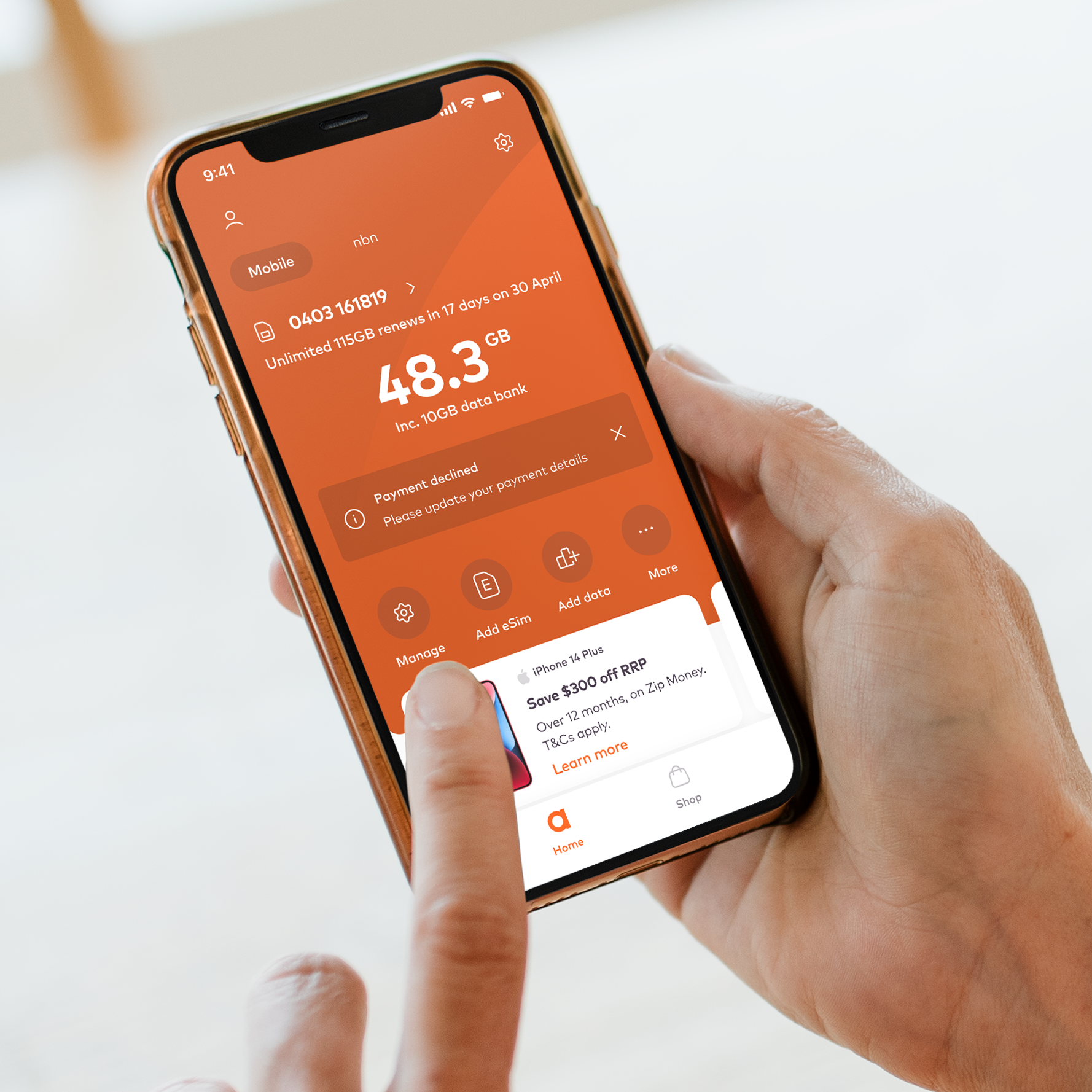
As part of the iterative design approach I organised user testing sessions at regular intervals. I used Askable to book the users and run the sessions, validating every screen and flow as the design progressed.
Processes we think should be intuitive and simple can present unexpected challenges to users who are unfamiliar with the interface.
USER TESTING
Home-screen
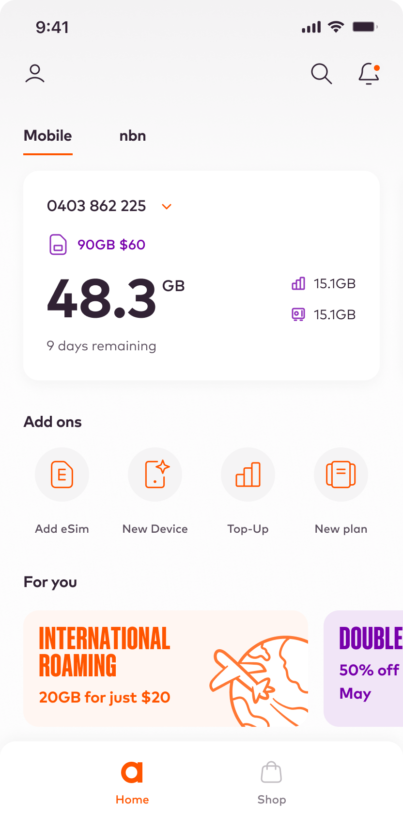
I wanted to validate that users understood the data presented, and would be able to find and use the various navigation areas.
I created a simple prototype of an early home-screen design. This was a simple test, and the questions were as follows:
- Can you tell me how much data you have left?
- When is your next payment due to be processed?
- How would you find more information about your account?
- How would you change your user perferences?
- Do you have any notifications?
- How wold you read your notifications?
- How many promotional offers do you have?
- How would you:
- change your plan?
- add a new phone?
- add an eSim?
- top up your account?
The test was organised using Askable, with 5 existing customers.
*Early home-screen design
USER TESTING: VALIDATION
Home-screen
This early validation session revealed a few issues with the initial design, and also confirmed that the interaction model worked:
- The design is clean and easy to use
- Users were able to achieve all the tasks successfully
- The icons for data and data bank were too ambiguous
- The design was a bit 'plain' and 'vanilla'
- User's were able to use the promo carousel
- The notification alert was successful
- Users's preferred a date over '9 days left'
- The user preferences icon was successful
PROCESS
The iterative design process
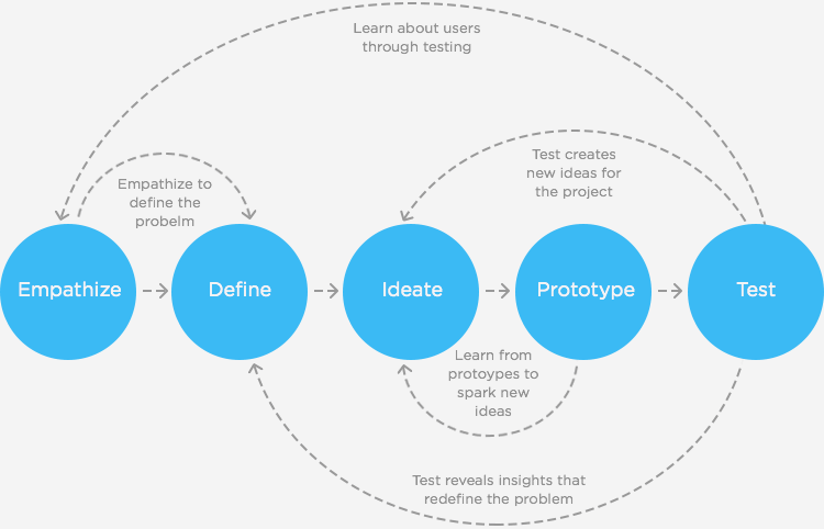
After multiple user testing sessions, and utilising feedback from the key stakeholders within the business, the designs evolved into the final designs further down the page.
Some key changes from the early home screen designs were a stronger, more brand-heavy approach bringing more of the brand colours into the design, more commercial and retail looking promos, the consideration of a dark theme, and a reduced number of competing data points.
USER TESTING: VALIDATION
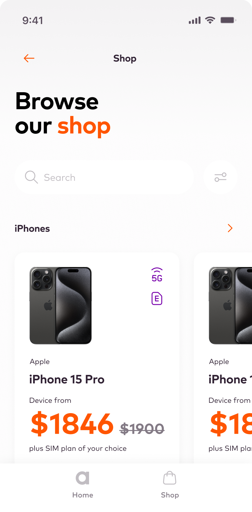
Shop funnel
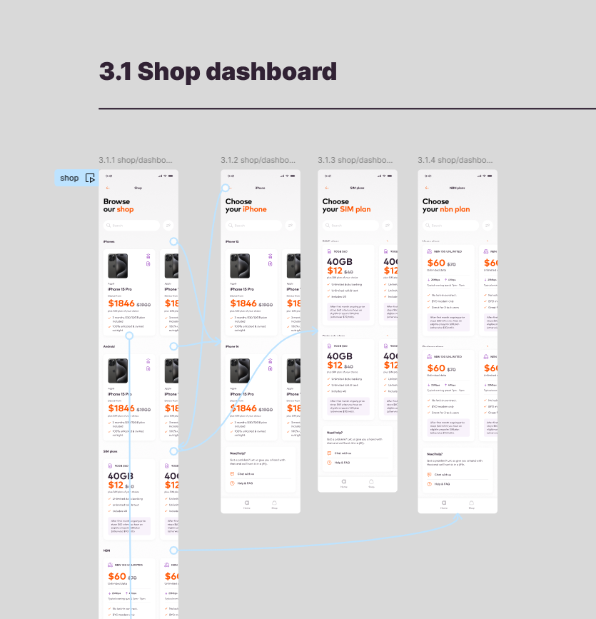
I wanted to validate that users could successfully purchase a device, and that the process wasn't confusing or laborious.
I created a prototype of the entire journey in Figma.
- It's time to buy a new phone! Please order the new iPhone 15 Pro from our new mobile device store.
I observed the 5 customers navigating the experience and asked them follow up questions if they got stuck or seemed confused.
USER TESTING: FINDINGS
Shop funnel
This early validation session revealed a few small issues with the initial design, and also confirmed that the interaction model worked:
- The design is clean and easy to use
- All 5 users were able to achieve all the tasks successfully
- The prototype would need to be built in code to get better results, as things like the configurator and search were not functional
The next step was to sit with the engineering team and come up with a plan for a more high-fidelity prototype using Flutter.
PROCESS
Prototyping in Figma vs code
Although it's important to test early using Figma (or similar) to validate initial ideas, the best results always come from more interactive, complex prototypes.
For this reason I try to move into code quite quickly, so it's important to sit with the engineering team to discuss a strategy for this type of validation.
- Is it feasible?
- How long will it take?
- How much fidelity is required?
- Do we need live data sources?
Keeping the engineering team engaged in the prototyping and testing increases transparency, allowing them to have clear visibility of the direction the product is heading in, and provides opportunities for them to contribute ideas, patterns libraries, and insights.
USER TESTING: VALIDATION
Change plan
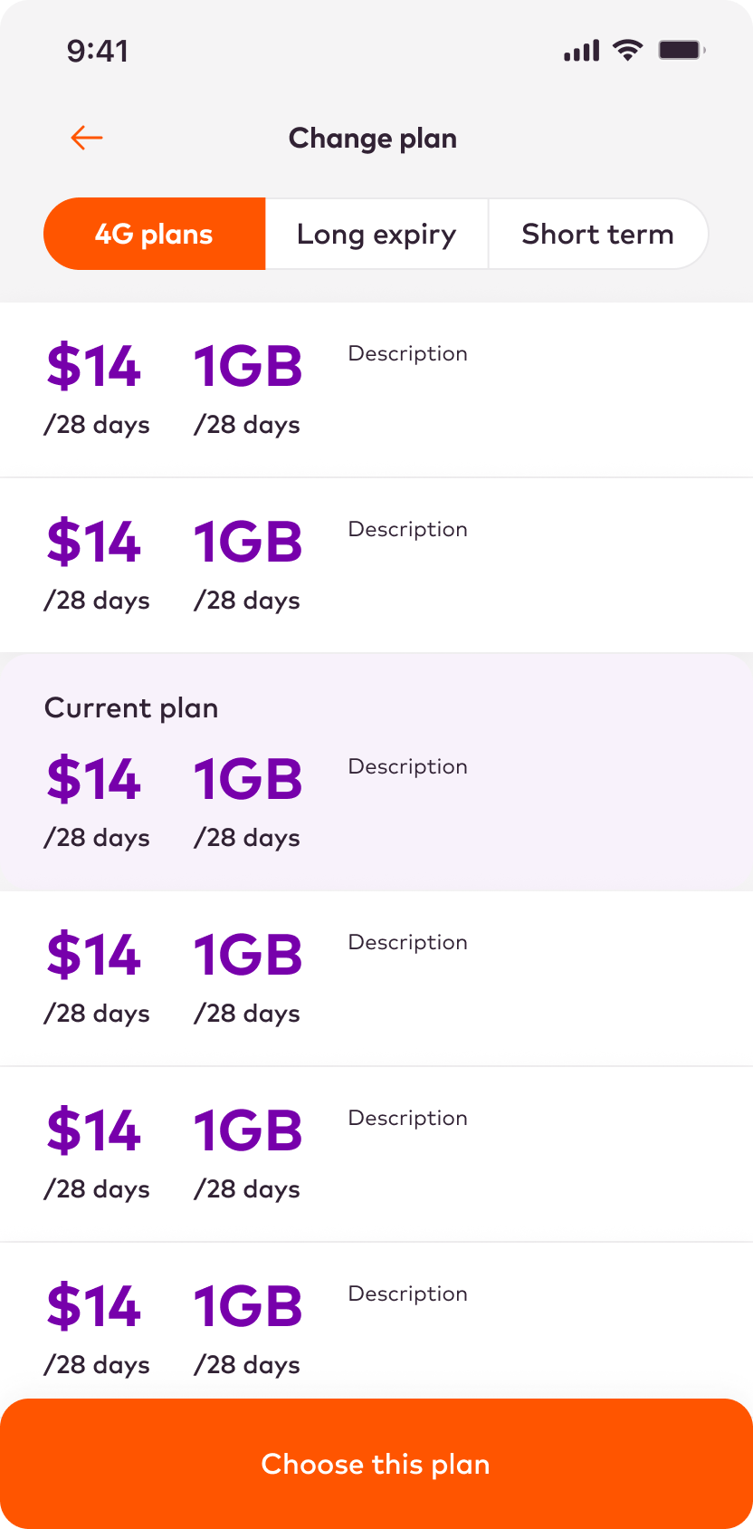
The Change Plan flow was one of the existing app's main pain points, with a confusing flow and cluttered interface.
I created a simpler, cleaner approach with fewer steps and more focused screens with extra customer support options.
The test was simple:
- Please try to change your mobile plan
Follow up questions based on observing the user interactions:
- How did you find the process?
- Were there any points where you felt confused?
- Can yout think of any ways the process could be improved?
- Did you have enough information throught the process?
The test was organised using Askable, with 5 existing customers.
USER TESTING: FINDINGS
Change plan
This early validation session revealed a few issues with the initial design, and also confirmed that the interaction model worked:
- The design is clean and easy to use
- All users successfully made it through the journey
- The initial steps of getting into the funnel were the most challenging due to so many options
- Two users questioned the terms 'long expiry' and 'short term'
- The back button put users at ease with the journey
- Plan promotions and offers were clear and reassuring
DESIGN
Solving the settings puzzle
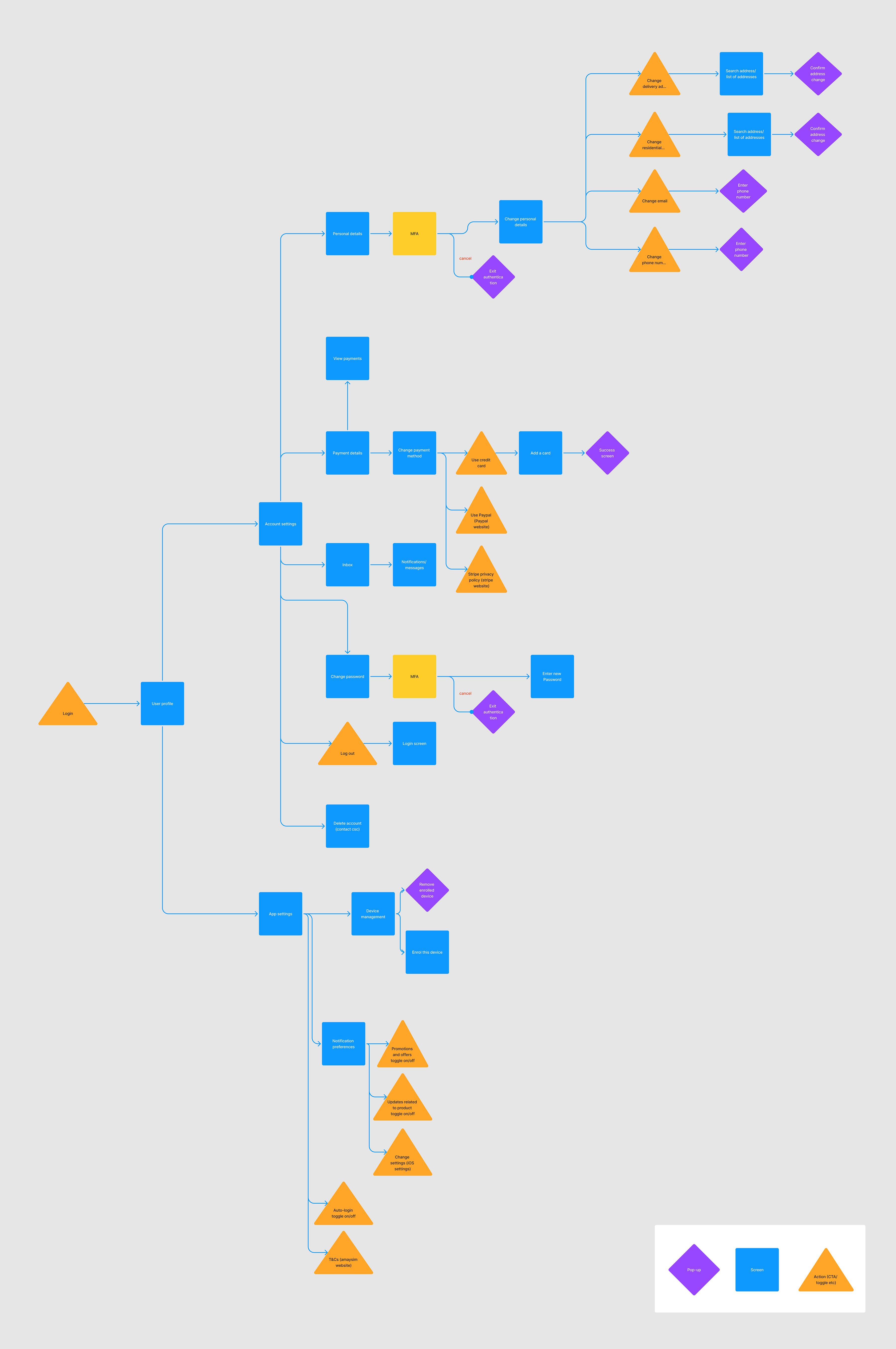
In the current app, all settings live under a single cog icon on the home-screen. This merges user preferences with app settings, creating a long, unintuitive settings screen that is hard to navigate.
I decided to try splitting the settings into two areas:
- User profile
- App settings
To achieve this I mapped out the various user journeys and settings features in FigJam, and then used this diagram to organise them into the two groups.
DESIGN
An improved IA
The new Settings IA proved much easier to understand and navigate for users.
IA
User profile
Personal Details
- Delivery address
- Residential address
- Phone number
Payment Details
- Change payment method
- Credit card
- Paypal
- Stripe website
- Inbox
- Notifications
Change password
Log out
Delete account
IA
App settings
Device management
- Remove device
- Enrol device
Notification preferences
- Promotions & offers
- Product updates
iOS settings
Auto-login
T&Cs
DESIGN
UI implementation
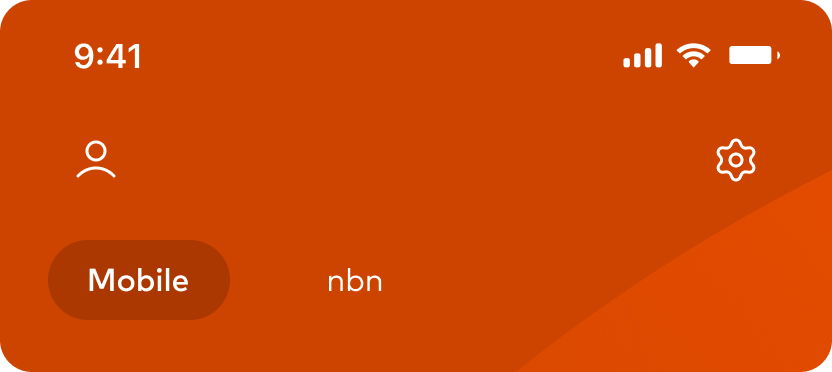
The settings were split into two nav icons - user settings at the top left, and app settings at the top right.
This IA performed well under testing, with all 5 candidates successfully completing the navigation tasks.
DESIGN
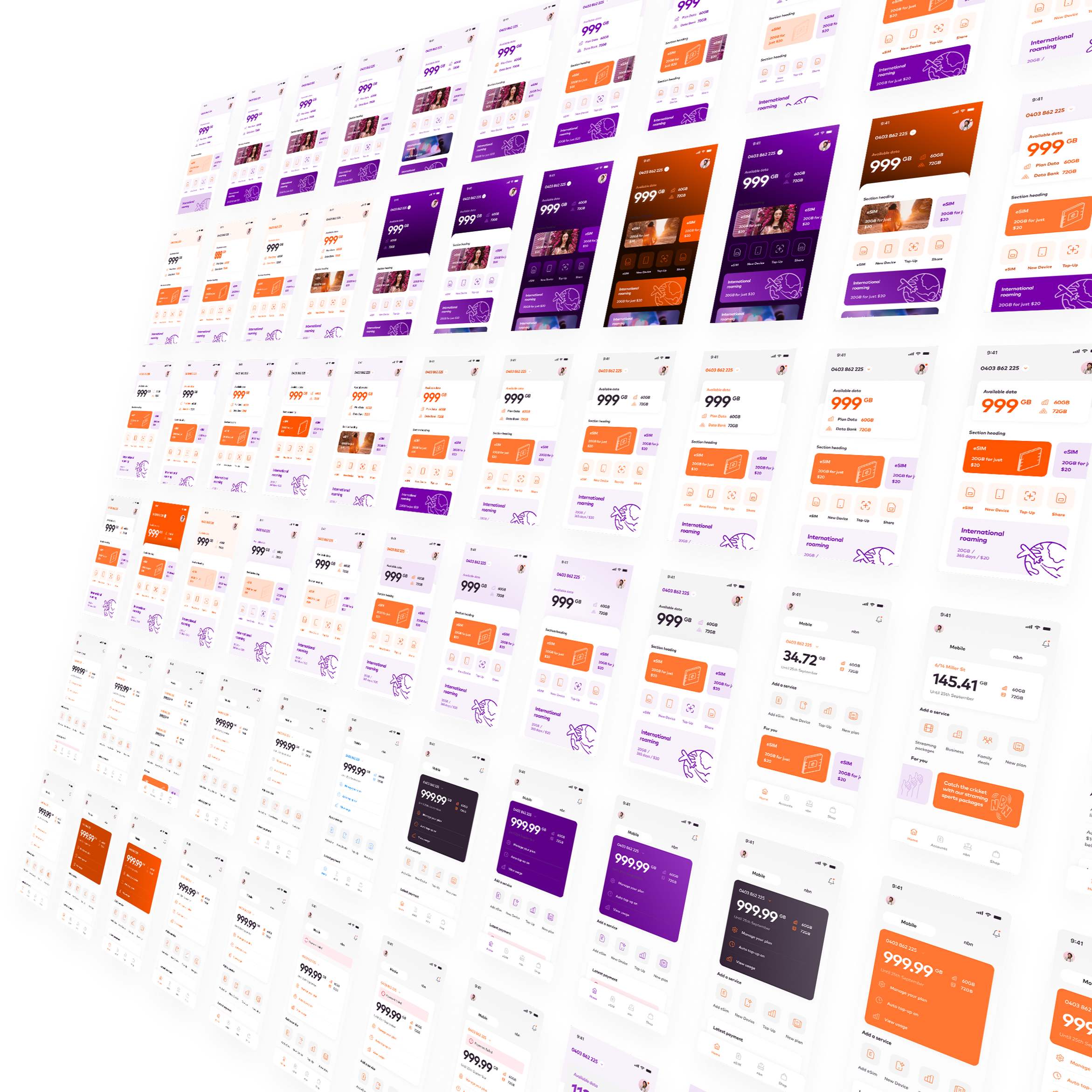
A design exploration
The following designs are the culmination of many days of experimentation and exploration.
Design is an iterative process, and the current state of the designs will almost certainly change as we as we gain new insights and understanding.
What follows is a suggested design treatment and interaction model, sympathetic to the brand but subtle in its application, with the user experience the top priority.
DESIGN
A usable, scalable new direction
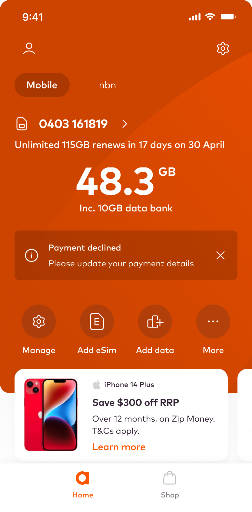
A clear and intuitive hierarchy ensures that users can quickly grasp the structure of the app and find what they need.
Services and features are logically grouped and categorised, making it easier for users to locate and access the functionalities they are looking for.
The design allows swiping to move between services, and for navigating personalised content.
DESIGN
A usable, scalable new direction
A clear and intuitive hierarchy ensures that users can quickly grasp the structure of the app and find what they need.
Services and features are logically grouped and categorised, making it easier for users to locate and access the functionalities they are looking for.
The design allows swiping to move between services, and for navigating personalised content.
DESIGN
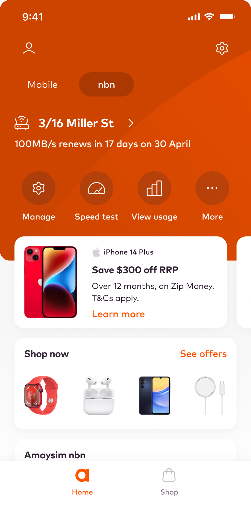
A personal touch
The app analyses user behaviour and preferences to recommend relevant add-ons that complement their usage patterns, ensuring a tailored experience.
Key functions are user configurable, allowing the user to tailor the home screen experience to their own needs.
Promotions are displayed at appropriate moments within the app, aligning with the user's journey and adding value to their experience without interrupting their flow.
DESIGN
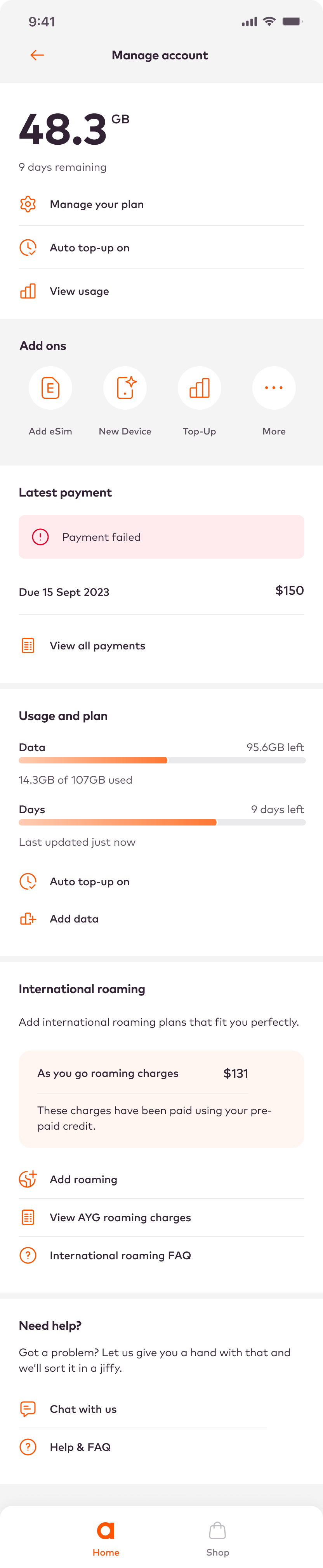
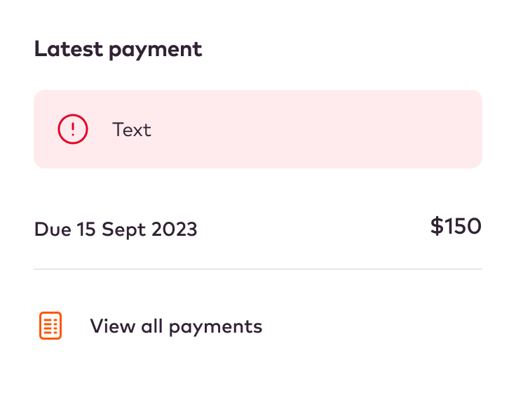
A robust, component driven approach
Contextual tools enhance efficiency and usability.
They provide quick access, reduce cognitive load, and adapt to user behaviour helping optimise engagement.
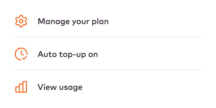
Modular
Modular app design simplifies the integration of contextual tools and notifications by organizing functionalities into independent, flexible modules.
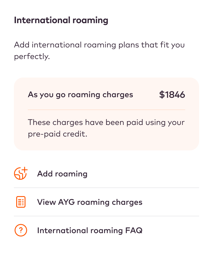
Adaptable
Notifications can be seamlessly added within relevant modules, ensuring timely and context-specific information delivery to users.
Flexible
This modular structure provides UX flexibility, allowing modifications or additions to specific modules without disrupting the entire app. It also allows modules to easily be re-structured and re-arranged extremely efficiently.
PROCESS
An emphasis on collaboration
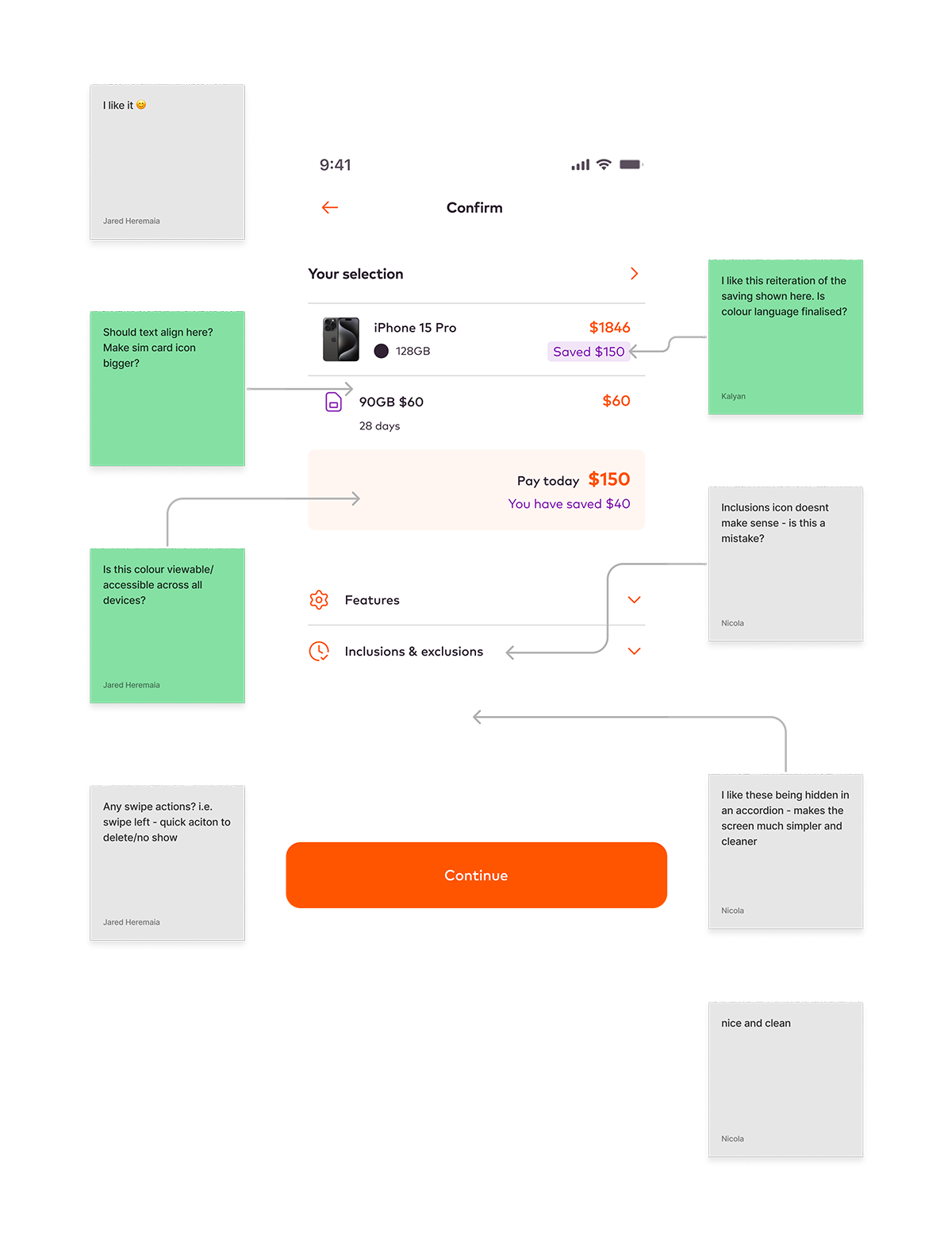
In multidisciplinary teams it's essential to gather insights and knowledge from across the team.
I set up and ran fortnightly design review sessions to gather feedback from the whole team; engineering, stakeholders, brand, and sales.
These collaborative review sessions help ensure that any issues are caught before they can impact timelines, and the transparency increases trust and engagement - everyone feels they are contributing directly to the proposed solution.
These are run before any user testing sessions to ensure the team is aligned with what we are validating.
PROTOTYPE
Interaction design
As part of the design process, and to facilitate dev handover, for each feature I created a small prototype to demonstrate the interaction. Below are a couple of examples.
NOTIFICATIONS
USER SETTINGS
SERVICE SWITCHER
DESIGN
Final screens
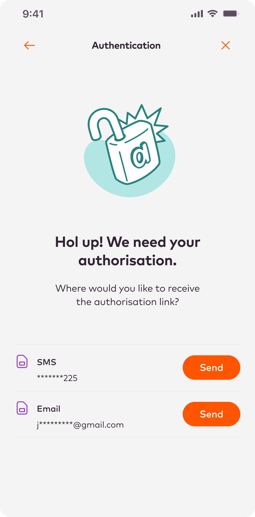
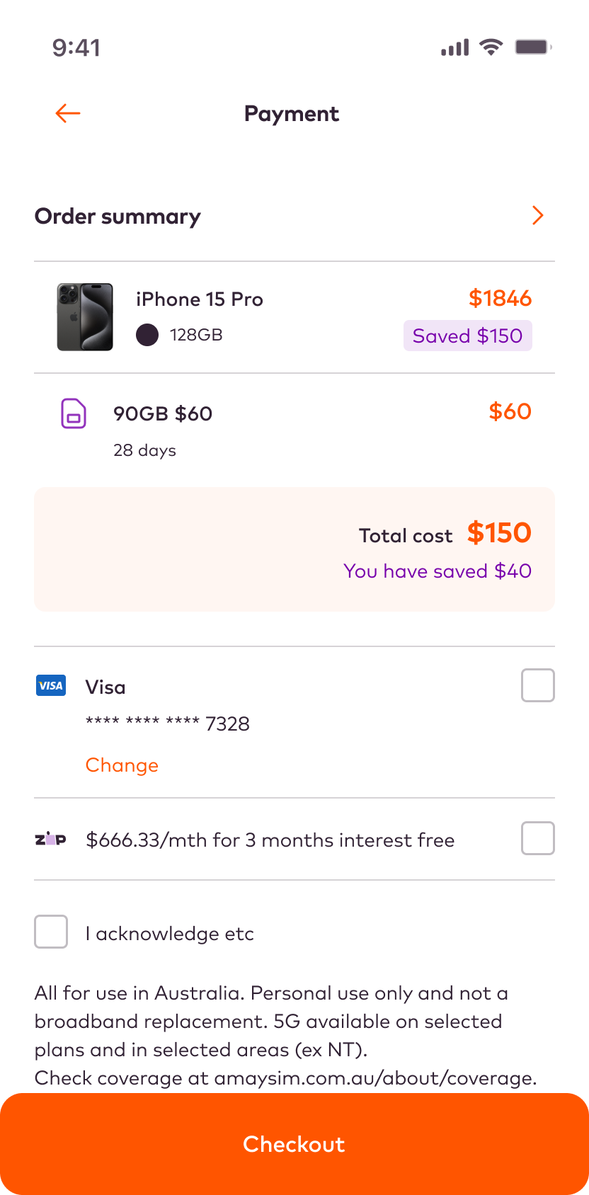
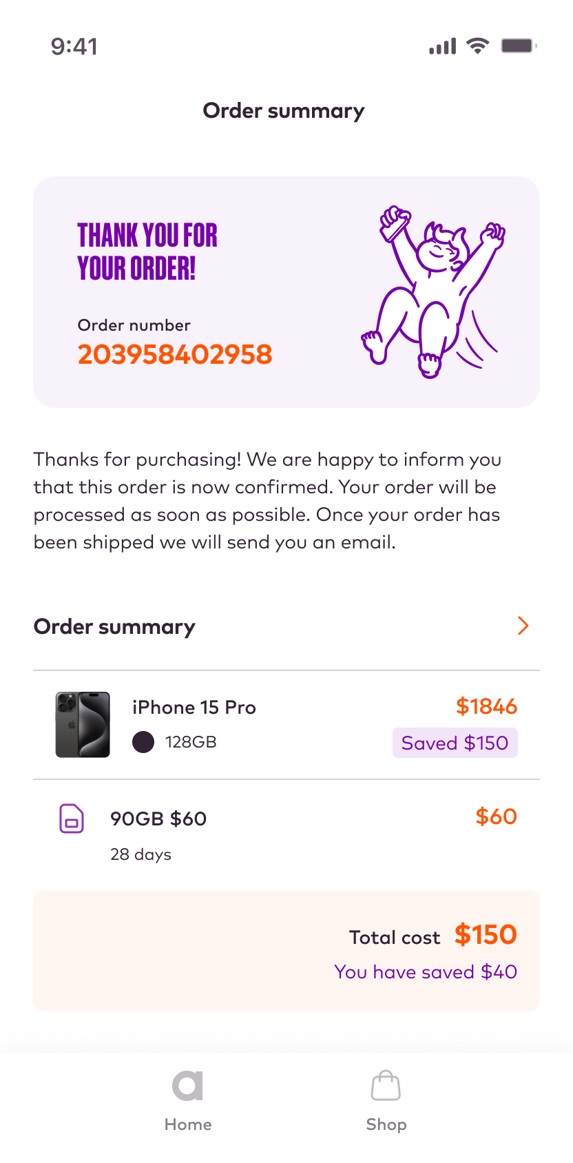
Below is a small selection of the final screens.
DESIGN
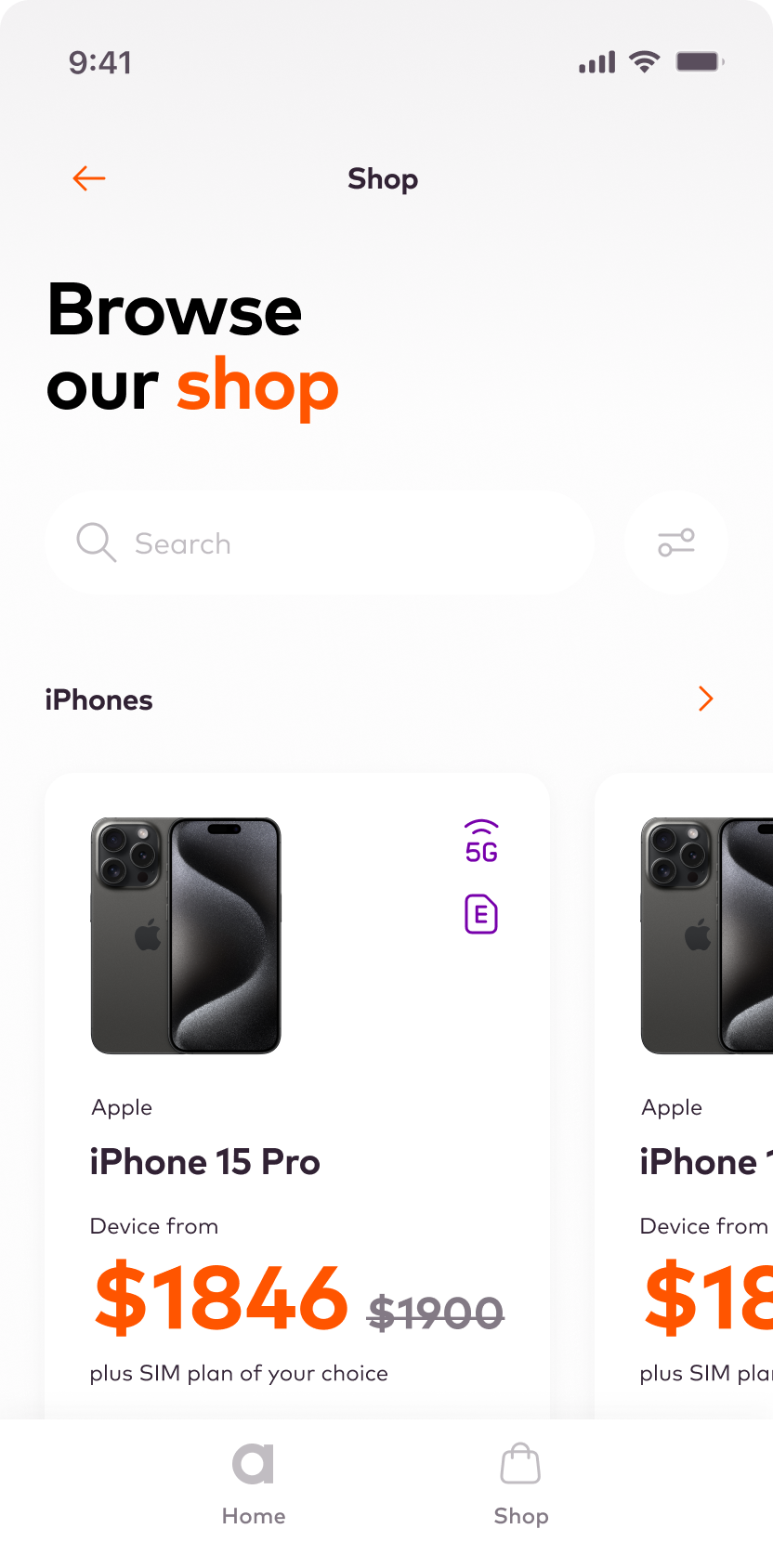
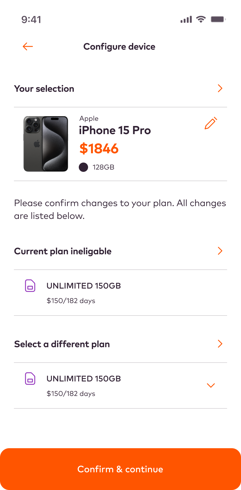
Final screens
A selection of the final screens.
Home screen
Shop
Configure device
2FA
Payment
Order summary
DESIGN
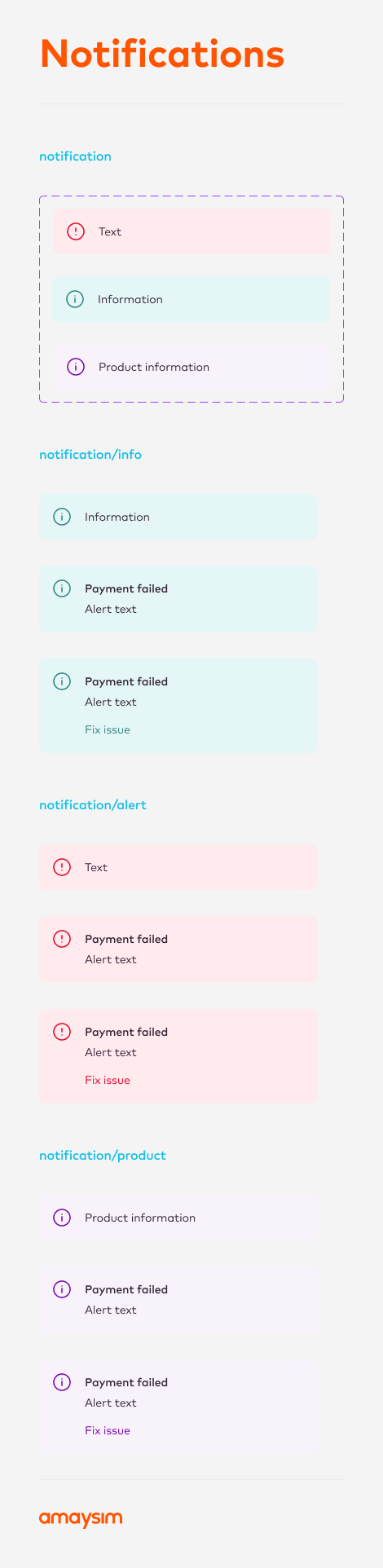
Component library
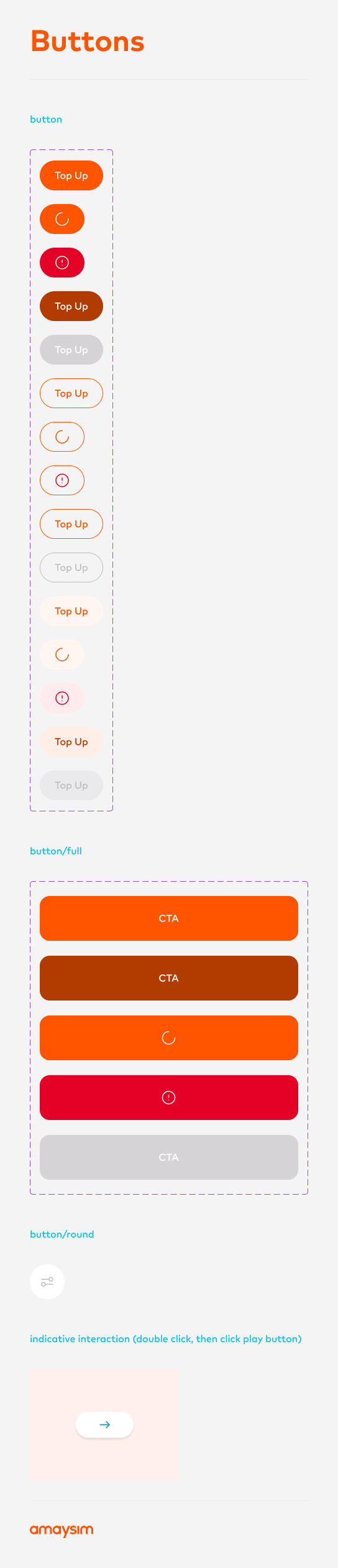
Below is a selection of some pages from the component library.
Colours

Navigation

Buttons
Cards

Selected Projects