Designing the Advice Intelligence platform
Designing the Advice Intelligence platform
Designing the Advice Intelligence platform
Designing the Advice Intelligence platform
Designing the Advice Intelligence platform
ADVICE INTELLIGENCE
Financial Advice SaaS platform
The Advice Intelligence platform is a white-lable solution for both advisers and clients to manage their investment goals. I was brought in to lead the ux design and build a functional, scalable UI kit that would shape the product going forward.
The Advice Intelligence platform is a white-lable solution for both advisers and clients to manage their investment goals. I was brought in to lead the visual design and build a functional, scalable UI kit that would shape the product going forward.
RESPONSIBILITIES
UI Design, UX, Interaction Design

Understanding the users
Understanding the users
The product was used by both advisers and customers, and these customers had a range of financial skills across the following categories:
- Financially illiterate
- Moderate knowledge
- Sophisticated investors
Therefore the product needed to be deep and complex, yet also provide a simple and intuitive UI for those who simply want to check on the status of their investments without using the deeper functionality.
The product was used by both advisers and customers, and these customers had a range of financial skills across the following categories:
- Financially illiterate
- Moderate knowledge
- Sophisticated investors
Therefore the product needed to be deep and complex, yet also provide a simple and intuitive UI for those who simply want to check on the status of their investments without using the deeper functionality.
Framing the challenge
Framing the challenge
The brief was to re-design the existing product from the ground up. The build was functional, but had had no consideration for the user and had only been tested in a dev environment.
The home-screen was a dashboard, and this was where I focused my attention. The first thing to establish was what makes a good dashboard design?
- It communicates essential information quickly
- It displays information clearly and efficiently
- It shows trends and changes in data over time
- It is easily customizable
- Data is prioritized
- Users can easily navigate through to more detailed and comprehensive infomation

The existing product
Typography
Creating a UI type library requires more than the standard H1-H4 and body copy styles. Considerations need to be made around labels, tooltips, errors and various other type styles.
My approach was to have a limited set of base styles and then base all the various UI styles off those. I also considered how the styles would work on a dark background which is used in a few places throughout the application.
Since I was working to an 8px grid, all the font sizes are divisible by 4px, with 4px fidelity on the leading. The reason for this is that 8px leading is just too coarse for an elegant visual language, especially when used on smaller font sizes.


Colours
Finessing the interface
I created two sets of colours for the product - the primary UI colours, for alerts, success, errors and various system status warnings, and the wider colour scheme for the vast amount of data-visualisation that the product needed to deliver.


Iconography
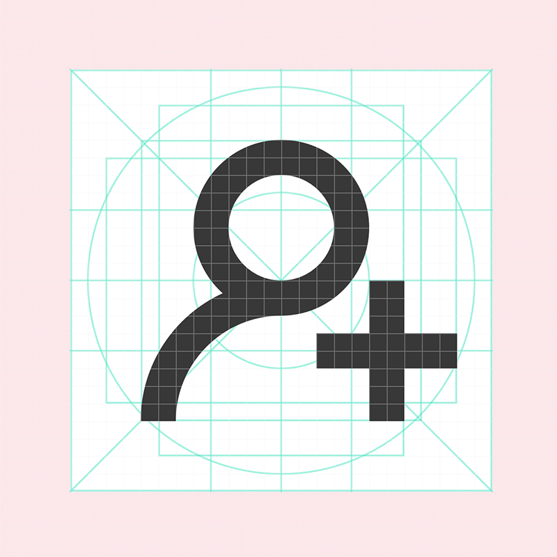
The platform required clean, functional, understandable icons. I created a framework to ensure that all icons looked and felt like part of the same library. UI icons needed to be able to work in isolation, whereas the navigation icons would always sit next to a label.


Form elements
The form elements for the AI UI Kit are clean, funtional and intuitive, and always use established web form conventions.


Cards and data visualisation
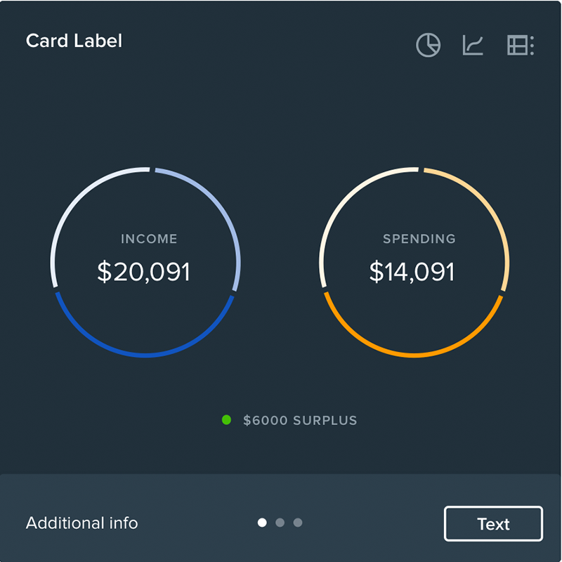
For the dashboard cards I created a card framework that allowed a user to switch between different types of data presentation, and provided both a light and dark variation.
For the dashboard cards I created a framework that allowed a user to switch between different types of data presentation, and provided both a light and dark variation.


Button rules and hierachy
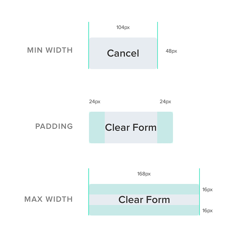
Buttons should establish a clear functional hierachy, they should be accessible, and the labels should be concise and unambiguous.
Buttons also need to have maximum and minimum widths, and be able to display interactions such as loading indicators or ticks to help provide extra feedback to the user.


View the guide
View the guide
The final Sketch UI kit is responsive, dynamic and uses overrides for just about every variable. This means it can be used to build out further designs with ease, and also lays out a solid platform for creating new components.
The final Sketch UI kit is responsive, dynamic and uses overrides for just about every variable. This means it can be used to build out further designs with ease, and also lays out a solid platform for creating new components.
View the full UI kit
(30MB PDF)
View the promotional video
View the promo video
This video was put together by an outside agency to help promote the platform.
Final designs
Below is a small selection of the final screens.
Client overview

Client management

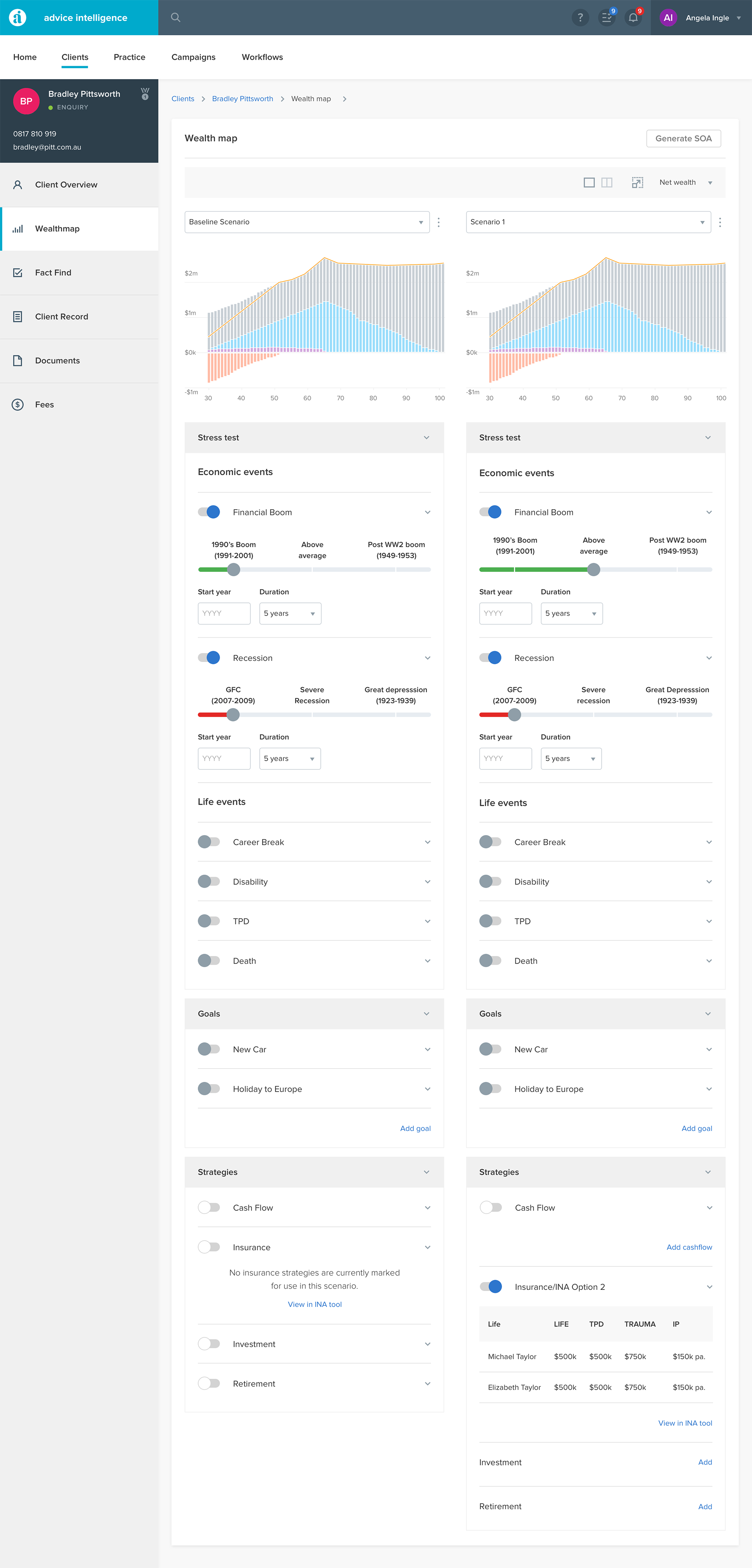
Scenario compare
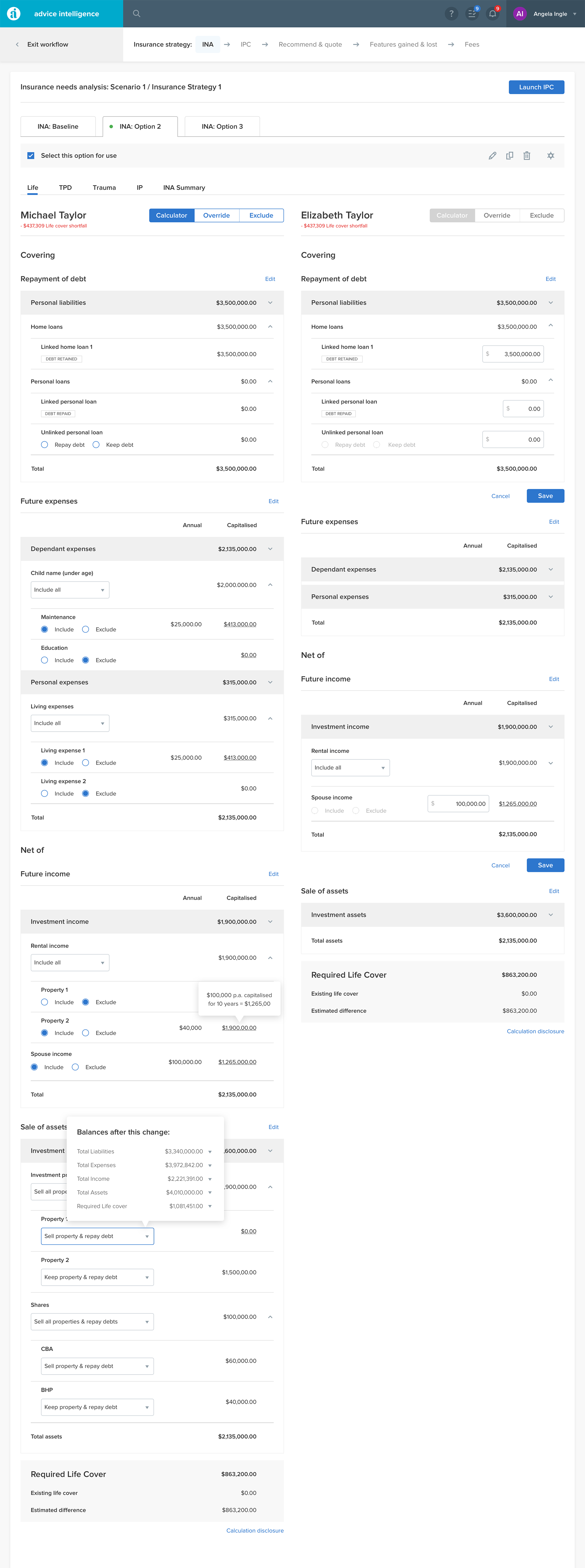
Insurance strategy
Selected Projects