UX Guide: connecting behavioural principles to research methods

gravatar
 · 
July 7, 2026
 · 
9 min read
Featured Image

UX Guide is a reference I built to connect behavioural principles, research methods, and workflow guidance in one place. This article describes why I built it, the product decisions that shaped its scope, and how I use it in design work.

The problem I was solving

There are several resources for research methods, and behavioural laws and principles, but none of them provide them in a way that suited my way of working; understanding the problem, and wanting to easily find which methods could help solve it. 

I built https://uxguide.jamescutts.me because I wanted that ability in a single, maintainable place.

Knowledge in this field is split across formats and sites. Research methods live in articles, books, and templates. Psychology and behavioural science live in separate libraries. Ethics tends to appear as a footnote, or not at all, when teams discuss persuasion patterns.

In practice, designers and researchers repeat similar work in every project:

  • A flow shows drop-off, but the team debates UI details before naming the mechanism.
  • A study is commissioned, but the method does not match the question.
  • Critique language stays vague (“confusing”, “clunky”) because the team lacks shared terms.

Sites such as Laws of UX, NN/g, and various method lists are valuable references. They are not routing tools. They rarely answer: *given this symptom, which principles should we consider, and which method would test our assumption?*

I also wanted ethics to sit alongside persuasion patterns, not in a separate conversation weeks later. When a team discusses scarcity, urgency, or social proof, the reference should surface tradeoffs at the same time as applications, and they should know when and where to apply these hooks.

That gap is what UX Guide is for.


What UX Guide is

UX Guide is a public reference at https://uxguide.jamescutts.me. It combines two parallel domains with shared supporting layers.

Browse mode

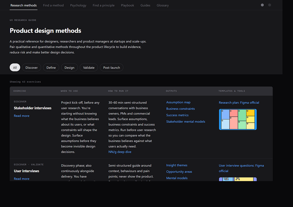
Research methods: a phase-tagged table (Discover, Define, Design, Validate, Post-launch) with 43 exercises. Each row covers when to use the method, how to run it, expected outputs, and links to templates.

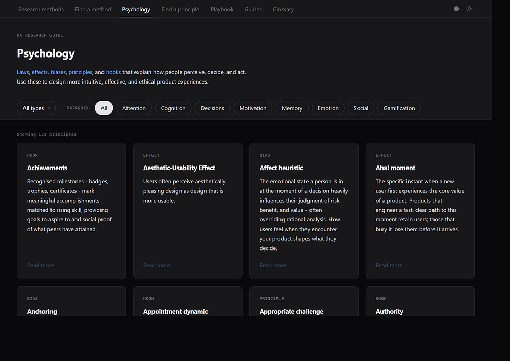
Psychology: a filterable library of 131 principles spanning laws, effects, biases, design principles, and behavioural hooks. Each card links to a detail modal with applications, sources, and related items.

Guided mode

Find a method: the same information architecture for research: a guided flow and a situation lookup table.

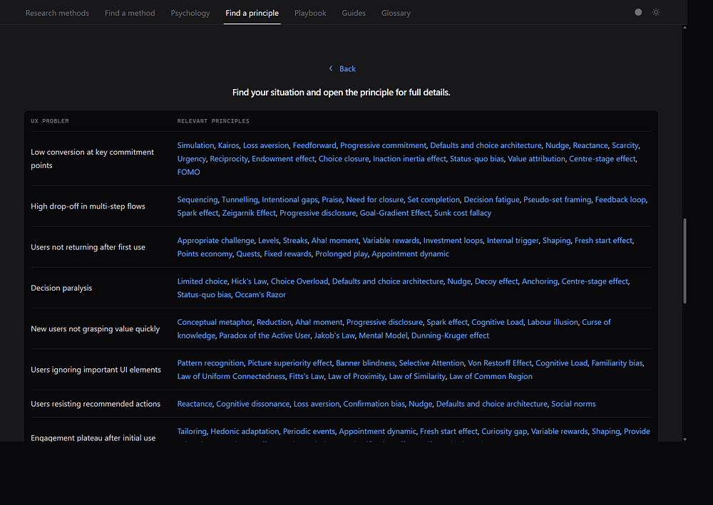
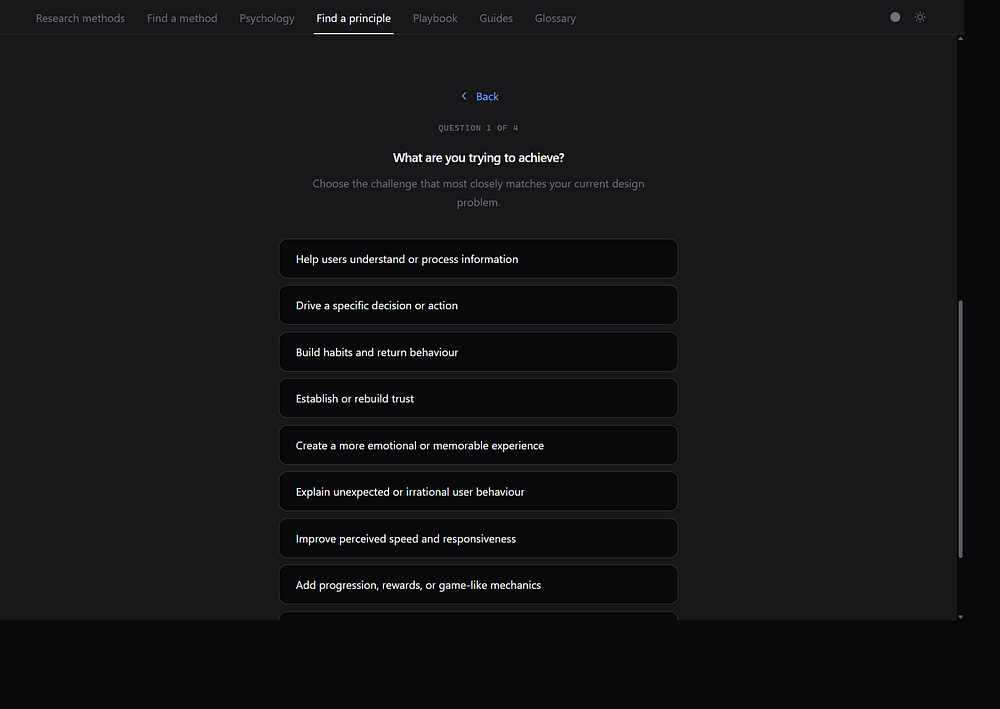
Find a principle: a 37-question wizard with 67 result paths, plus a browse-by-problem table with 24 common UX problem rows (for example, “High drop-off in multi-step flows” or “Trust deficit with new users”).

Shared layers

Playbook: an end-to-end product design workflow, from research planning through validation.

Guides: longer articles on topics such as researcher bias, which bridge methods and principles.

Glossary: 70 terms with sourced definitions for shared team vocabulary.
The site is a single-page application (vanilla HTML, CSS, and JavaScript) with theme tokens and deep links (for example, `#psych/scarcity` or wizard result URLs) so a specific principle or result can be shared in critique or workshop notes.

I chose a static architecture deliberately. The content changes more often than the interaction patterns. A single `index.html` with supporting data files keeps deployment simple and makes link auditing tractable. That matters when a reference cites hundreds of external sources.


Key product decisions

Several decisions shaped the original concept into the finished product.

Scope creep

I started with a research methods table: when to use each exercise, how to run it, what outputs to expect. That answered one recurring question in project work.

As I used it, other gaps appeared. I kept opening separate tabs for Laws of UX, NN/g articles, and bias catalogues when critiquing flows. The principles library followed. Once there were 100+ items, a flat browse view was not enough. 

The Find a principle wizard and problem lookup table came from the same need: teams often arrive with a symptom, not a principle name.

The playbook was another scope expansion. Methods and principles are reference material. Project work needs sequence: understand the problem space, orient on the landscape, prioritise, then validate. I wrote the playbook as a guide on how a typical project might run, and how the tool would fit into that process.

The glossary came last for a simpler reason. An easy way to look up any term used in the platform, and link to the relevant detail. Basically just another way to find what you need.

One resource or two?

At several points I debated splitting UX Guide into two products: a principles site and a research methods site. The two domains serve different mental models. Principles attract designers exploring behaviour; methods attract researchers planning studies. Separate URLs would simplify navigation and allow clearer branding. However, for now it‘;’s one source, so less maintenance, and less clicking between sites.

Users who land on methods sometimes need a principle to explain what they found. Users exploring principles sometimes need a method to test a hypothesis. One site preserves that optional cross-discovery. A split optimises for focus at the cost of accidental learning.


Responsive design as a learning requirement

A reference that only works at a desktop is a reference that gets used less.

I use the guide during design reviews, in workshops, and in quick conversations where someone asks “what should we call this pattern?” Those moments happen on phones and tablets as often as on a large monitor. A link shared in Slack or a workshop board needs to open readably without zooming or horizontal scrolling.

Responsive layout was therefore a product requirement, not a polish pass. Tables reflow or scroll within containers. Modals become sheet-style panels on narrow viewports. The wizards and glossary letter navigation needed explicit scroll and offset behaviour on small screens. None of that is visible in a desktop screenshot, but it determines whether the tool is consultable in the moment it is needed.

For a learning resource, consultability is the metric that matters. If a designer cannot pull up a principle modal while looking at a live prototype on a phone, the library might as well be a PDF.

Where the value lies

Principles at scale

The library covers perception, cognition, decision-making, motivation, memory, emotion, social influence, and gamification. It goes beyond a short list of laws. Hooks include risk labels and ethical consideration sections. The intent is informed tradeoffs, not a catalogue of manipulation tactics.

For example, the Scarcity hook modal includes warnings that scarcity can create anxiety and that time pressure degrades decision quality. High-risk patterns are flagged so teams can discuss them before implementation, not after a complaint.

This is not a compliance checklist. It is a prompt to ask whether a pattern serves the user or only short-term conversion. The same modal links to NN/g and dark pattern references so teams can read canonical sources, not only my summary.

Routing from problems

Find a principle and the problem lookup table answer questions such as:

“We see drop-off at checkout.”

“Users do not trust this flow.”

“Research findings feel too positive.”

Each row links to relevant principles. The wizard narrows further when the problem is less clearly stated.

Methods as the evidence layer

Once a team has a hypothesis about behaviour, methods describe how to test it. The table includes operational detail: when to use each exercise, how to run it, and what outputs to expect.

A useful bridge is the problem row for overly positive research findings. It points to the researcher-bias guide, confirmation bias, the Hawthorne effect, and anchoring. That mirrors a reasonable process: name the mechanism, choose evidence, revise the design, measure behaviour and sentiment.

The methods wizard follows the same logic as Find a principle. A team that knows *what* they need to learn but not *how* to study it can start from situation rather than method name. That reduces defaulting to familiar methods (surveys, heatmaps) that may not answer the question.
AI-assisted development

I used AI-assisted development in Cursor to bvuild the platform. The stack is deliberately simple: static files, no framework, theme tokens, and scripts for content maintenance.

What AI accelerated

  • HTML and CSS scaffolding for wizards, modals, and tables.
  • Repetitive patterns: modal layouts, card grids, taxonomy filters.
  • Content expansion and link audits across hundreds of entries.
  • Iteration on navigation, scroll behaviour, glossary fixes, and theme polish.

What remained human

  • Editorial decisions: what belongs in the reference, and at what depth.
  • Information architecture: parallel wizards, problem tables, ethics framing.
  • Source selection: favouring free, canonical resources (NN/g, government and academic sources) over paywalled books.
  • Risk labelling on behavioural hooks and the wording of ethical sections.
  • Tone and accuracy of definitions in the glossary and guides.

How I use it

I use the guide in three ways: solo review work, team alignment, and as a published artefact.

Solo design review

Before a critique, I look up the symptom in the problem table and open two or three linked principles. That gives shared language for feedback.

Example: A subscription onboarding flow asked users to choose between four plans, two add-ons, and a billing interval before showing any product value. Completion was poor. I opened the row for “Decision paralysis” and followed links to Hick’s Law, choice overload, and progressive disclosure. The critique was no longer “too many options on one screen.” It was: we are asking for commitment before the aha moment, and the choice architecture front-loads cost before value. We reduced the first step to a single recommended plan with an optional comparison view. The discussion moved from layout preferences to sequencing and cognitive load.

Team alignment

The glossary and playbook give shared terms in kickoffs. Find a method settles method debates with evidence-led framing rather than habit.

Example: On a retention project, a product manager proposed a broad satisfaction survey to understand why users left after week one. I opened Find a method and walked through the guided flow together. The situation pointed toward recent churn with unknown causes and a need for depth, not a population score. We agreed on a short round of exit interviews plus review of session recordings, and documented the decision in the research plan using playbook step 0. The survey was deferred until we had themes to validate. The guide did not make the decision. It gave us a structured way to name the tradeoff between breadth and depth.

Portfolio and critique anchors

A live product demonstrates systems thinking, ethics awareness, and execution. Deep links work as critique anchors in documents and workshop boards. A hiring manager can inspect the information architecture, not only read about it in a case study.

Sentiment and behaviour

The guide does not change user behaviour on its own. It changes how teams frame problems, choose evidence, and discuss tradeoffs. What ships after that discussion is what users experience.

A reference supports better outcomes only when teams act on it. Naming scarcity or social proof in a review does not help users unless the team changes what they ship.

In hiring and portfolio terms, the interesting question is not whether AI wrote lines of code. It is whether the builder can connect behavioural mechanisms to study design, state ethical limits, and ship something teams can use under time pressure. The guide is evidence of that way of working, not a substitute for it.

Design concern Example principlePossible effect
Too many choicesHick’s Law, chunkingFewer errors, less abandonment
Weak trust signalsSocial proof (applied carefully)Higher completion if claims are genuine
Poor recall of the experiencePeak-end ruleSentiment reflects peaks and endings, not averages
High-risk persuasionFlagged hook patternsAvoid short-term gains that damage long-term trust

UX Guide reflects how I prefer to work: name mechanisms, choose evidence, and state ethical limits before debating UI details. AI-assisted development made it feasible to maintain at scale. The harder work was deciding what belonged in it.

The site is public at https://uxguide.jamescutts.me

Comments

No Comments.