

Many money and investment apps share the same symptoms:
- Users sign up but never complete their first meaningful action
- Features are explored once, then abandoned
- Market dips trigger reactive withdrawals
- Educational content sits untouched
When we treat these issues as feature problems, we often respond by adding more dashboards, more charts, and more analysis tools. The product becomes more capable, but user behaviour doesn't improve. The real opportunity is not more functionality, it is better behavioural design.
Retention in financial products depends on how people feel about their decisions over time. Confidence, transparency, and consistency are not created by information alone. They are built through repeated, reinforced action.
A more useful strategic question is:
What financial habits do we want users to form, and how will the product help them repeat those behaviours consistently?
In money apps, users want confidence and clarity, while the business needs retention and assets under management. Behavioural design aligns these goals by shaping user behaviour over time rather than relying on one-off decisions.
From Hooked to modern product systems
In Hooked, Nir Eyal describes four steps that form a behavioural loop:
Trigger → Action → Variable reward → Investment
The model explains how products create repeated engagement by reinforcing behaviour until it becomes habitual.
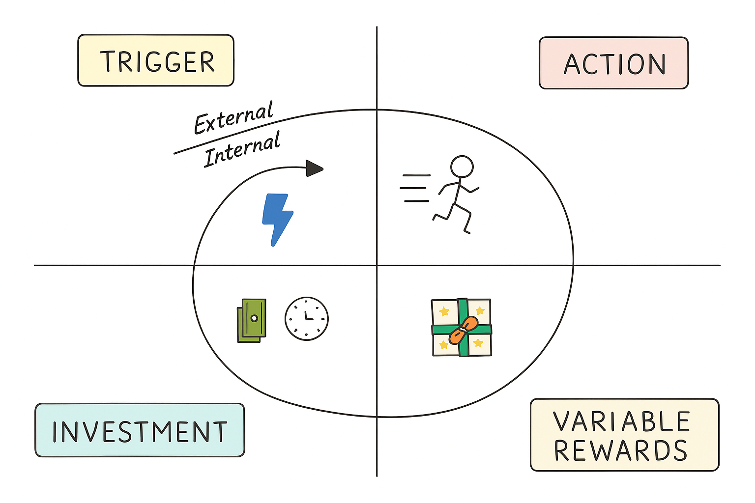
In modern product design, especially in fintech, this loop is often made more explicit:
Trigger → Prompt → Action → Reward → Result
In this version of the loop, the prompt is the designed intervention that appears in response to a trigger. The trigger is the situation, such as a salary landing or a market drop. The prompt is how the product responds to that situation, for example a notification or pop-up.
The result is what changes after the interaction. It is not just the immediate reward, but the lasting effect on behaviour. This might mean a contribution is automated, a goal is clearly defined, or a user decides to stay invested during volatility. If nothing durable changes, the loop is shallow. If behaviour becomes easier, more consistent, or more committed, the loop compounds over time.
Behavioural vs traditional design
| Behavioural design | Traditional design |
|---|---|
| Focuses on understanding human behaviour and psychology. | Focuses on aesthetics, functionality, and usability. |
| Utilises insights from behavioural economics to influence user actions. | Relies on design principles and conventions. |
| Design interfaces to guide users toward specific behaviours or outcomes. | Designs interfaces primarily for visual appeal and usability. |
| It employs persuasive techniques like social proof and gamification. | May not explicitly consider psychological factors or behaviour change. |
| It prioritises user motivations, habits, and cognitive biases. | Typically follows a linear design process from concept to implementation. |
| Emphasises iterative testing and optimisation based on behavioural data. | It emphasises user feedback but may not focus specifically on behavioral metrics. |
| It aims to create engaging and intuitive experiences by shaping user behaviour. | Aims to create visually pleasing and functional designs based on established norms and guidelines. |
Behavioural design has a profound impact on user experience by leveraging insights from psychology, behavioural economics, and human-centred design principles to create interfaces and interactions that are more intuitive, engaging, and effective.
Some key impacts of behavioural design on UX include:
Enhanced engagement
Through persuasive design and behavioural nudges, behavioural design increases user interaction and participation.
Reduced friction
By minimising cognitive load and simplifying tasks, behavioural design streamlines the user experience, reducing frustration and enhancing usability.
Effective habit formation
Behavioural design facilitates the development of positive user habits by reinforcing desired behaviours and providing timely feedback.
Personalised experience
Leveraging data and user insights, behavioural design tailors content and interactions to individual preferences, improving relevance and satisfaction.
Ethical considerations
Behavioural design encourages designers to prioritise user autonomy and well-being.
Data-driven decision making
Behavioural design promotes the use of user data for iterative UX improvements, leading to more effective design solutions.
The five behavioural hook types
Behavioural loops in money apps are not all trying to do the same job. Some are designed to make sure people invest regularly. Some help them increase their contributions over time. Others step in when markets fall and emotions run high. And some simply remind users that their progress is real and building.
In practice, financial products tend to rely on five distinct types of hooks:
Habit loops
Anchor behaviour to predictable real-world moments such as pay day, turning intention into routine.
These hooks reduce the need for repeated decision-making by linking financial action to an existing rhythm. When a salary lands, the product recognises the moment and makes the next step obvious. Defaults play an important role here. Contribution amounts are pre-filled, bank accounts are pre-selected, and frequency is aligned with past behaviour. The user is not asked to decide everything again.
Over time, the behaviour shifts from something users think about to something they simply do. When designed well, habit loops evolve into automation. Manual confirmation becomes automatic investing, and the system protects the behaviour without constant prompting. The goal is to remove friction gradually, not to rely on repeated reminders.
Contextual nudges
Suggest small, well-timed improvements based on demonstrated behaviour and capacity.
Rather than pushing large commitments, these hooks build on existing momentum. They appear only after consistency has been demonstrated, which makes the suggestion feel earned rather than intrusive. Personalisation strengthens the nudge. The increase suggested is based on actual contribution history and income patterns, not arbitrary targets.
Choice architecture also matters. The improved option is clearly presented, its impact is visible, and the user can preview the outcome before confirming. The change is easy to accept and easy to reverse. Contextual nudges focus on gradual improvement rather than dramatic change, preserving trust while increasing long-term value.
Loss framing hooks
Provide perspective during market volatility, reducing reactive decisions driven by short-term fear.
Financial decisions are highly emotional, particularly during downturns. These hooks introduce context at moments of uncertainty, shifting attention from short-term fluctuations to long-term trajectory. Defaults are important here too. The interface can default to a longer time horizon, reducing the visual dominance of short-term losses.
Careful framing helps users see potential consequences clearly. If withdrawing today delays a goal by several months, that information is shown plainly. The aim is not to scare users into staying invested, but to counteract the natural tendency to focus on immediate loss. Loss framing, used responsibly, stabilises decision-making when emotions are high.
Goal clarity hooks
Translate vague financial intention into time-bound commitment with visible progress.
Many users start with aspiration but no direction. Goal clarity hooks restructure the decision itself. Instead of asking only how much to invest, the product asks when the user wants to reach a target. The required contribution updates dynamically as the timeline changes.
This is an example of choice architecture in action. The product guides users toward realistic, achievable plans by making trade-offs visible. Defaults can highlight recommended contribution levels based on the selected date, reducing guesswork. When effort is tied to a specific outcome and date, motivation becomes more durable and less vulnerable to drift.
Reward reinforcement hooks
Make progress tangible and cumulative, strengthening identity and intrinsic motivation.
Progress in investing can feel slow and abstract, especially early on. These hooks surface milestones, streaks, and cumulative growth so users can see evidence of consistency. Visualisations, comparisons to starting balance, and monthly summaries all help make improvement visible.
Light elements of gamification can be useful here, but the emphasis remains on meaningful progress rather than novelty. Personalisation reinforces relevance by showing how this specific user has improved over time. As progress becomes visible, users begin to see themselves as someone who saves or invests regularly. Over time, behaviour becomes less dependent on prompts and more aligned with identity.
Together, these five hook types shape behaviour at different moments in a person’s financial journey. Habit loops make sure contributions happen regularly instead of being forgotten. Contextual nudges help people increase their savings gradually, without feeling pressured. Loss framing gives people perspective during market drops, so they are less likely to panic and withdraw at the worst time. Goal clarity helps users understand what they are working toward and how long it will take. Reward reinforcement reminds them that progress is happening, even when it's slow.
Five behavioural principles in practice
1. Habit loops
Turning pay day into automatic investing.
Trigger
A salary deposit is detected through transaction categorisation, and the system recognises a regular pay-day pattern.
Prompt
Within one or two hours, a personalised notification appears:
“You’ve been paid $4,960. Want to invest your usual $25 and keep your 8-week streak?”
Tapping the notification opens a contribution screen where:
- The amount is pre-filled
- The bank account is already selected
- The primary button is clear and prominent
- A visible streak badge sits near the confirm button
After three consecutive manual confirmations, a card appears on the dashboard:
“You’ve invested on pay day for 3 months straight. Automate this so it happens every time?”
The automation toggle sits directly beneath the streak visual so it feels like a natural next step rather than a new feature.
Action
The user confirms the pre-filled contribution, and later enables auto-invest by switching on a simple toggle, with frequency and amount already aligned to their existing behaviour.
Reward
Immediately after confirmation:
- The streak counter increases
- The progress bar advances
- A message appears: “Nice. You’re now 42% toward your goal.”
When automation is turned on, the confirmation changes to:
“Auto-invest active. Your contributions now run automatically on payday.”
On the next payday, the contribution runs quietly in the background.
Result
The behaviour shifts from something the user has to remember to something the system handles. Investing becomes part of the background routine, consistency improves, and retention strengthens because the product protects the behaviour rather than relying on reminders.
2. Contextual nudge
Using consistency to increase contributions over time.
Trigger
The system detects ten or more consecutive contributions and stable income patterns. The user opens the app during a calm market period.
Prompt
An inline card appears beneath the goal progress bar:
“You’ve saved consistently for 12 weeks. Increasing to $30 per week could help you reach your goal 3 months sooner.”
A “See impact” link expands a panel showing:
- The current completion date
- The new projected completion date
- The difference in total return
The suggestion is modest and clearly connected to progress.
Action
The user taps “Increase to $30,” reviews a summary screen with the updated timeline, and confirms. The change can be undone with one tap.
Reward
The goal timeline updates immediately, the progress arc tightens slightly, and a message appears:
“Updated. You’re now on track for March 2028.”
The improvement feels measurable and earned.
Result
Contribution levels increase gradually across users, and the change feels supportive rather than sales-driven. Small improvements compound over time without damaging trust.
3. Loss framing with context
Reducing panic during market downturns.
Trigger
Market volatility causes a visible portfolio decline, and the user opens the app after seeing negative news.
Prompt
The portfolio screen defaults to a three-year or five-year view rather than a one-week view. A banner appears at the top:
“Markets are down this week. Short-term dips are common. Here’s how similar periods recovered.”
Tapping the banner reveals:
- Historical recovery examples
- Long-term performance charts
- A projection comparing staying invested with withdrawing
If the user selects “Withdraw,” a modal appears:
“Withdrawing now may delay your goal by 7 months. Review impact?”
The tone remains calm and factual.
Action
The user switches between time ranges, reviews the projections, and considers the long-term impact before making a decision.
Reward
The long-term growth curve becomes more prominent than the short-term drop, and the visual emphasis shifts away from alarm. Perspective replaces urgency.
Result
Fewer impulsive withdrawals occur, and the product becomes associated with steadiness during difficult periods. Trust grows because the app provides context rather than amplifying fear.
4. Goal clarity
Turning vague goals into clear plans.
Trigger
During onboarding, the user selects “Save for the future” but does not specify when they want to reach their goal.
Prompt
Instead of asking only for a target amount, the screen asks:
“When would you like to reach $10,000?”
Below this:
- A date selector
- A dynamic weekly contribution calculation
- A visual timeline
As the date changes, the required contribution updates instantly.
Action
The user selects a target date and adjusts the contribution using a slider. The system recalculates in real time and pre-fills the recommended amount.
Reward
The dashboard reflects the selected timeline with a visible countdown:
“On track for March 2028.”
The progress bar shows both percentage complete and time remaining.
Result
The goal becomes concrete rather than abstract. Contributions feel tied to a clear outcome, which reduces drift and supports sustained behaviour.
5. Reward reinforcement
Making progress visible so users stay motivated.
Trigger
The system detects a milestone, such as reaching $1,000 saved or completing twelve consecutive contributions.
Prompt
The next time the user opens the app, a full-screen message appears:
“You’ve saved your first $1,000.”
The screen includes:
- A visual progress arc
- A comparison to the starting balance
- A link to “See your journey”
Messaging reinforce progress:
“You invested 5 times this month. That’s 2 more than last month.”
Action
The user explores their cumulative progress and views their contribution history.
Reward
Growth becomes visible and tangible, and progress feels real rather than incremental.
Result
The user begins to see themselves as someone who saves consistently, and behaviour becomes internally motivated. Contribution rates stabilise rather than taper after milestones.
From tools to behavioural systems
When these loops operate together, the product becomes more than a dashboard.
- Habit loops make sure investing happens regularly
- Nudges help people increase their contributions gradually over time
- Clear context during market drops helps users avoid panic decisions.
- Clear goals help users understand what they are working toward and how long it will take.
- Visible progress helps people stay motivated
The outcome is not more screen time, it is stronger financial behaviour.
Long-term retention in financial products emerges when behaviour is supported and reinforced over time. That is when a money app becomes something users rely on, rather than something they occasionally check.

No Comments.