PROJECT TYPE
Start-up, fintech, retail
TEAM
1 Product Designer, 3 Engineers, 1 CEO
MY ROLE
Lead Product Designer
Bolt Group
Bolt app
Bolt app
Bolt app
Bolt was a new fintech product and brand, created from scratch to replace an existing consumer payments app called Bano. While Bano had demonstrated early demand, it was not designed to scale in terms of usability, interaction model, or features.
I led the end-to-end design of Bolt, defining the brand, product experience, and interaction model, while establishing a lean delivery process capable of supporting rapid iteration and long-term growth.
My role spanned brand, UX, interaction design, and delivery process. My goal was to create a robust product foundation that could compete with established platforms and scale without becoming harder to use or maintain.
RESPONSIBILITIES
Creative Direction, Brand, Visual Design, UX, Interaction Design, User Testing
Creative Direction, Visual Design, UX, Prototyping, User Testing, Interaction Design
Process
Business goals
The commercial outcomes the product needed to drive.
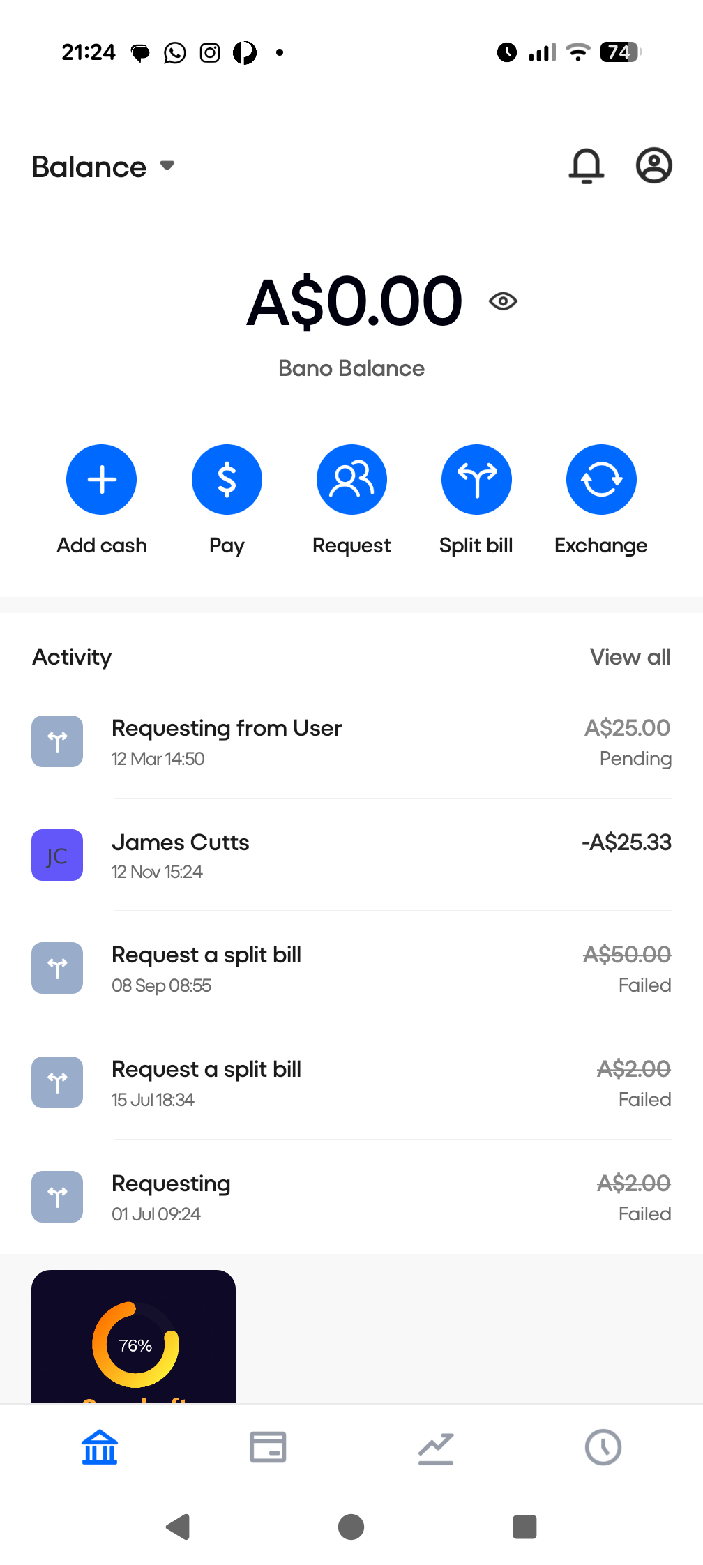
Bano
The existing Bano app had limited functionality, poor design, confusing UX, and limited options for scalability.
The goal of this project was to completely redesign and rebrand a tired and dated money app, and add compelling new features to allow the platform to compete with the industry big players, like Revolut and Wise.
Increase activation and retention
Bolt was designed to solve two problems at the same time: help people build better money habits, and create a sustainable fintech product that could grow through long-term engagement rather than one-off transactions.
From a business perspective, the early focus was on three areas: activation, retention, and trust. Financial apps often lose users quickly if people do not take a meaningful first action, so the product needed to guide new users toward making their first deposit and starting a saving or investing habit as early as possible. This initial action was critical because it dramatically increases the likelihood that a user will return.
Retention was the second priority. Many financial tools are opened once, then forgotten. Bolt needed to become something users interacted with regularly, similar to how people return to learning apps like Duolingo. The product therefore focused on building small, repeatable behaviours such as automated deposits, progress tracking, and clear visual feedback that reinforced positive financial actions.
Build trust and money habits
Trust and clarity were equally important. Because the product deals with personal money, the experience needed to feel transparent, predictable, and safe. Users should always understand what is happening with their money, what actions they are taking, and what the long-term outcome might be.
In practical terms, the product needed to:
- Increase onboarding activation, particularly getting users to make their first deposit during onboarding
- Build habitual engagement, encouraging regular saving or investing behaviours
- Reduce drop-off and account abandonment by making financial progress visible and rewarding
- Establish strong user trust through clarity, transparency, and simple language
- Create a product experience that supports long-term customer value, not short-term transactions
These goals shaped the product design approach, particularly the use of behavioural design principles, progressive disclosure, and clear feedback loops that help users feel confident about their financial decisions.
Process
Discovery & ideation
Understanding where the existing product was falling short.
Research and discovery
I started by trying to understand what problem we were actually trying to solve. I looked at how people already handled shared payments in the real world, where things broke down, and what caused friction or confusion.
I explored everyday scenarios such as splitting meals, chasing friends for money, and managing informal debts. The consistent pattern was not a lack of financial tools, but poor implementation.
This discovery work helped narrow the scope of the product early. The outcome was a clear problem definition that guided both product decisions and design execution throughout the build.
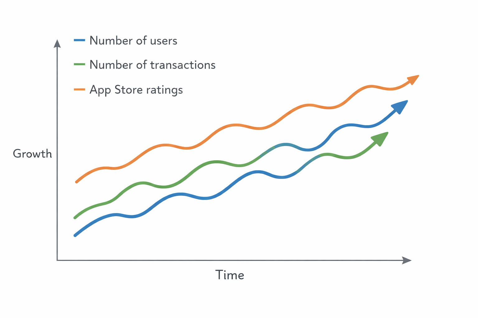
Designing without data
With little historical data to build from, there was no clear definition of what success would actually look like. We did not yet have enough usage patterns or behavioural insight to point to a single north-star metric, so the first step was to establish a simple, practical baseline.
I chose three early KPIs that we could track consistently over time: the number of active users, the number of transactions, and app store reviews. These were easy to measure, easy for the team to understand, and closely tied to real customer behaviour and sentiment.
Each design update or new feature could then be linked back to a measurable outcome, helping us learn what was working, what was not, and where to invest next.
Competitor analysis
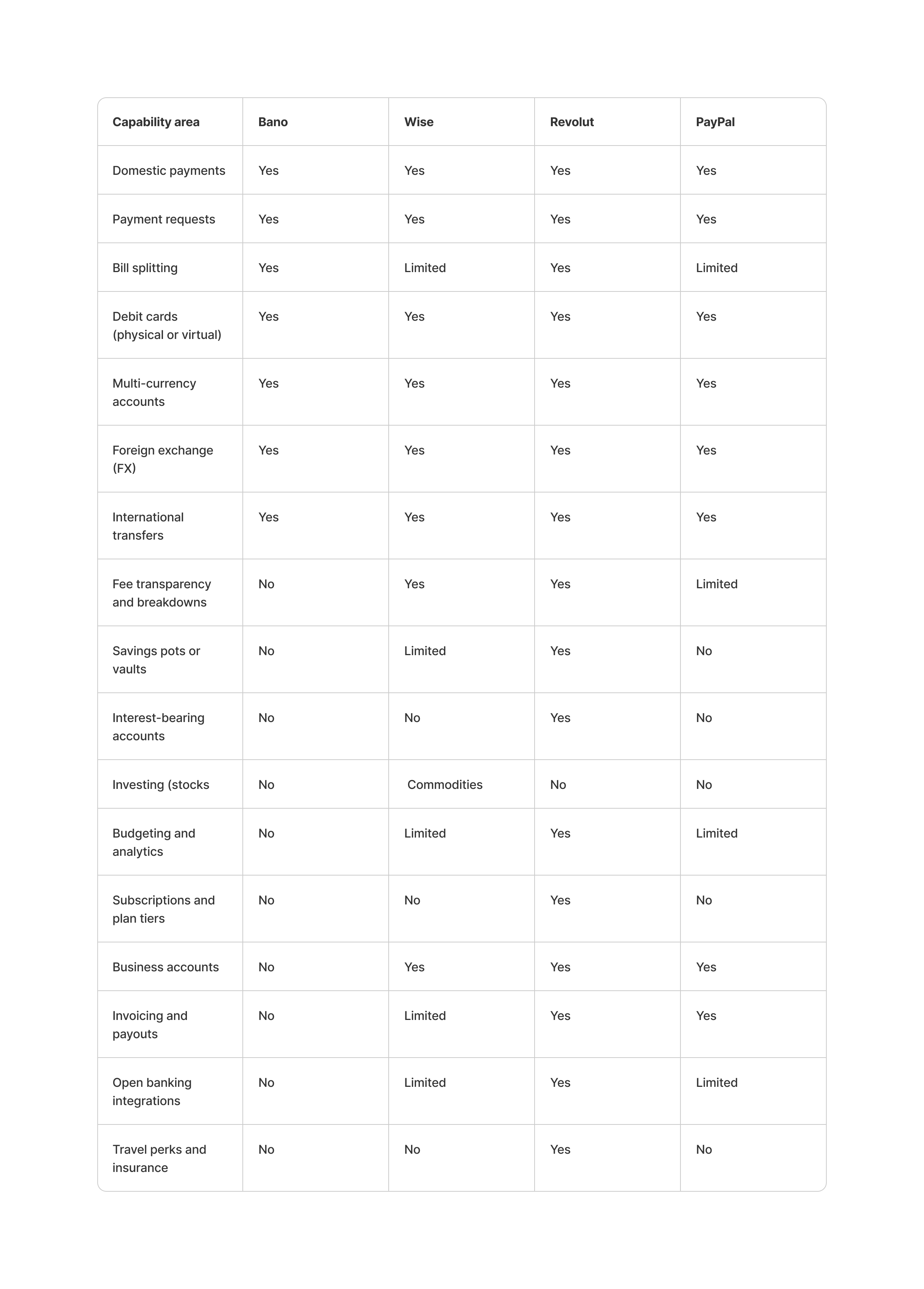
The initial Bano product focused on a small set of core money-movement features: payments, requests, bill splitting, and basic account and FX flows.
The comparison highlights how much broader established platforms such as Wise, Revolut, and PayPal have become over time. Payments now sit inside much larger products that include international transfers, savings, investing, subscriptions, and business tools. In these platforms, payments are no longer the end product – they are the starting point.
For Bolt, my goal was not to match this breadth early on, but to do the basics better. By getting the fundamentals right first, Bolt could add new features later without undermining usability or trust.
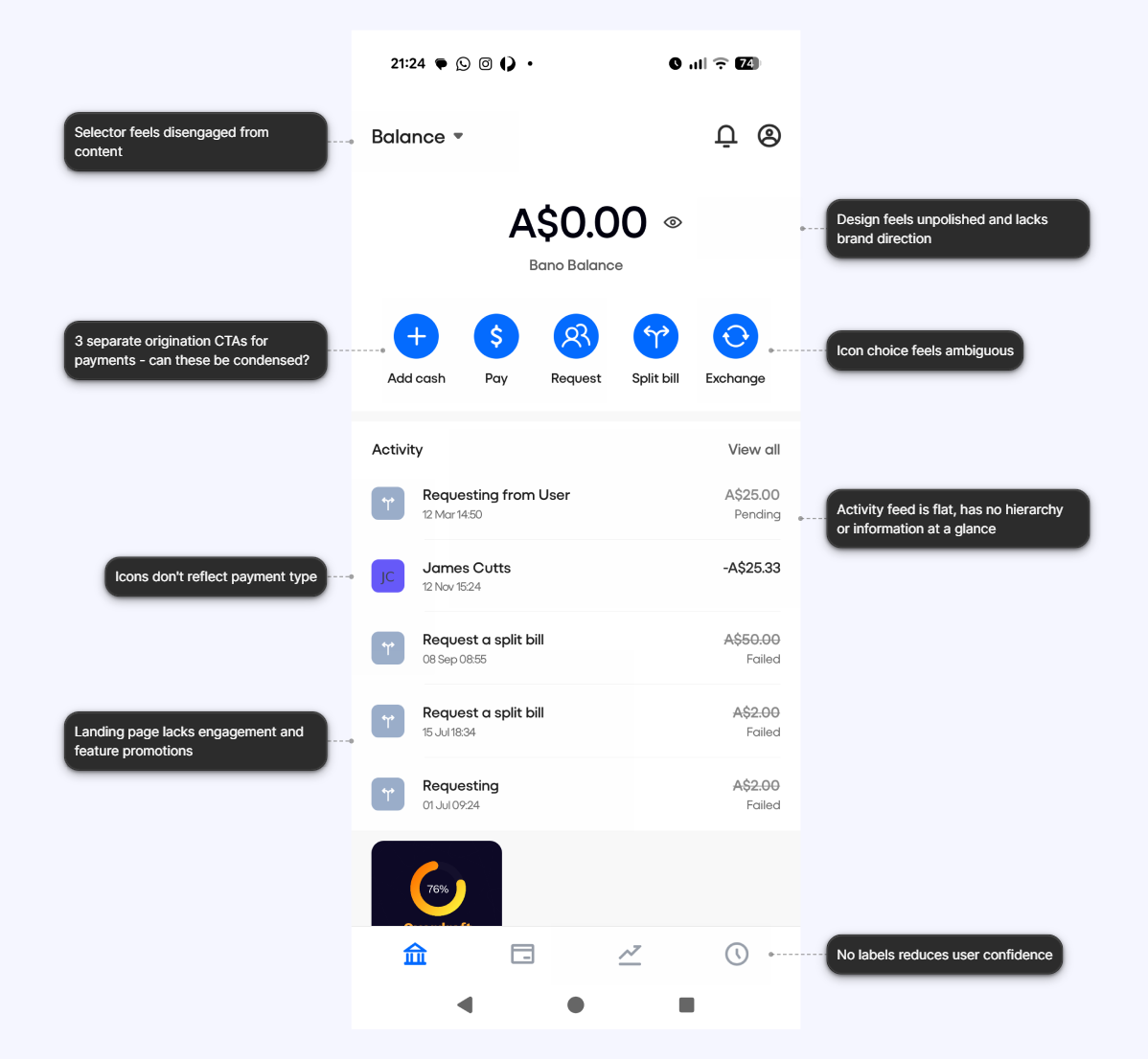
Auditing the current experience
I began with a rapid product audit, mapping the existing journeys and identifying usability and visual inconsistencies.
Using heuristic evaluation and competitor benchmarking, I defined key design issues that any new design would have to address.
Understanding the main challenges
The existing Bano app had a couple of thousand users, but very limited functionality and a poor user experience. My job was to rethink the app from the ground up, build a design capability within the business, and help the team scale the product up quickly with a modular and feature-led approach.
Challenge #1
The interaction model did not scale.
The existing app was built around rigid, one-off flows, lacked a clear navigation hierarchy, and did not support new features or evolving user needs.
Risk
As the product grew, each new feature increased complexity, slowed delivery, and introduced inconsistent behaviour across the app.
Challenge #2
The product could not compete at a functional level.
Bano offered only basic payments with limited flexibility, making it hard to justify switching from established platforms.
Risk
Without clearer value or differentiated execution, the product would struggle to retain users or attract new ones.
Challenge #3
The user experience was dated and confusing.
Poor visual hierarchy, unclear language, and inconsistent patterns made simple tasks harder than they needed to be.
Risk
Users would lose trust in the product, abandon key flows, and associate the brand with friction.
Design
Creating a brand
Making Bolt feel coherent across product, marketing, and comms.
Guiding UX and brand principles
One of my first goals was to define who Bolt was, and where we would be positioning ourselves in the market. To help with this I ran a workshop to help define 4 brand pillars that would underpin the experience going forward.

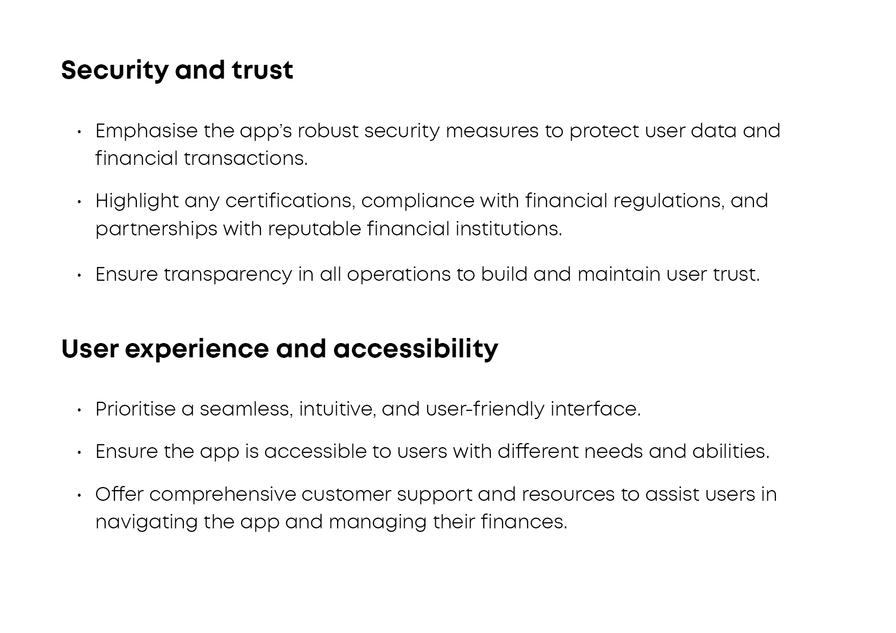
Security and trust
- Emphasise the app's security measures to protect user data and financial transactions.
- Highlight any certifications, compliance with financial regulations, and partnerships with reputable financial institutions.
- Ensure transparency in all operations to build and maintain user trust.

User experience and accessibility
- Prioritise a seamless, intuitive, and user-friendly interface.
- Ensure the app is accessible to users with different needs and abilities.
- Offer comprehensive customer support and resources to assist users in navigating the app and managing their finances.

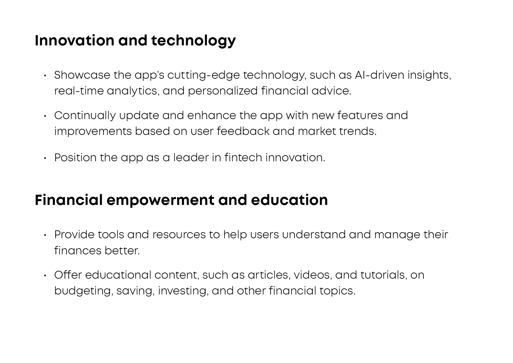
Innovation and technology
- Showcase the app's cutting-edge technology, such as AI-driven insights, real-time analytics, and personalised financial advice.
- Continually update and enhance the app with new features and improvements based on user feedback and market trends.
- Position the app as a leader in fintech innovation.

Financial empowerment and education
- Provide tools and resources to help users understand and manage their finances better.
- Offer educational content, such as articles, videos, and tutorials, on budgeting, saving, investing, and other financial topics.
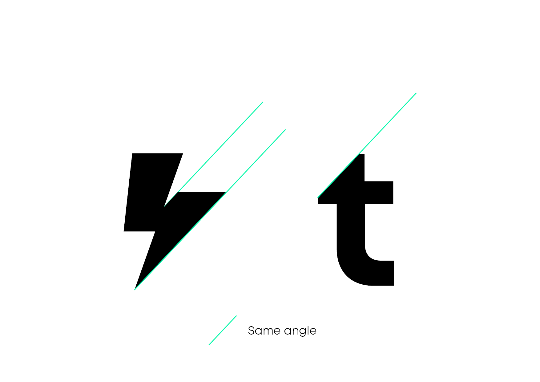
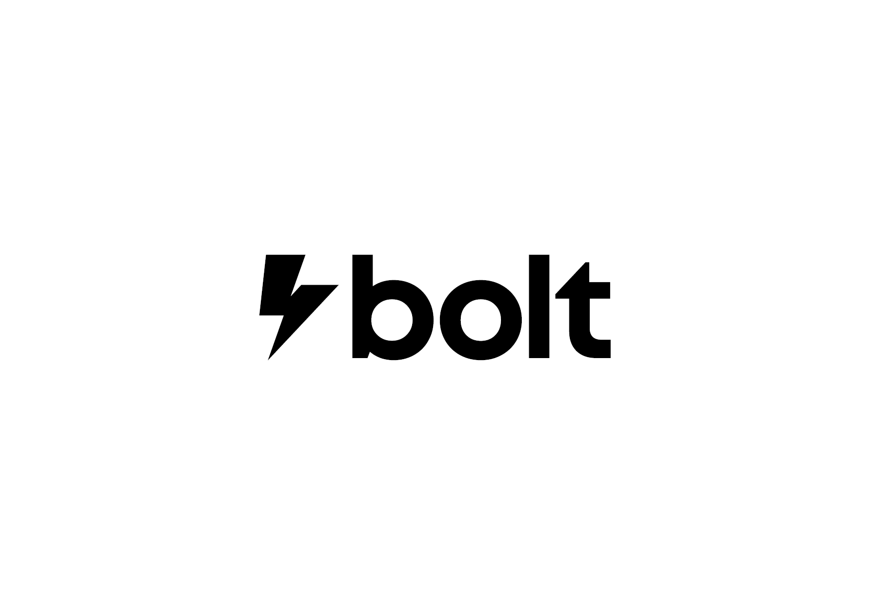
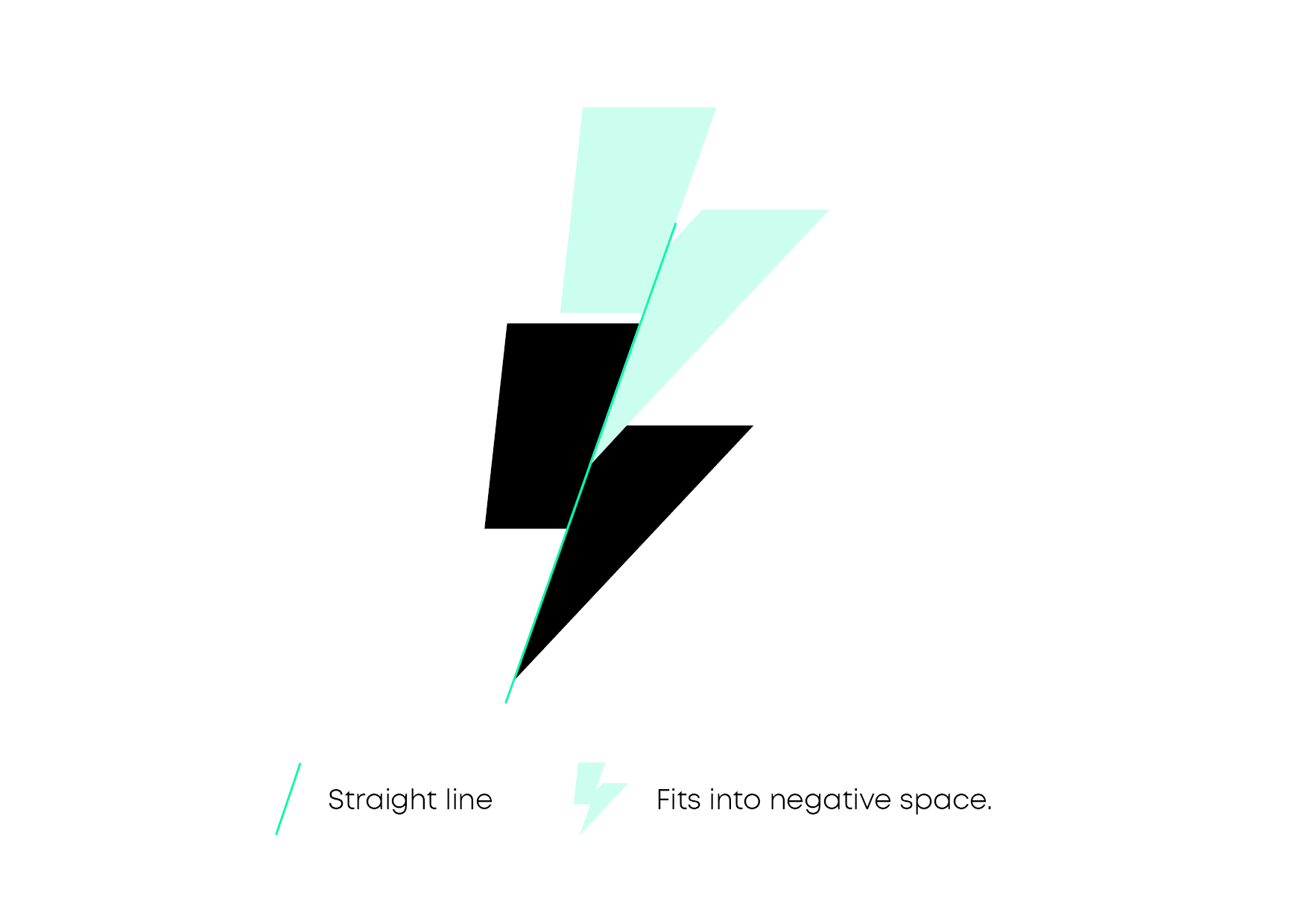
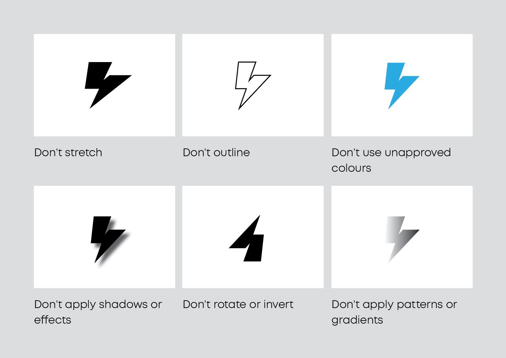
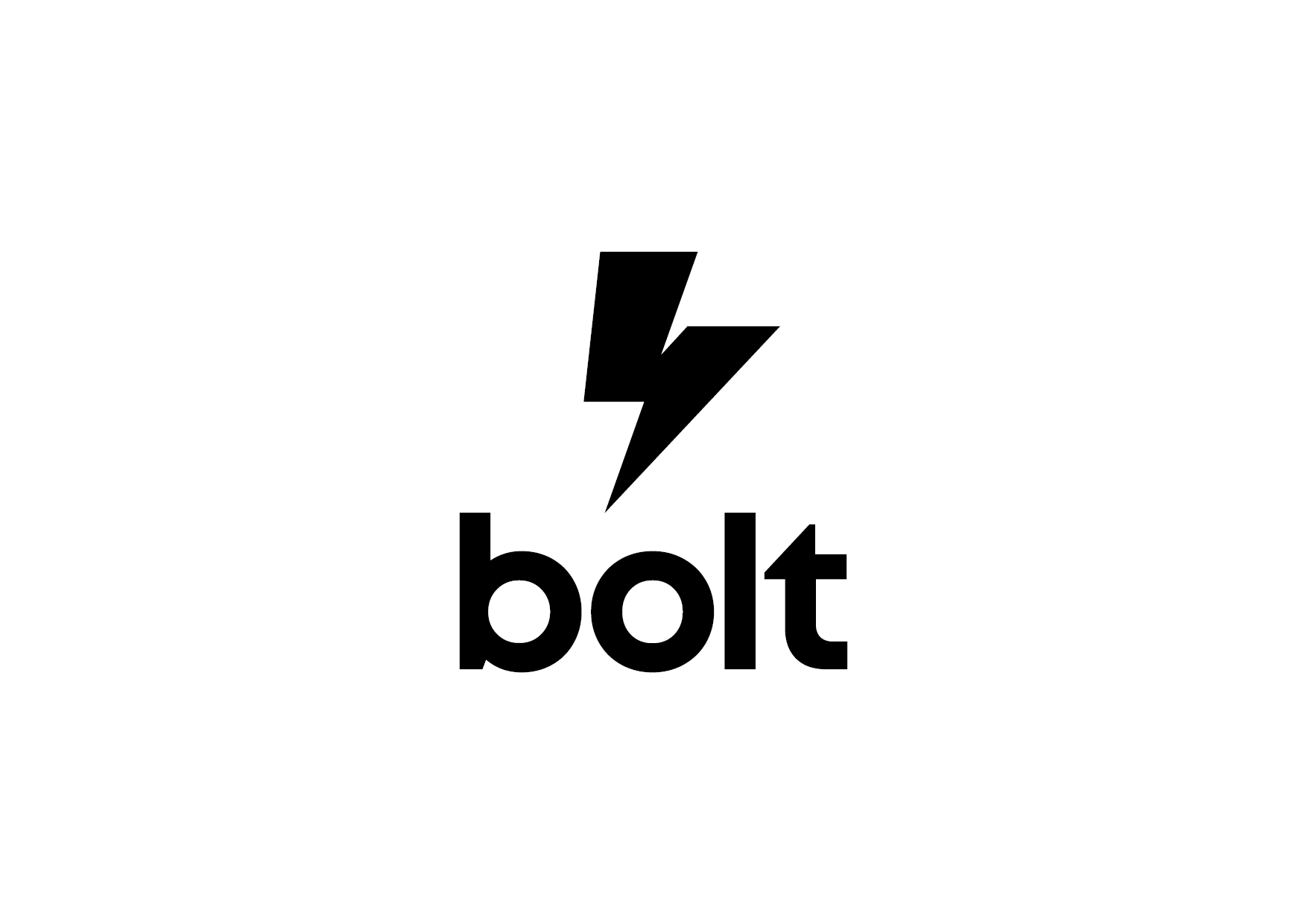
A striking new logo
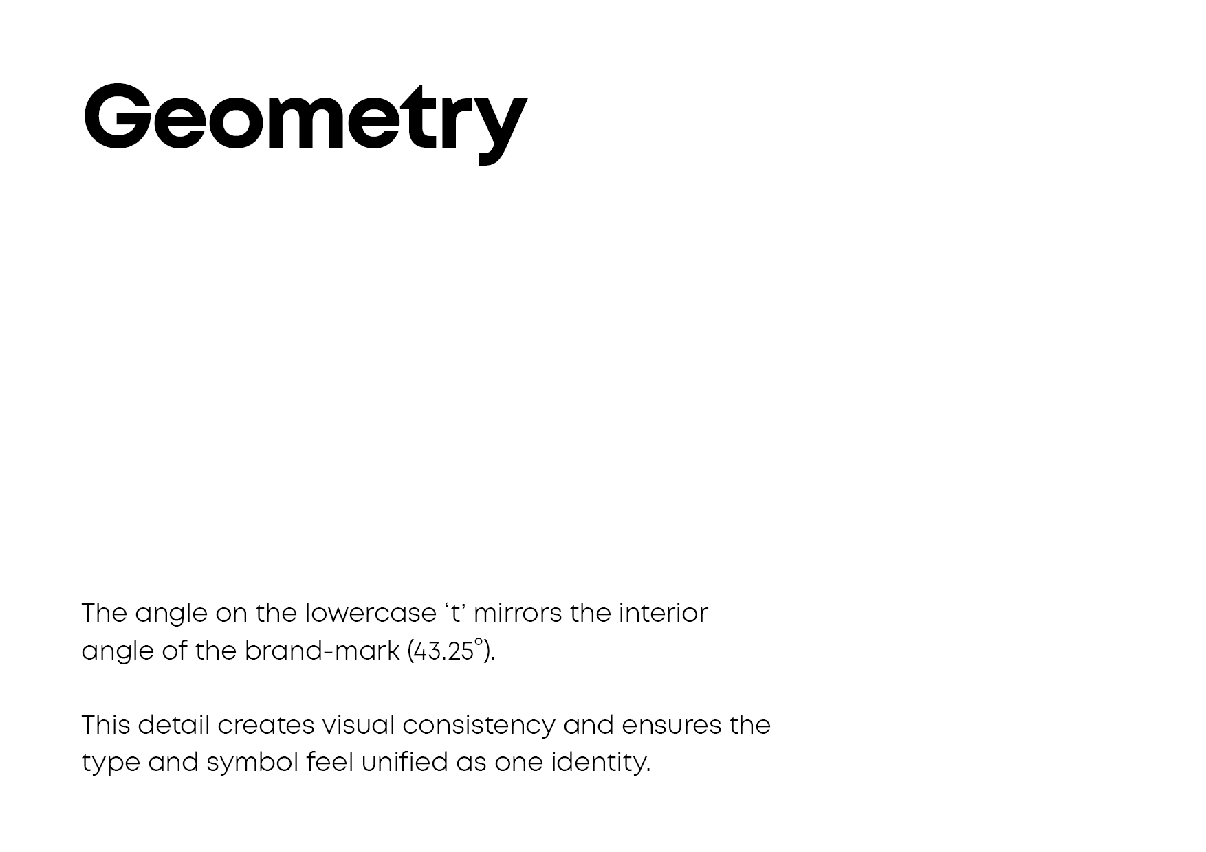
I designed the bolt device first, using simple, consistent shapes and angles to creat something balanced and unique. The small chip out of the shape adds a subtle depth to the brandmark, and prevents it feeling too heavy. This chip uses the same angle as the lower part of the device, and there is a straight line which runs through it creating a dynamic, directional shape.
The group identity
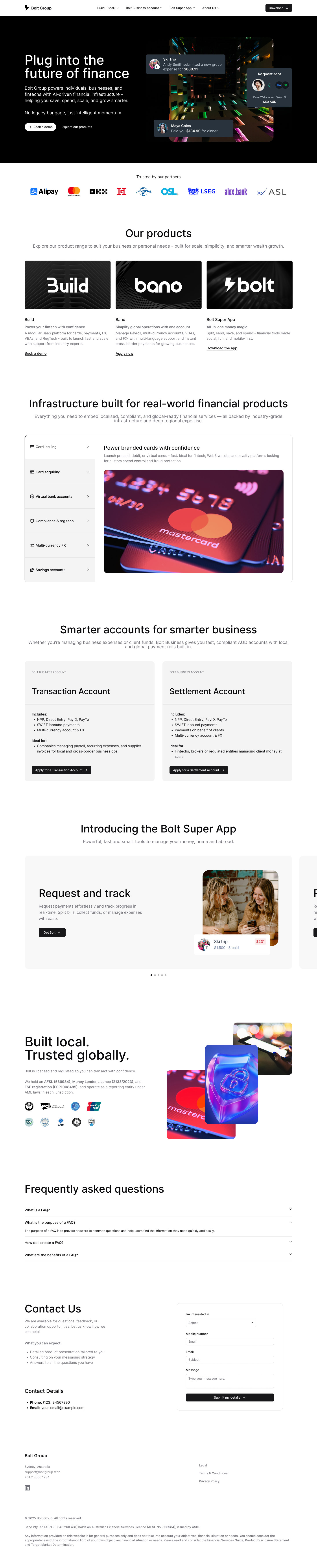
After approving the new logo, the founder decided to rename the entire group (comprising Bolt app, Bano, and Build) to Bolt Group.
This required a new brand, and I wanted to make sure the logo differentiated the group from the app, to prevent confusion and weaking of either brand.
Instead of re-using the lightning bolt brandmark, I wanted to explore a more typographic route. This would help establish the group as a separate entity to the app, and added some gravitas and maturity, distinguishing it from the retail experience of the app. The individual productrs under this group umbrella would then each have their own brand, logo, and potentially a brandmark.
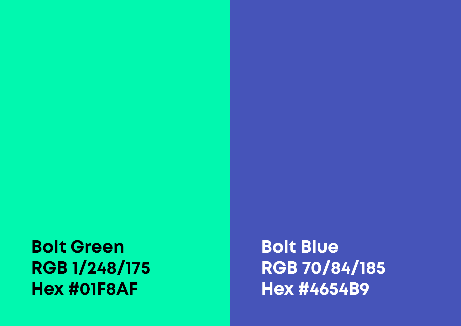
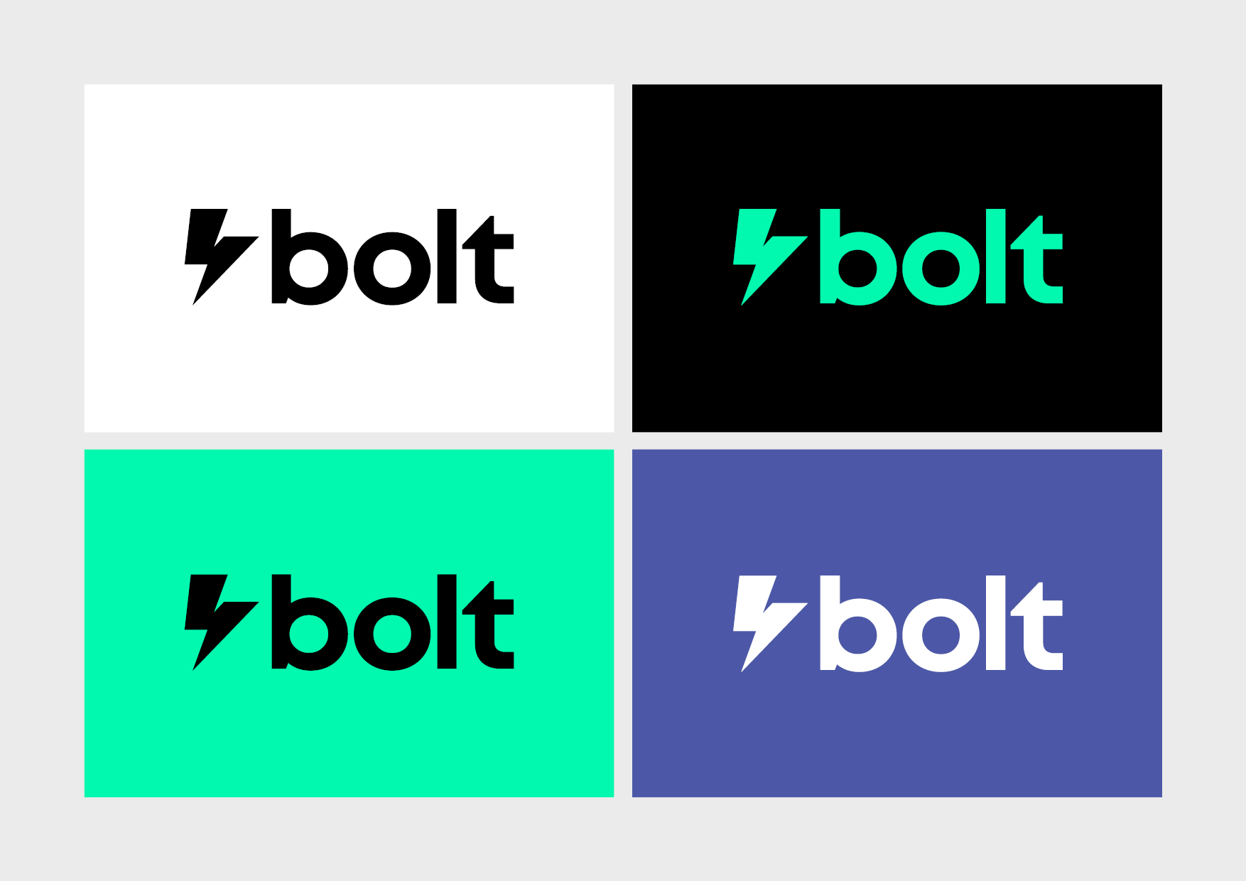
A dynamic duo
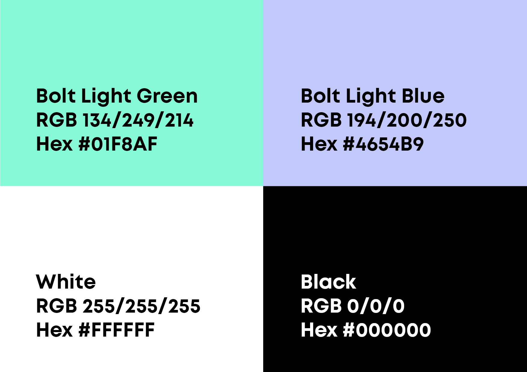
I ran several internal workshops to get consensus on the brand colours. They needed to support the brand pillars, they should not compete with our semantic RAG colours, and they needed to work within accessibility guidelines.
I also created a set of brand tints and a broad spectrum of data visualisation colours to be used across user avatars and other components.
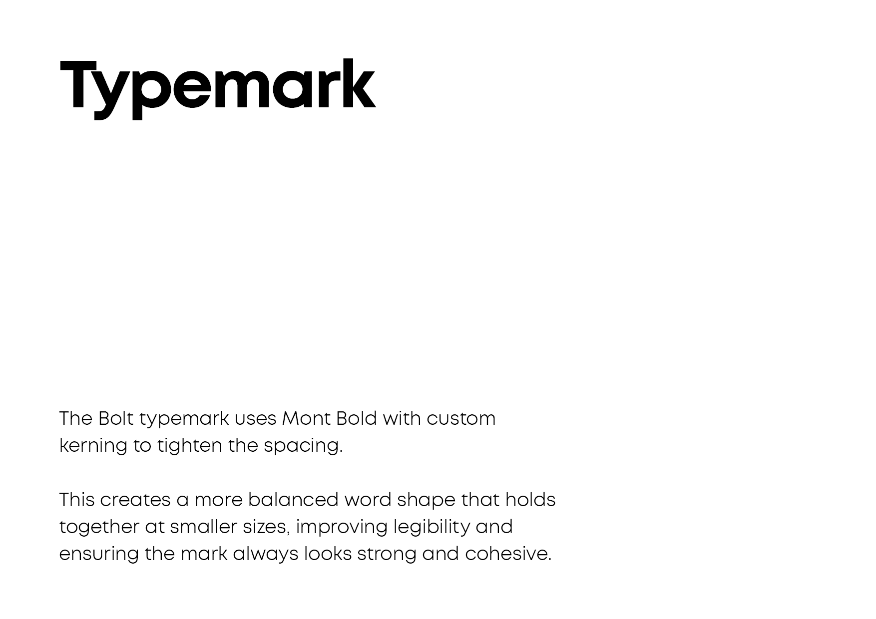
Grammatically consistent
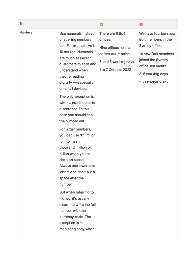
It was important to set up our brand tone of voice and grammar rules early. I created a table in confluence with all our rules, and then created a custom GPT that I could run copy through to ensure it met our guidelines.
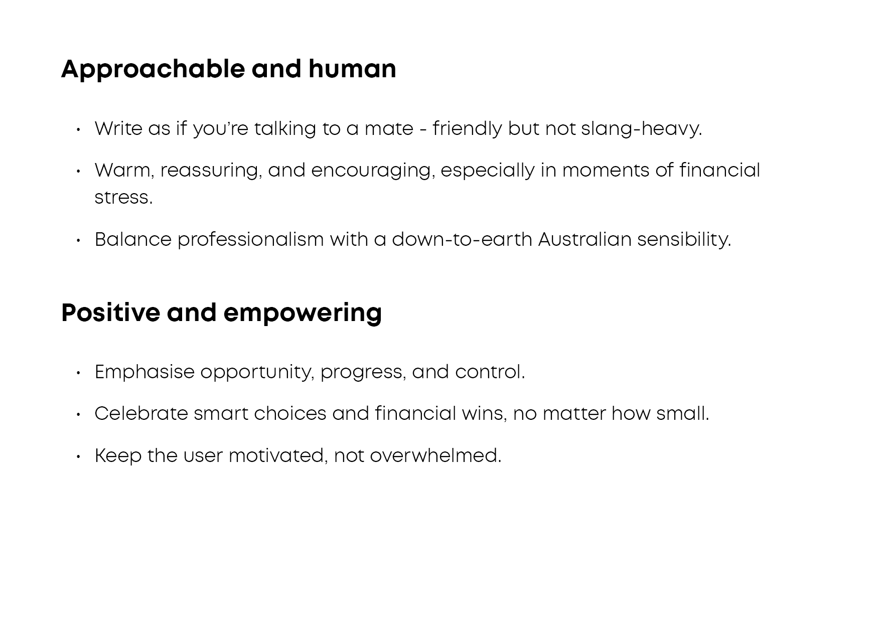
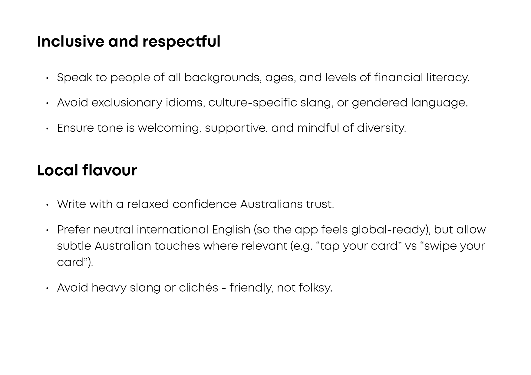
American spelling, inconsistent use of ampersands, number formatting, and overuse of the passive voice, and first vs third person all affect how users perceive a brand, and I wanted to ensure that all communications followed brand guidelines and were consistent across app, marketing, and communications.
Animation
For loading and transition screens I created a simple looping brandmark animation in Rive.
The idea was to inject a bolt of electricy into the brandmark, using a flash of the brand green. The shape also animates, contracting along the line that runs through the device.
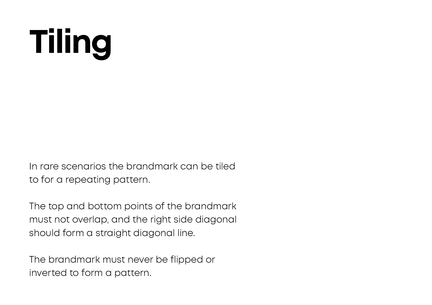
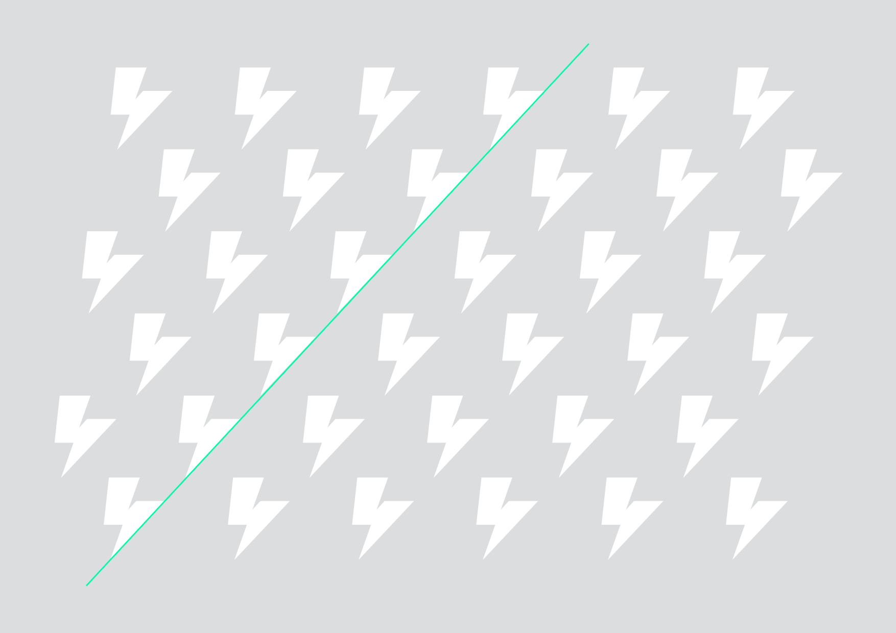
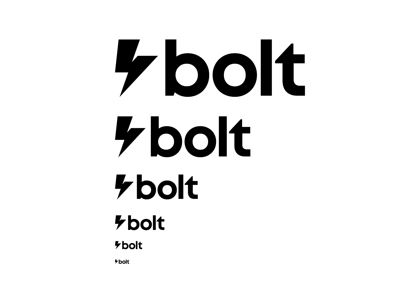
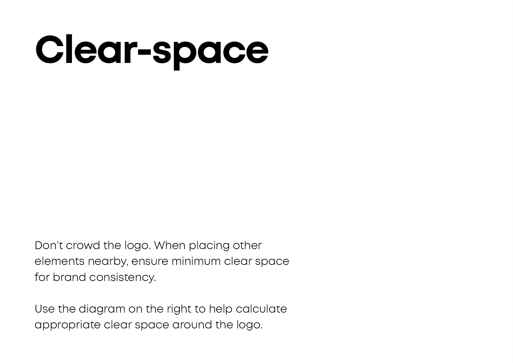
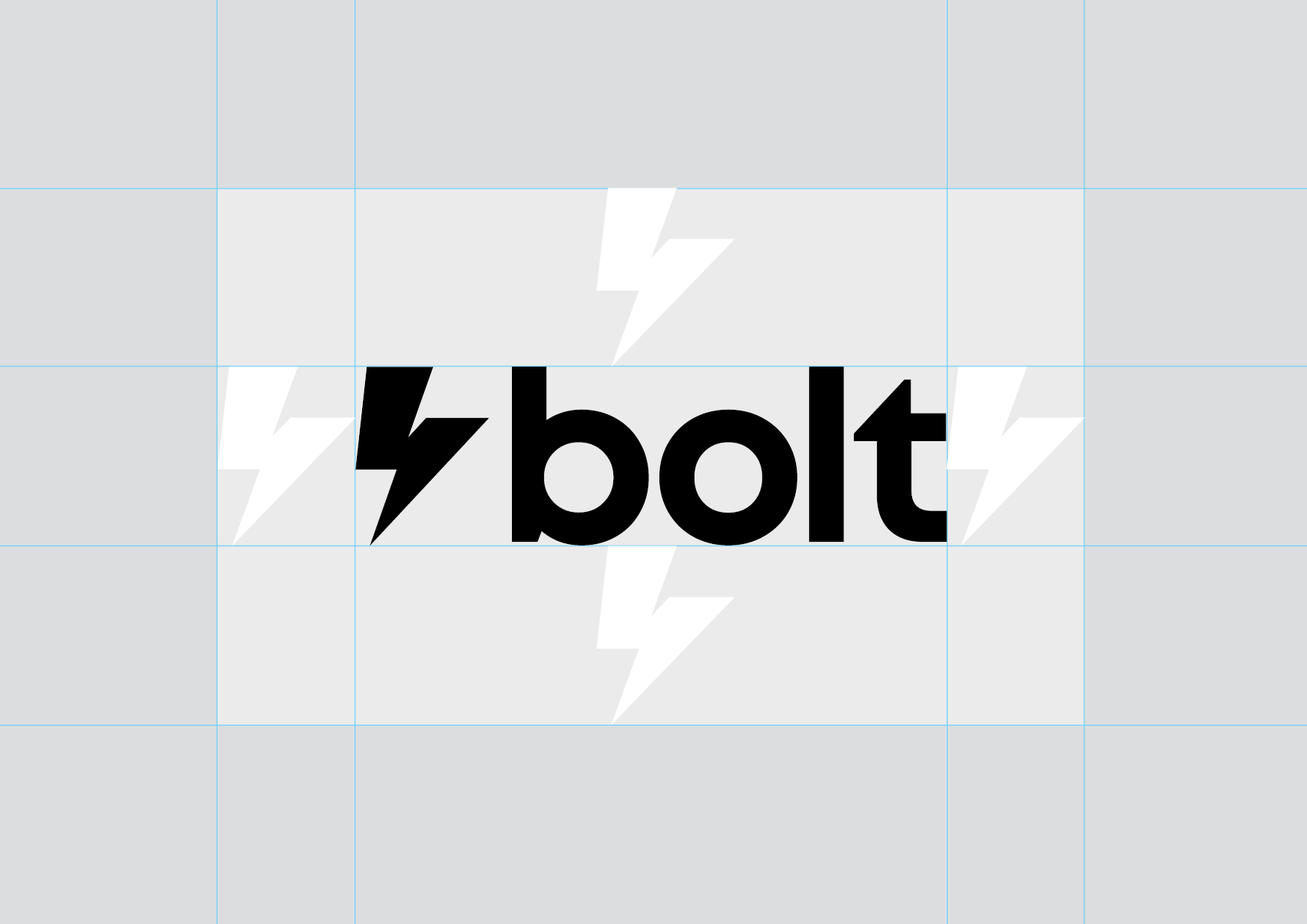
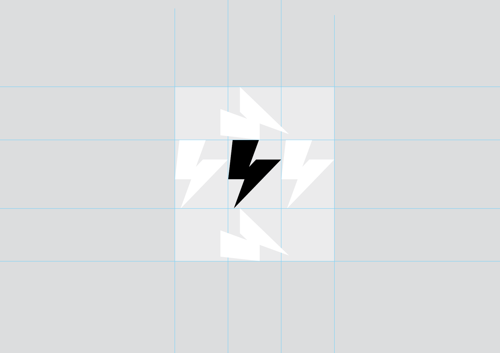
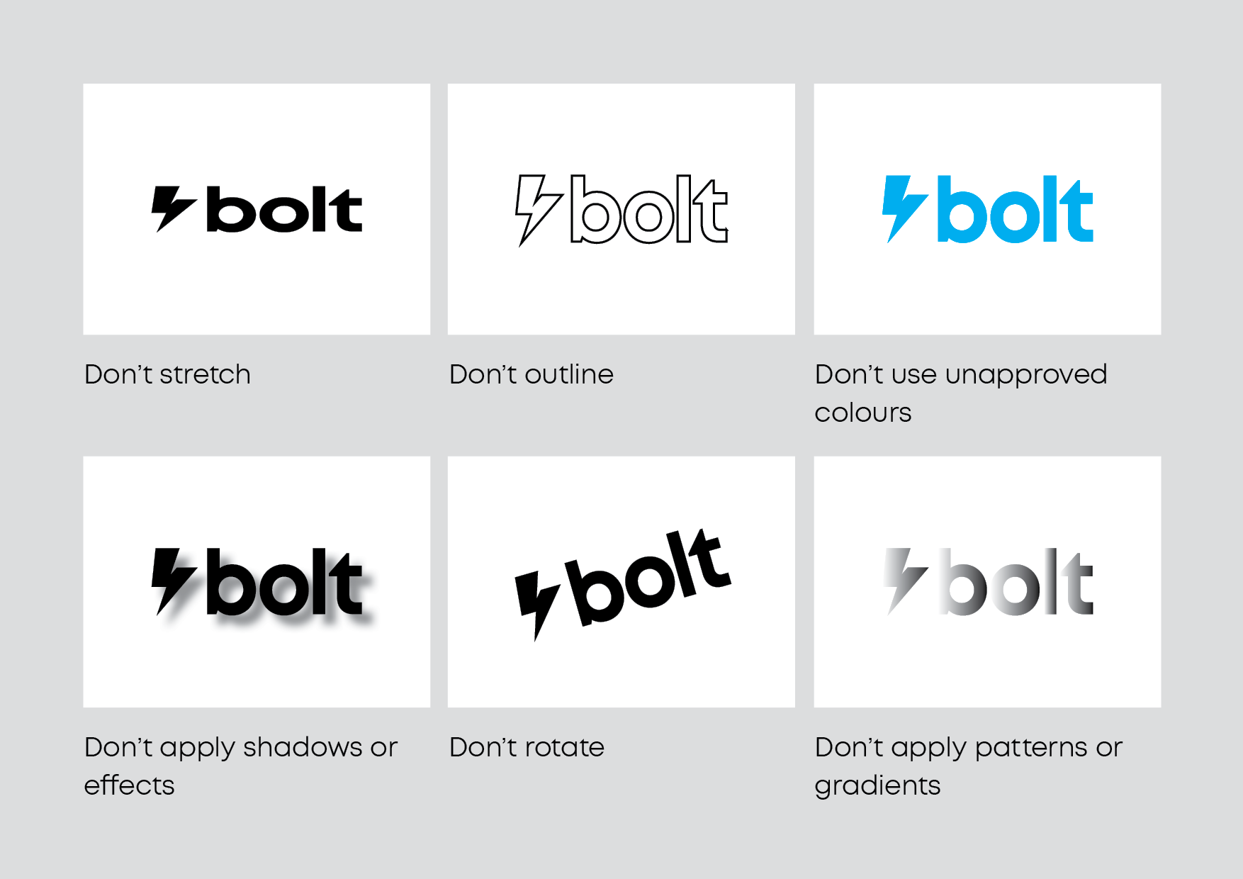
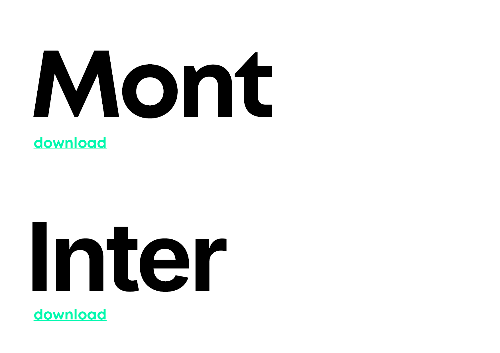
Brand guidelines
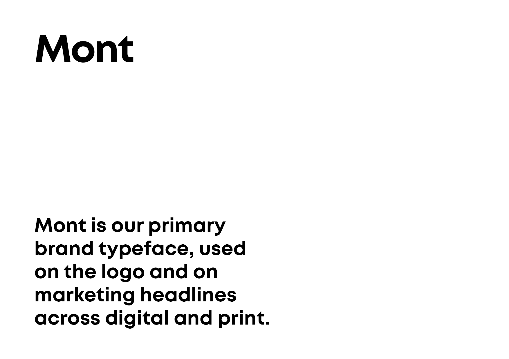
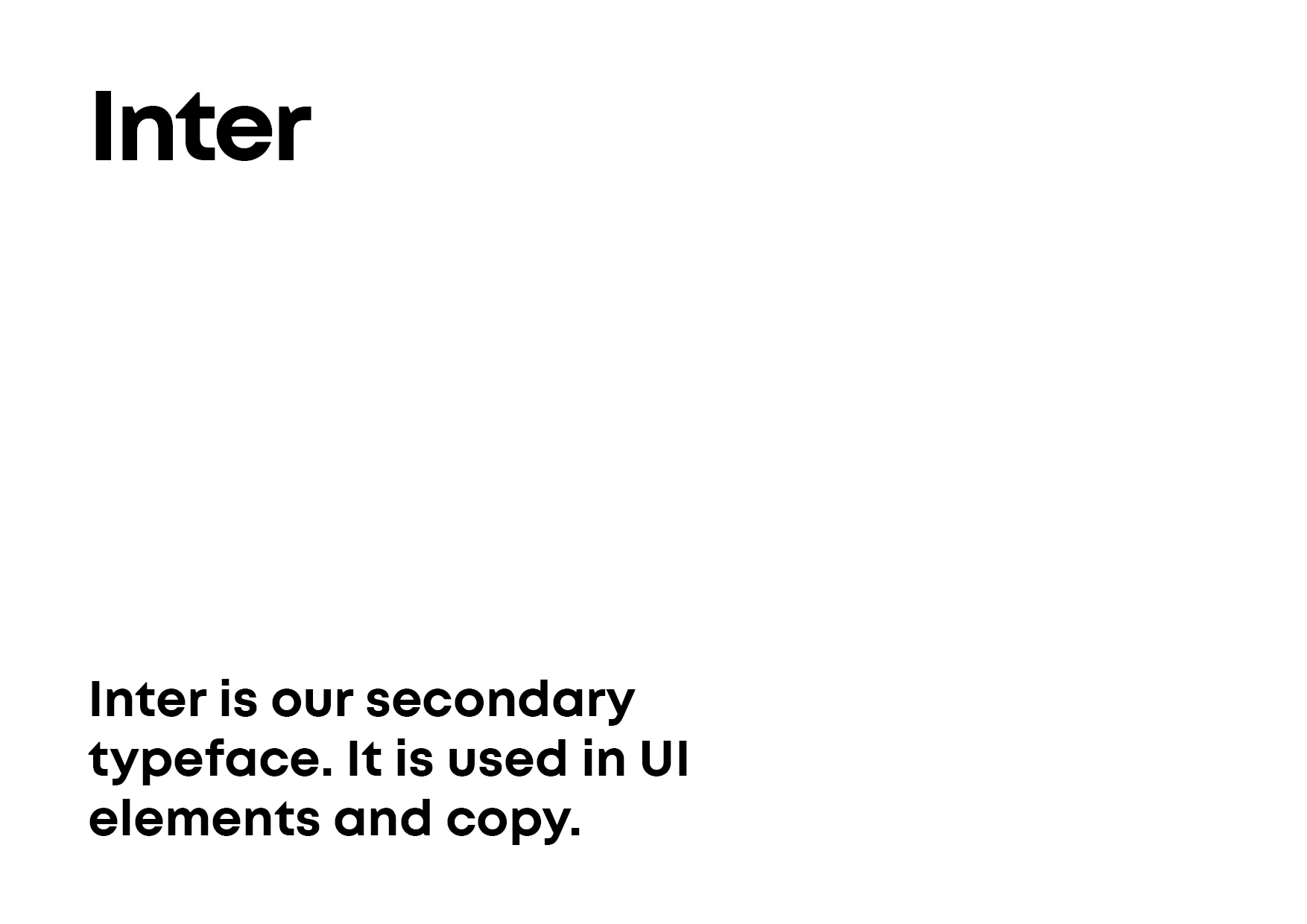
I created formal brand guidelines covering logo usage, clear space, dos and don’ts, colour application, and typography rules. I also established a scalable colour system using tokens, and a typographic hierarchy that supported accessibility, localisation, and future feature growth.
Alongside this, I designed all core marketing collateral to ensure the external brand matched the in-product experience. The goal was a single, coherent brand system that could scale with the product, be applied consistently by non-designers, and remain durable as the company grew.
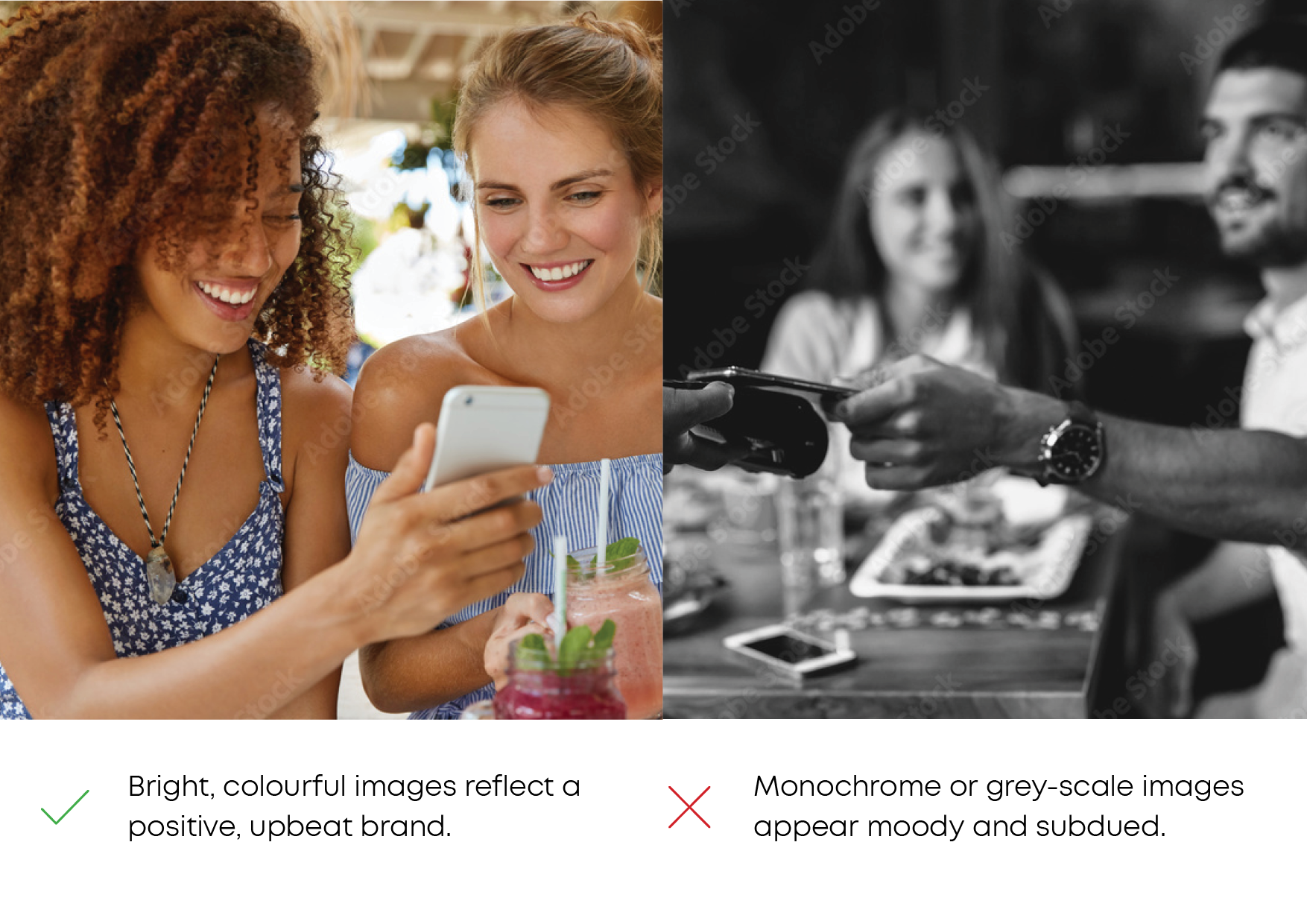
You can use the arrows to explore the brand guidelines document below.


Process
Establishing a lean process
Setting up a way to design and ship without slowing the team down.
Delivery at speed
To enable fast delivery without sacrificing quality, I established a robust but lean product design process. This covered how ideas were shaped, how decisions were documented, and how designs moved from concept to build. That process is now the foundation for how the company designs and ships new features.
- Preferring lightweight design artefacts
- Utilising AI tools throughout the process
- Running continuous, small research loops
- Working alongside engineering and product in short, iterative cycles
- Being strict about prioritisation and scope
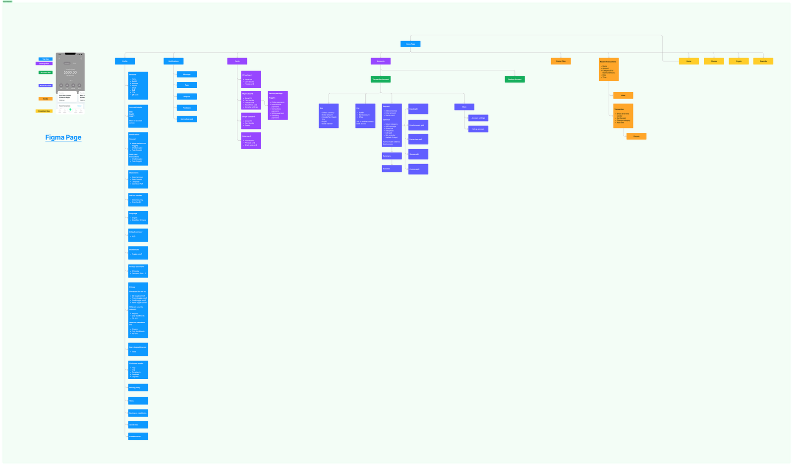
Mapping the IA to the navigation model using an early wireframe.
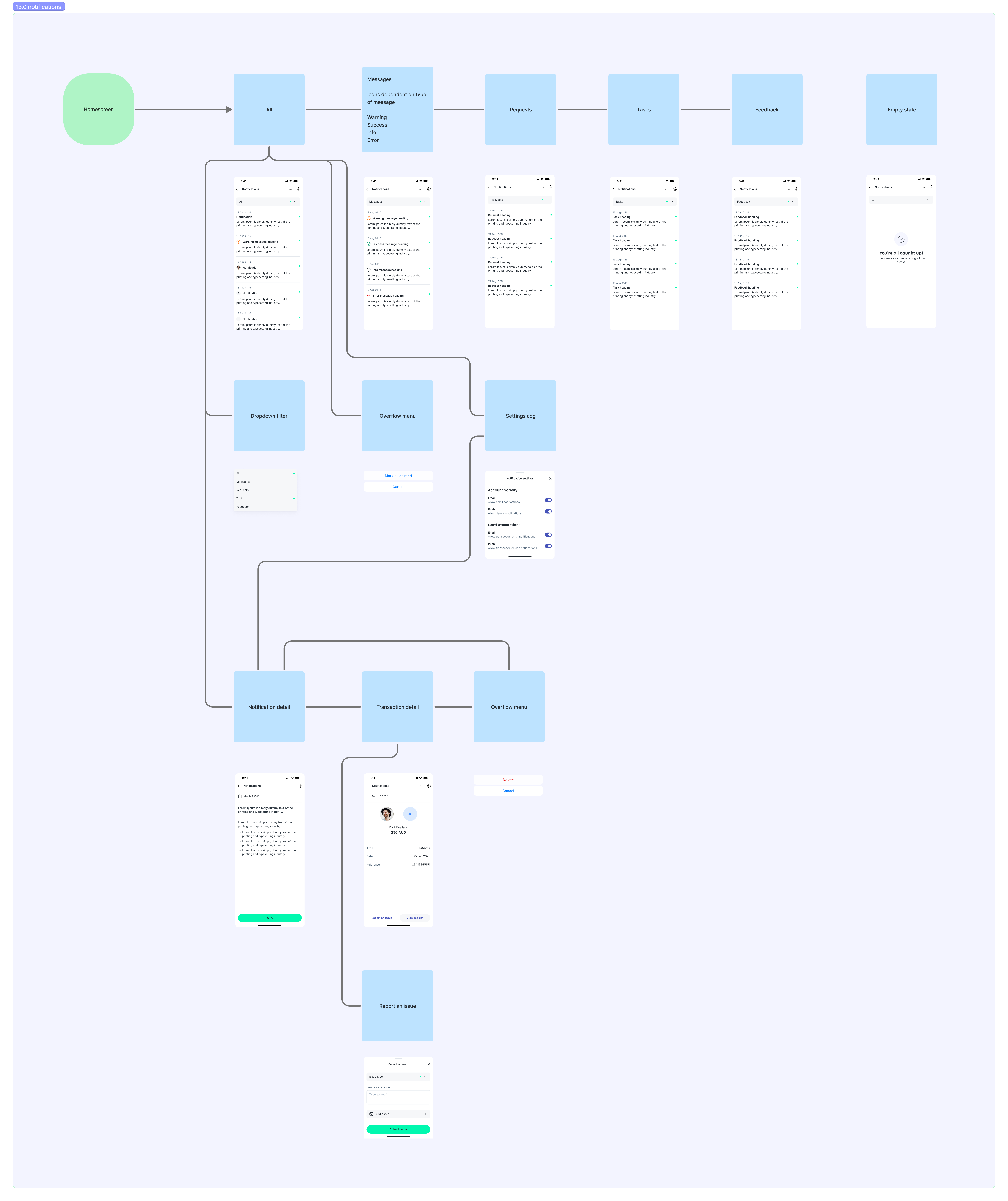
Designing the notifications system.
Priorities
I worked closely with the CEO on feature prioritisation, translating business goals into clearly scoped, deliverable features. I was also responsible for getting designs into the hands of the engineering team in China, ensuring they had the context, assets, and documentation they needed to execute confidently.
I set up and owned the delivery workflow across Confluence, FigJam, and Jira, so design, product, and engineering stayed aligned throughout.
Journey mapping
For each feature, I mapped out the end-to-end user journey with the team. For existing journeys, I focused on identifying business and user pain points, compliance risks, and areas of friction that were slowing processes or causing drop-off.
For redesigned journeys, I worked closely with compliance and engineering to make each process as streamlined as possible while still meeting regulatory obligations.
Request payment CEJ showing the various touchpoints and logic.
Ideation
Ideation is usually an ongoing process. I looked at the user and business requirements, took into account the landscape and competitor offerings, and begin exploring solutions that deliver something intuitive and scalable. How does a user navigate between accounts? How do we separate top level nav between accounts and cards (and later, shares), and inter-account navigation? Where are account settings? How do we surface the most common actions? How do we prioritise user actions, and where do less frequent actions sit?
All the research, workshops, and feature prioritisation came into play here, and I constantly referenced my findings in Confluence and Figjam to ensure nothing was overlooked. The user stories become feature definitions, journeys become flows, and I began to flesh out the interaction language and mental model, ensuring there is consistency across journeys to ensure every user task is learnable and familiar.
This phase is also where AI can be very useful for generating initial proof of concepts. It is good at designing hierachy, at getting features into a screen to spark discussion, and for rapid, iterative improvements. I generally use Claude.ai for these prototypes, preferring ChatGPT for more text-based work such as synthesising research and documentation.
Early landing screen and FX wireframes.
Prototyping
I used Figma to prototype all features for usability testing. For more complex features, like bill splitting, I worked directly with the engineers to build an in-app version. Although this could probably be achieved in Figma using variables, it's not a good use of time in a lean environment.
By working with the engineers on the feature for testing held foster a shared understanding of how the feature worked, and allowed fast deployment once testing was completed. Using real numbers for features like bill splitting is crucial for user testing, and is the only way to gather genuine insights.
A Figma prototype showing connections and signposting for viewers.
Continuous feedback
As part of handover, and to support anyone not familiar with Figma, I always signpost interactive prototypes and include clear guidance on how to use them. This makes it easy for anyone across the team to explore flows and interactions without needing design tooling knowledge.
The more people who can review a flow or feature, the better the feedback. Some of the most useful insights come from fresh eyes, and good ideas aren’t limited to designers. Making this kind of access frictionless, alongside regular design jams, was key to building a genuinely collaborative, design-led way of working.
Collaboration and delivery
Throughout the project, I ran regular design jams with the wider team, deliberately bringing engineers and key stakeholders into the process early. These sessions helped surface insights and concerns before designs were locked in, reduced surprises later in delivery, and gave engineering clear context around upcoming features and decisions.
I treat engineers working on UI and interaction as part of the creative team, not just brick-layers. They bring valuable perspective on patterns, libraries, and technical constraints, and involving them early allowed us to resolve misunderstandings quickly and improve the quality of the final implementation. This approach made collaboration smoother, delivery more predictable, and the engineering team more invested in the product as a whole.
Feature
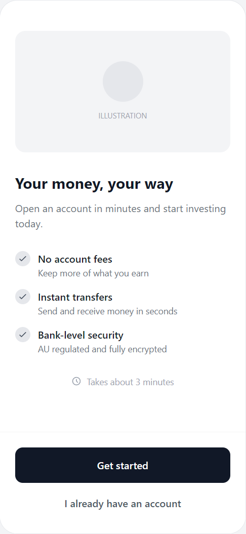
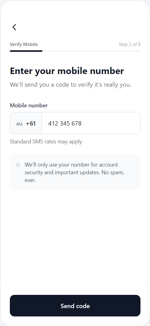
01. Onboarding
Navigating the regulatory landscape
Balancing act
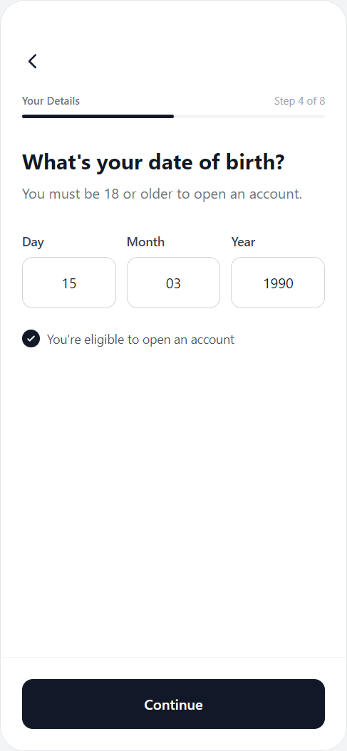
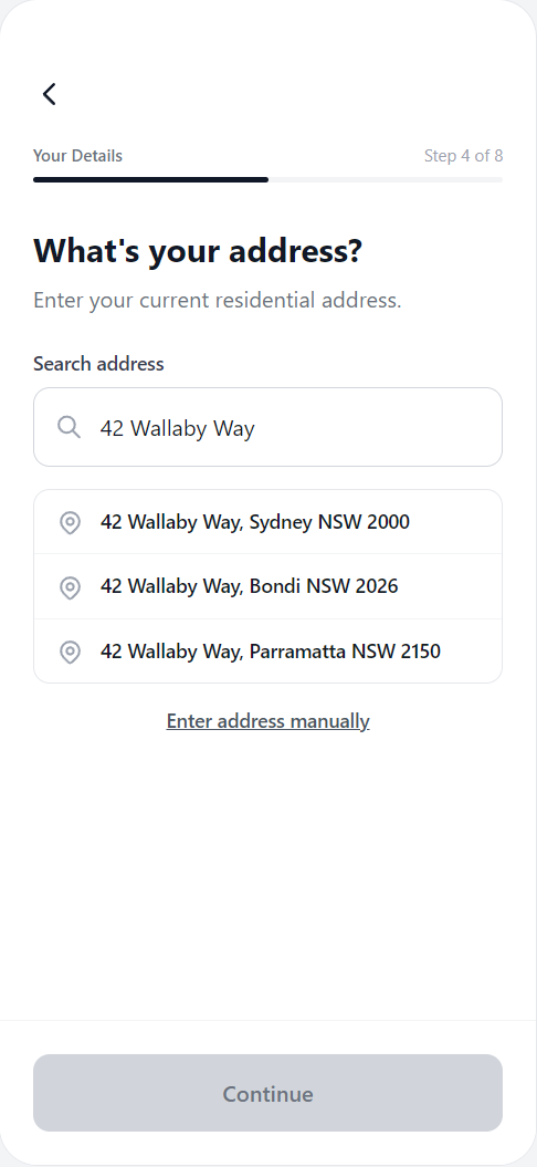
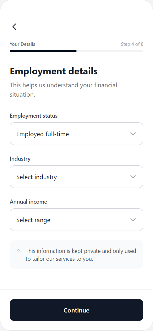
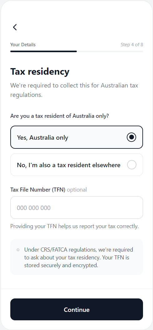
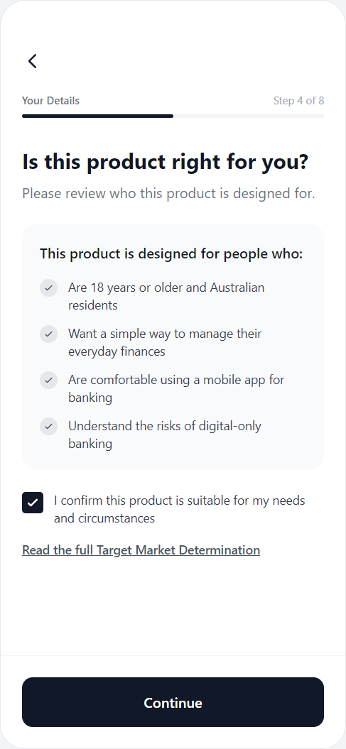
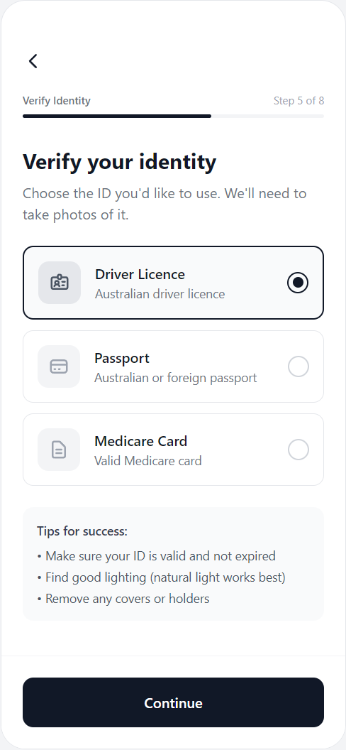
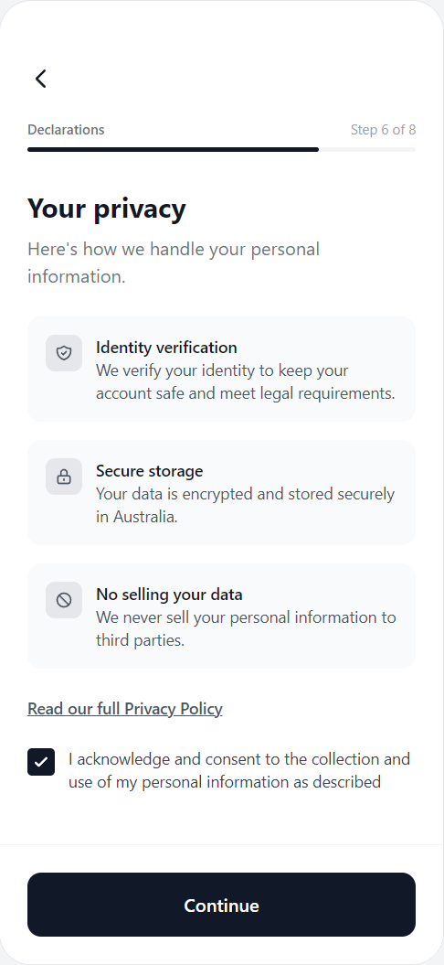
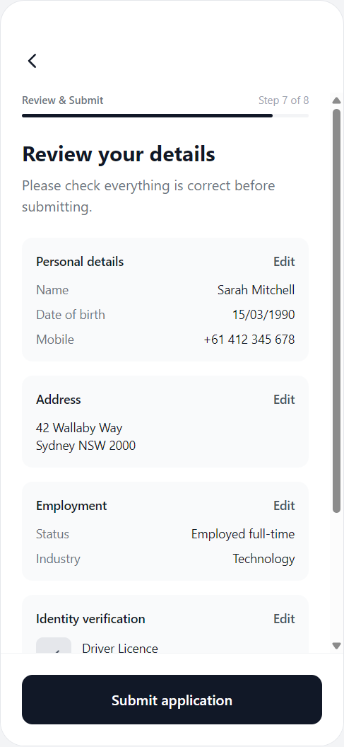
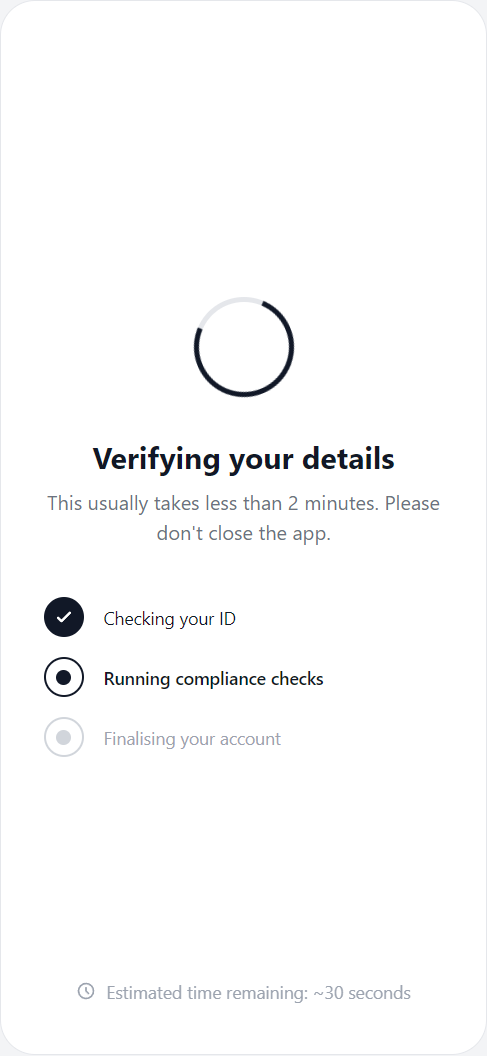
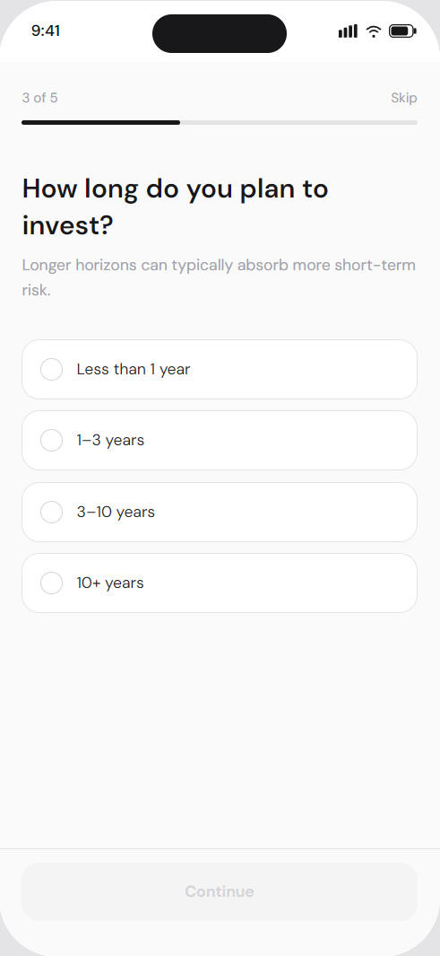
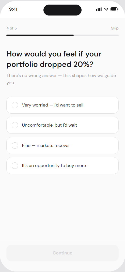
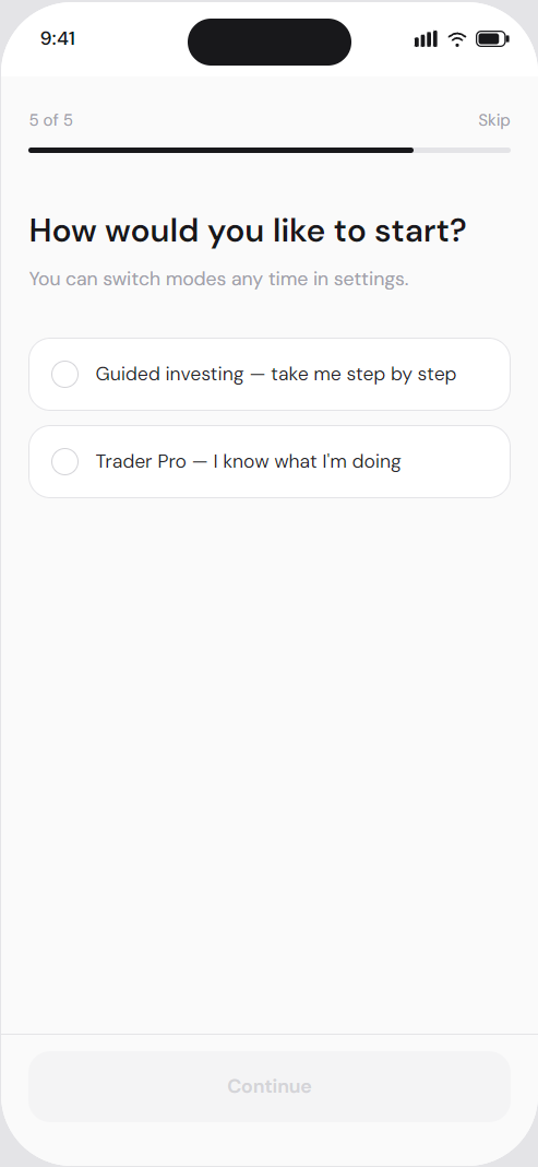
Designing fintech onboarding in Australia means balancing two competing forces: regulatory compliance and user drop-off.
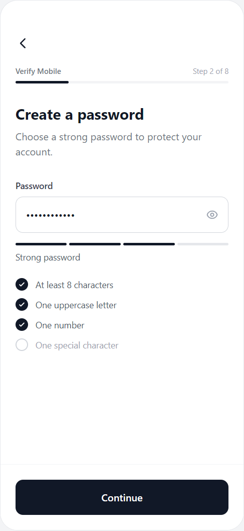
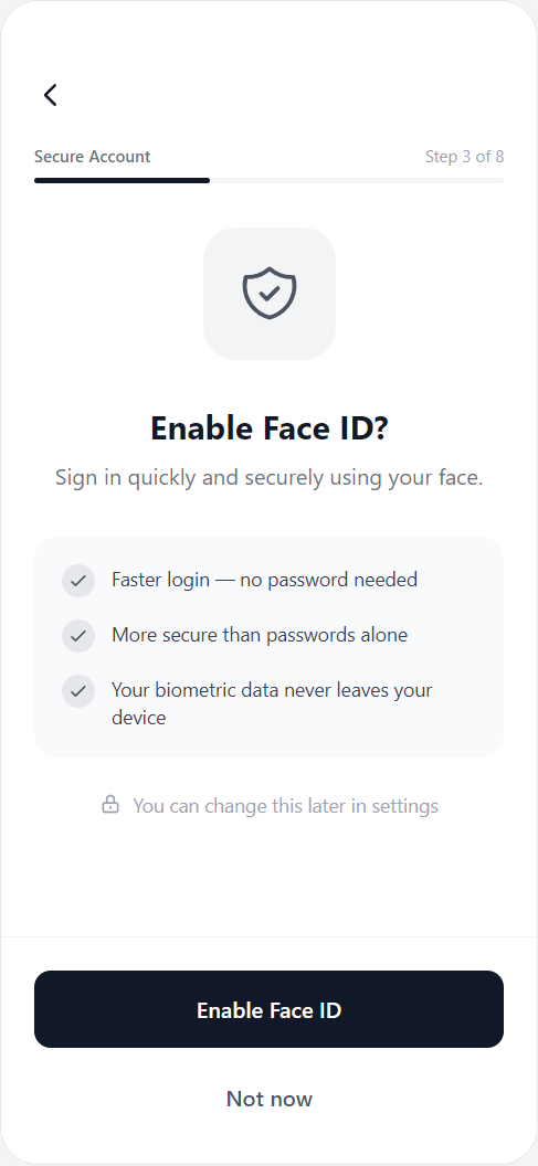
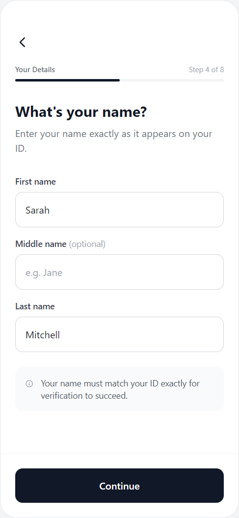
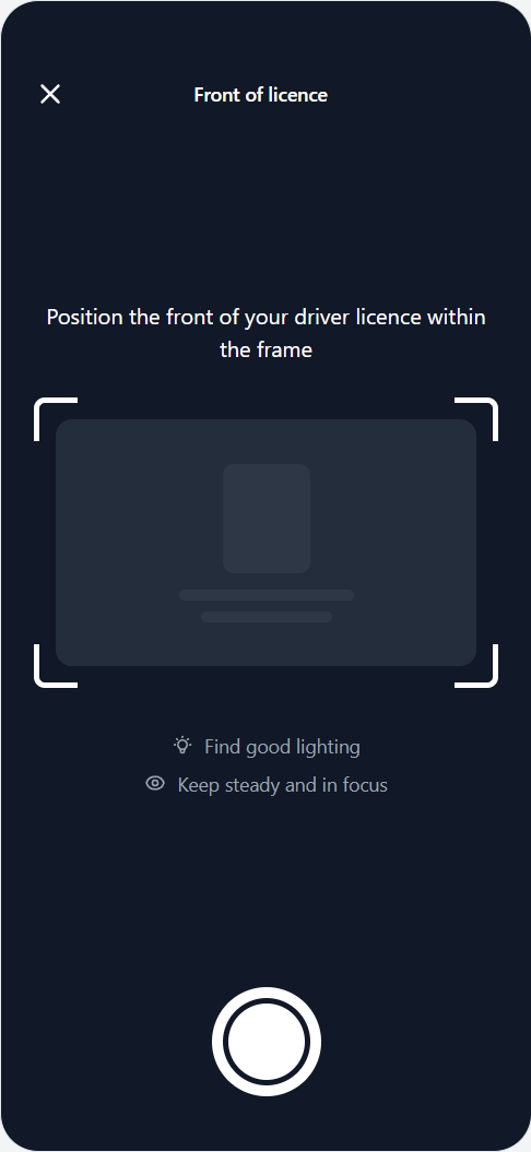
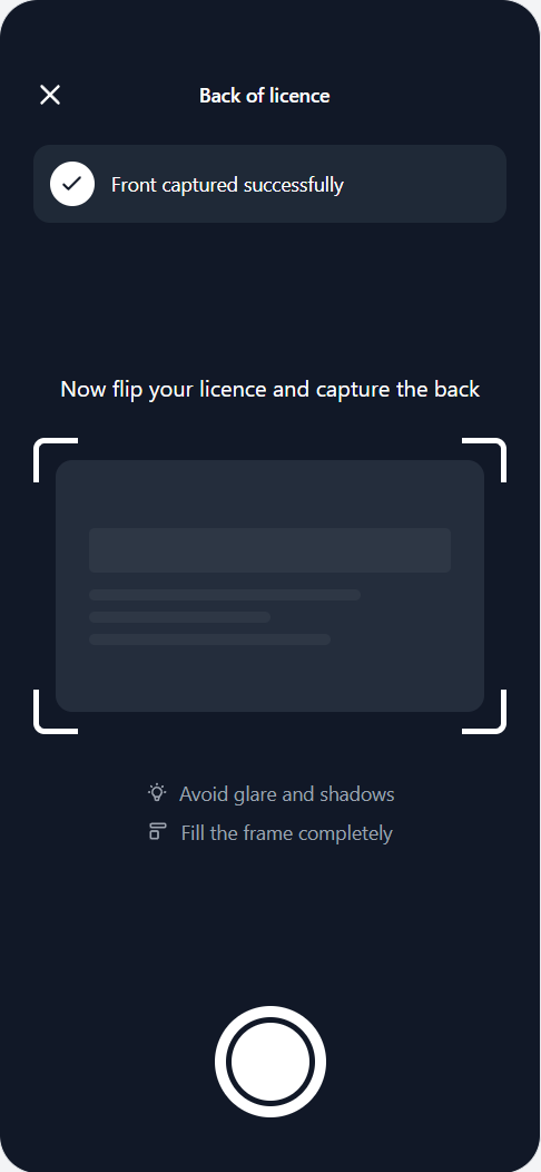
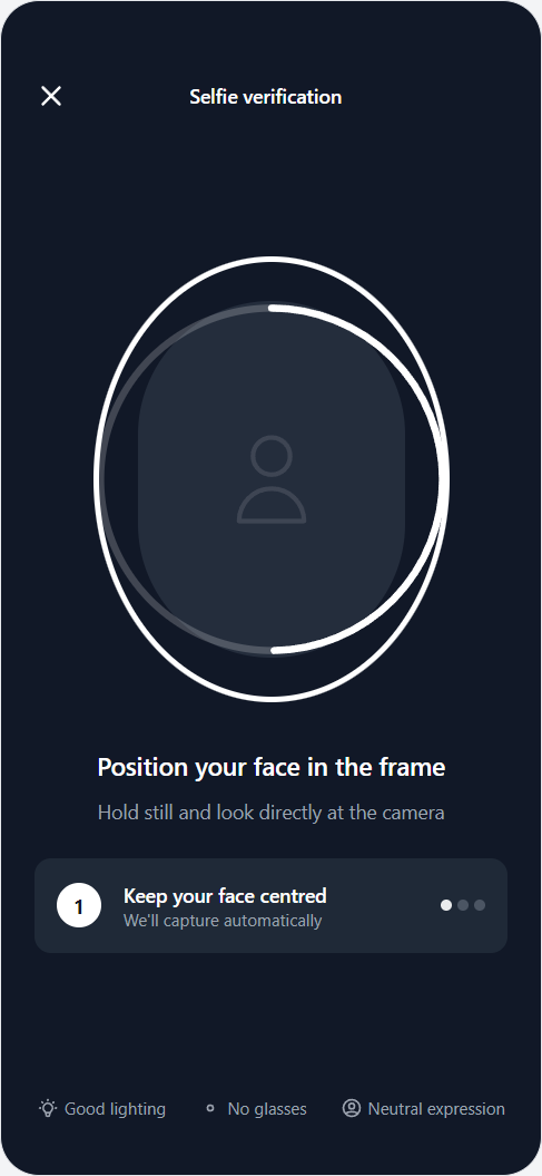
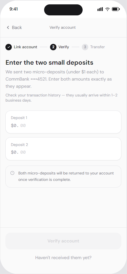
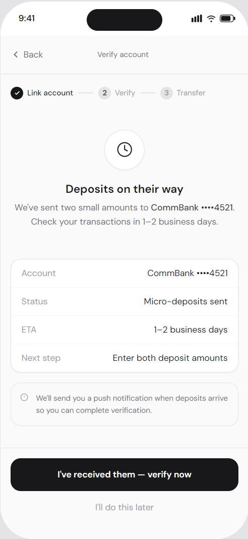
Users need to verify their identity, complete legal declarations, and pass AML checks before they can access the product. At the same time, they expect the process to feel easy and painless. I utilised behavioural design and chunking to create a simple, engaging flow that never feels overwhelming.
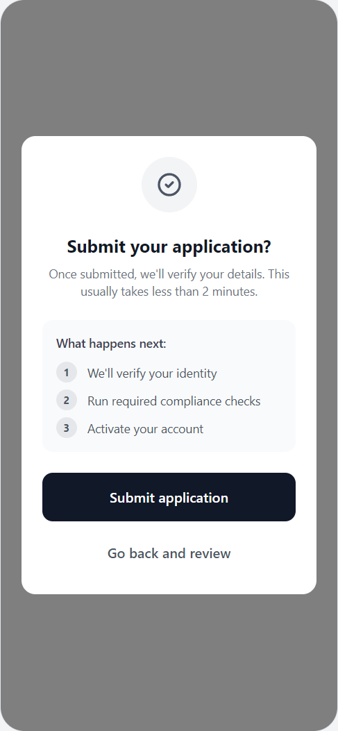
One early decision was to allow users to access the app before full identity verification was complete. They could explore features, but any action involving the movement or storage of money was locked until KYC checks were finished. This approach was designed in partnership with compliance and aligned to our AML/CTF program. It allowed users to experience the product early, which reduced initial drop-off and premature churn, while still managing regulatory risk.
Onboarding CEJ showing system and compliance swimlanes.
Compliance and user needs
I mapped the full Customer Experience Journey vertically, aligning:
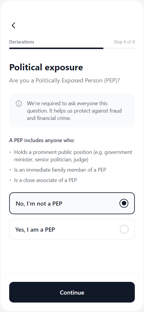
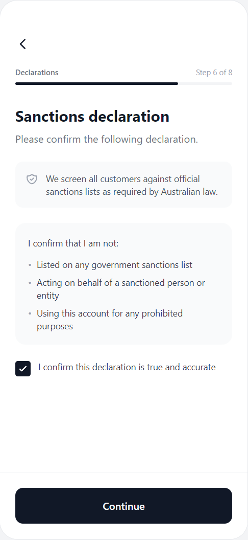
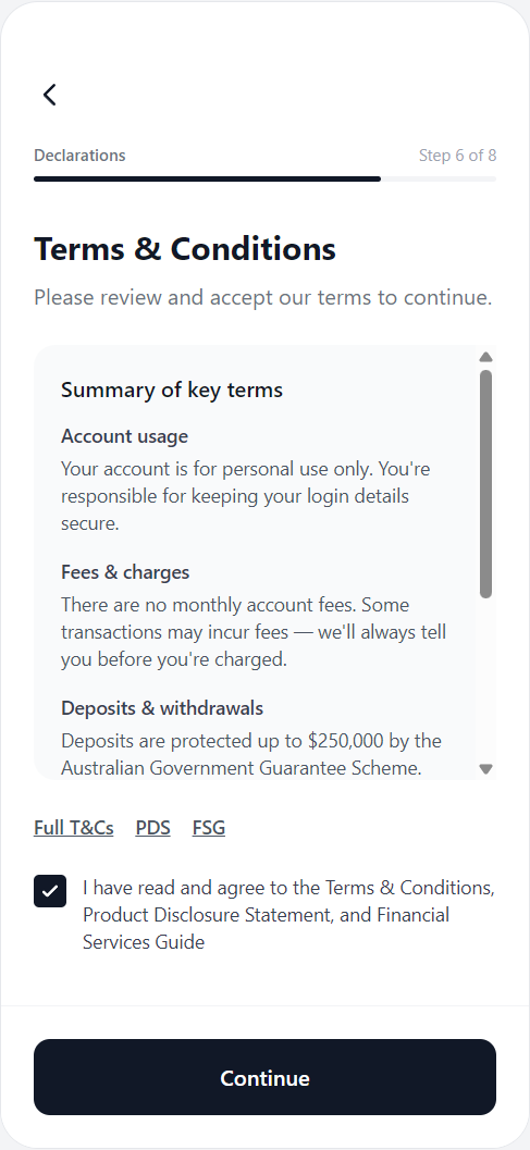
- Regulatory requirements (KYC, AML, PEP, sanctions, TMD, privacy)
- System touchpoints (IDV, OCR, liveness, screening)
- User emotions and pain points
- Activation opportunities
Instead of treating compliance as a checklist, I treated it as a behavioural journey.
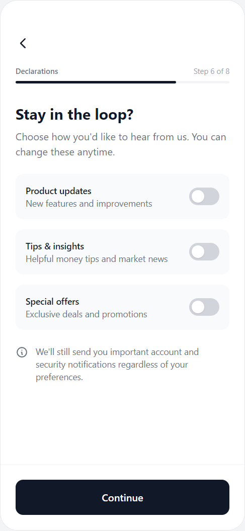
Key decisions:
- Chunking the flow into single-purpose screens to reduce cognitive load.
- Adding plain-English explanations to sensitive questions (PEP, sanctions).
- Introducing progress indicators to reduce abandonment.
- Designing clear recovery paths for ID errors, OTP failures, and manual review.
- Using the moment of approval as the trigger for activation (deposit).
Designing the experience
Reduce friction
One question per screen removes the overwhelm of a long form. Users only see what's needed at each step.
One primary action per screen
A single Continue button per question eliminates decision paralysis and keeps momentum through the flow.
Inline validation
Answers are acknowledged immediately on selection, giving users confidence they're progressing correctly.
Familiar patterns
Large tap targets and single-select question cards mirror native mobile patterns users already know.
Progressive disclosure
Personal and financial questions appear in order of sensitivity - basic experience first, risk tolerance last.
Build trust
"Why we ask this" micro-copy appears beneath sensitive questions, framing data collection as being in the user's interest.
Security cues
Encryption and regulatory references appear at the point of data entry, not buried in a terms screen.
Calm, neutral tone
Question copy avoids financial jargon and alarming language - written to feel like a conversation, not a compliance form.
Minimal legal overwhelm
Required disclosures are acknowledged with a single tap rather than presented as walls of text.
Drive activation
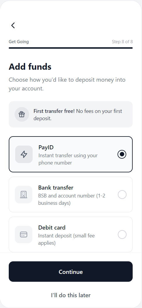
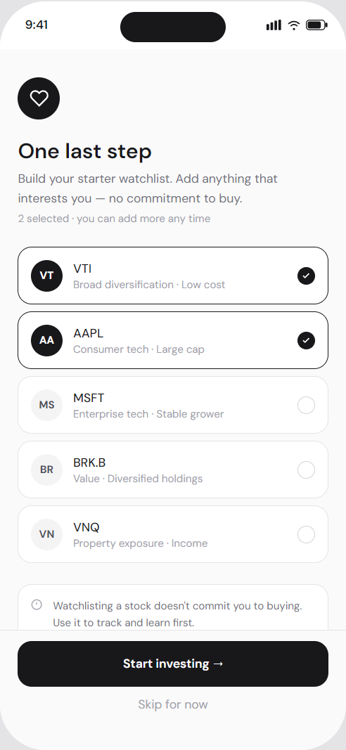
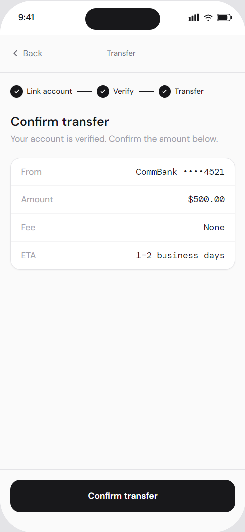
Onboarding doesn't end at "You're verified." A prompt to add funds is introduced immediately, leveraging three effects in combination: the Goal Gradient Effect (users accelerate near completion), the Peak-End Rule (the approval moment is the emotional high point), and Commitment and Consistency (effort already invested makes the next step feel like a natural continuation).
Get started
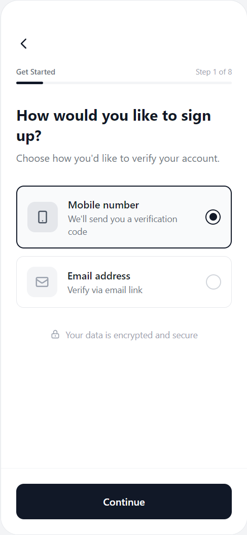

Verify mobile
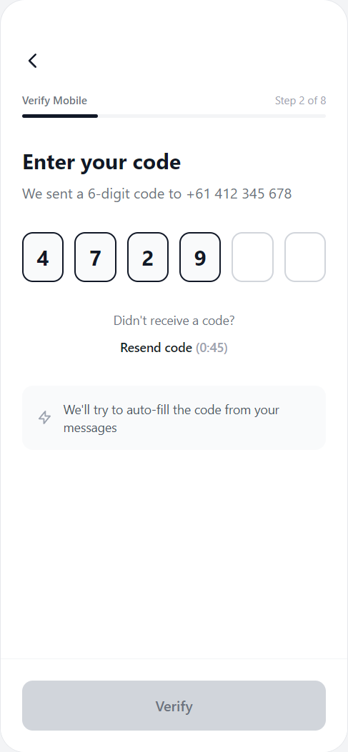
Secure account
Details
Verify identity
Declarations
Review & submit
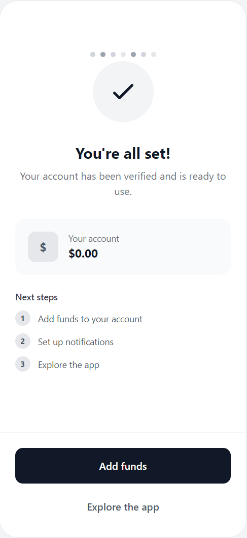
Activation
Feature
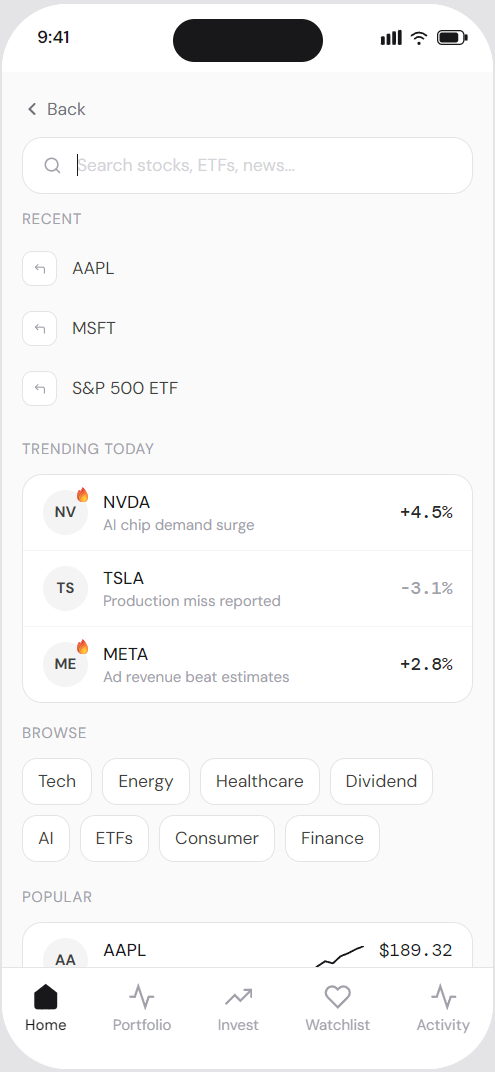
02. Home screen
Designing a clear starting point that could scale over time.
Home as a feed
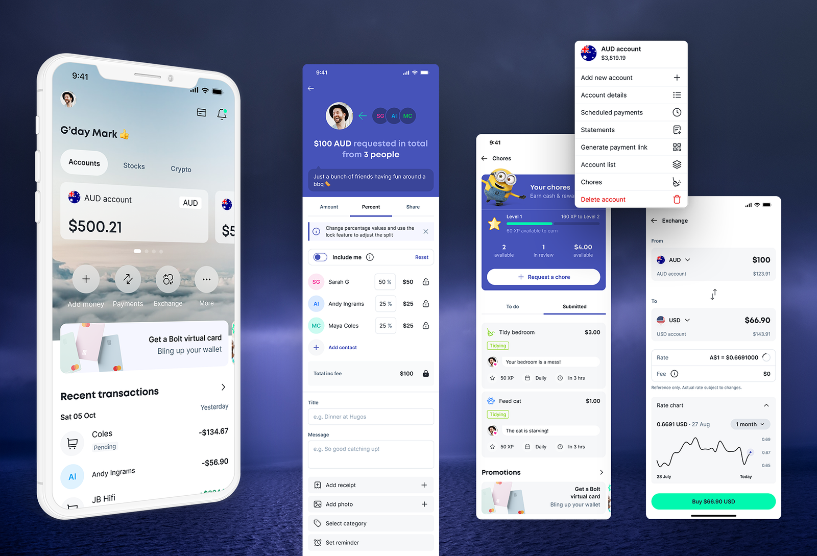
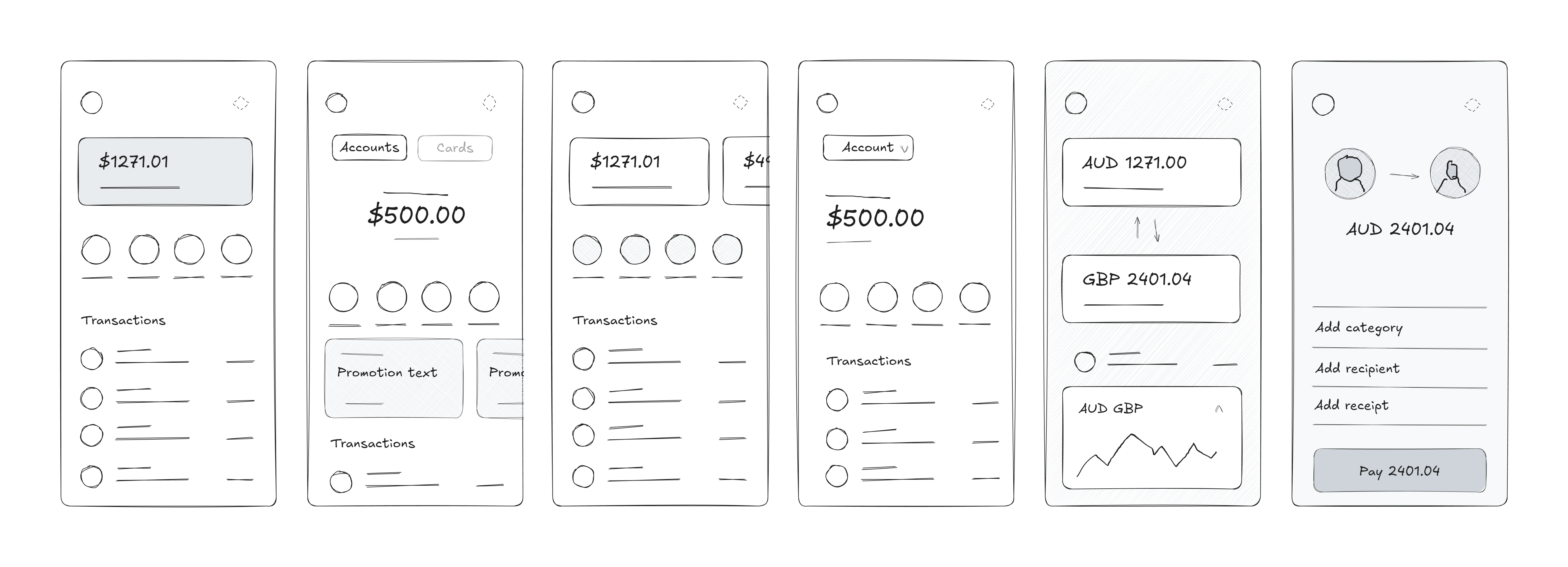
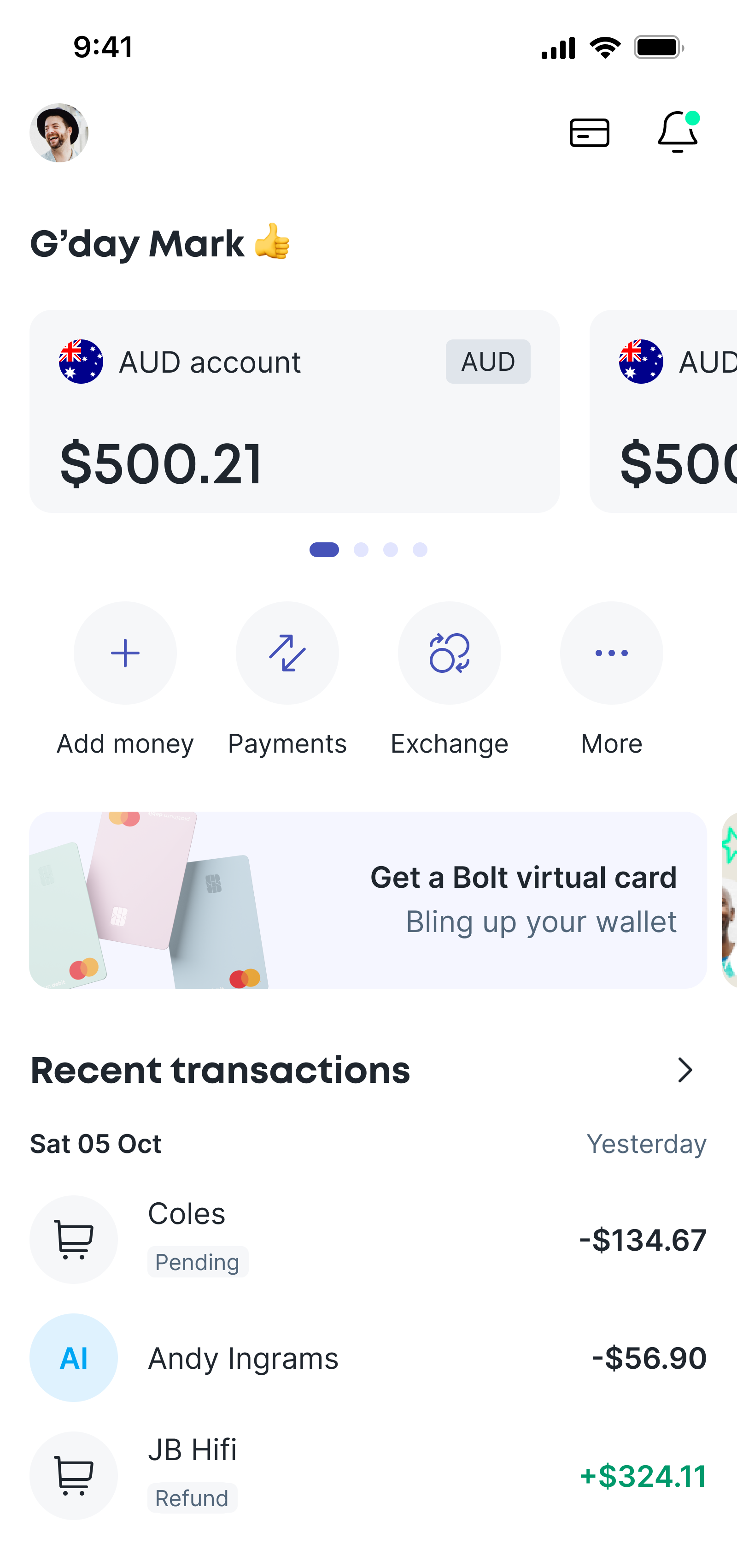
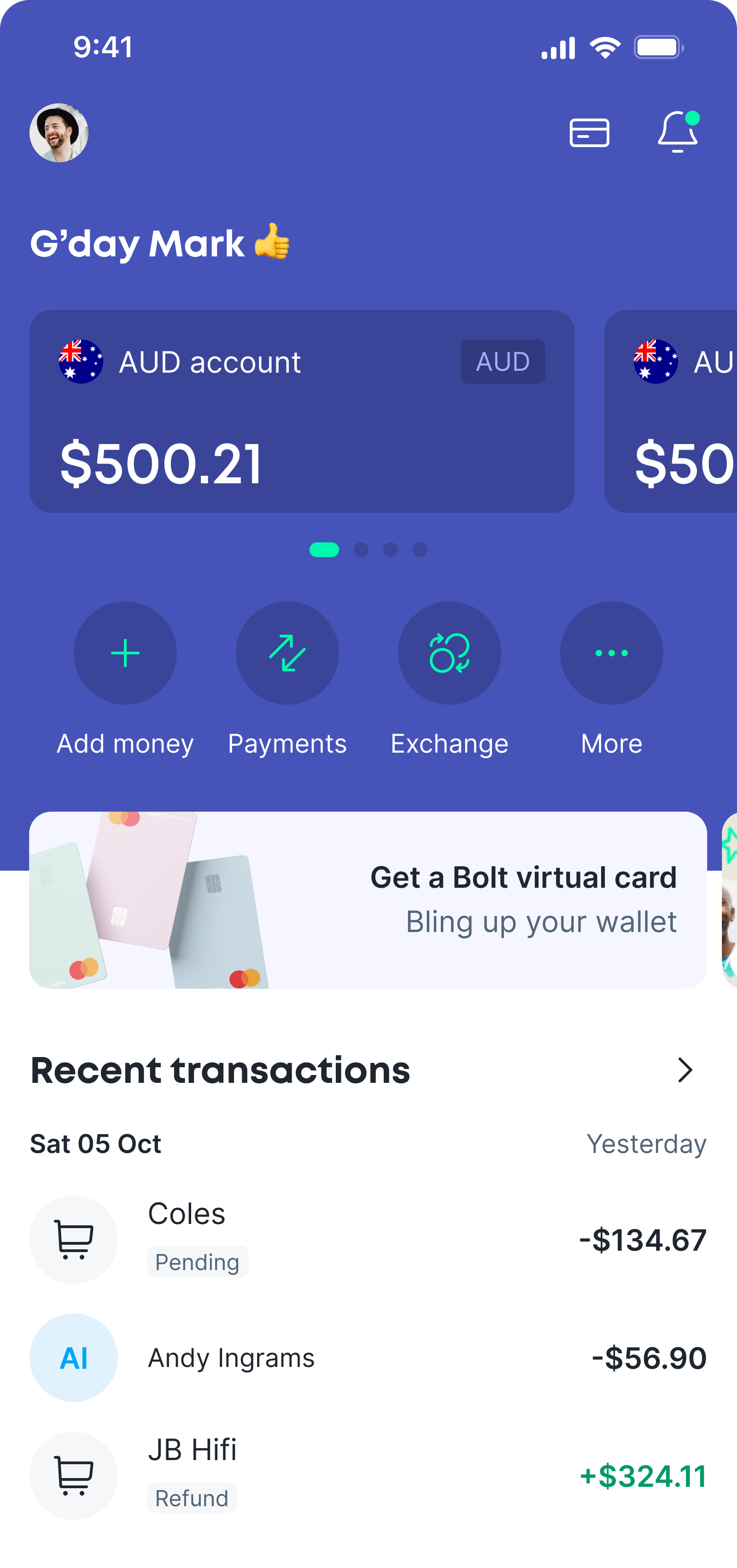
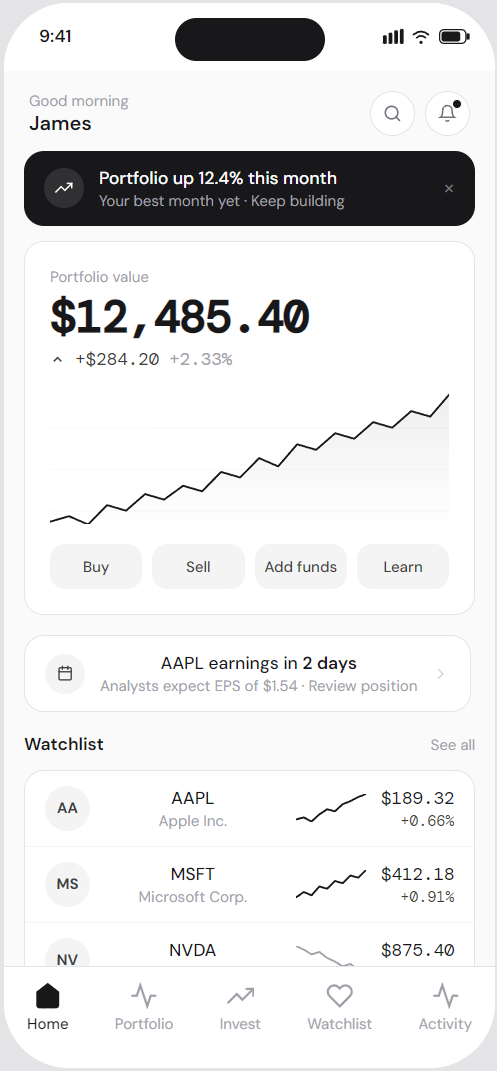
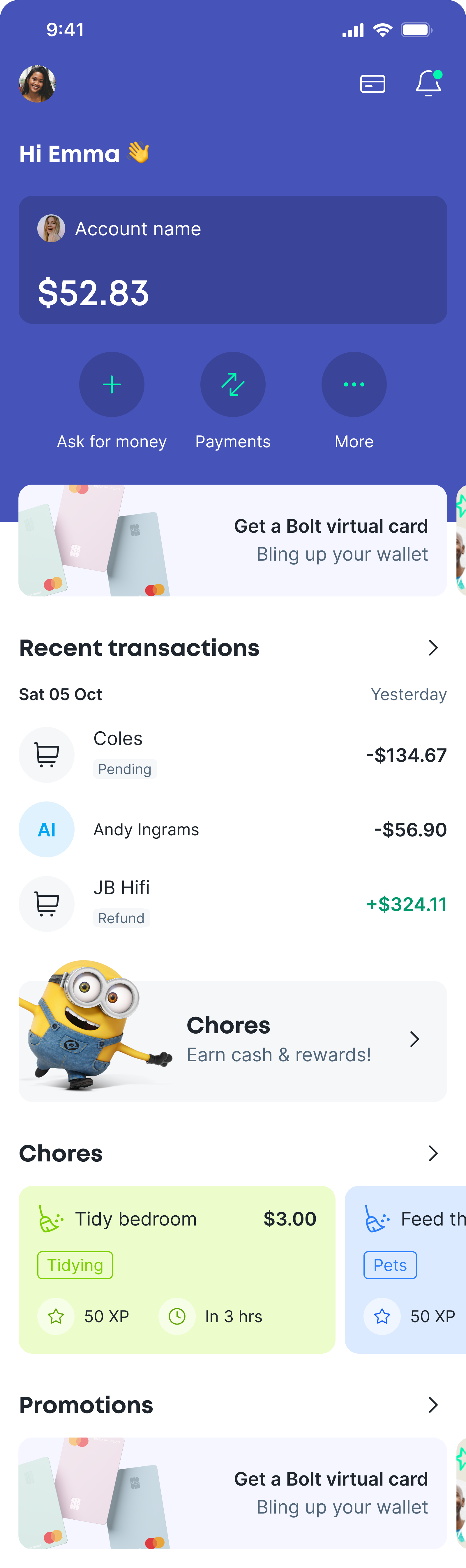
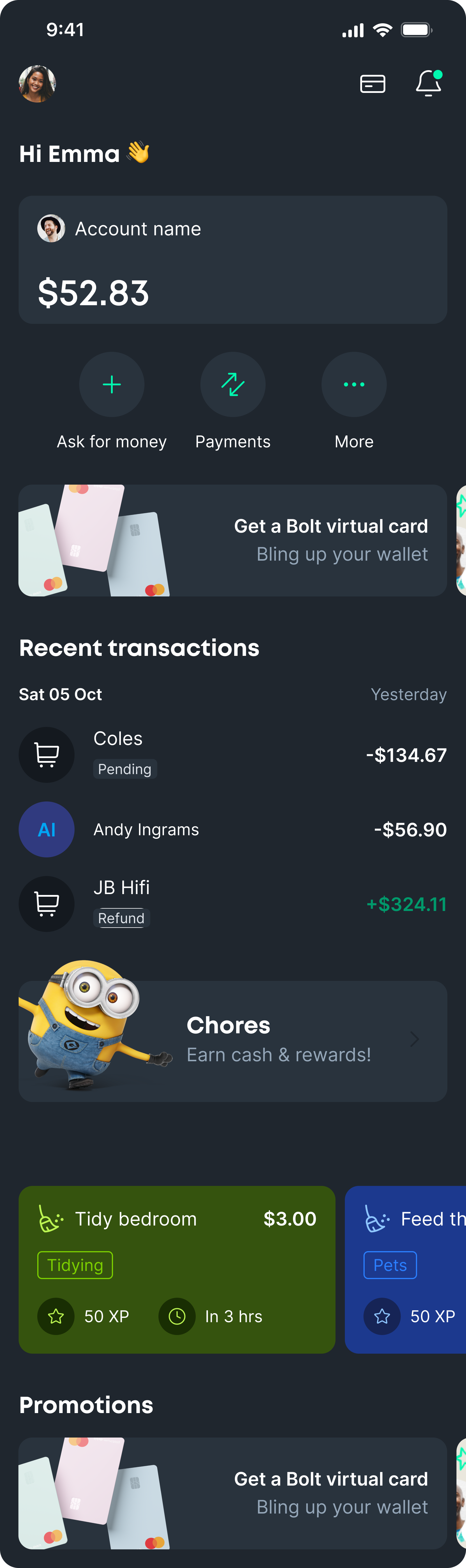
The home screen was designed to give users a quick and easy overview of their balances, recent activity, and any outstanding obligations, with direct access to the most common account actions. The aim was to help users understand what’s going on, and whether anything needs attention, within a few seconds of opening the app, without navigating or scanning multiple screens.
I designed the home screen as a hybrid of an account dashboard and a dynamic feed. The account area at the top provides a consistent snapshot of balances and primary actions, so users always know where they stand the moment they open the app, with key actions kept in persistent positions.
Below that, a feed-style layout adapts to the user’s current situation. Requests, group activity, chores, and tasks surface when they’re relevant, keeping the focus on what needs action now without overwhelming the user, while allowing the rest of the screen to evolve as new features are added over time.
An early specification for the home feed.
AI ideation
I used Claude.ai to help with the ideation phase. I wrote a brief using ChatGPT with the features and specification, deliberately keeping it non-prescriptive.
The outputs, along with my research into common patterns, competitor UI, and requirements for scalability and stickiness, helped me settle on a feed direction for the home screen.
Designing scalability
I already had an idea of how I thought the dashboard should work, but there was an important heirachy to consider. At launch the user would only be able to have accounts, and make and receive payments. But future scope included shares and crypto, so I wanted to ensure that the dashboard and nav could scale to accomodate these top level features.
I added a scrollable lozenge navigation that could be implemented down the line, that could accept multiple top level features; accounts, shares, crypto, and later perhaps savings, business, loans and others as the app grew. Scalability sits at the core of any successful product design, and I always implement these solutions early to prevent difficult UI challenges later.
The other key interaction is the scrolling account carousel. I wanted to show enough of the next card that the user could see the currency and an indication of the balance, rather than the much smaller 'peek' I used in the promotional carousels. Since the user can rename the account and change the avatar, there is also a small currency badge that sits in the top right corner of each card.
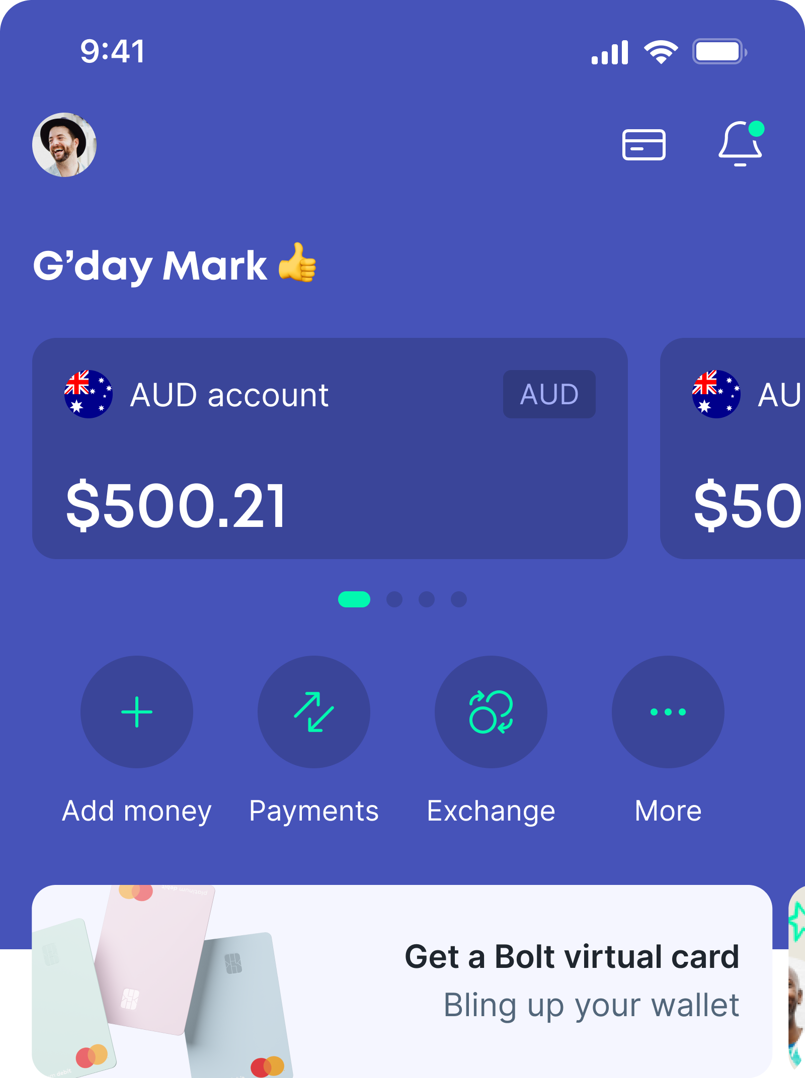
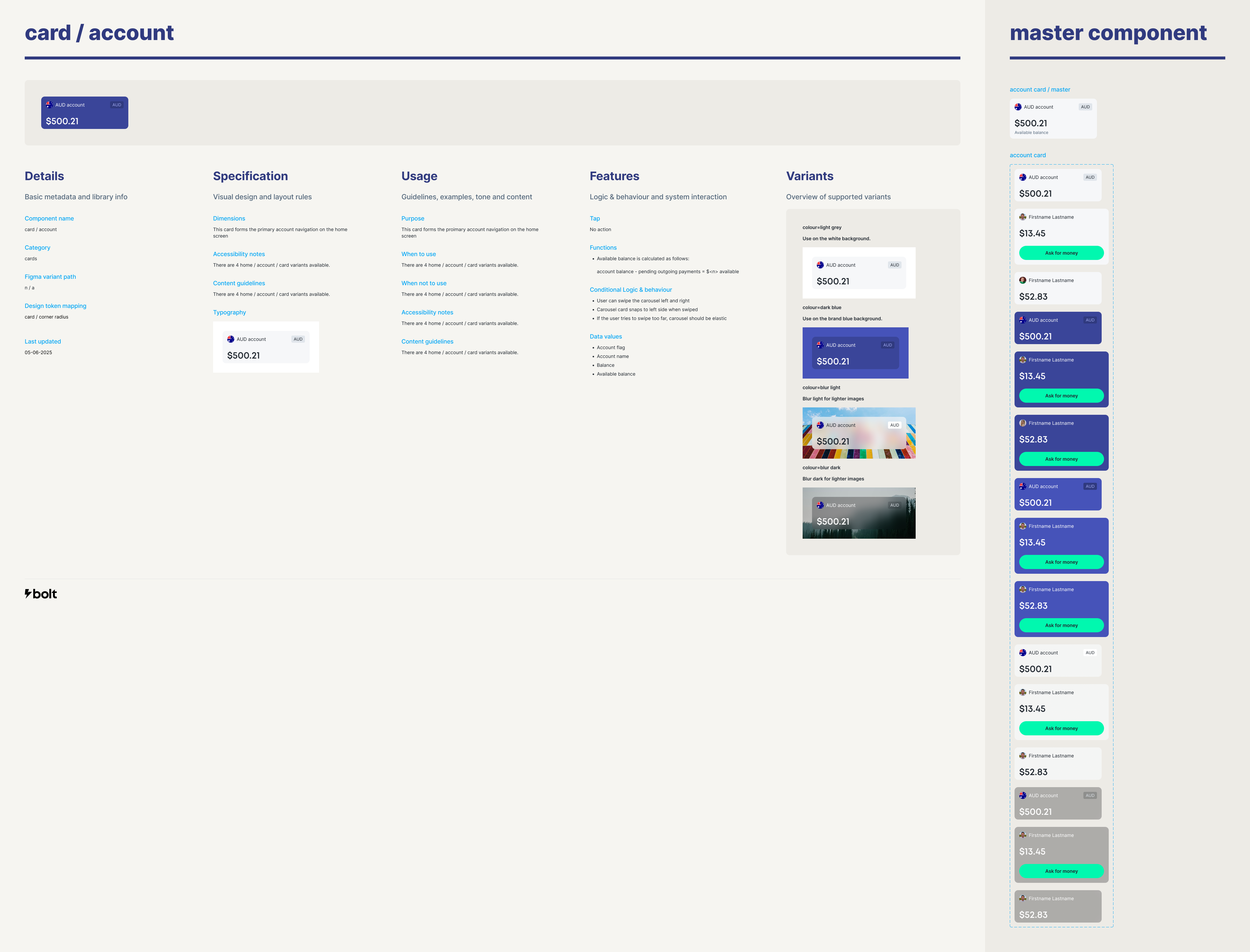
Account dashboard
The account dashboard's purpose is to let users check balances and move between accounts quickly, with as little friction as possible. The goal was to make the current state of their money obvious at a glance, and surface the most common tasks without cluttering the interface.
Accounts are always visible and easy to move between, reinforcing where the user is and what they’re looking at. I used a swipeable account carousel with a small, consistent set of actions underneath to surface the most common actions.
Less frequent actions grouped under “More”, preventing the interface from becoming cluttered or harder to scan as the product grows. This also helped with scalability, providing a consistent area for any future actions.
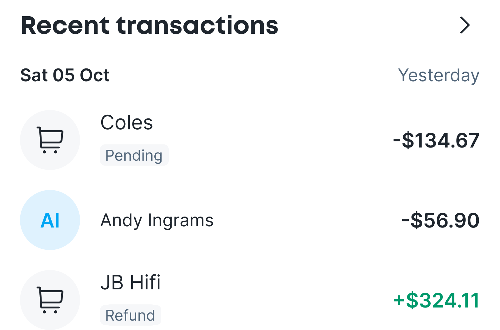
Recent transactions
The excisting app dedicated the entire homescreen to the transaction list. It's still an important feature, so it sits near the top of the feed, but I limited it to just the most recent transactions to reduce the footprint.
Groups
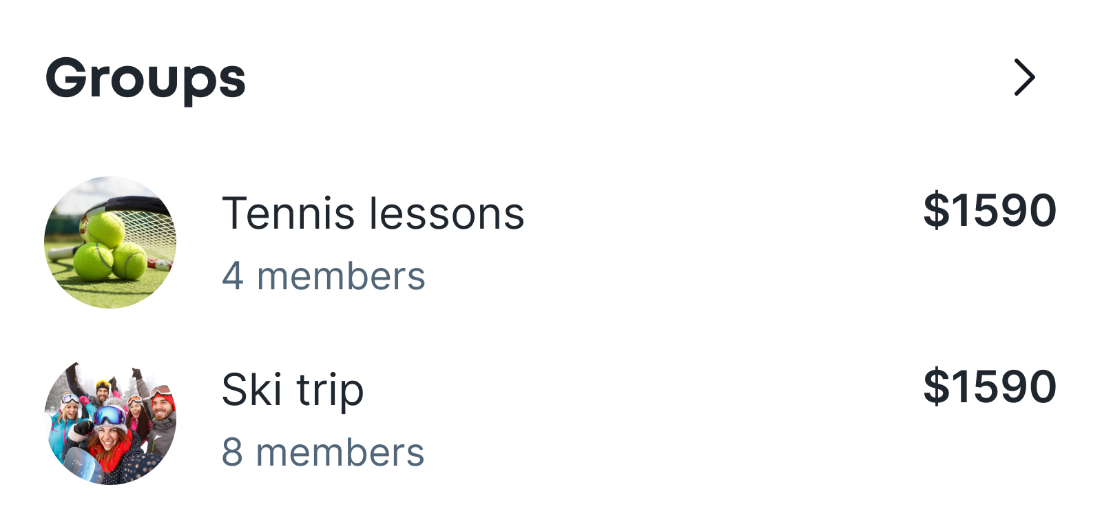
This card surfaces any active groups, and their status.
The power of group features would allow the app to be more widely adopted through friend recommendations and invites, and also ensure the platform to remain 'sticky', driving return visits.
This module prevents missed payments, stalled group activity, and user frustration caused by hidden obligations.
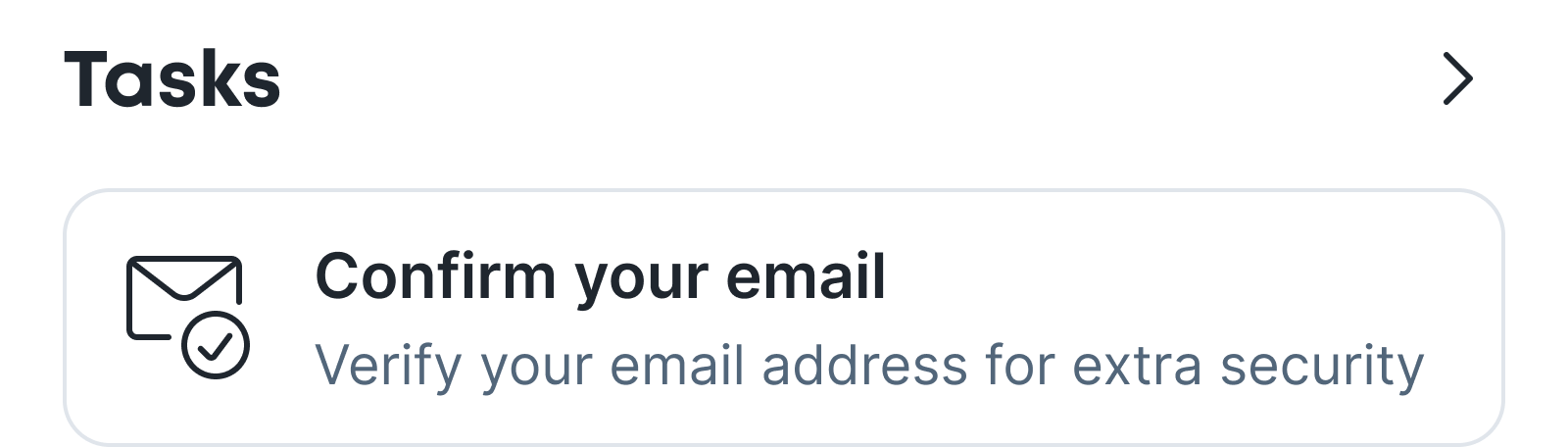
Tasks
It was important to me to allow users to access the app as soon as possible with a restricted set of tools, regardless of whether they had completed all onboarding tasks.
However, I wanted to ensure we could remind users to complete these tasks in order to enjoy the full range of features.
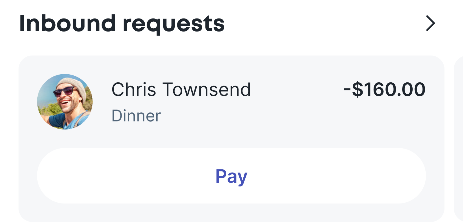
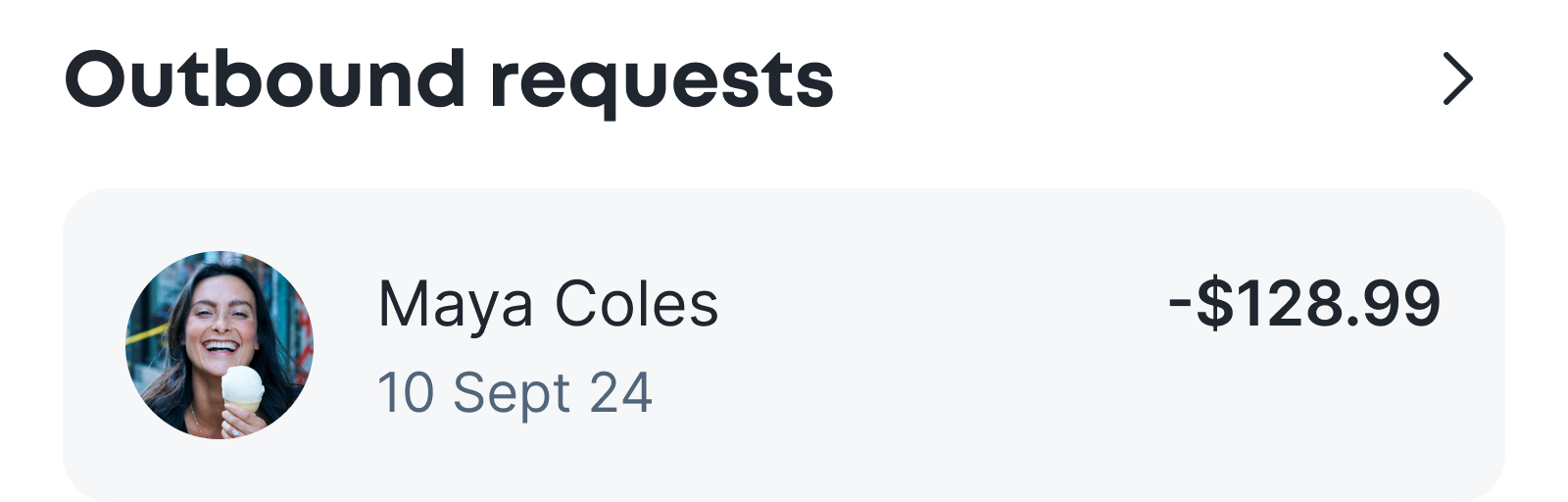
Inbound and requests
Outstanding inbound requests, with a clear CTA to initiate the settlement flow.
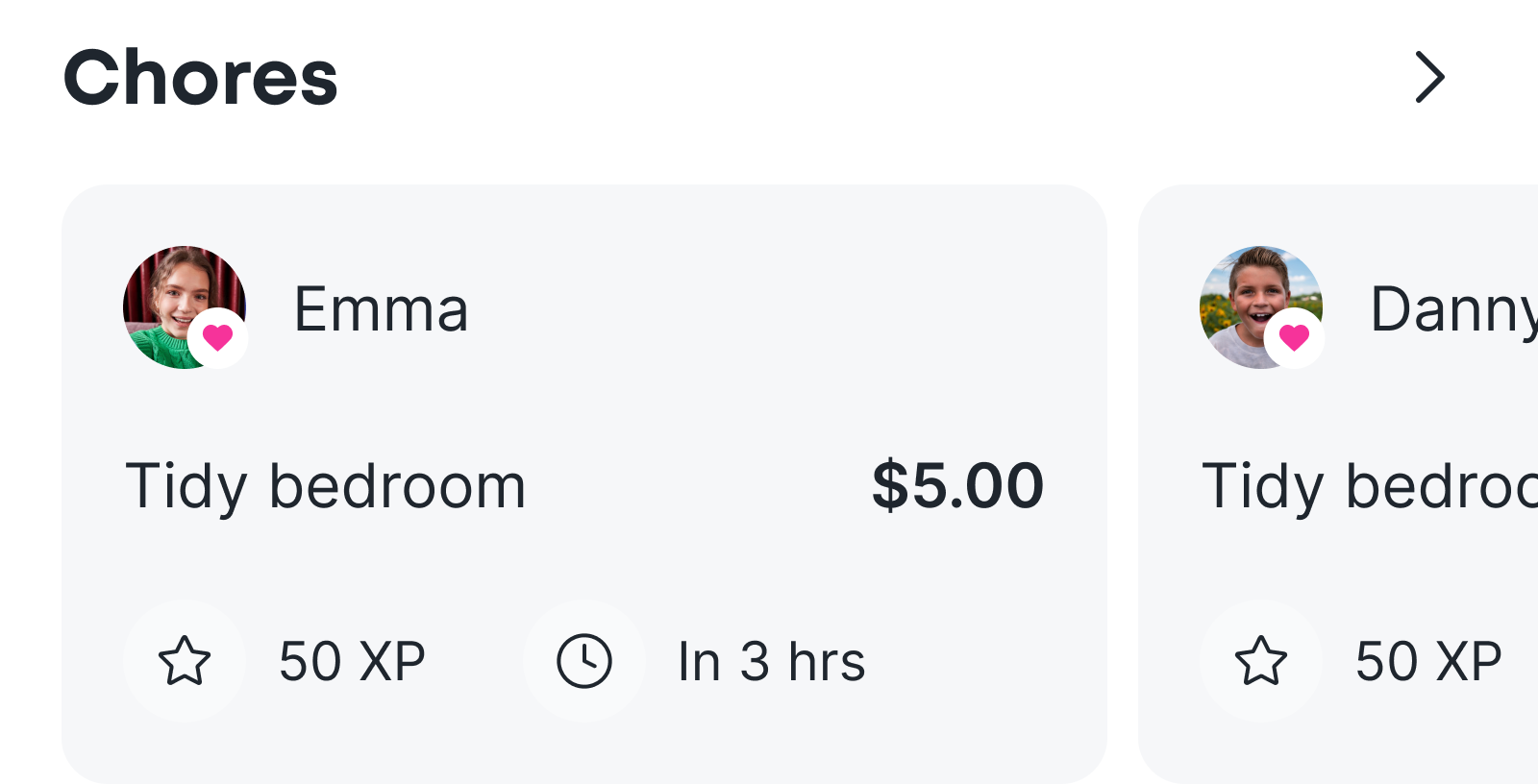
Chores
The chores carousel surfaces the 3 most urgent chores, both for the assignee and the assigner.
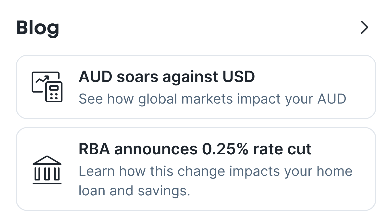
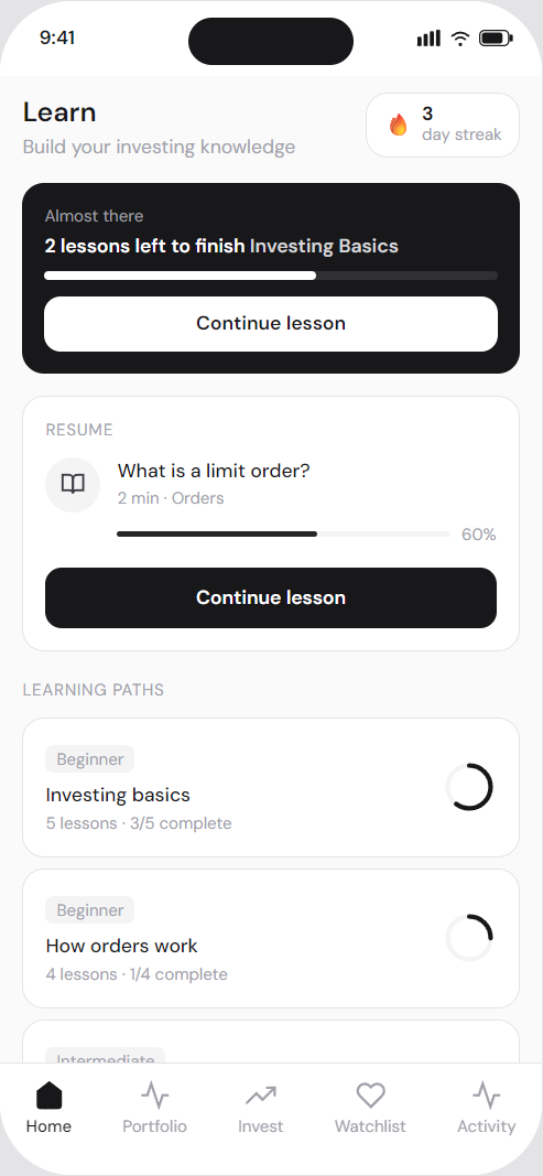
Blog
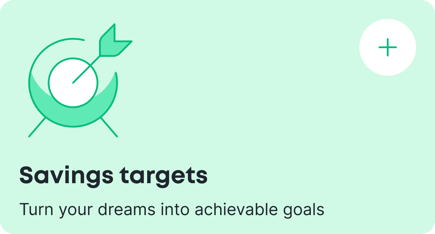
I'm passionate about improving financial literacy, and saw it as a defining aspect of our brand. The blog would provide educational content alongside financial analysis, and also help drive customers through search results.
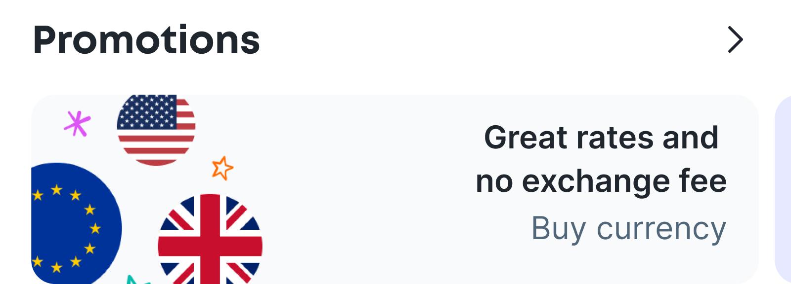
Promotions
Promotions needed some granularity, so I ended up creating 3 components.
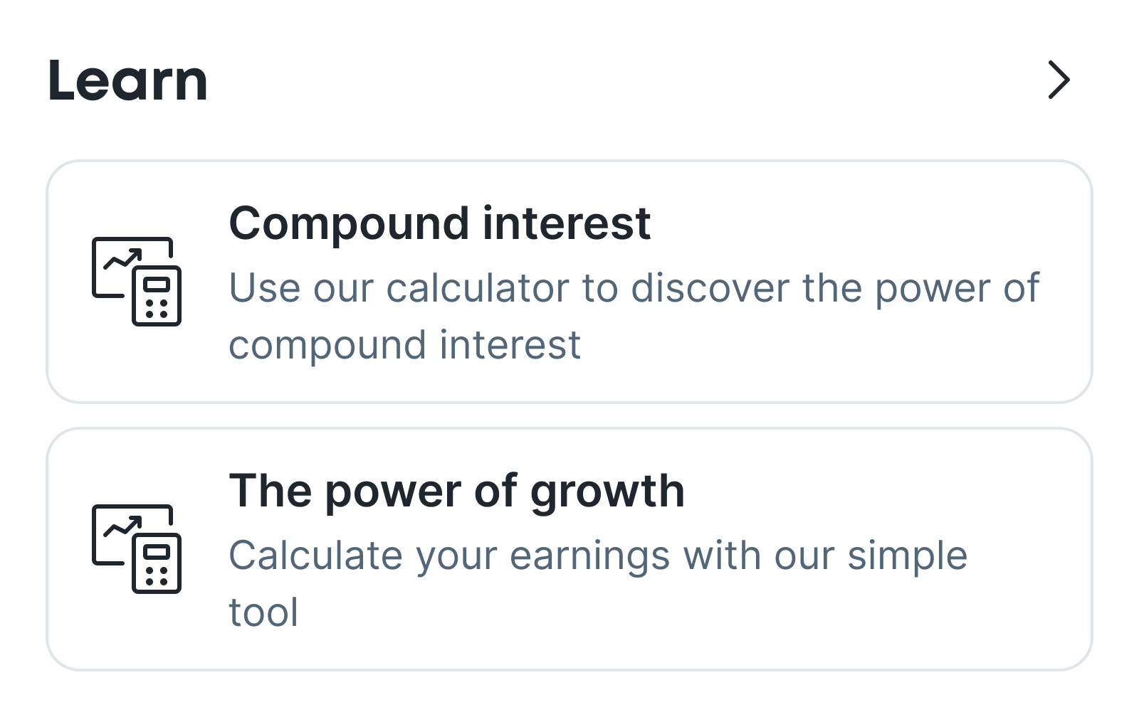
Learn
In the current app, all settings live under a single cog icon on the home-screen. This merges user preferences with app settings, creating a long, unintuitive settings screen that is hard to navigate.
Personalisation
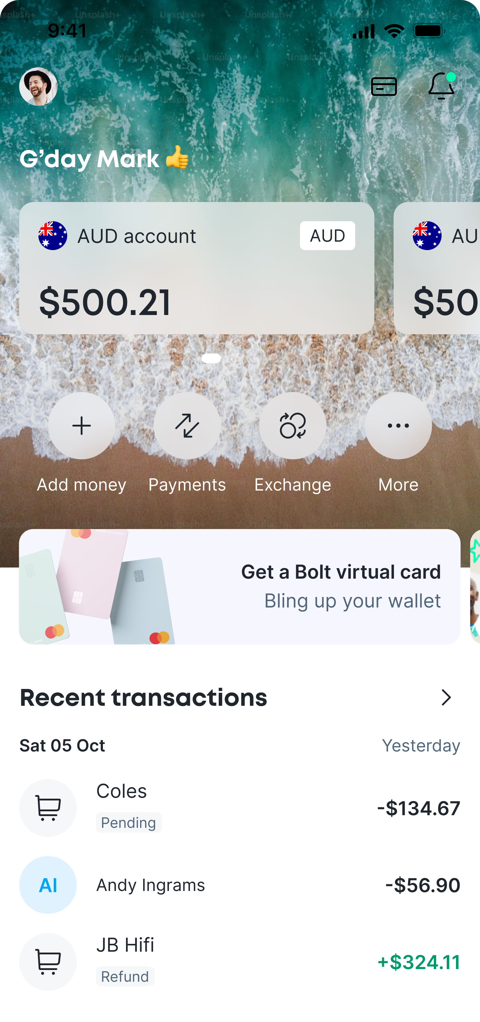
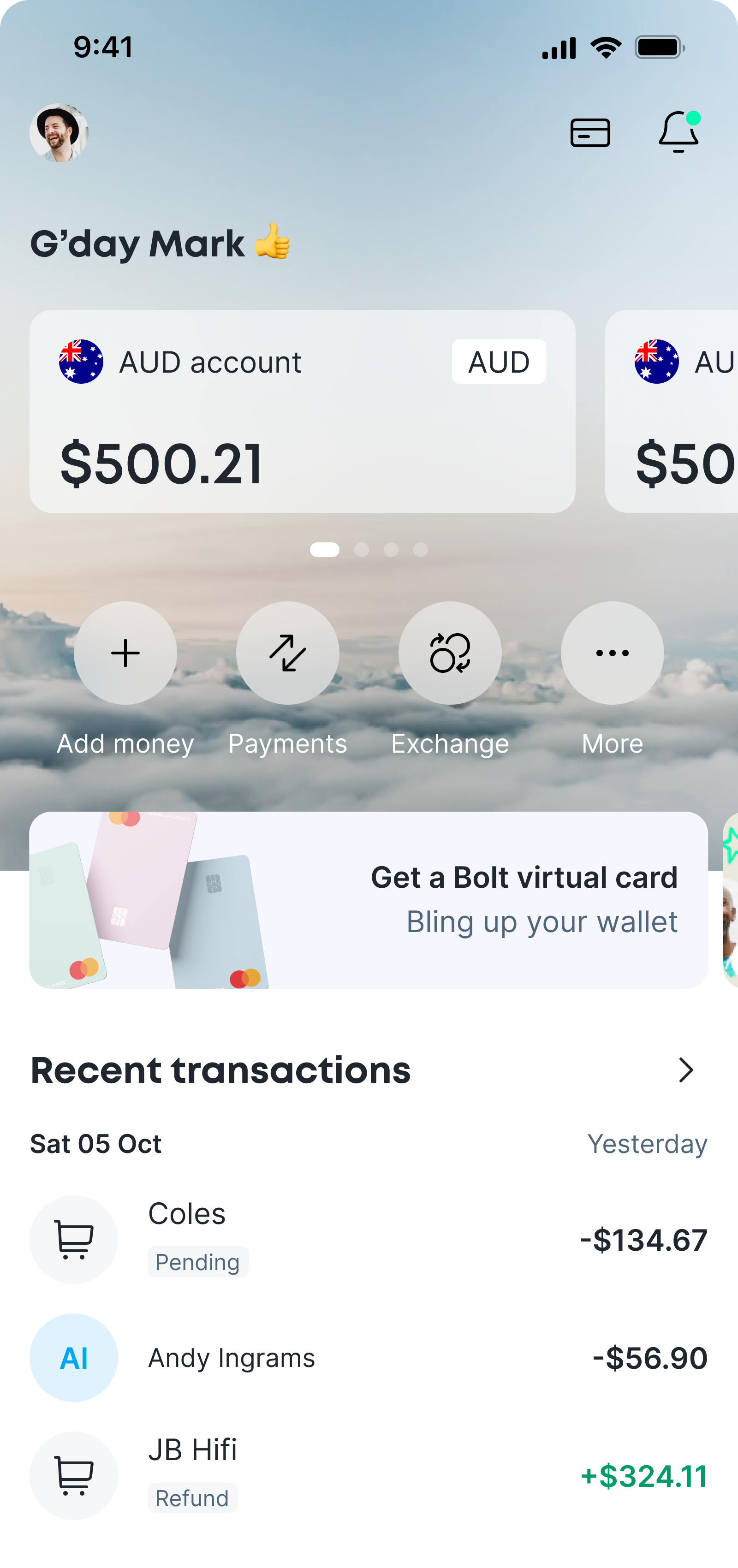
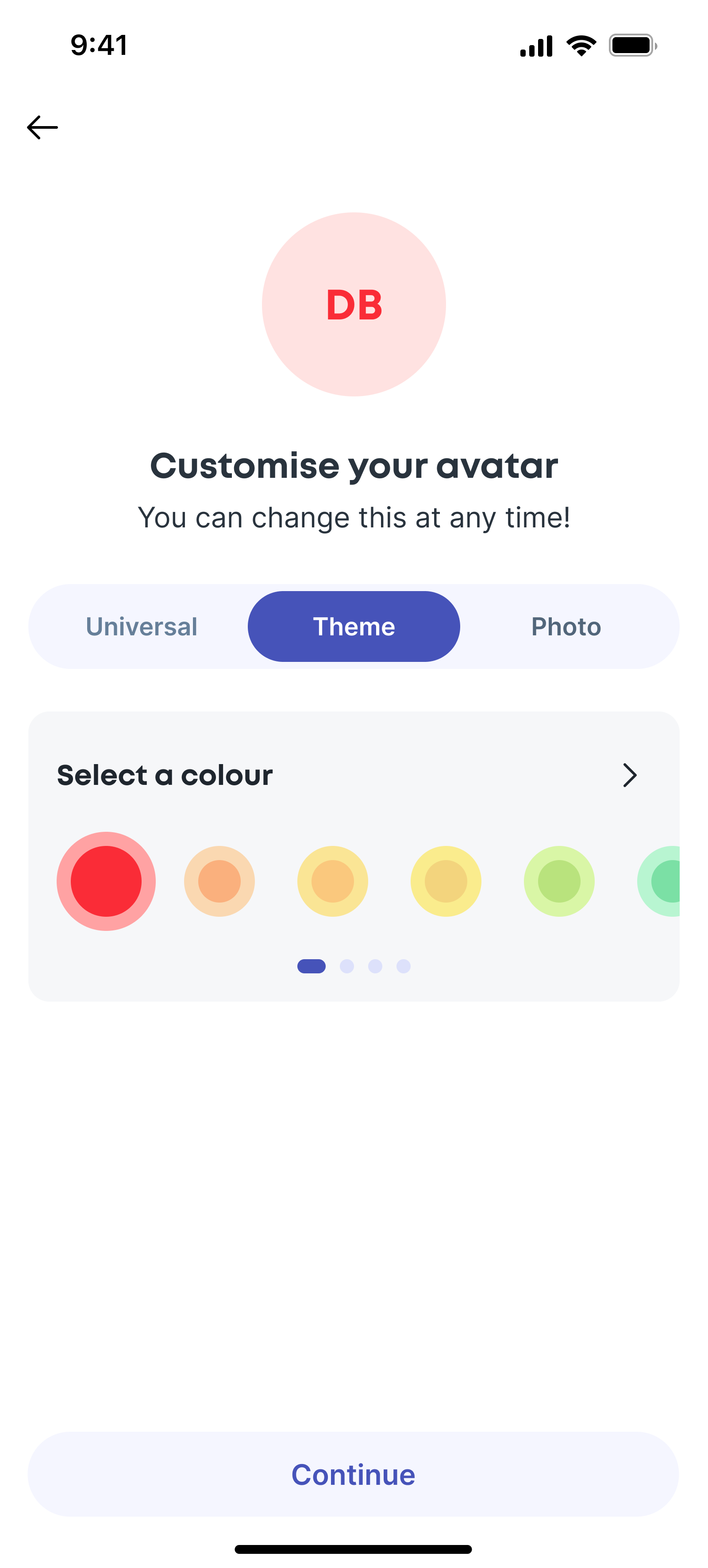
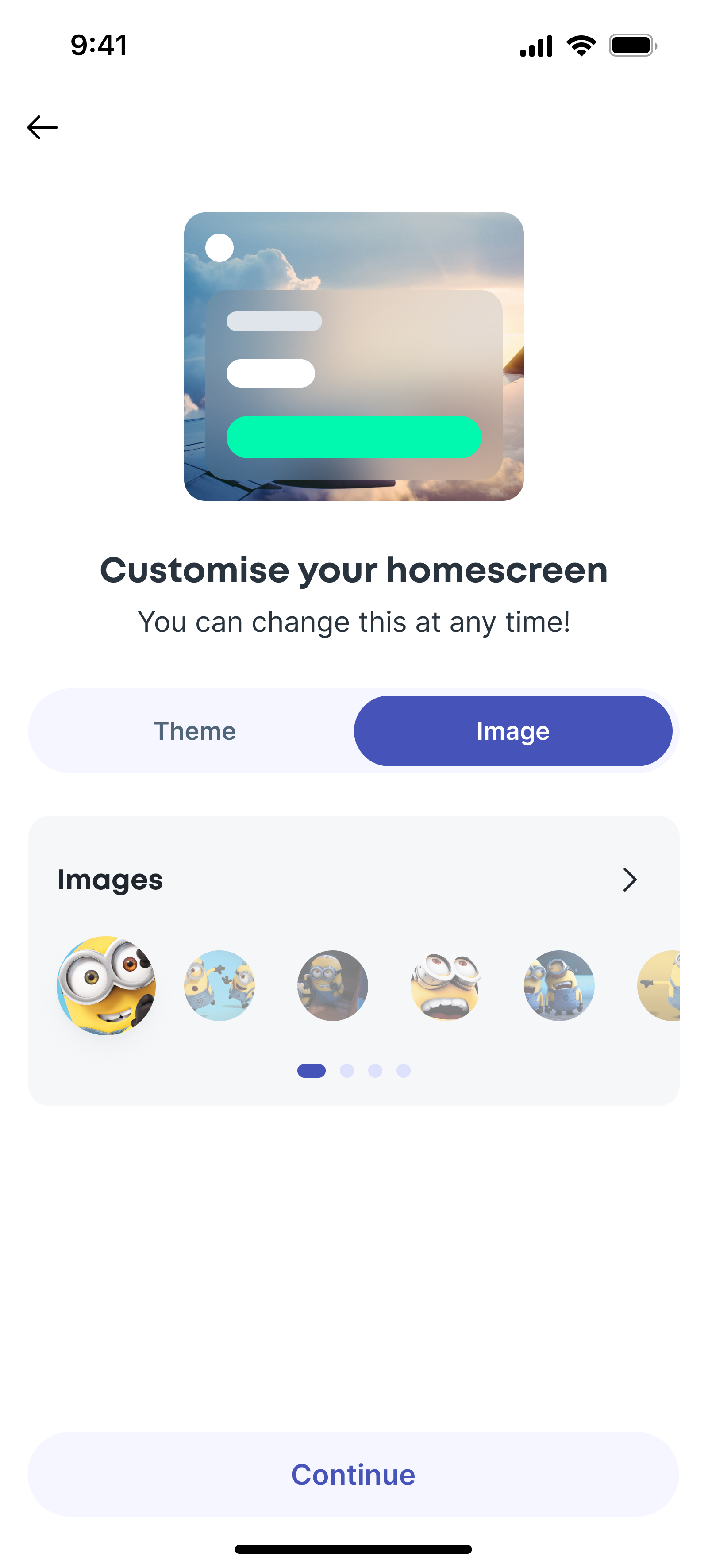
I wanted to give users control over how the dashboard felt without compromising clarity or usability. I designed the UI to support personalisation through background blurs, light and dark themes, and a curated set of approved images that worked reliably with the interface. This allowed users to make the app feel more personal while keeping contrast, readability, and layout consistent across all states.
The complete feed
A simple prototype of the home feed, with all the cards stacked, showing the hierachy and overall experience.
Journeys off this feed always move to the right, with the back or close button bringing the user back to the home screen.
Feature
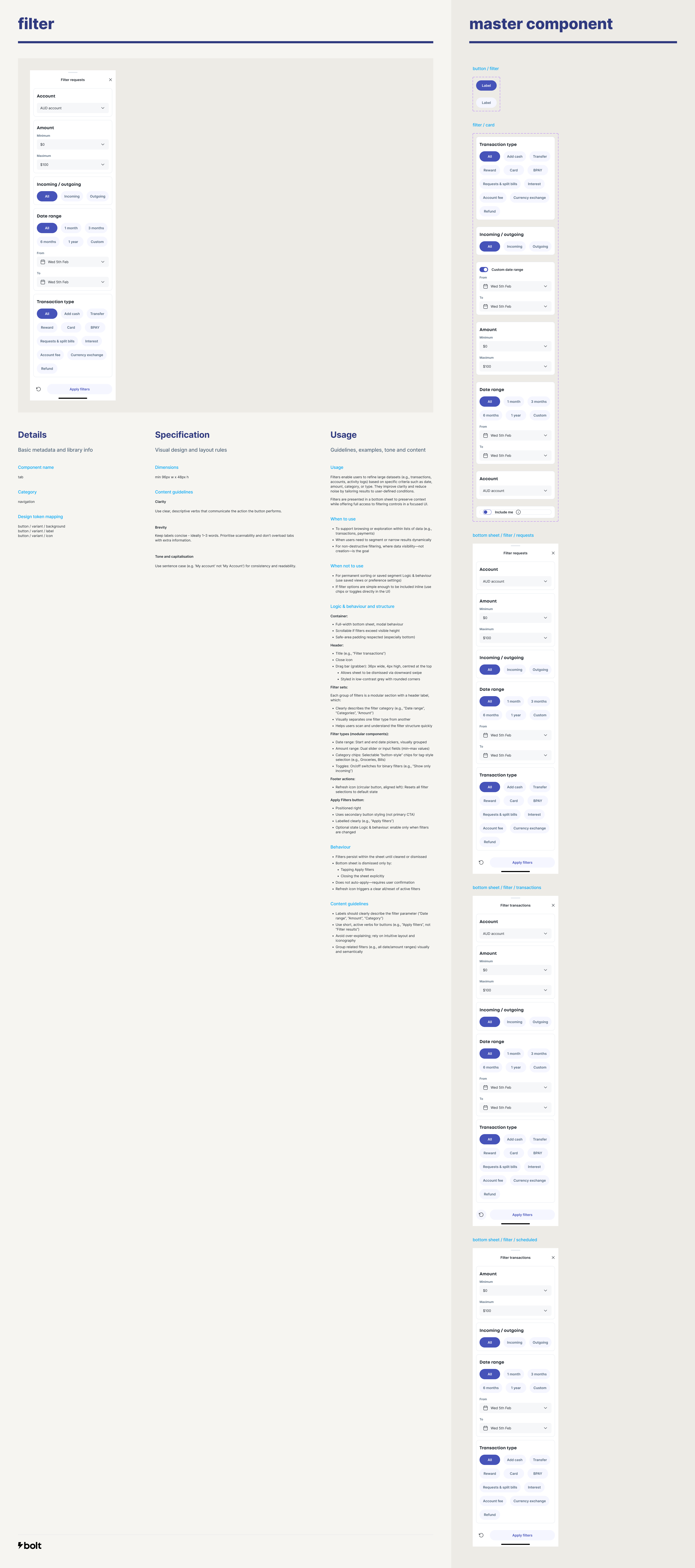
03. Payments
Simplifying money movement without while retaining control.
Simplifying the existing journey
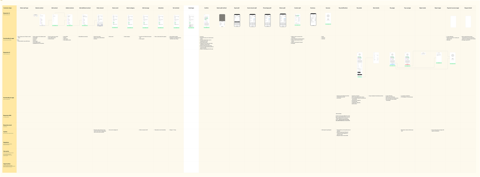
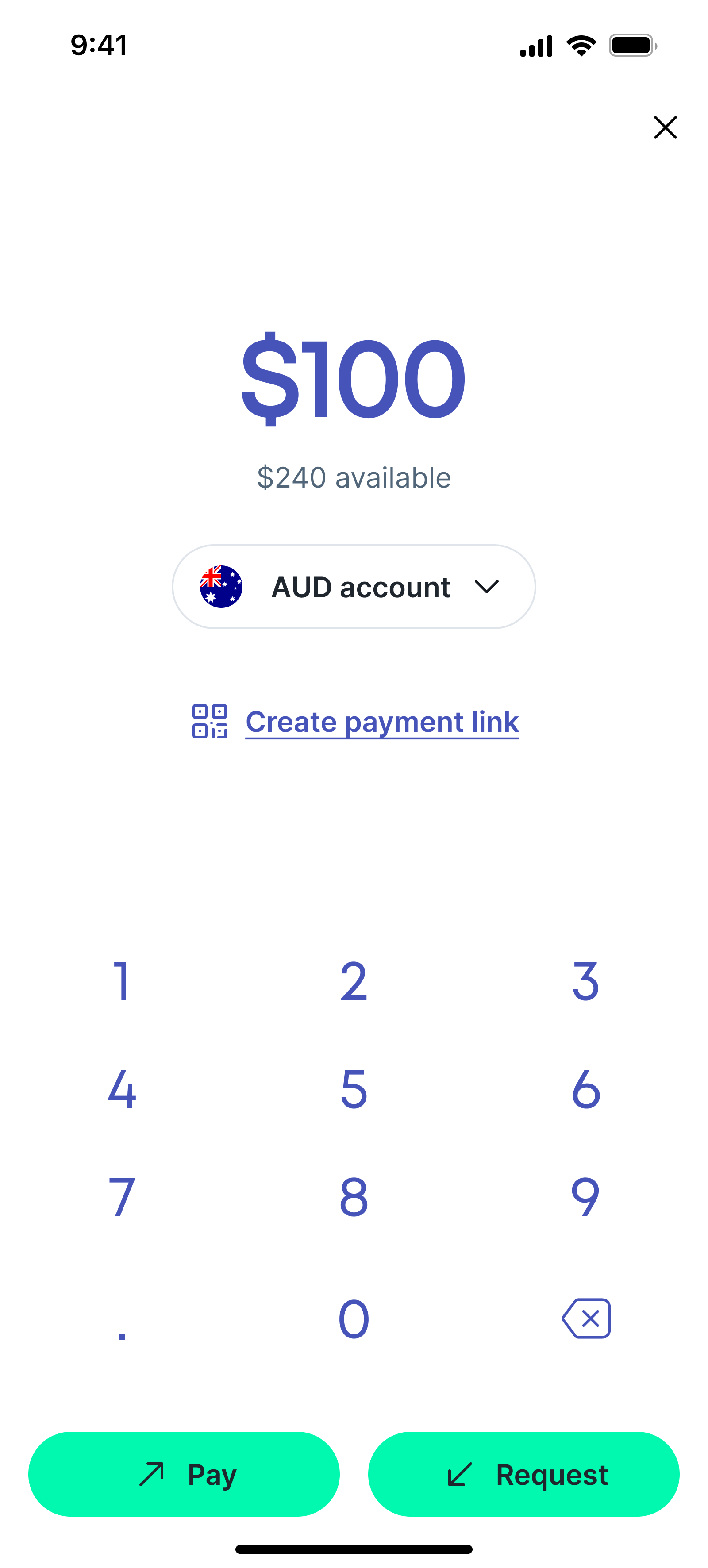
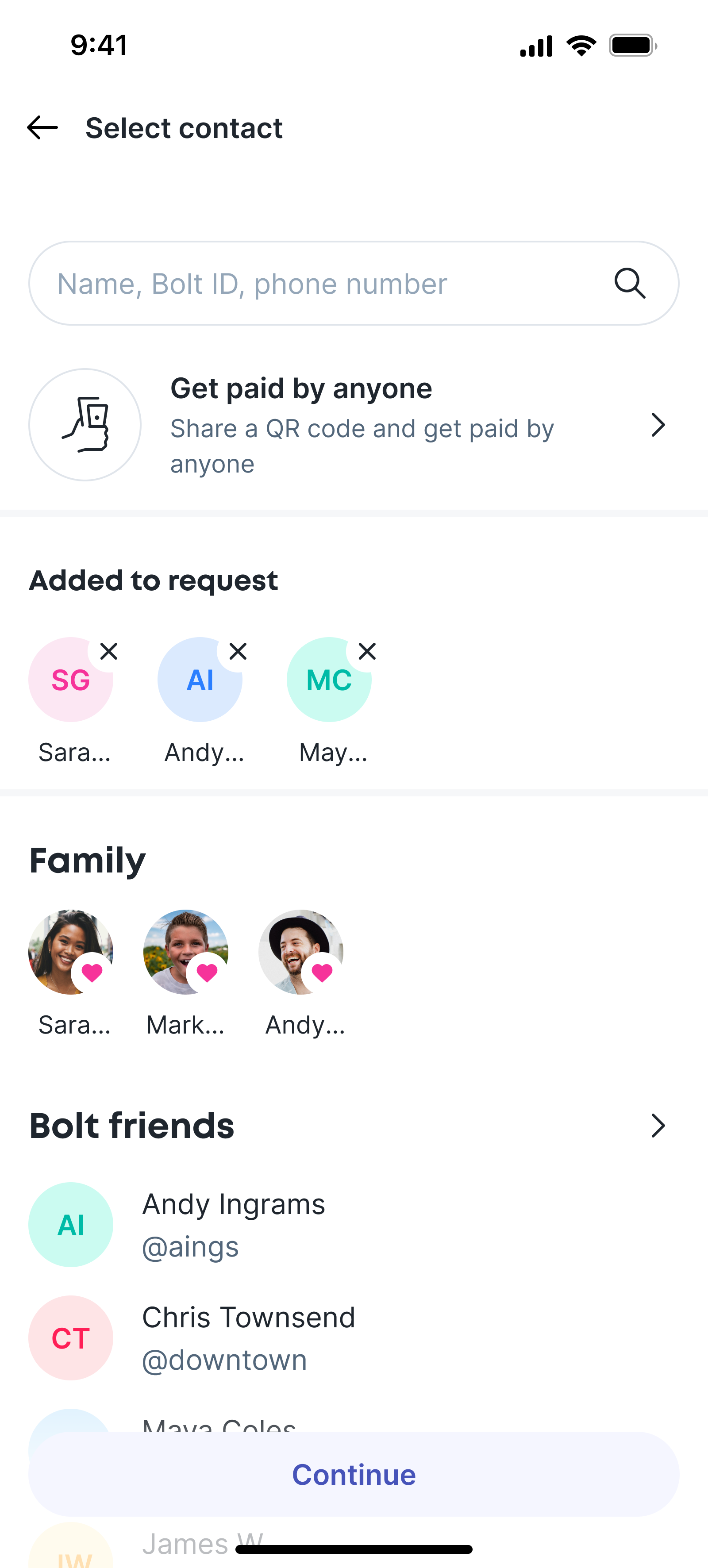
I simplified the IA here, combining pay, request and split into one button; payments. From here the user can enter an amout, select if it's a request or a payment, and then inititate the appropriate flow. To split a bill a user can just add more requestees.
This is a simple and elegant solution, and it tested well despite my concerns that users might need more specific labels to feel confident.
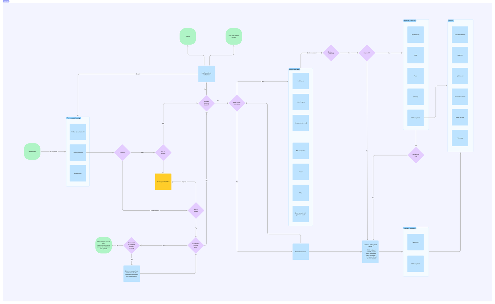
The simplified payments flow.
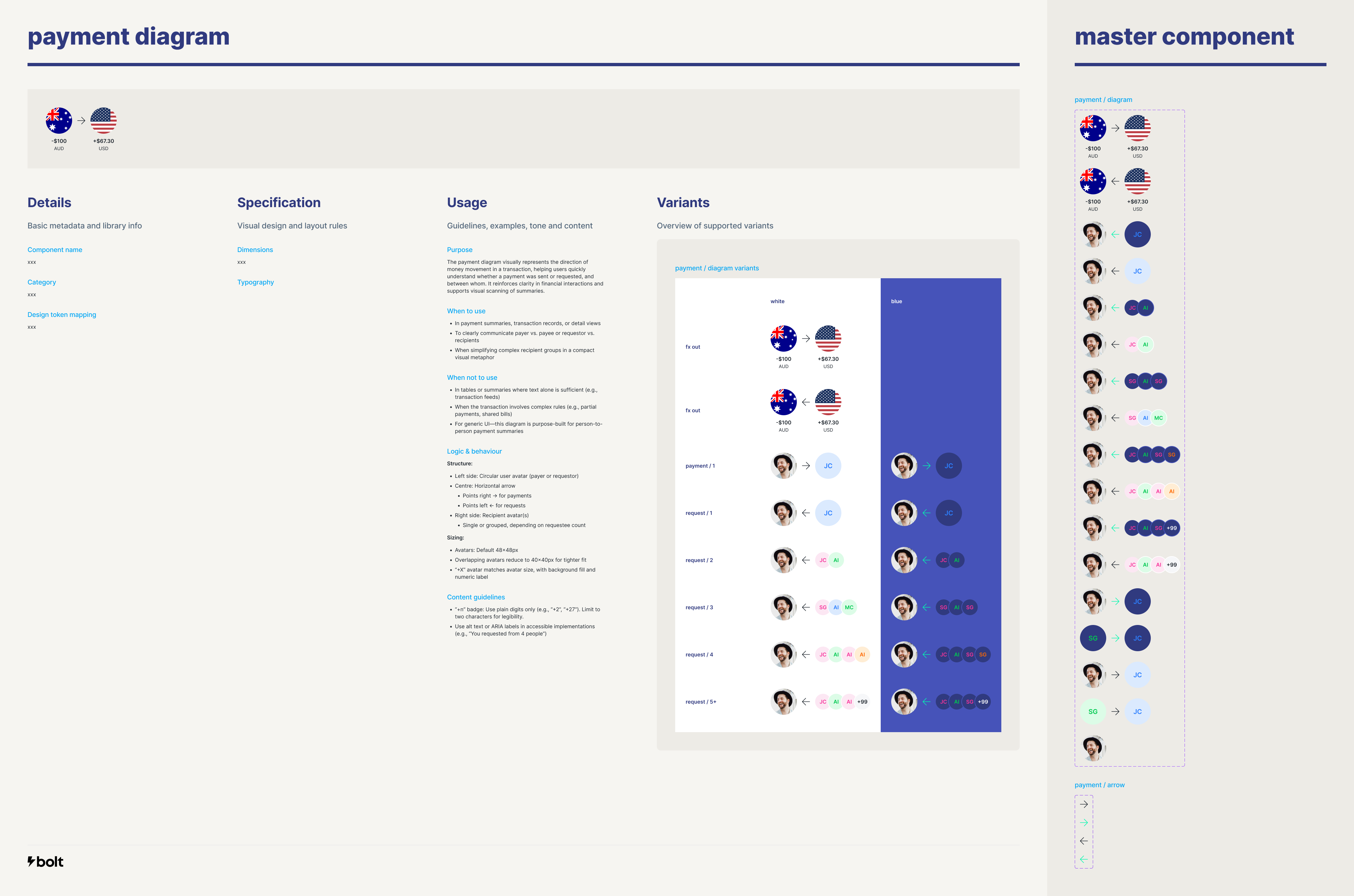
The payment diagram
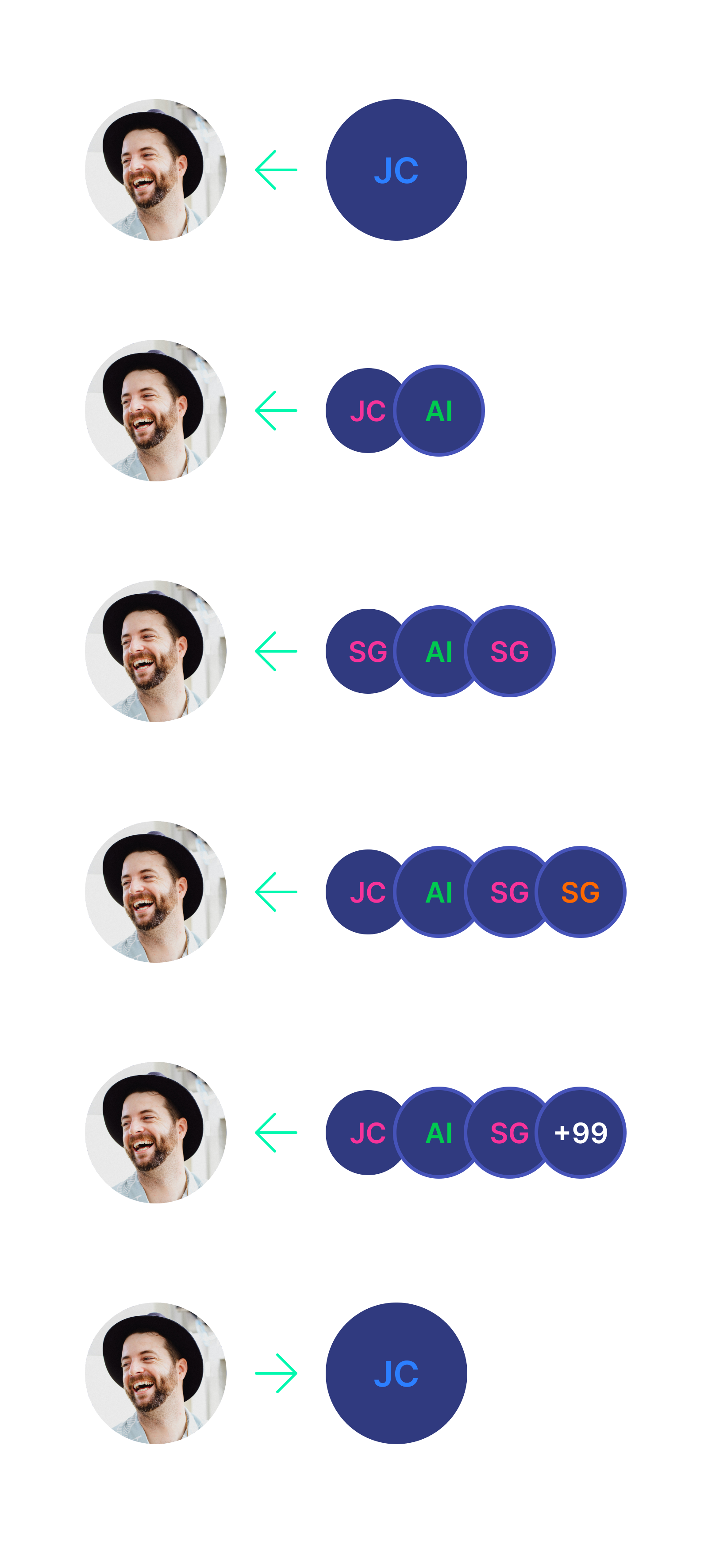
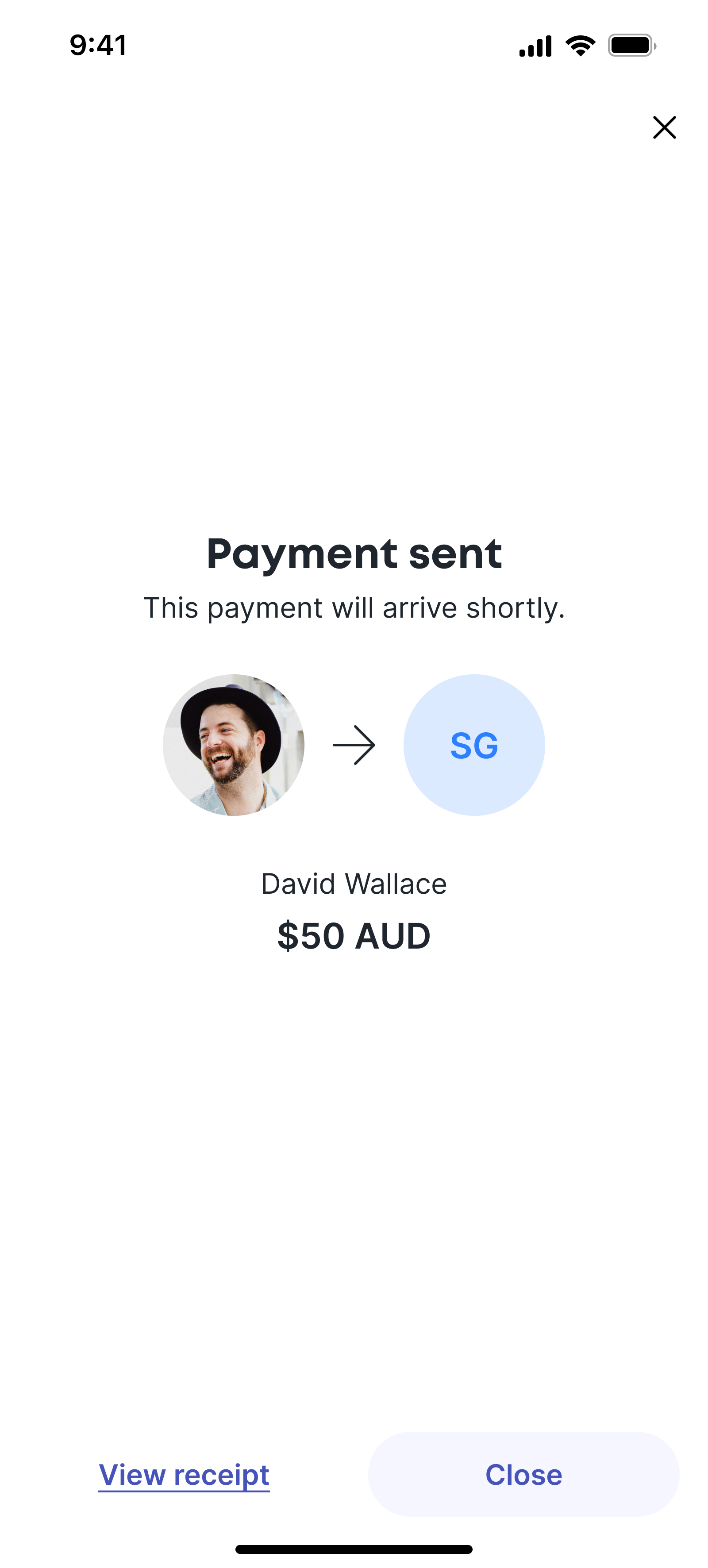
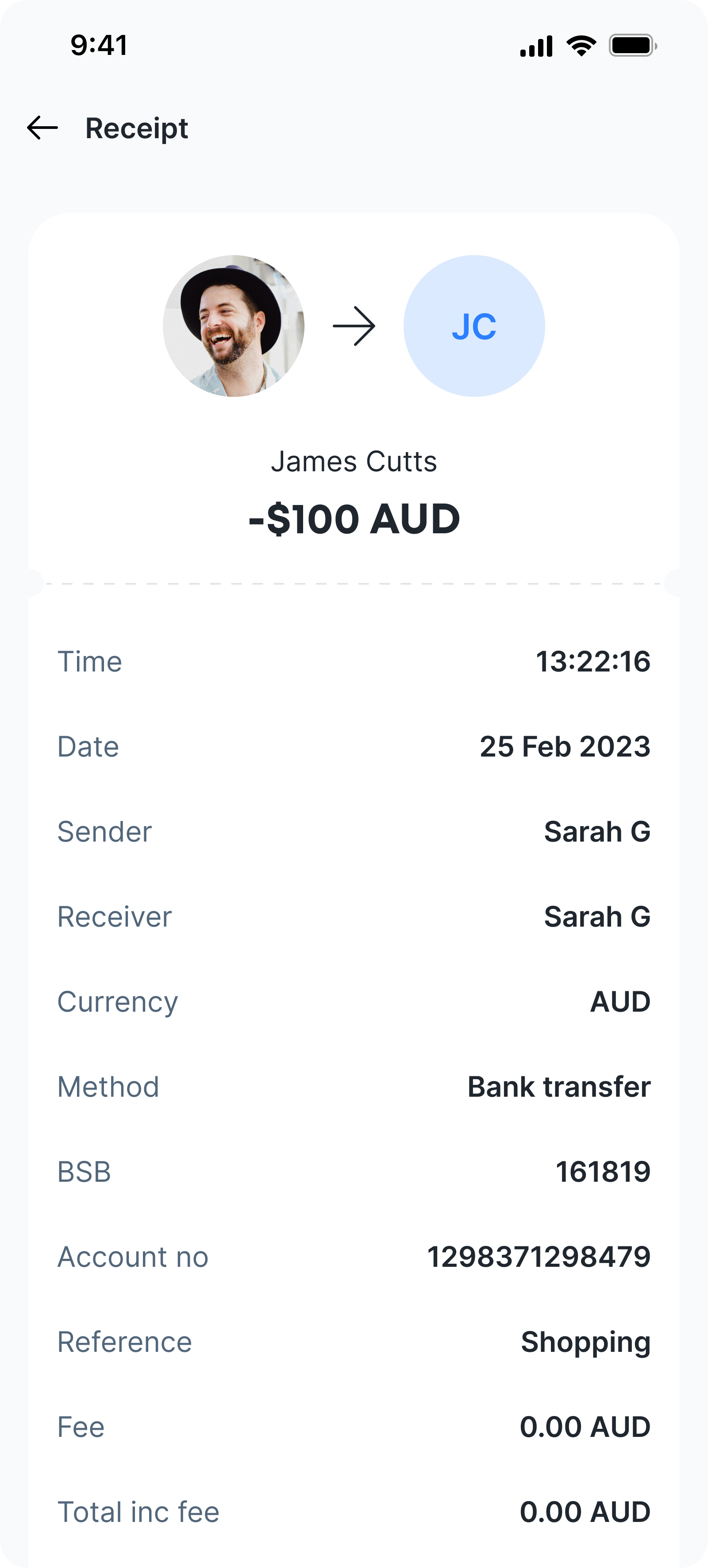
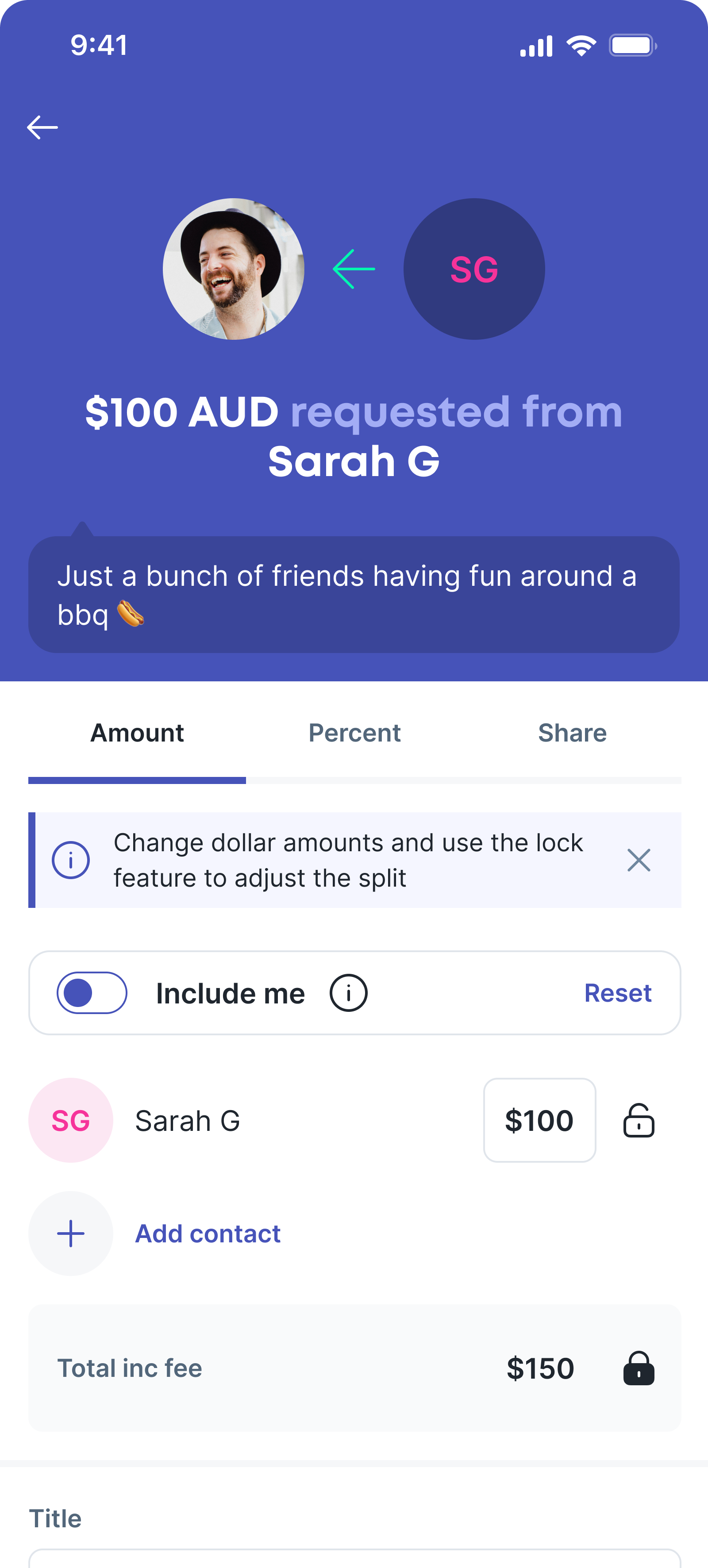
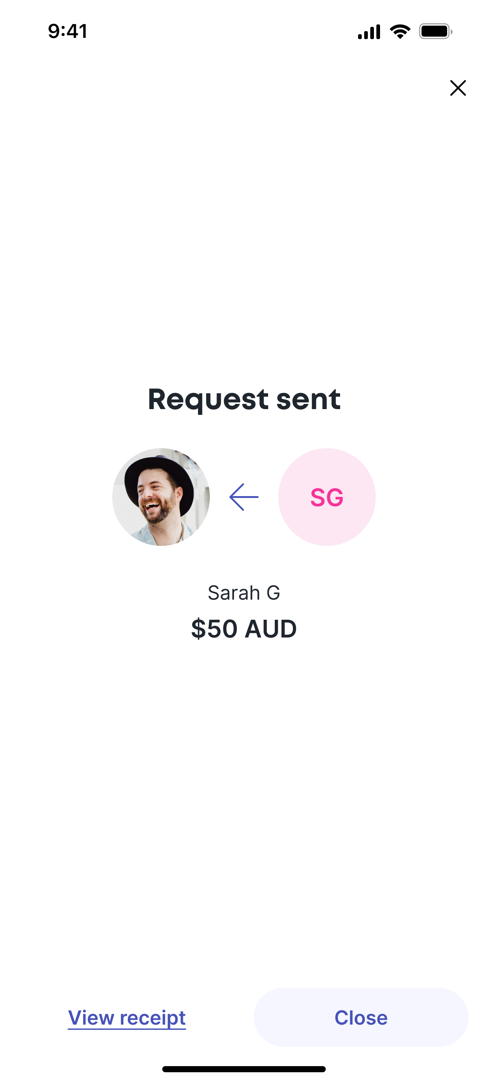
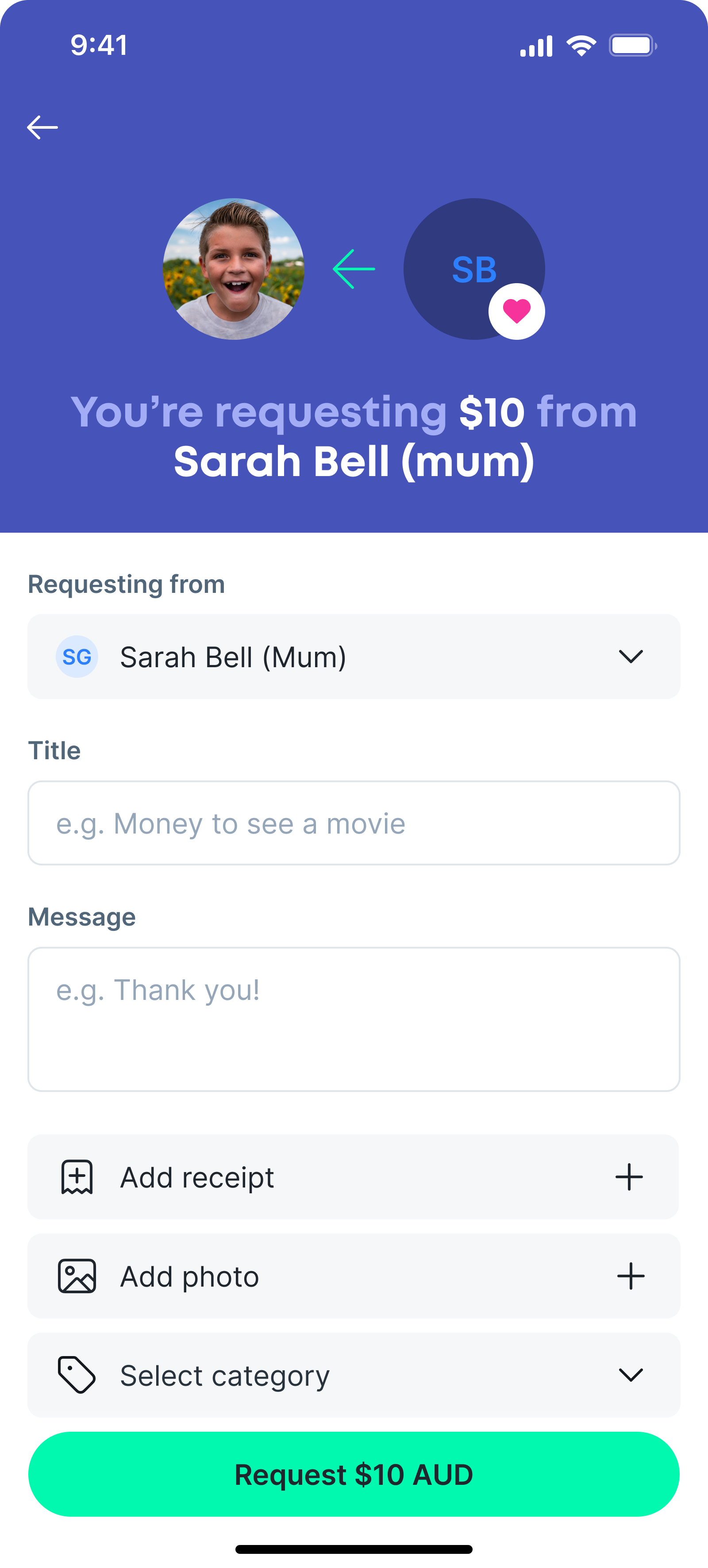
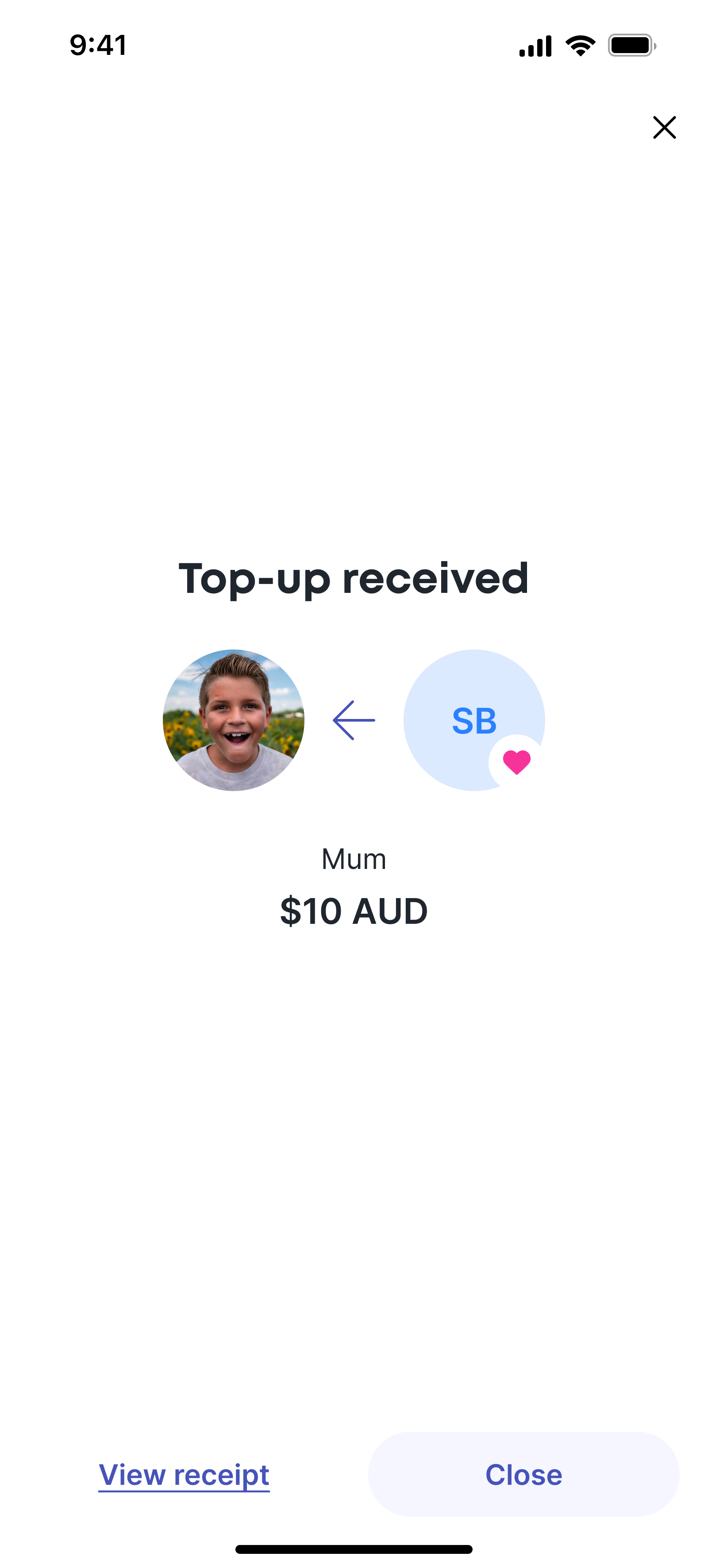
Because of the varying types of payments, and variable amount of people involved, I wanted a clear, concise way of conveying what was happening to the user.
I designed a payment diagram that used avatars, arrows, and clear language to ensure the user always felt confident. Multiple users were handled with overlapping avatars, for example when splitting a bill.
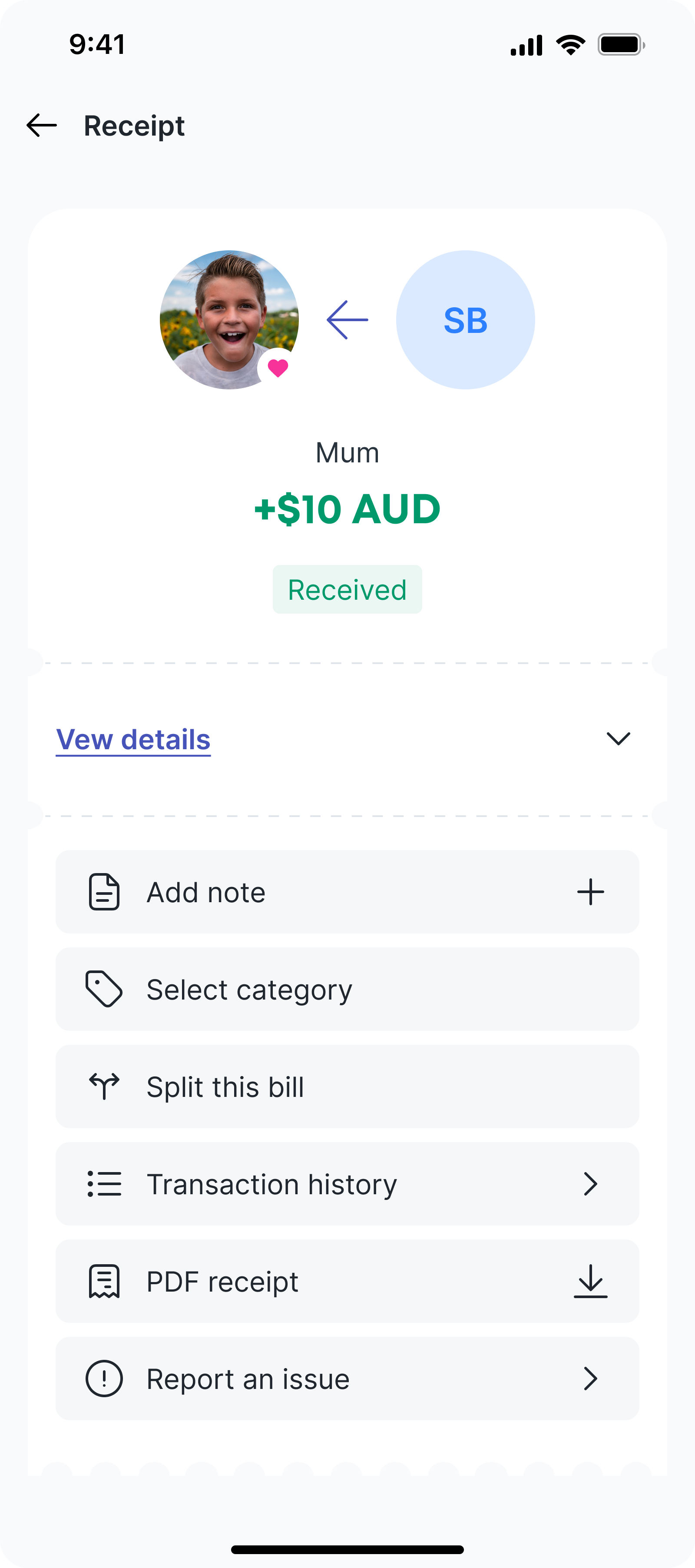
These diagrams were used consistently throughout the payment journey; configure, confirm, and receipt, and formed a core part of the Bolt payment experience.
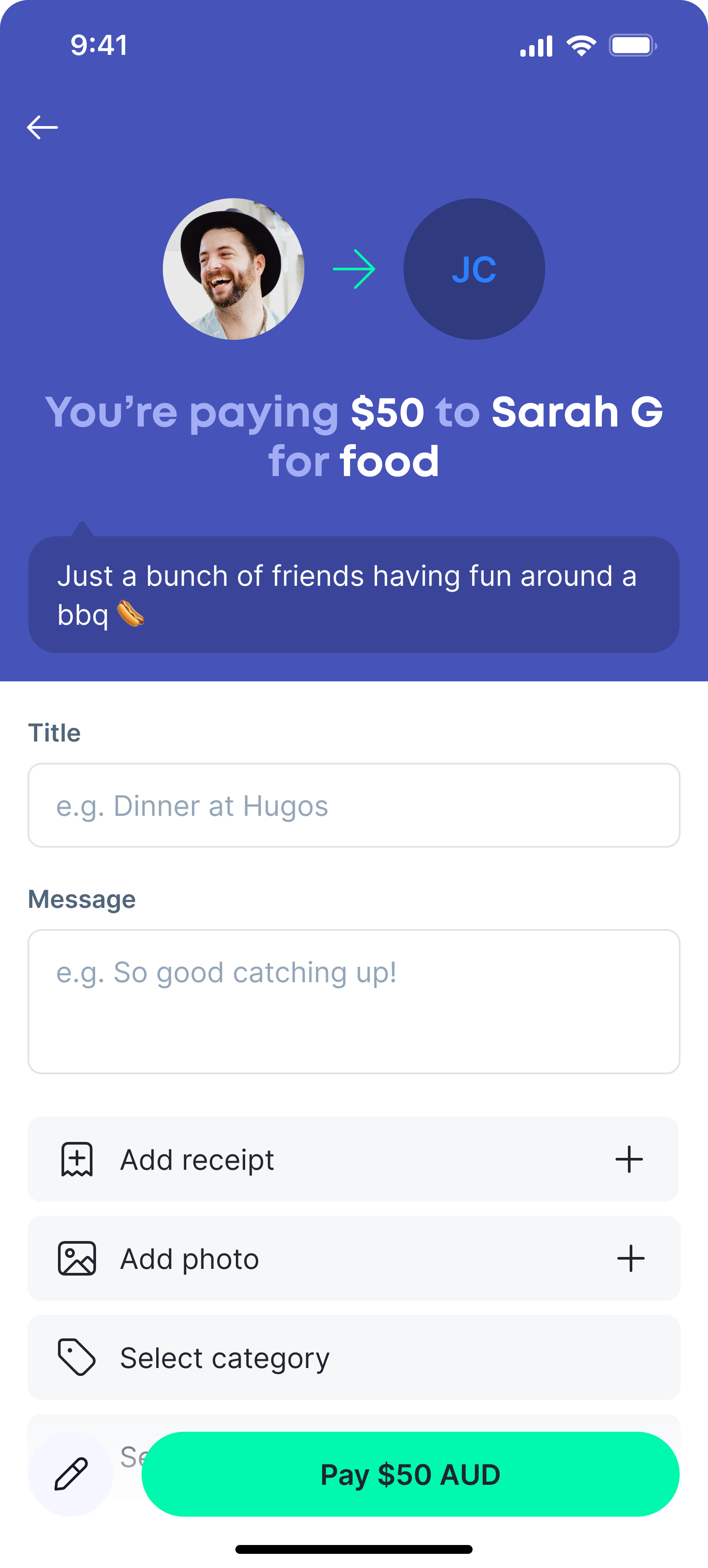
Pay
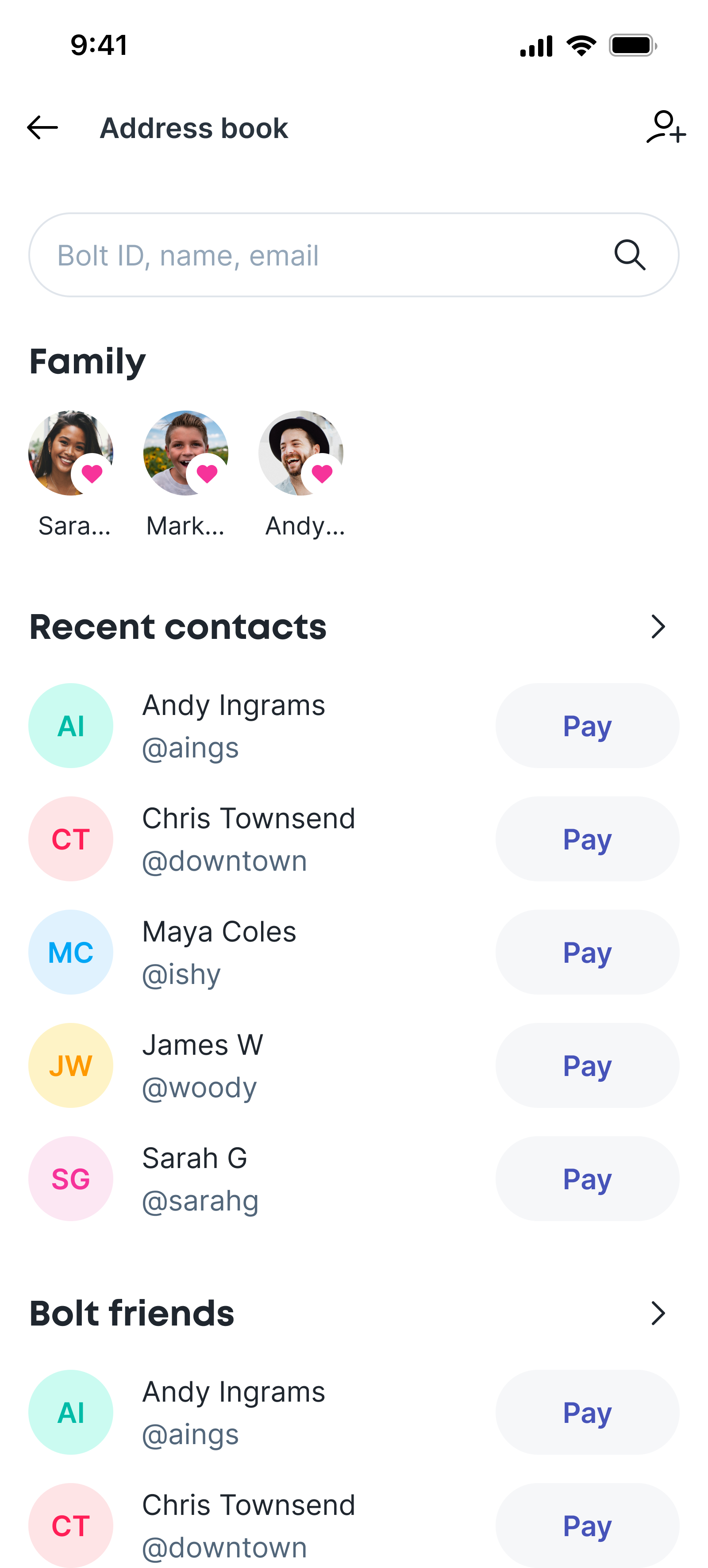
The Pay Someone flow is straightforward, with the user entering an amount, tapping 'Pay', selecting a recipient, and then configuring the payment by optionally adding a title, message, a photo or receipt, and selecting a category.

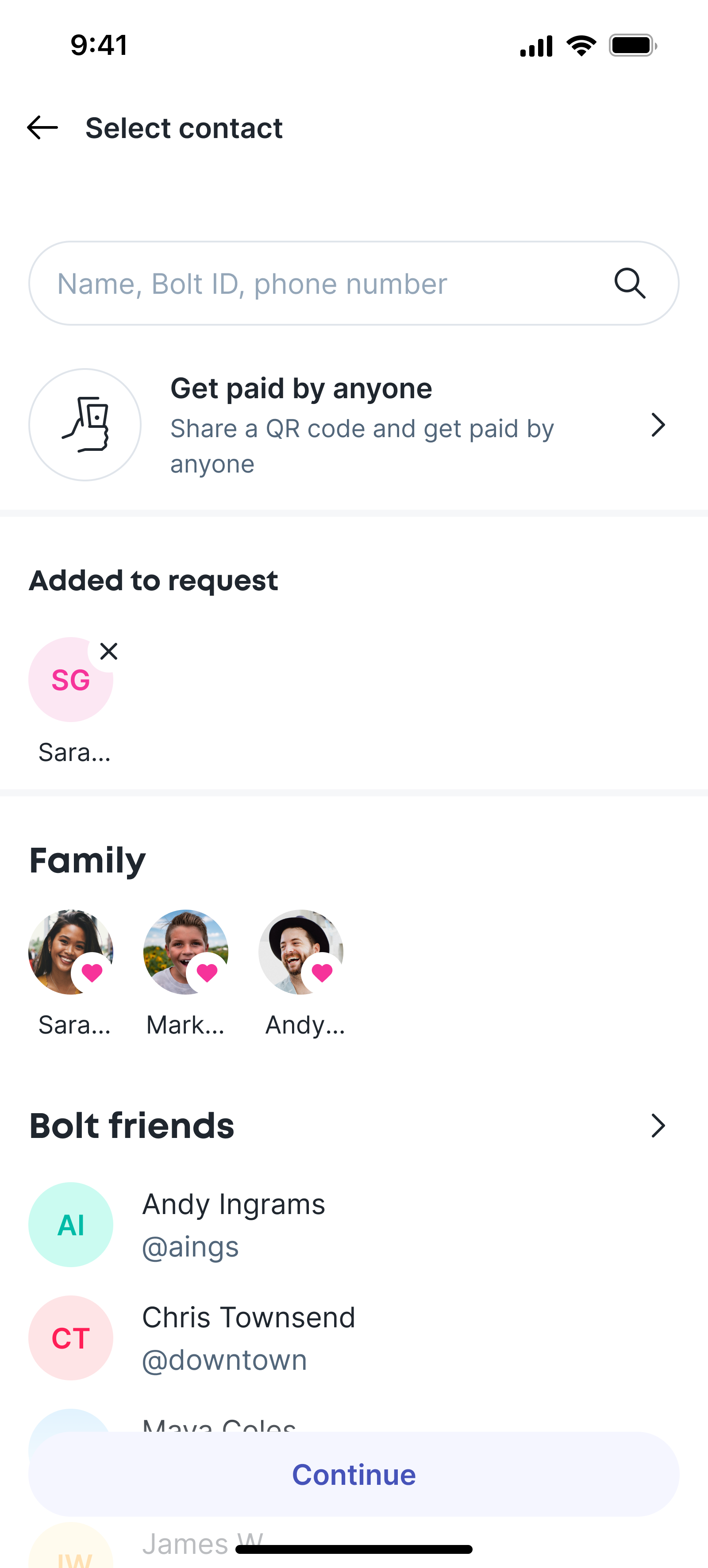
Request
The Pay Someone flow is straightforward, with the user entering an amount, tapping 'Pay', selecting a recipient, and then configuring the payment by optionally adding a title, message, a photo or receipt, and selecting a category.
AI ideation
Again I used AI as part of the ideation phase.
It helped surface some UI requirements, and where the real heavy lifting needed to be implemented - in the split UI, and the different split models.
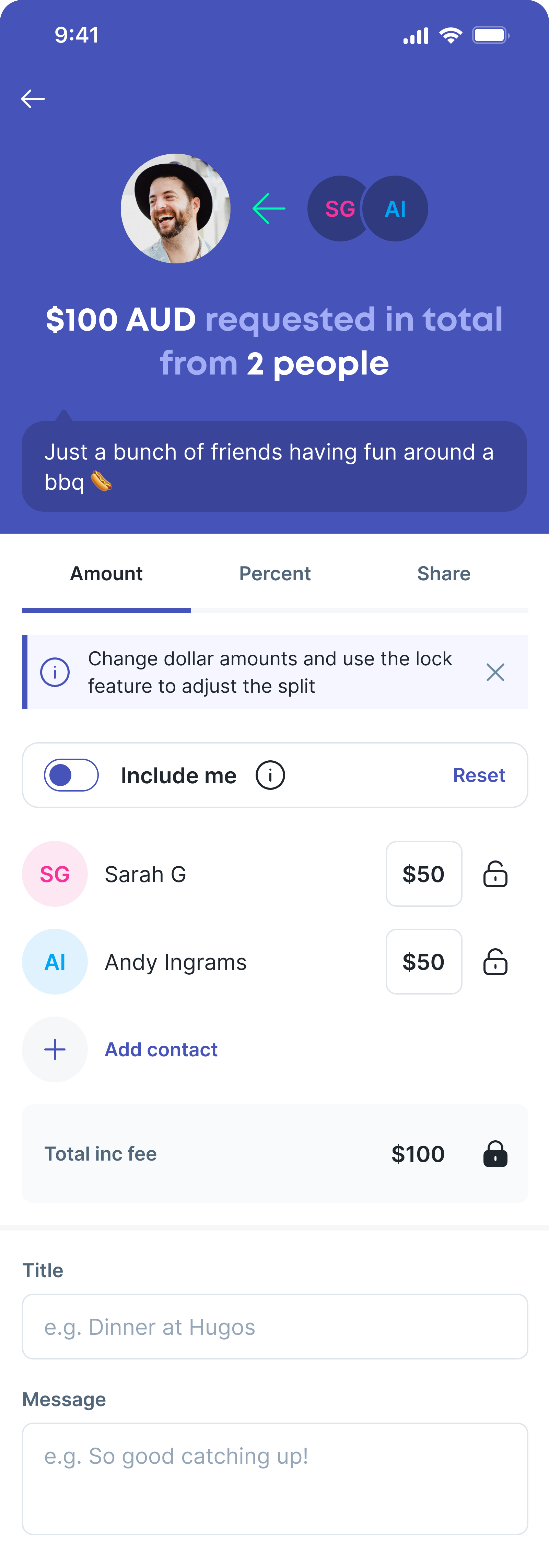
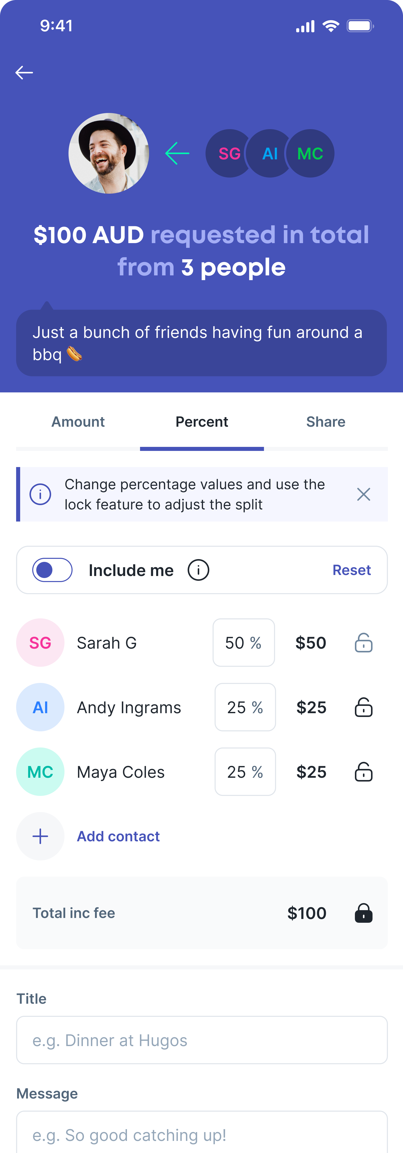
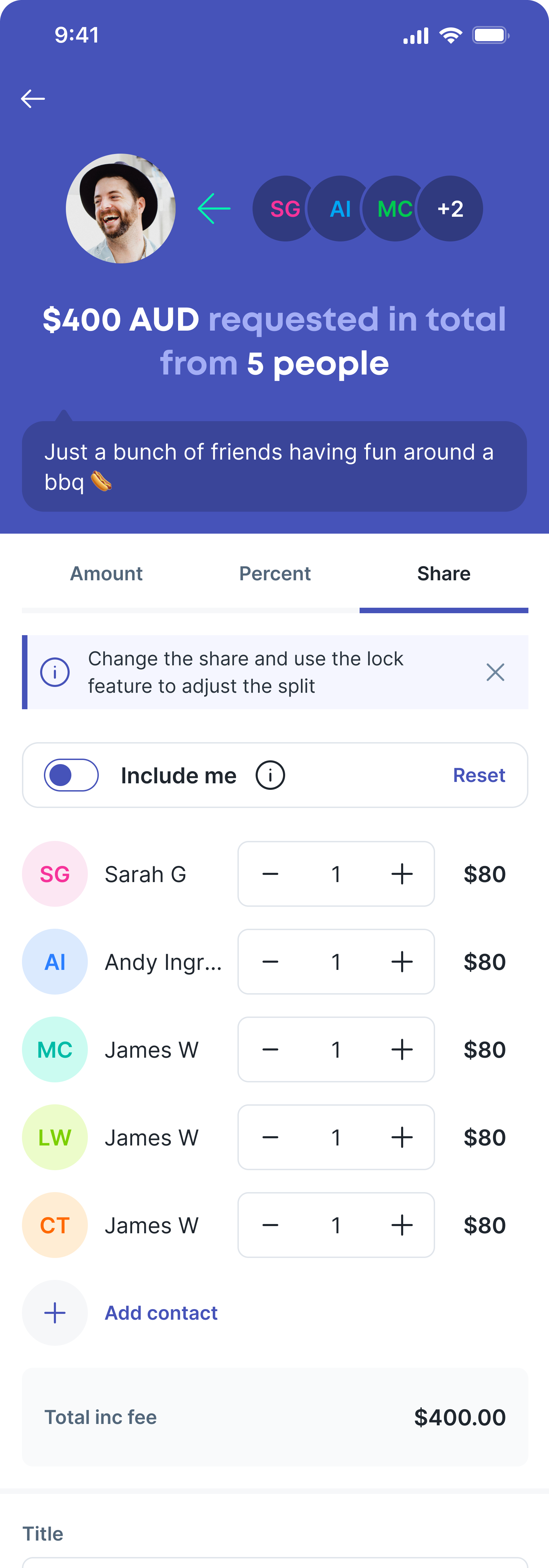
Split
When requesting a split, the user simply adds more recipients. The split mechanism allows three approachs; amount, percent, and share. The user can choose how to split, and then adjust the fields until they are happy with the proportions. The lock function allows users to prevent changes to a row while balancing the remaining amounts.
This is a simple, intuitive, and powerful bill splitting mechanism. In order to validate this model I worked with the engineers to create a working prototype in code. This helped them understand the functionality, and resulted in a fully functional prototype which was the only way to properly test this feature.
Payment header prototype
This Rive prototype demonstrates how the payment header assembles as the page loads and transitions into an interactive state, setting the tone for the rest of the screen.
All page-build interactions must complete within 1000 ms end-to-end. This includes initial state changes, motion, and any secondary micro-transitions.
The overall animation should feel fast, polished, and purposeful, remaining sympathetic to the key elements and hierarchy of the screen. Motion should support structure and intent, guiding attention naturally rather than competing with content.
Feature
04. Bolt Junior
Balancing independence for children with control for parents.
Mapping the chores journey for parents and children.
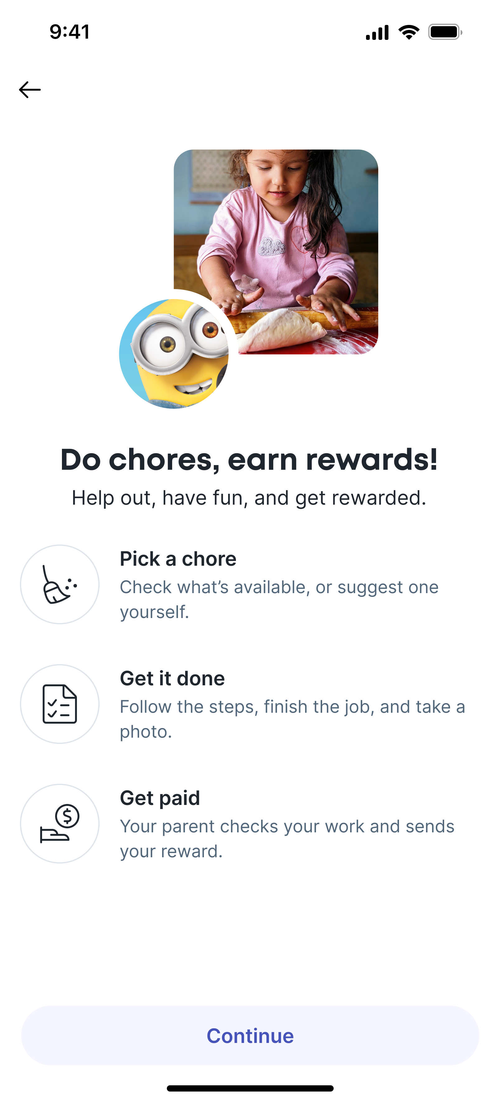
Making pocket money easy
Bolt Junior was designed to help parents introduce money concepts to children in a controlled, age-appropriate way, while keeping parents clearly in control. The core challenge was balancing independence for the child with visibility and oversight for the parent, without making the experience feel restrictive or overly complex.
The feature needed to work across a wide range of ages and support shared parent–child journeys, while fitting naturally within the main Bolt app. From a parent’s perspective, the goal was to set up and manage a child’s account quickly, control how money is earned and spent, and stay confident about where money is going.
For children, the experience needed to make money understandable through simple actions like earning, spending, and requesting, without exposing them to adult banking concepts too early.
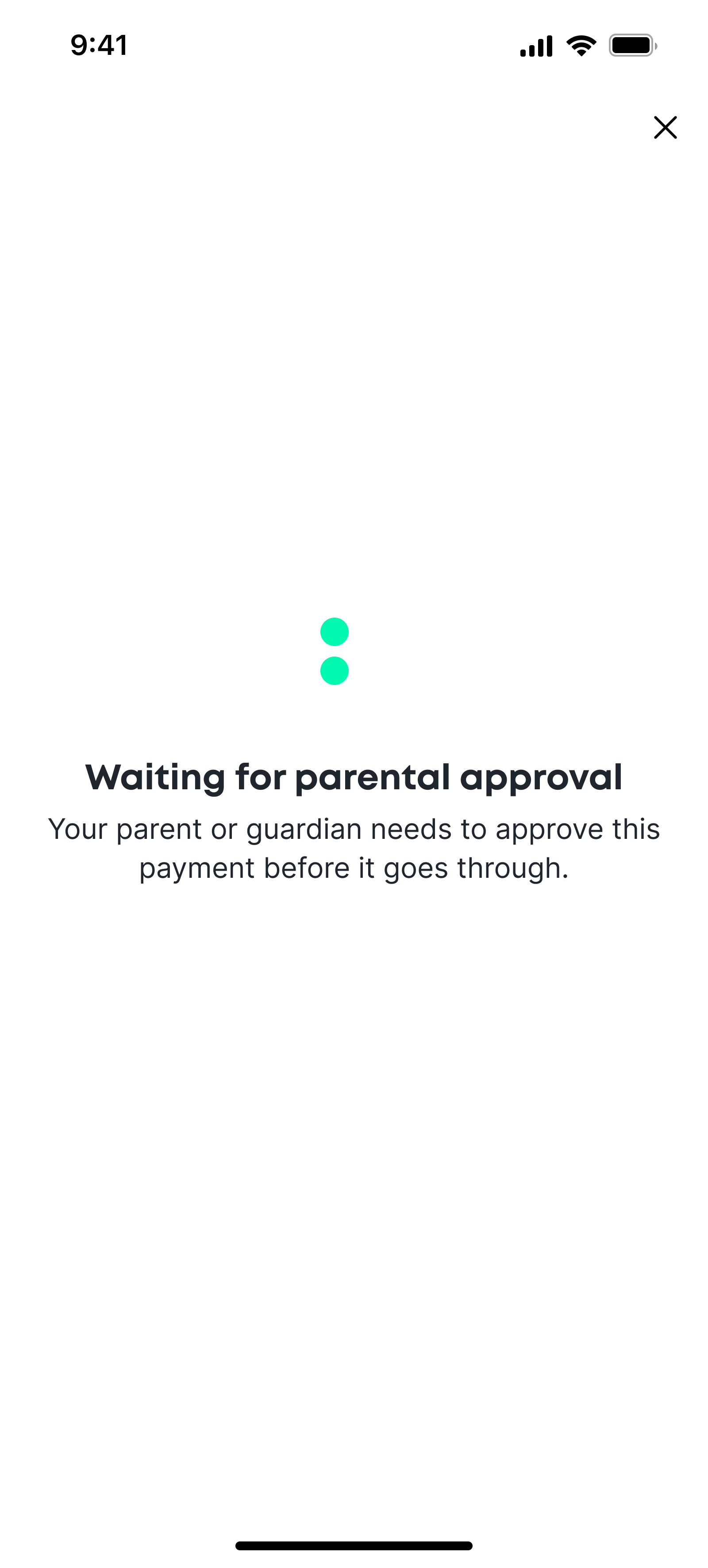
To support this, I designed Bolt Junior around progressive independence. Features are exposed gradually based on age and permissions, with clear limits and approval flows in place from the start. All actions remain visible to parents, helping both sides understand what’s allowed, what’s pending, and why.
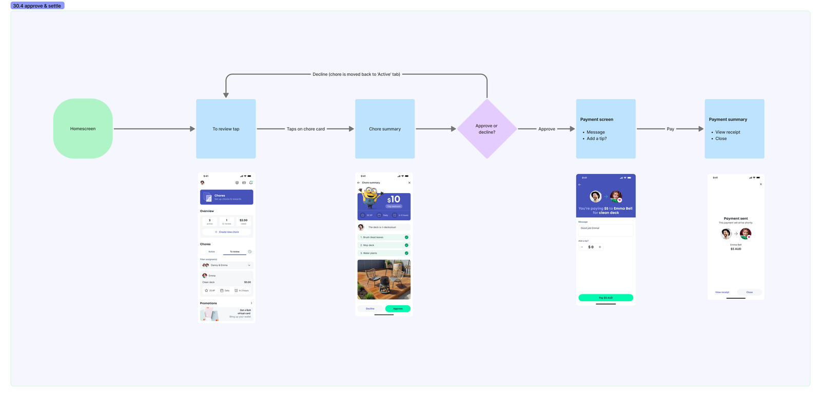
Chores approve and settle flow
Payments and requests
Junior payments reuse the core Bolt payment patterns, with approval layered on top. Depending on age and settings, payments and requests either require parent approval or operate within defined limits.
Pending states, approvals, and outcomes are always visible to both parent and child, reducing confusion and avoiding silent failures.
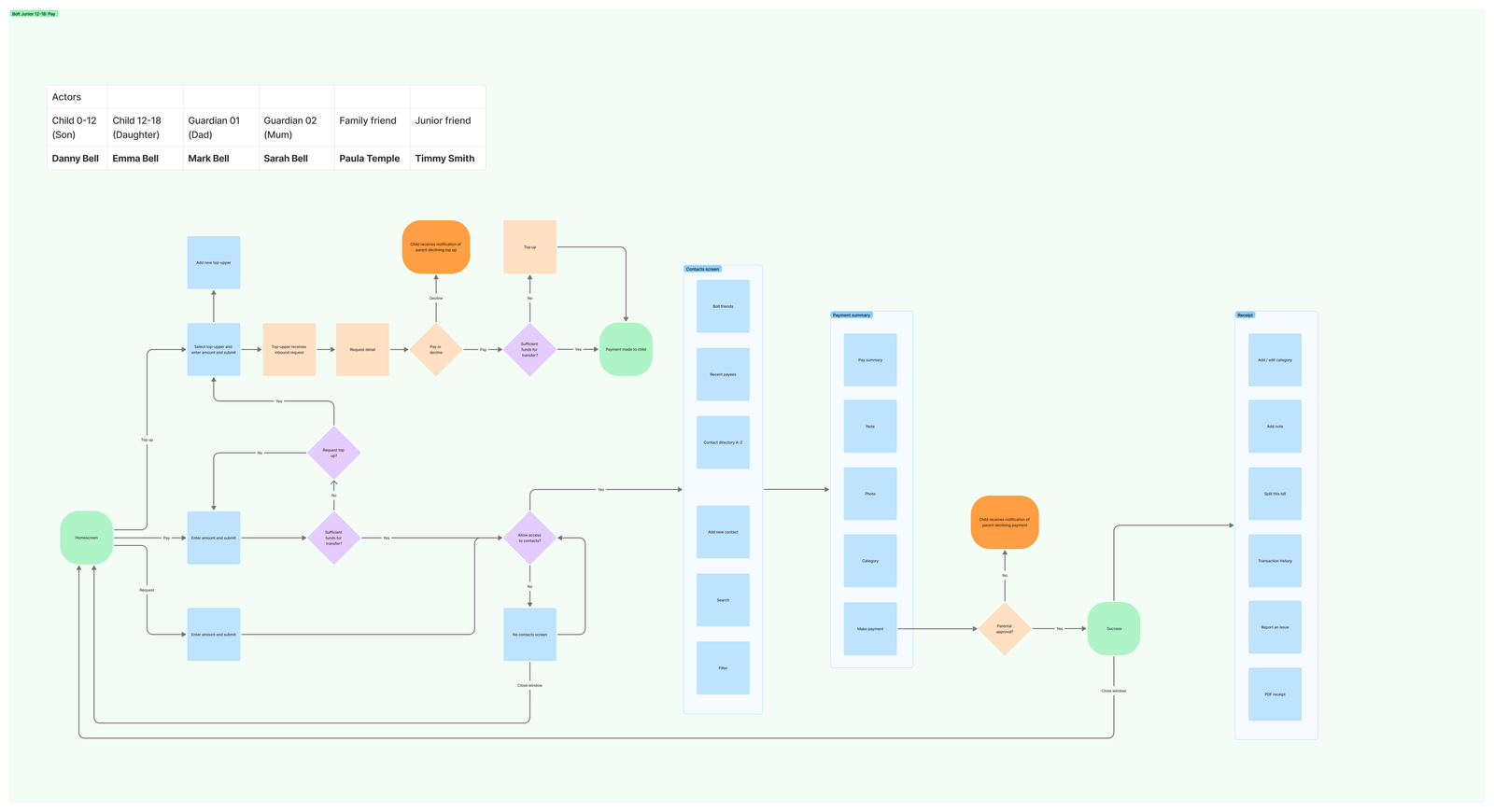
Junior payments flow with multiple actors
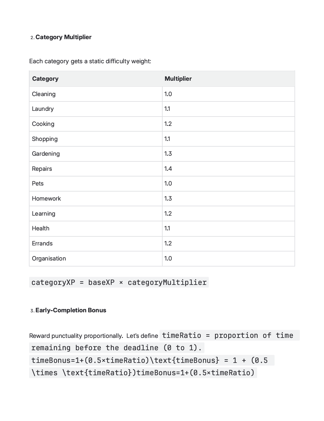
XP
I designed a lightweight XP system to sit alongside cash rewards in Bolt Junior, using ChatGPT to help refine the logic and test edge cases. The aim was to keep it fair, understandable, and hard to game.
XP is calculated from three inputs: the cash reward, the chore category, and how early the task is completed. Cash sets the baseline, categories apply a small difficulty weighting, and early completion adds a modest bonus. The result loosely reflects effort without overcomplicating the system.
This gives children a sense of progression and motivation beyond money, while remaining easy for parents to explain and control.
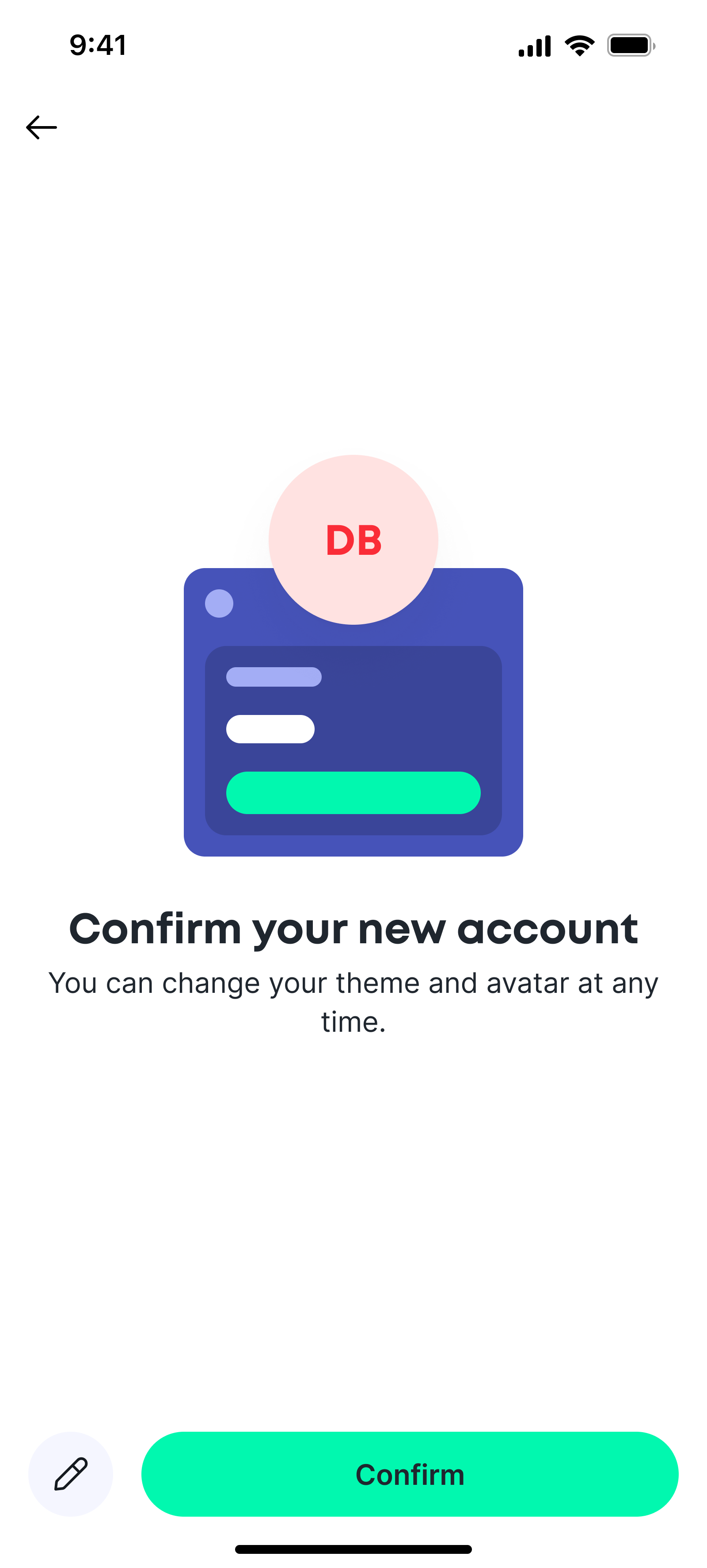
Onboarding
Junior accounts are created directly from the account carousel, using the same mental model as standard accounts. Parents set key controls upfront – spending limits, category restrictions, approvals, and allowances – without being forced to configure every detail at once.
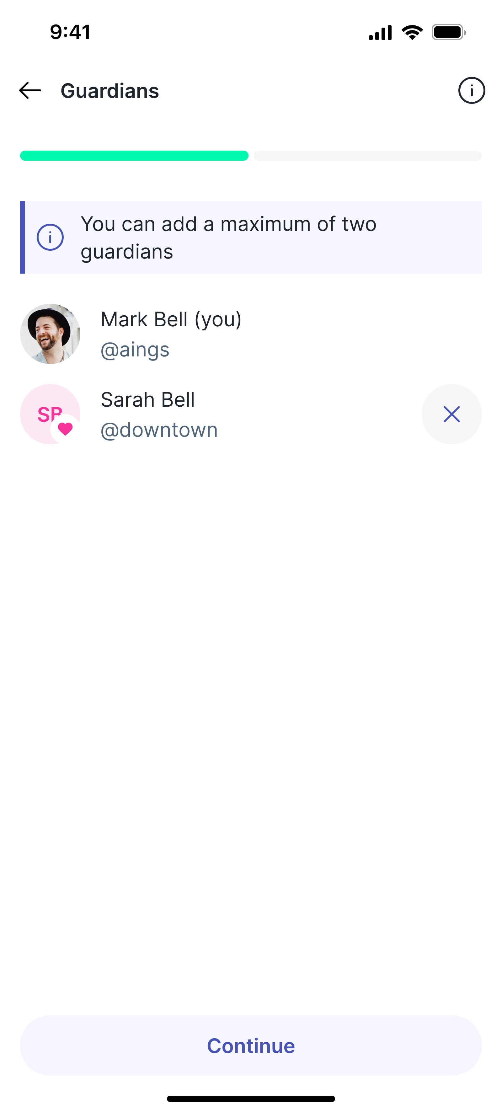
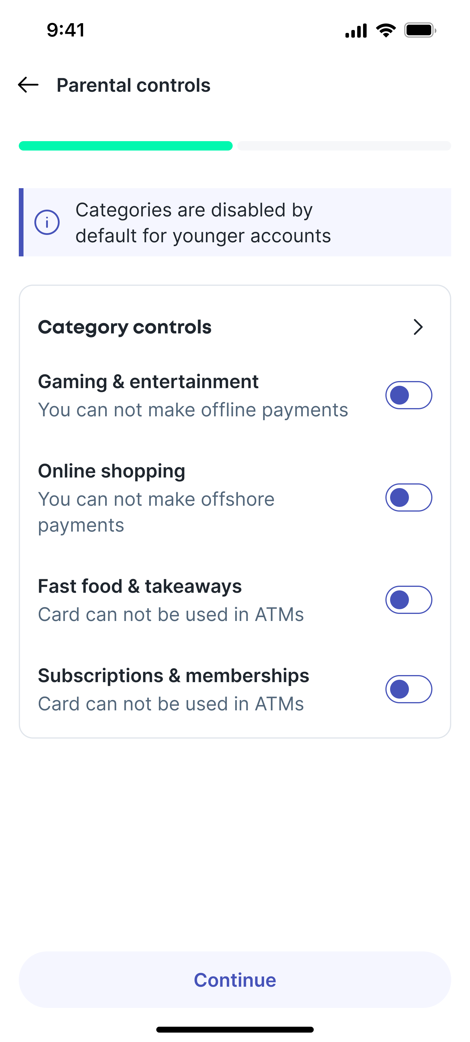
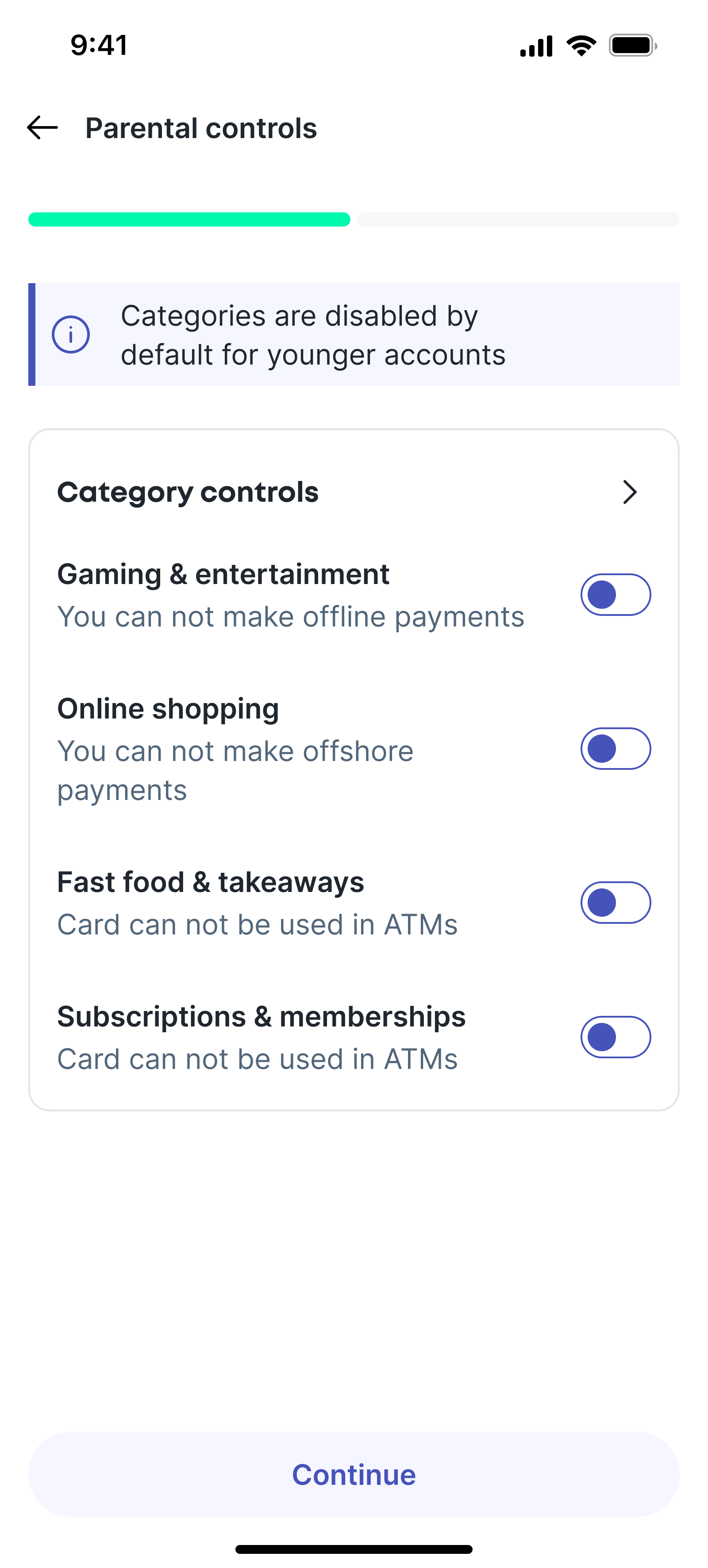
The child onboarding experience is lightweight and age-appropriate, focusing on personalisation of account dashboard background colour/image, and avatar colour/image.
Payments and requests
Junior accounts are created directly from the account carousel, using the same mental model as standard accounts. Parents set key controls upfront – spending limits, category restrictions, approvals, and allowances – without being forced to configure every detail at once.
The child onboarding experience is lightweight and age-appropriate, focusing on clarity and reassurance.
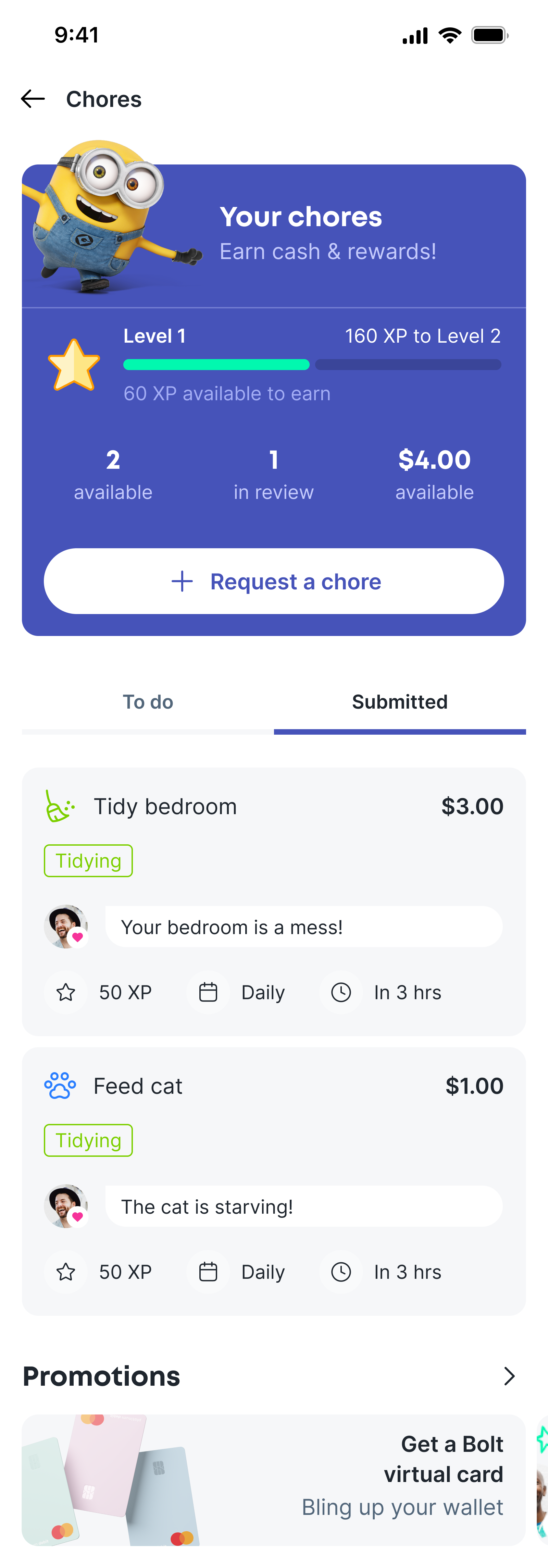
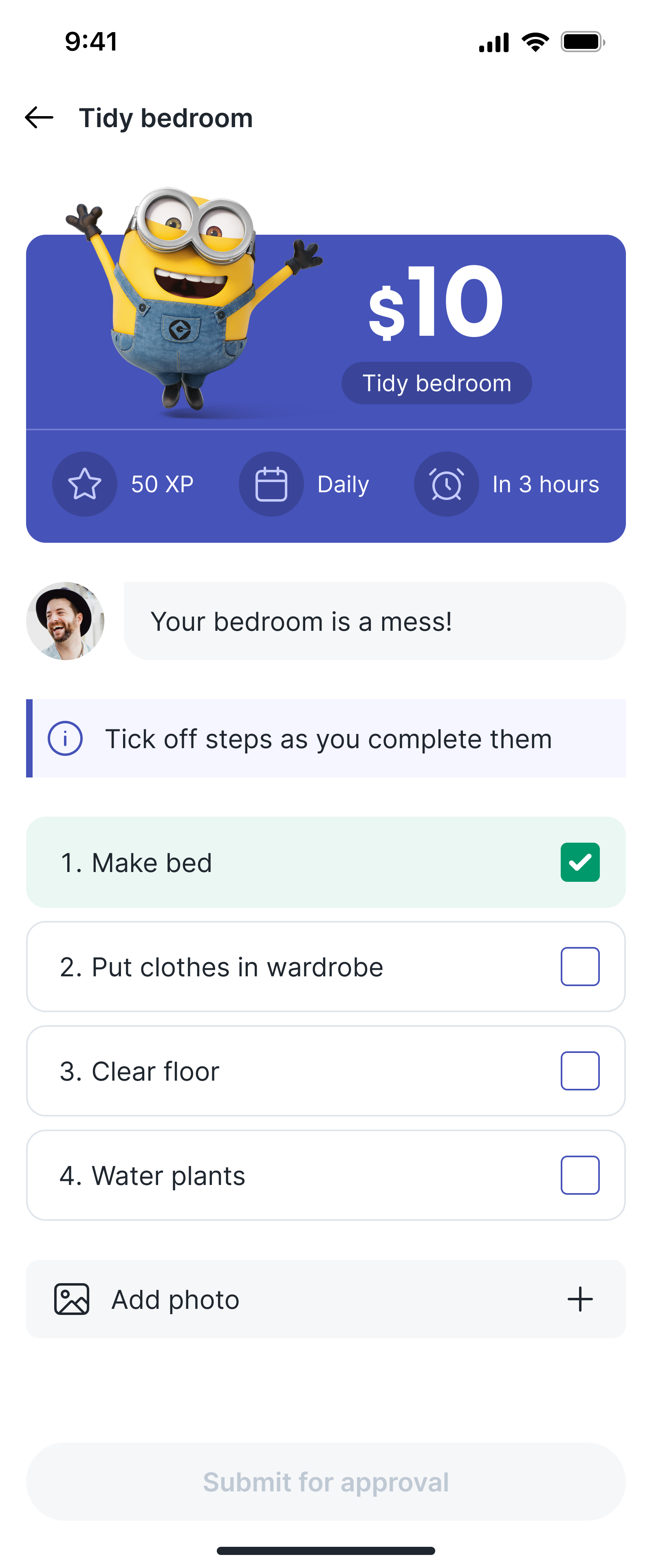
Chores
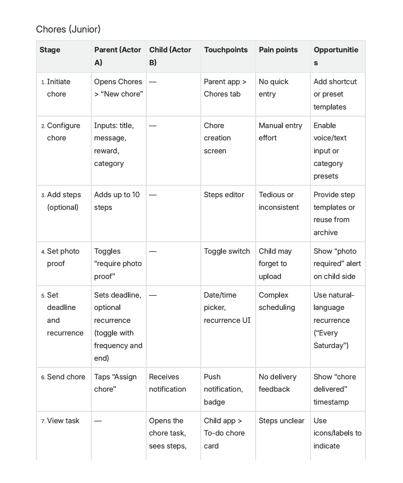
The chores feature serves two purposes - a fun way to get children learning about the value of money, and a way to incentivise kids to help out around the house. Parents can create chores with optional steps, deadlines, recurrence, and photo proof, while children see a clear, actionable task with progress tracking and status feedback.
I focused on making expectations visible on both sides. Children always know what needs to be done and what proof is required. Parents can review submissions with full context before approving or rejecting.
The feature also allows children to request chores from a parent or guardian.
Chores prototype
A simple prototype of the FX flow for validation. This interaction pattern - onboarding (shown only to first time users), feature, processing, confirmation and receipt is a constant across all money movement functions.
For more engaging interactions I generally sit with the engineer. This is often much more efficient than using Lottie, Rive, or other animation apps to try and replicate data driven features.
Parent
The parent flow for creating and editing chores.
Junior 0-12
0-12 year old flow for requesting and completing chores.
Junior 12-18
12-18 year old flow for requesting and completing chores.
Feature
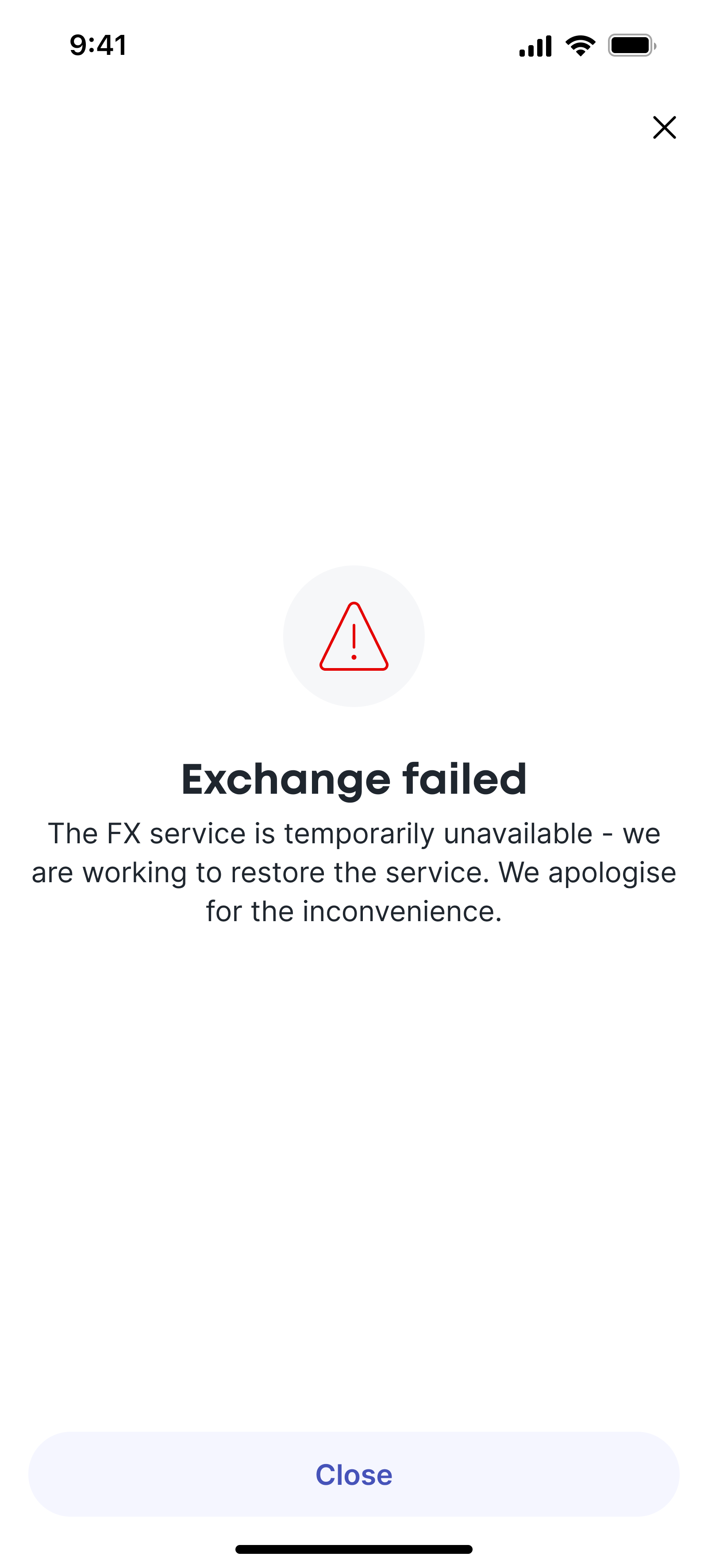
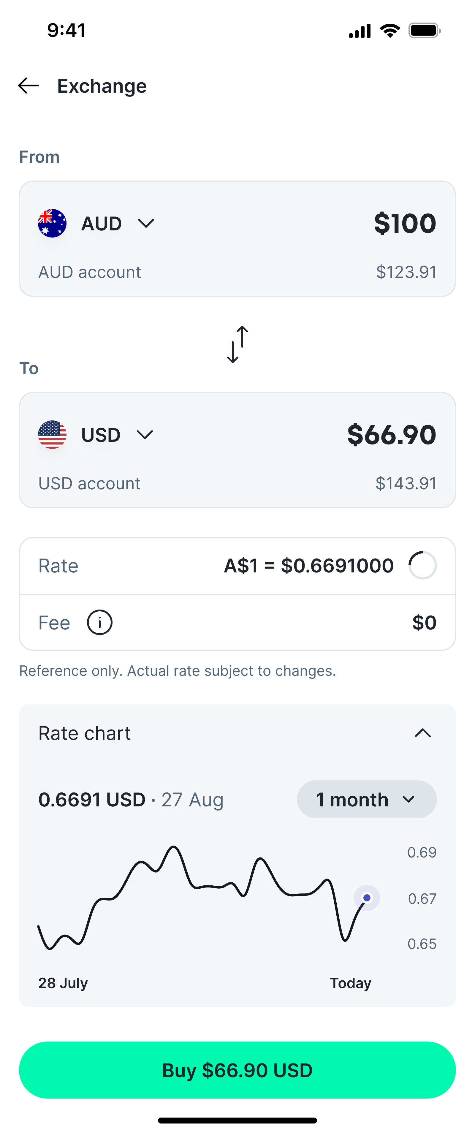
05. FX
Making a complex, regulated flow feel straightforward and transparent.
Multiple players
The FX journey was more a technical challenge than a UI challenge, and much of my time was spend talking to treasurey and compliance while mapping out user journeys, before looking at interactions. The journey has a couple of external touchpoints - currency cloud, and liquidity providers. All this happened behind the scenes - the user experience has to be clean, simple, and intuitive.
Exploring the FX flows.
Familiar patterns
I wanted to ensure the experience felt simple and transparent for the user, with all rates and fees clearly visible up-front, and the ability to view a basic rate chart to help inform the decision for larger amounts. I looked at competitor solutions and aimed to design something that captured all the common features or retail FX journeys, but in a cleaner, more reductive design.
It was important that the journey felt familiar to the user, so I utilised my component library and existing patterns to make the expertience feel distinctly 'Bolt'.
With most of the journeys in the app I established a similar pattern: learn and inform, enter/change values, confirm, and follow up tasks and support.
FX prototype
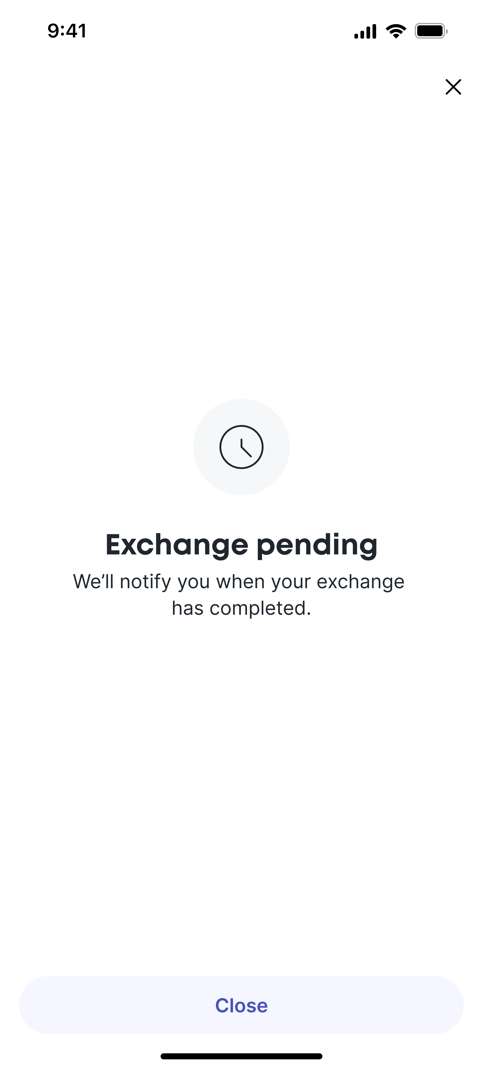
A simple prototype of the FX flow for validation. This interaction pattern - onboarding (shown only to first time users), feature, processing, confirmation, and receipt is a constant across all money movement functions.
FX switch interaction
This Rive prototype shows how the switch currency order button works. Users can flip the direction of the currency pair and show or hide the chart. When the direction is switched, the rate ticker resets.
Rive makes interaction, timing, and state changes explicit in a way static designs cannot. Engineers can see exactly what changes, when it changes, and how elements relate to each other. Prototypes are especially useful when working with non-English speaking developers, including our China-based team.
Motion and state transitions reduce reliance on written explanation and remove ambiguity around behaviour, sequencing, and edge cases. This approach reduces back-and-forth during build, and lowers the risk of incorrect interpretation in production.
Rive
Rive is a design and animation software built for creating real-time interactive animations. Unlike traditional motion graphics tools that focus on linear, timeline-based animations, Rive incorporates a state machine system, enabling designers to create animations that react dynamically to user interactions.
Feature
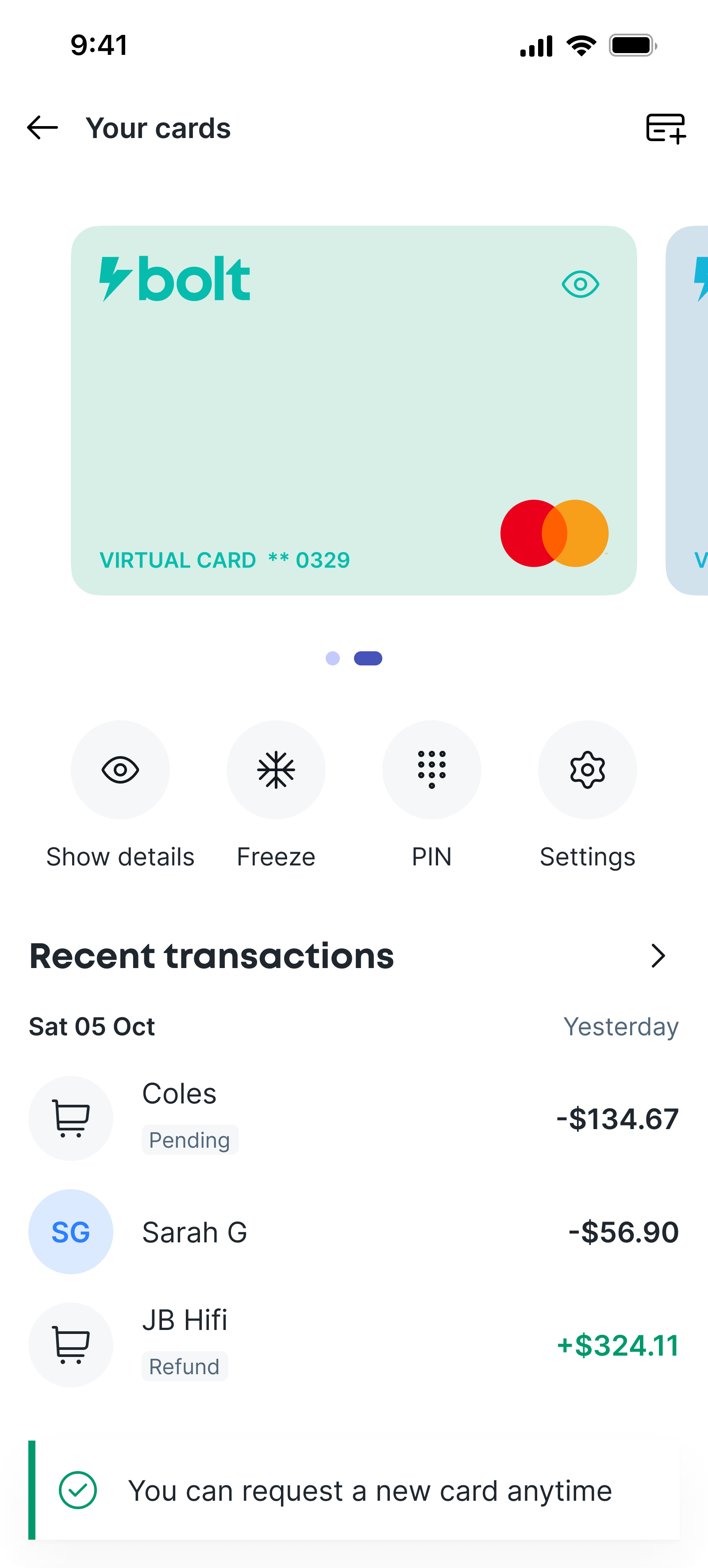
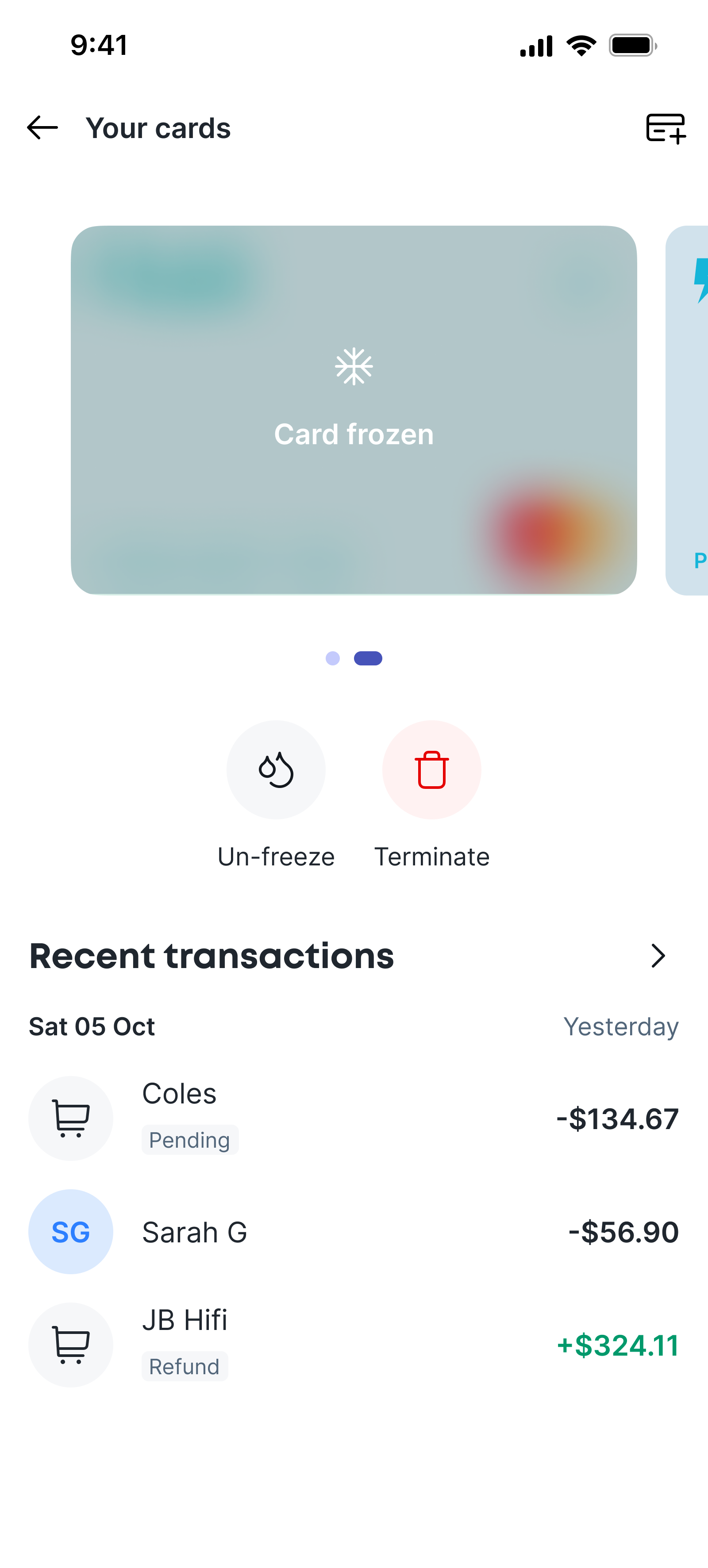
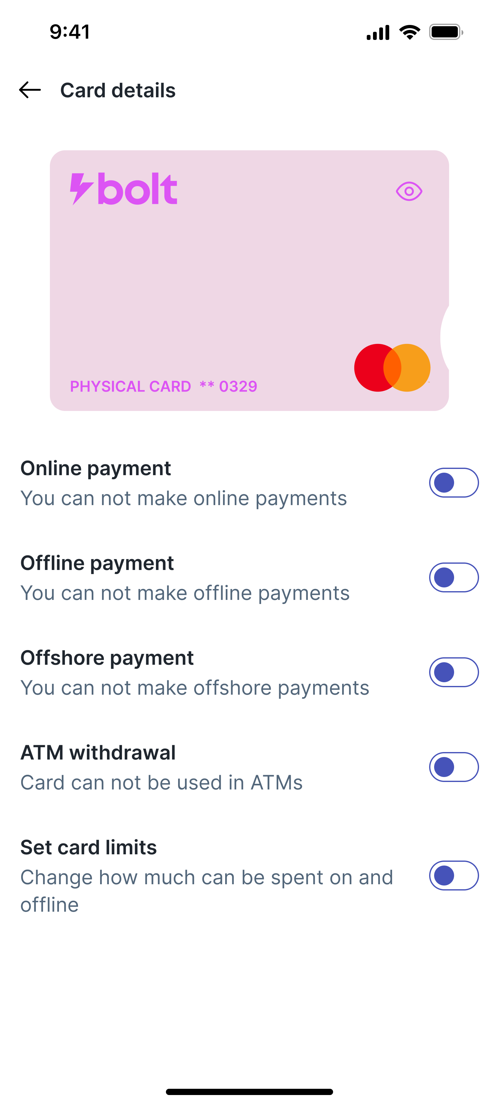
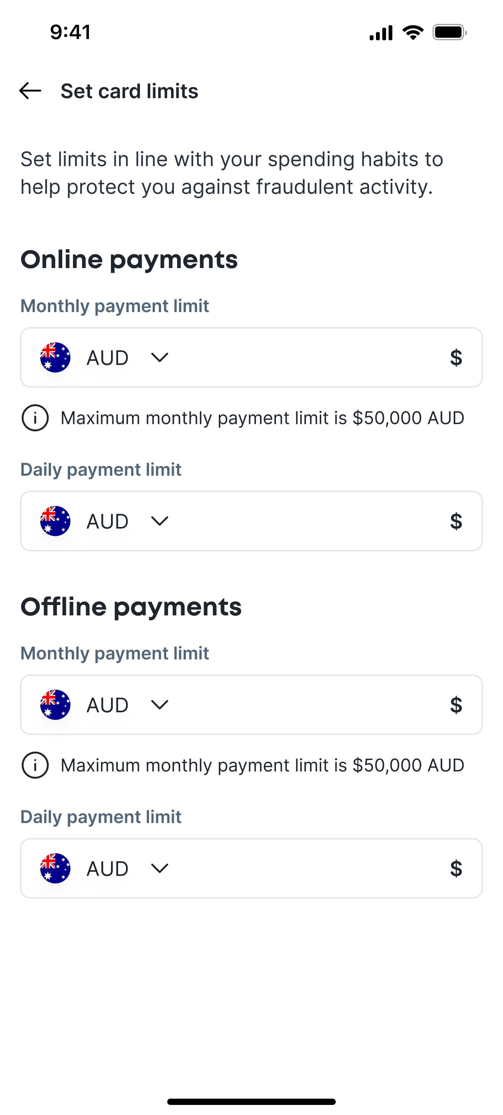
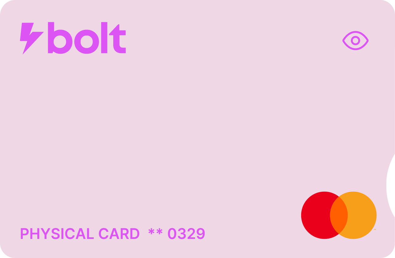
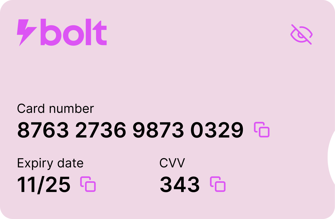
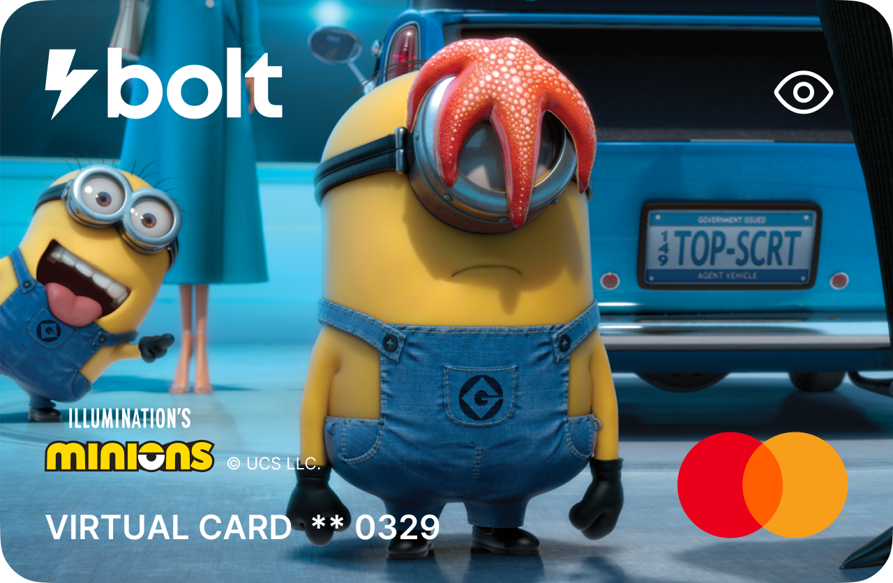
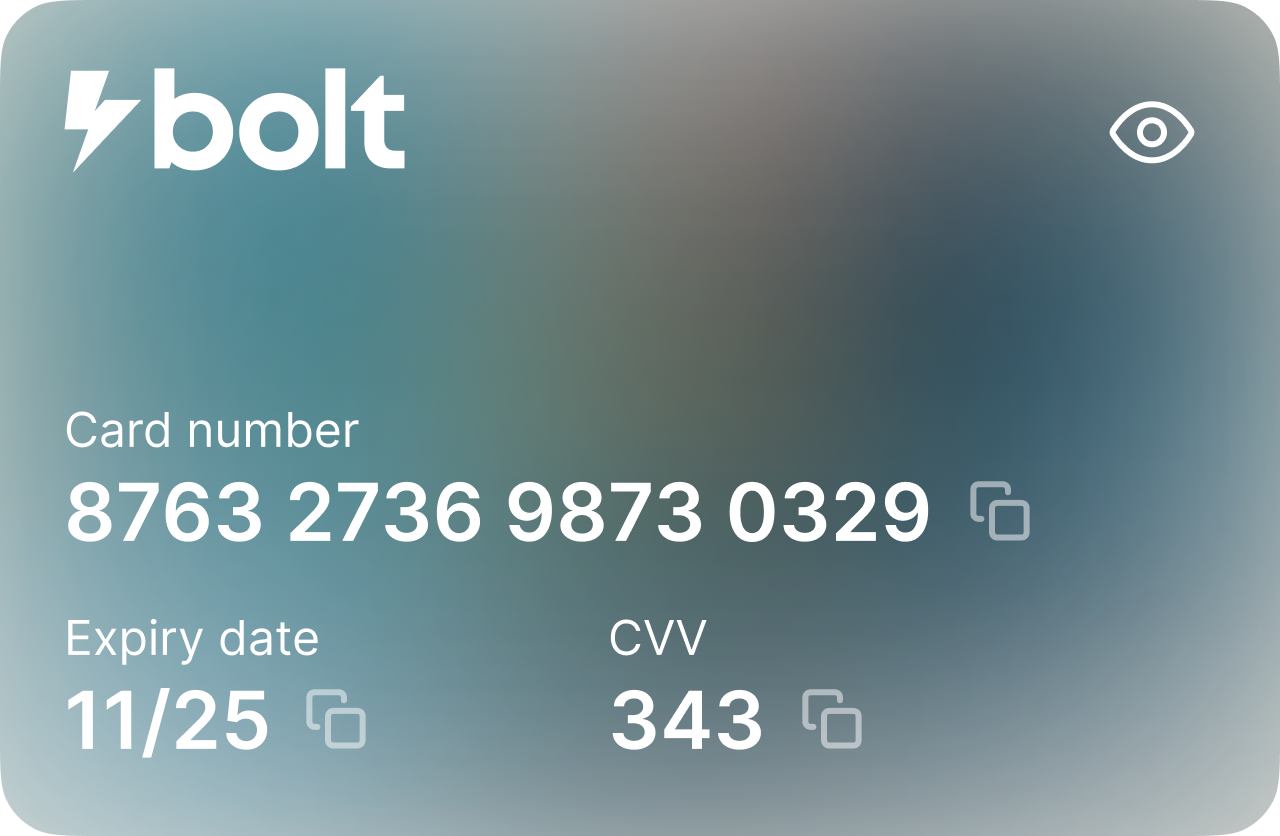
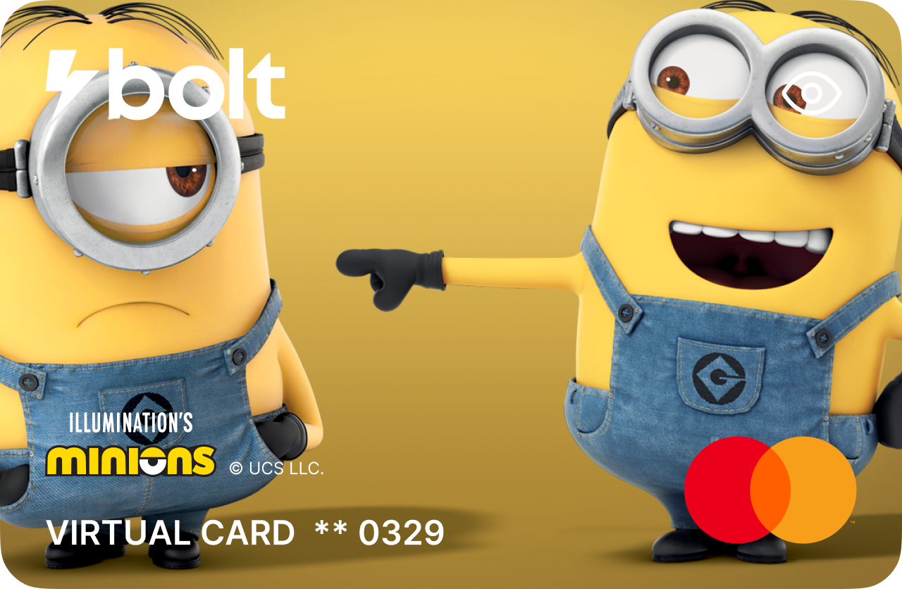
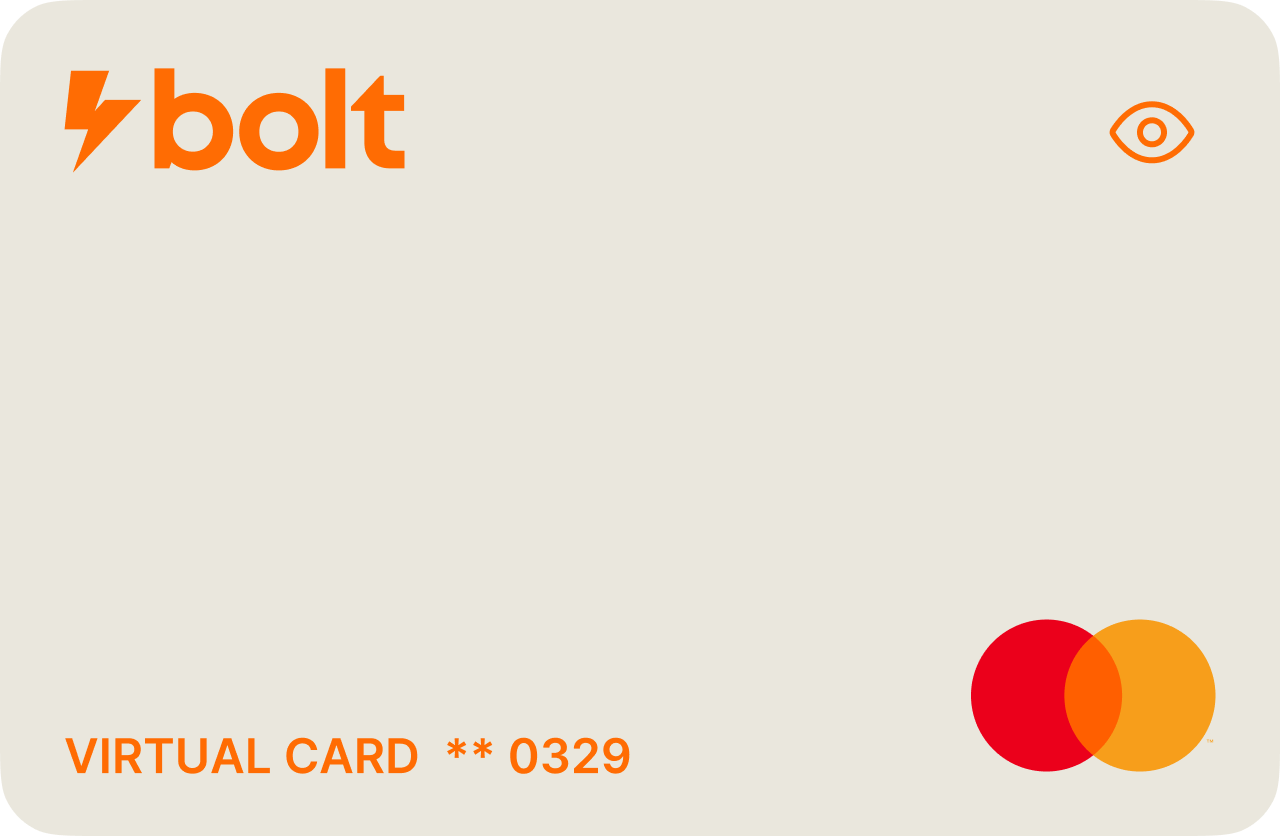
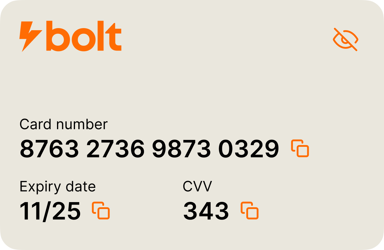
06. Cards
Giving users confidence and control over how they spend.
Virtual and physical
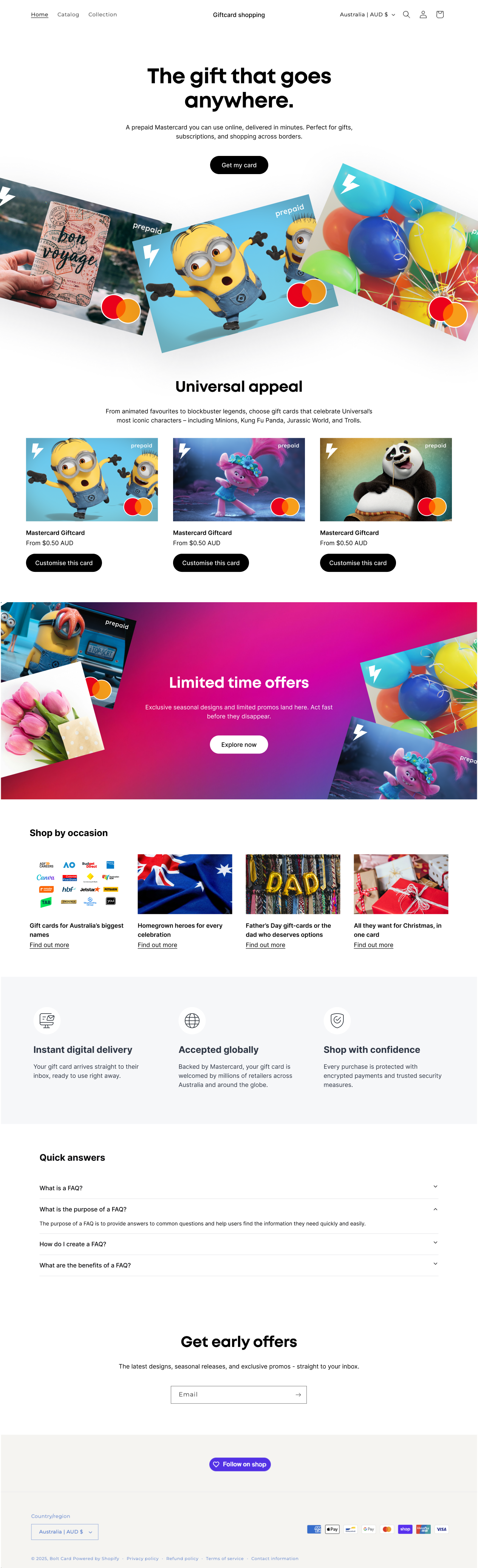
I designed a full card landing screen where users can order pre-designed cards, or customise their own. I utilised the Universal Studios IP that Bolt had invested in to create something engaging and marketable.
Mapping the cards feature.
AI ideation
Again I used Claude.ai to come up with some initial layout concepts, which was a fast and efficient way to translate my requirements into a starting point for the feature direction and interaction model.
Peace of mind
I re-used the same pattern as the account dashboard to surface the most important card controls. Show details, freeze, change PIN, and settings. Physical cards mirrored the actual plastic cards, with the accessibility cutout, and are also differentiated with the label at the bottom left.
Card designs
As part of the cards feature I designed the physical and digital cards, following Mastercards detailed guidelines. I worked with our cards procurment SME in the office to specify the initial launch colours and finish, and created templates in illustrator and Figma for future variants.
I also used Mastercard's spec PDF to create a custom GPT which would help me check all measurements, font sizes, and clear space to ensure the card designs would pass their approval process as quickly as possible.

Card launch colours
I worked with the team to come up with 5 initial card colours, and accent tones. These colours were based on market research into trending, popular hues, and I decided to finish them with a subtle glitter finish, naming this launch set the 'Sparkle Series'.
These colours and accents were used across the physical and virtual cards.
Feature
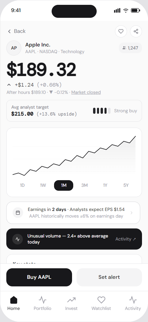
07. Stocks
Powerful investing tools for beginners and experts.
The stocks journey
The stocks journey maps out onboarding, stock analysis, share buying and selling, adding funds, and following a stock.
Mapping the stocks journey.
Designing the experience
Reduce friction
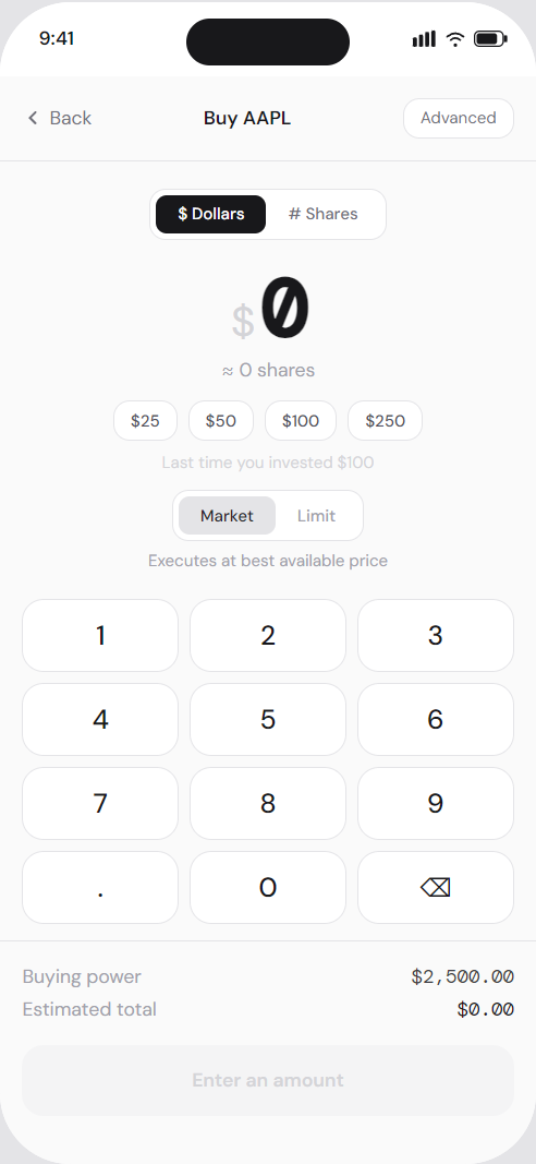
Dollar-based investing and quick-amount buttons remove calculation effort at the moment of decision.
One primary action per screen
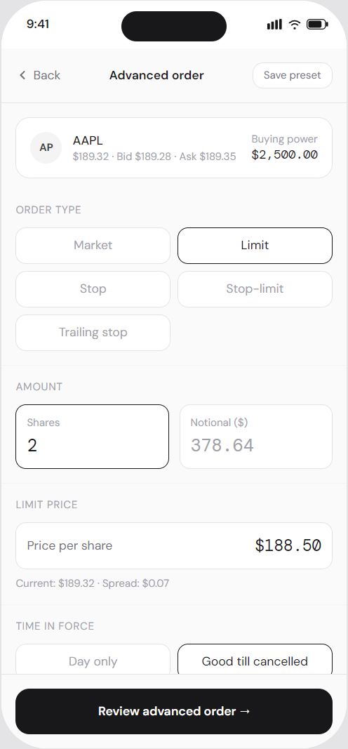
Secondary options (advanced order, set alert) are present but visually subordinate, preventing choice paralysis.
Anchoring
Analyst price target is shown before the user enters an amount, framing the current price as an opportunity.
Social proof
"1,247 watching" normalises interest and reduces the anxiety of acting alone.
Urgency without manipulation
Earnings countdowns and volume signals are factual triggers - genuine urgency grounded in real market events.
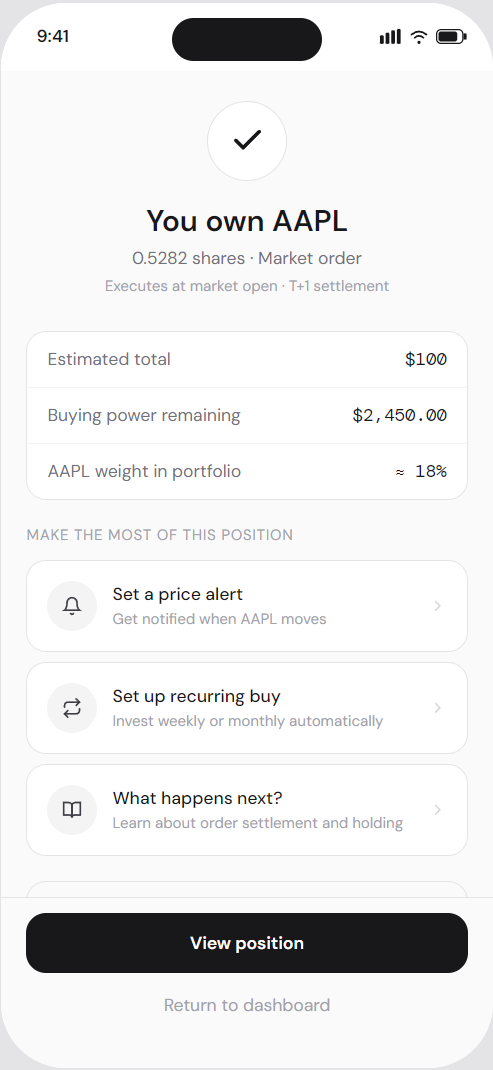
Variable reward
The portfolio milestone banner delivers an unpredictable positive signal on each dashboard visit; the same mechanism that makes social feeds compelling.
Goal Gradient Effect
The confirmation screen surfaces the next action immediately (Set alert, Recurring buy, Learn). Users are most open to continued engagement right after completing a transaction.
Peak-End Rule
The confirmation state is the emotional peak. Success icon, reinforcement copy, and hook loop cards make it the moment most likely to be remembered and to drive return visits.
Commitment and consistency
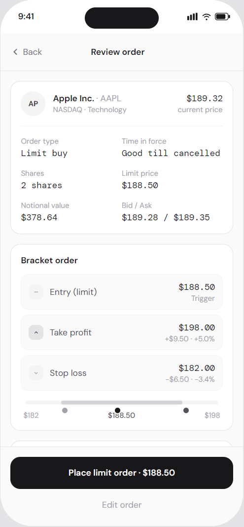
The thesis journal on Position Detail ("Why did you invest?") increases psychological ownership and reduces panic selling.
Progressive disclosure
Advanced order types are tucked behind a single link. New users never see complexity they're not ready for.
Loss aversion
The near-52-week-high warning is shown contextually rather than suppressed - building trust and modelling good adviser behaviour.
Drive activation
The deposit confirmation screen doesn't end at "Funds on their way" - it immediately presents an "Invest now" CTA before momentum is lost.
Build trust through transparency
Fee disclosures and regulatory copy appear inline at each decision point, not buried in footnotes or terms screens.
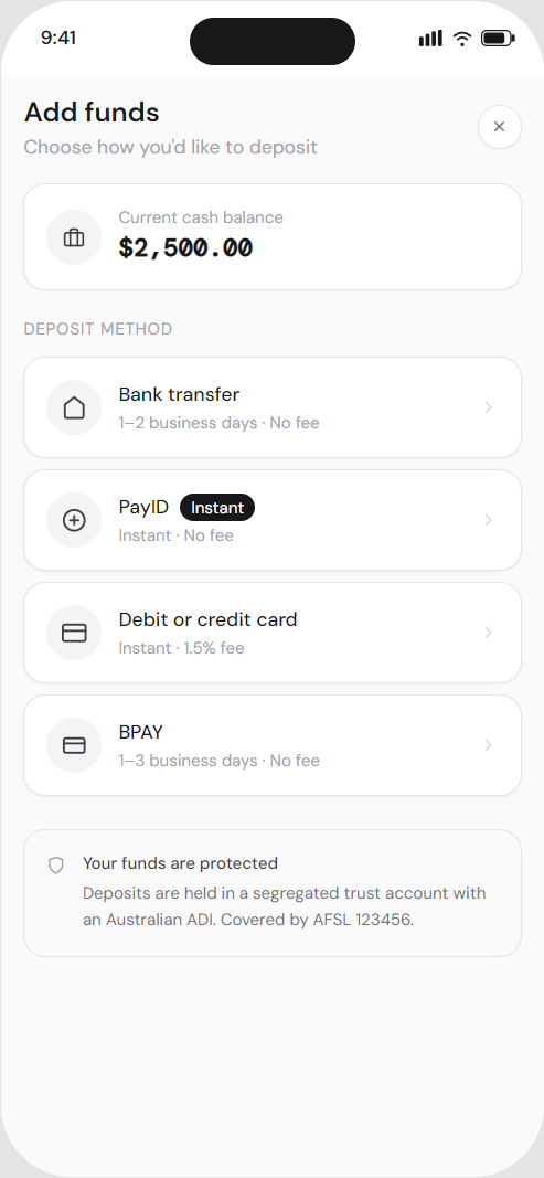
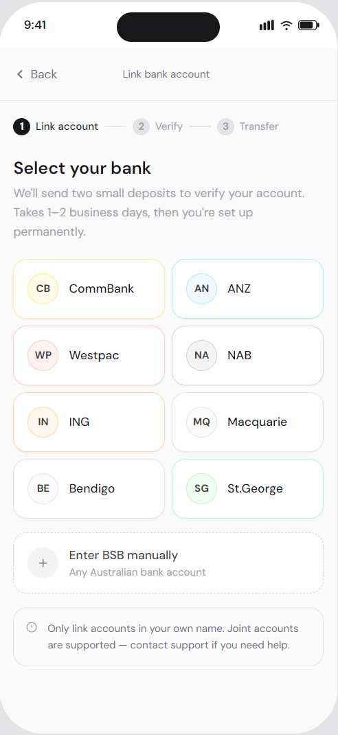
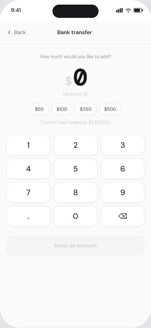
Onboarding
Dashboard
Add funds
Place order
Misc
Search
Learn
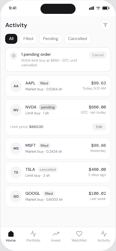
Activity
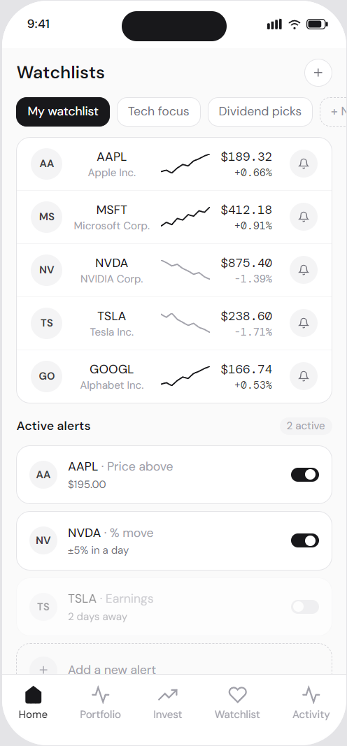
Watchlists
Process
Marketing and comms
Designing the experience beyond the app.
Above the line
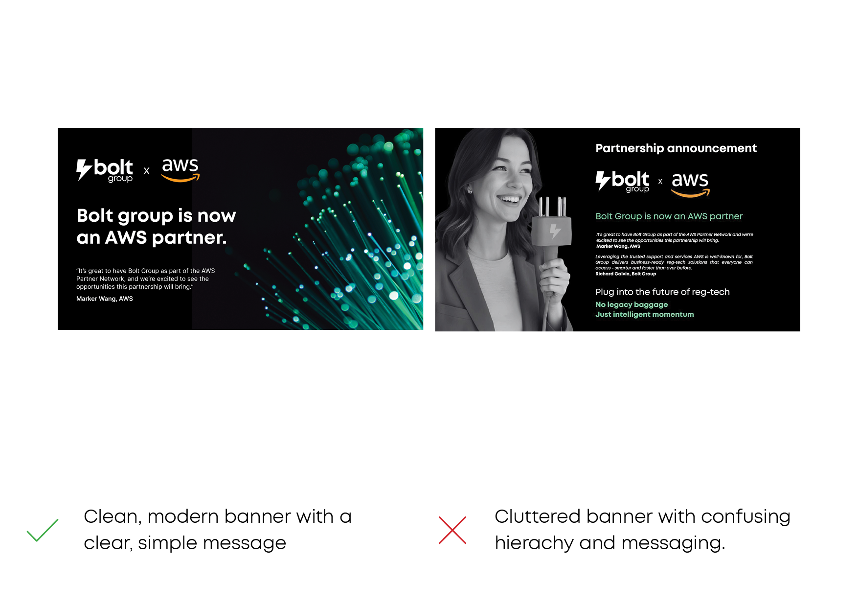
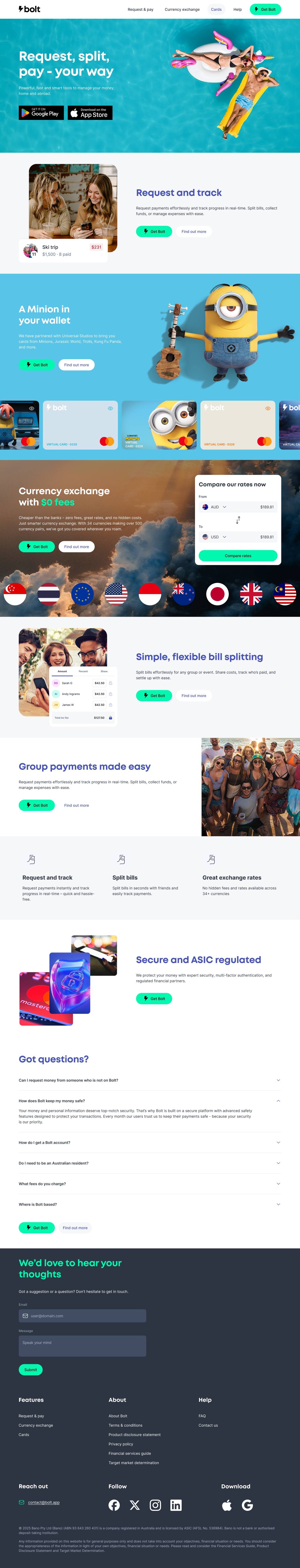
I designed the Bolt experience end to end, across every user touchpoint. This included the marketing websites for the app, the group, and giftcards. I also designed promotional material like promo tiles, marketing banners, and social media banners, as well as onboarding screens and emails, and all transactional communication such as receipts, requests, and notifications. My goal was to ensure the product felt consistent and trustworthy at every moment, not just inside the app.
Rather than treating these as separate channels, I designed them as a single system. Language, visual hierarchy, and interaction patterns were shared across marketing, product, and comms, so users always understood what was happening, and whether they needed to take action. This approach reduced friction, reinforced trust, and helped the product feel coherent and considered across the full user journey.
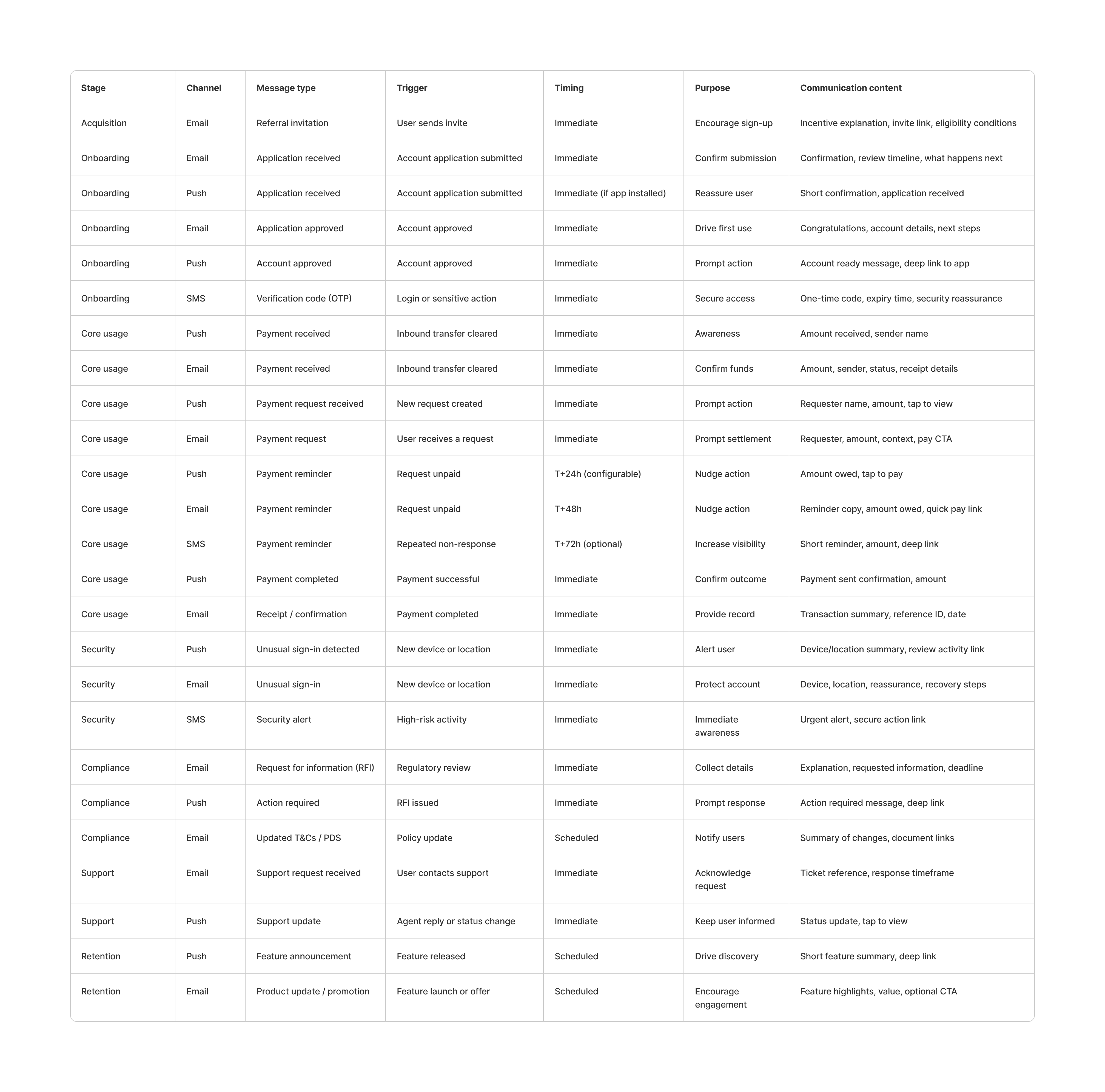
The comms experience with triggers and methods.
End-to-end
Email, push, and SMS are crucial communication tools in a money app, with each channel used based on urgency, risk, and user context.
Each touchpoint has a clear role, ensuring users received the right level of detail at the right moment.
- Email carries detail, reassurance, and record-keeping, such as receipts, approvals, and compliance updates.
- Push notifications surface time-sensitive events and prompt quick action.
- SMS is reserved for security-critical or high-urgency moments where visibility matters most.
By designing all communications with consistent language, structure, and intent, the experience feels coherent from first contact through everyday use, reinforcing trust and reducing friction across the entire lifecycle.
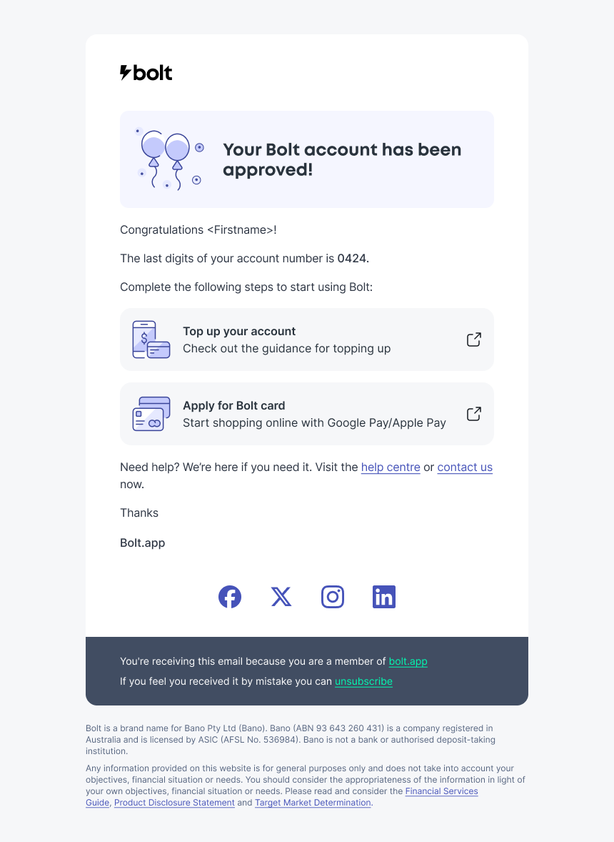
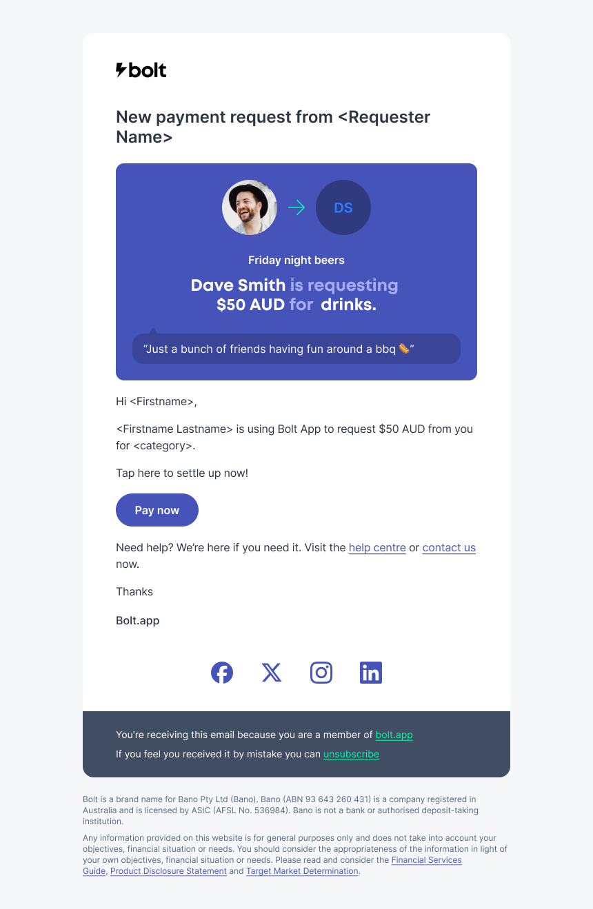
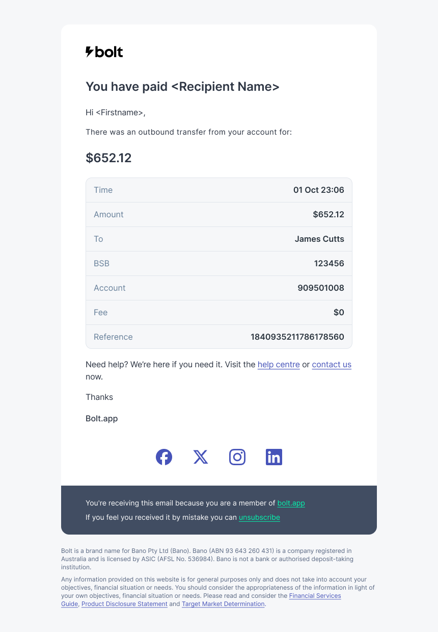
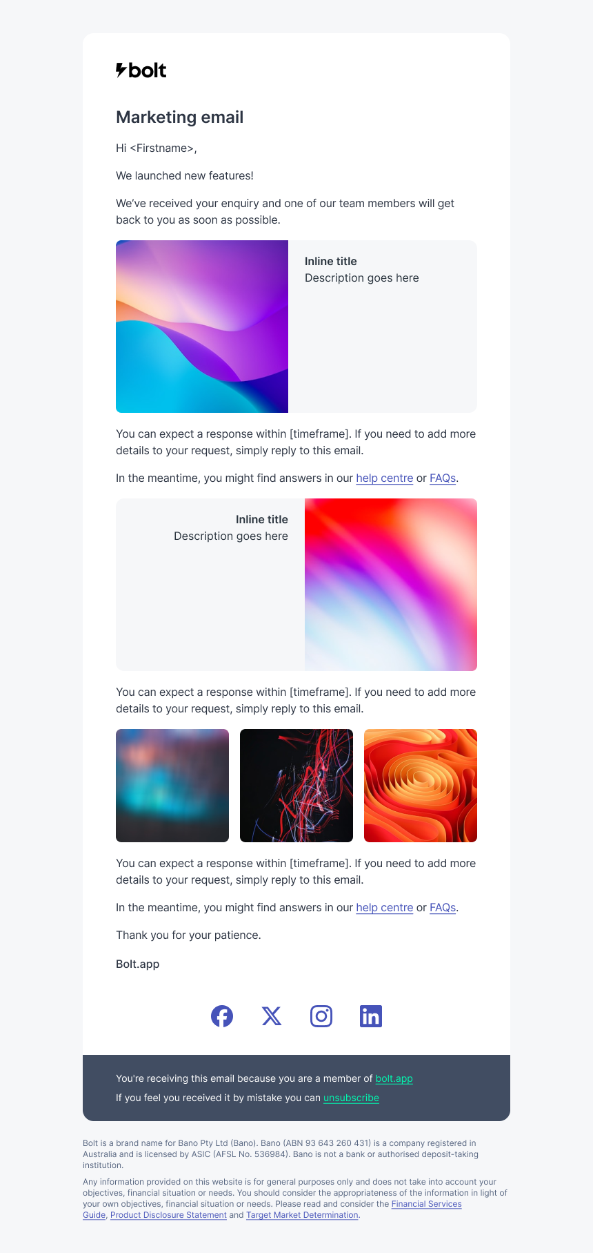
A reassuring voice
I designed a complete system of email, SMS, and push communications to support the product end to end, spanning onboarding, transactions, security, compliance, support, and growth. Each email type had a clear purpose, whether that was confirming something had happened, prompting action, or reassuring the user during sensitive moments.
Transactional emails focus on clarity and reassurance, with key details and next steps visible at a glance.
Security, compliance, and support emails are deliberately calm and direct to build trust, while onboarding and referral messages guide and motivate without feeling sales-led.
Across all communications, structure, tone, and visual language are consistent with the app, so every message feels recognisably Bolt.
Process
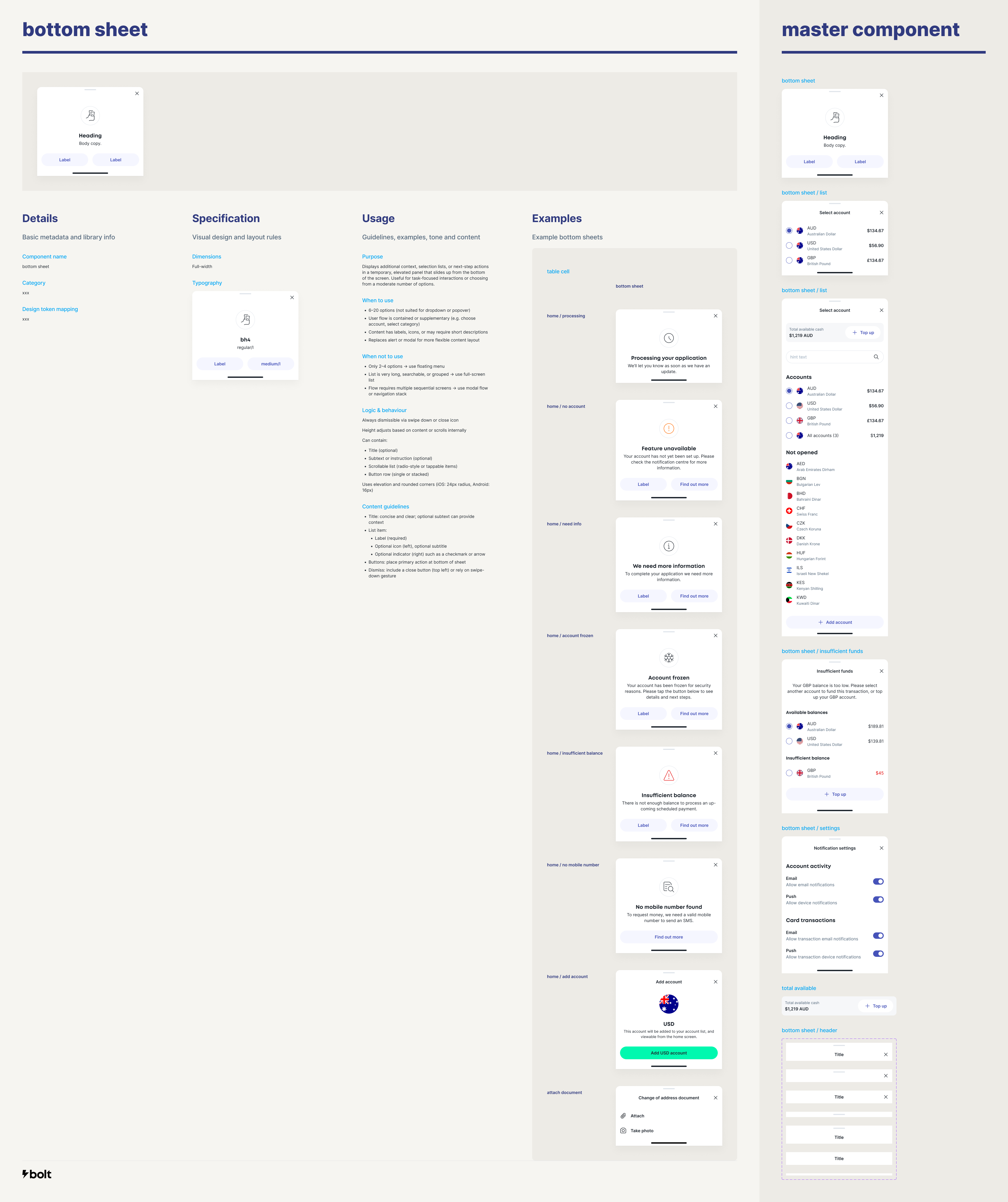
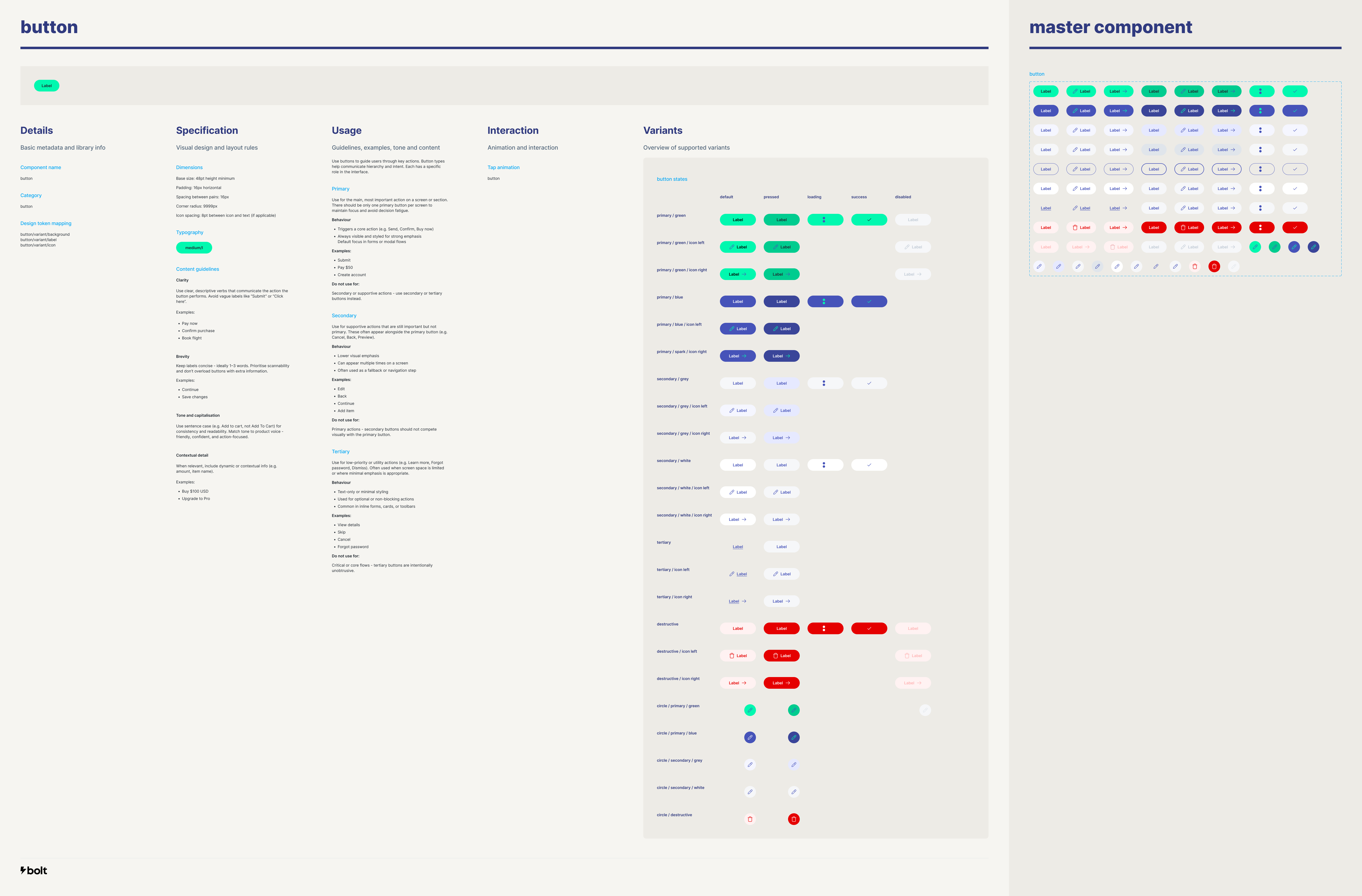
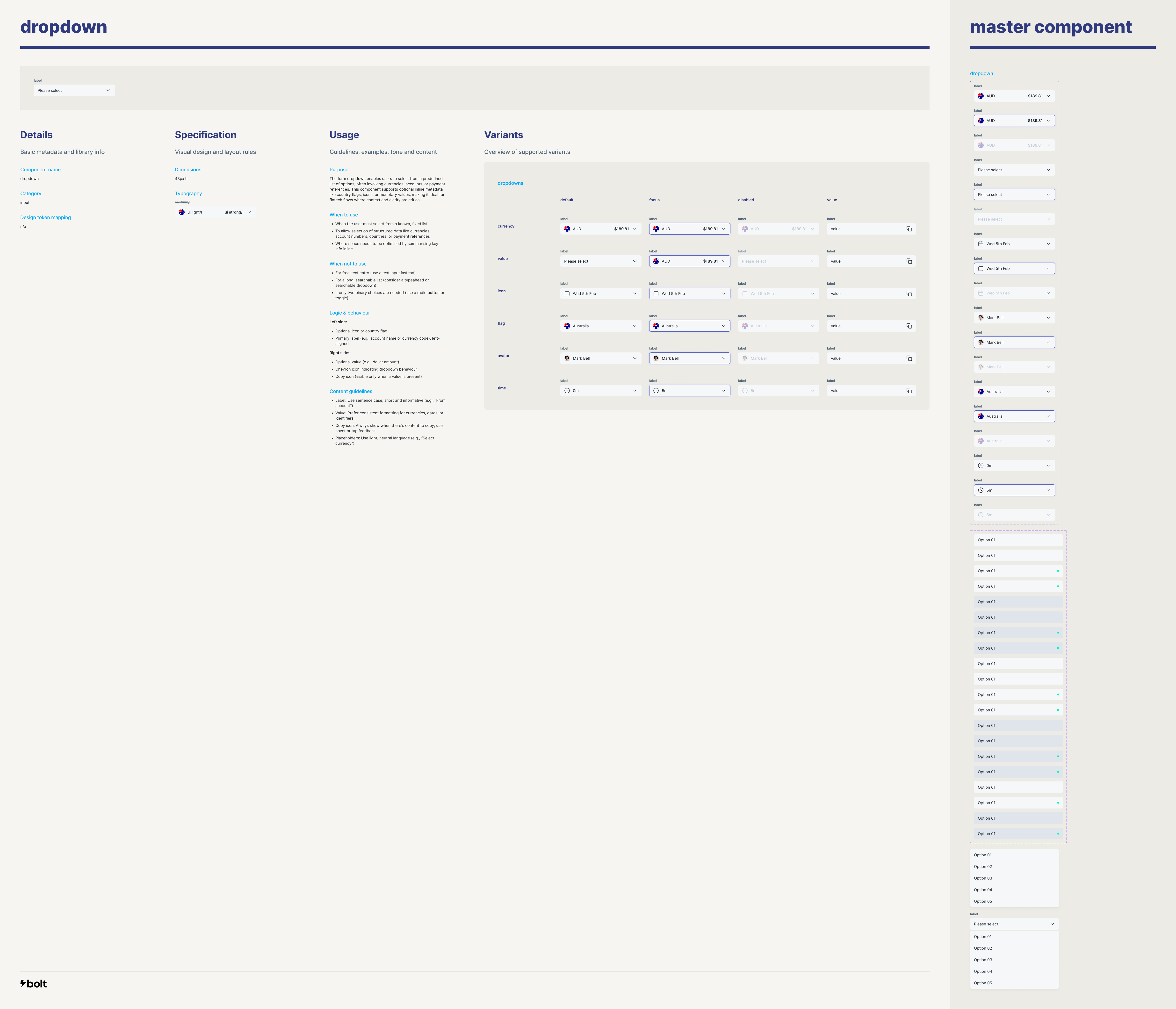
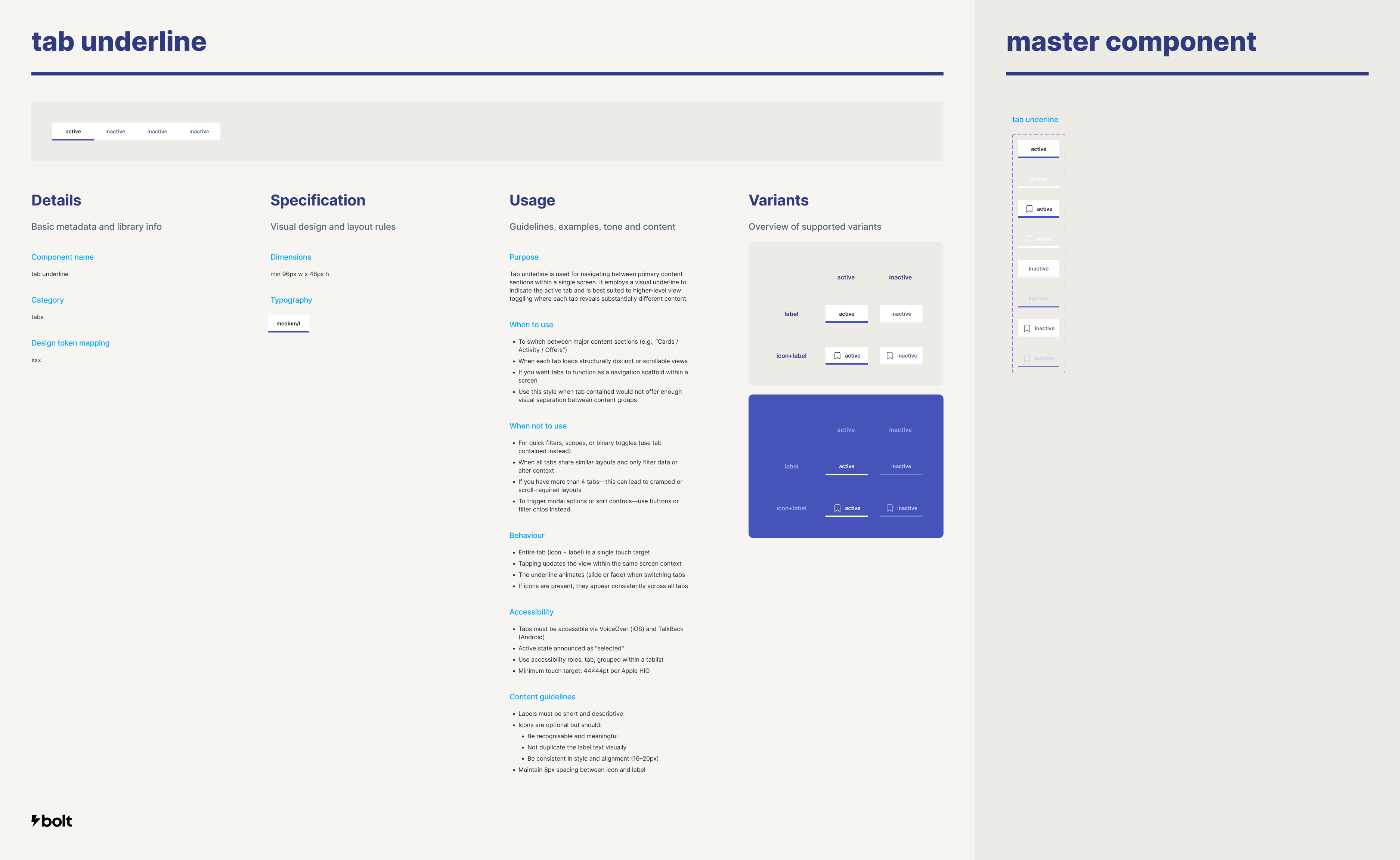
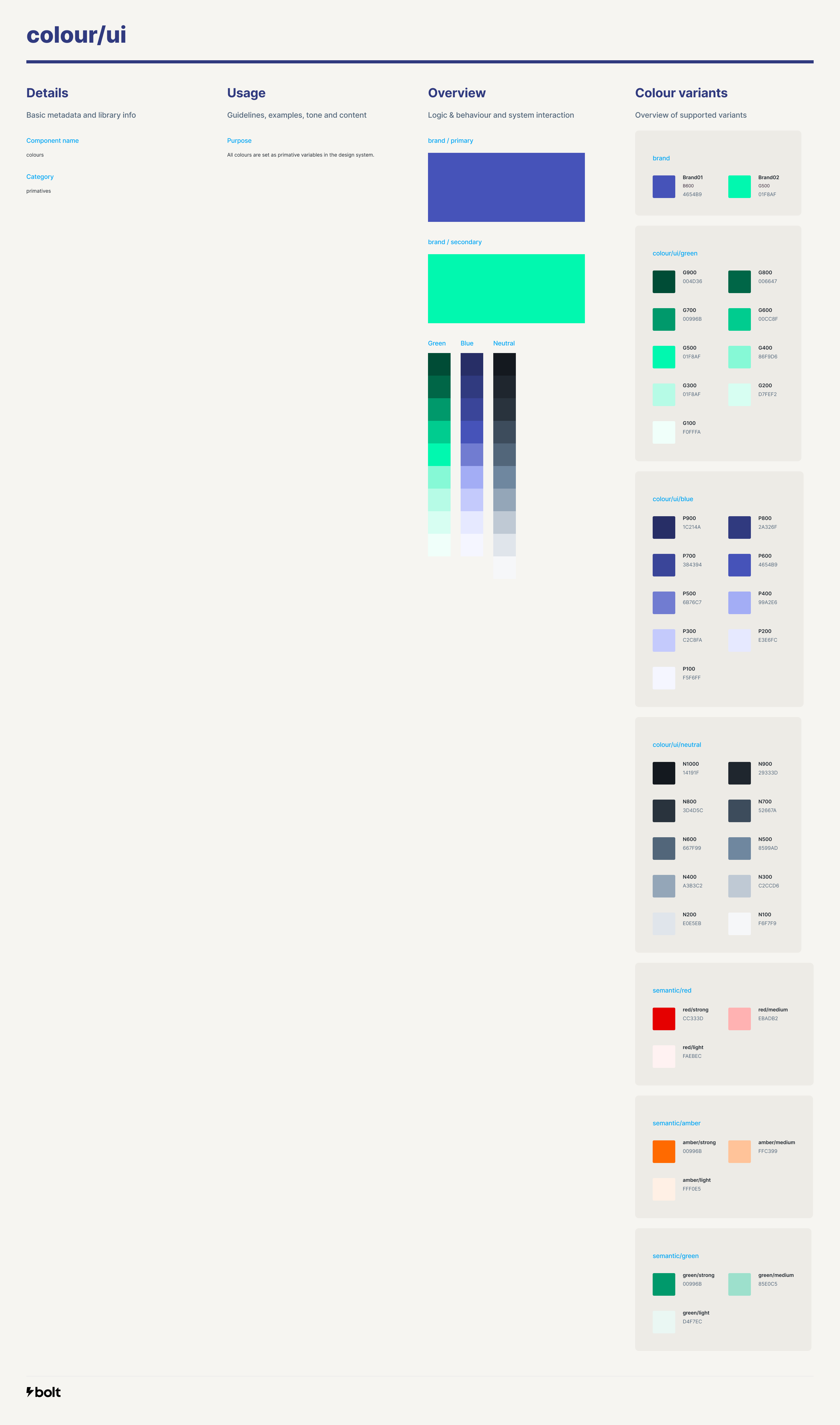
Component library
Aligning design and engineering around a single source of truth.
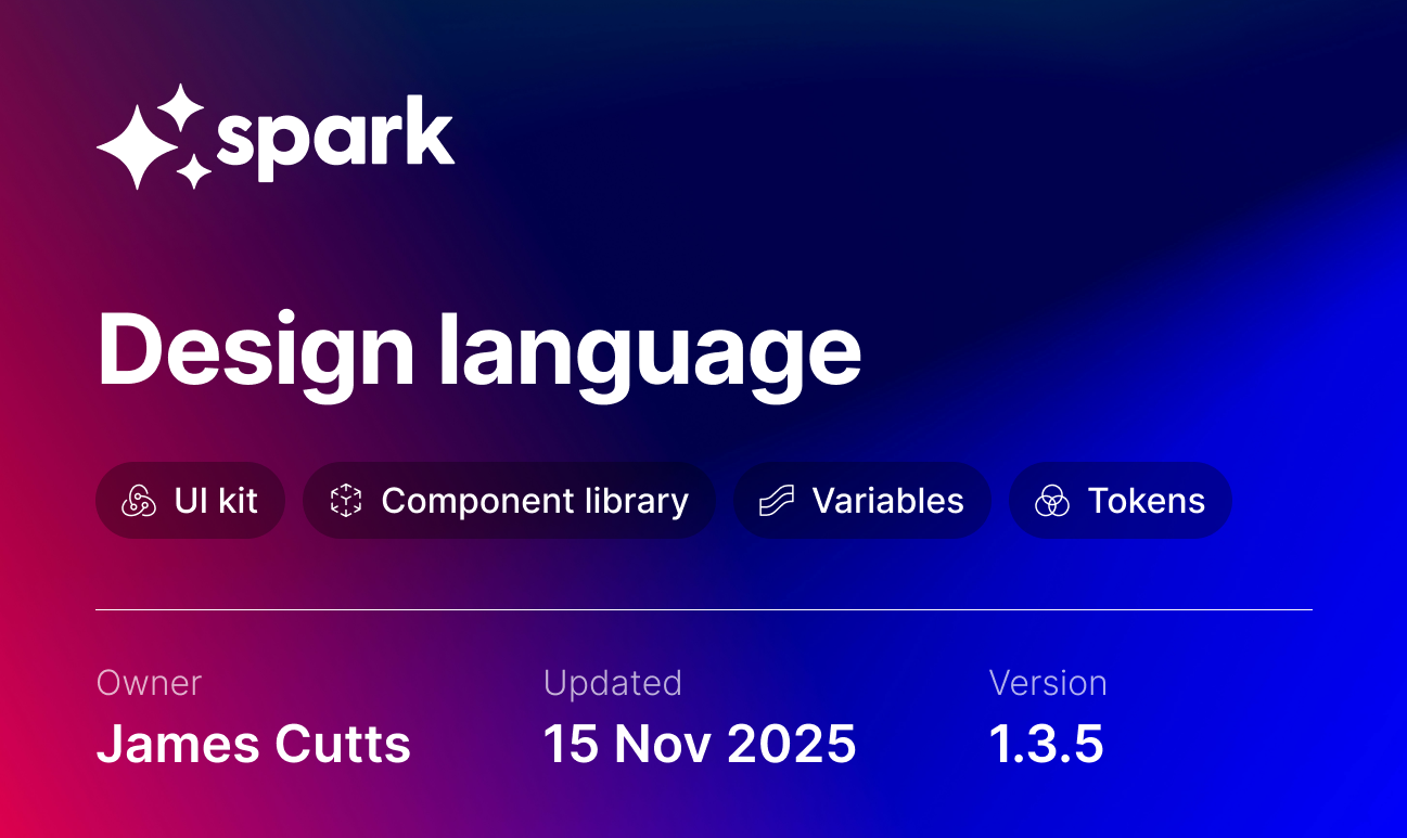
Spark
Alongside feature development, I built and maintained a component library and UI kit. Together with the brand guidelines, this formed Bolt’s design language, which I named Spark.
Whenever I worked on a new feature, I designed it using existing components wherever possible. If a new component was genuinely required, I created it with a clear purpose and supporting documentation, so future designers and engineers could reuse it with confidence.
Night and day
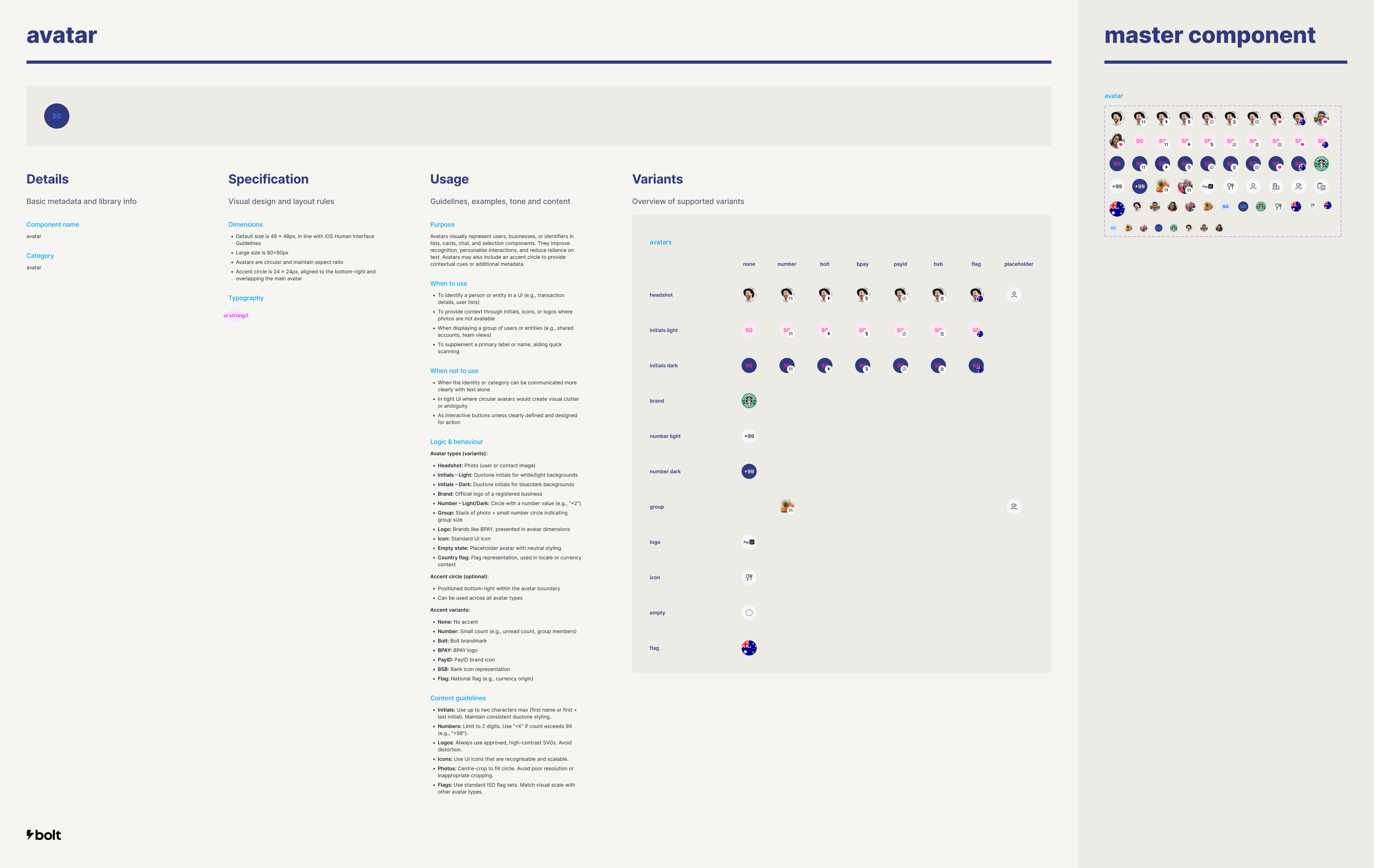
Using design tokens, I also worked on a dark mode version of the UI kit that would apply across all components and screens.
Avatars would also need to work across both modes, so I implemented blend modes to ensure they looked good andmaintained ACCC standards regardless of the background tint.
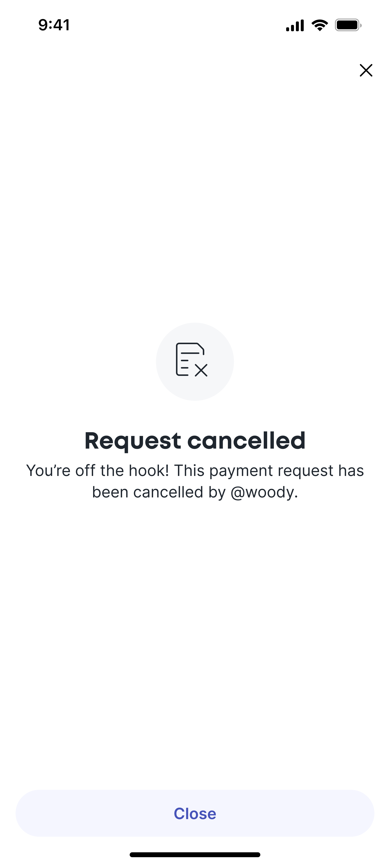
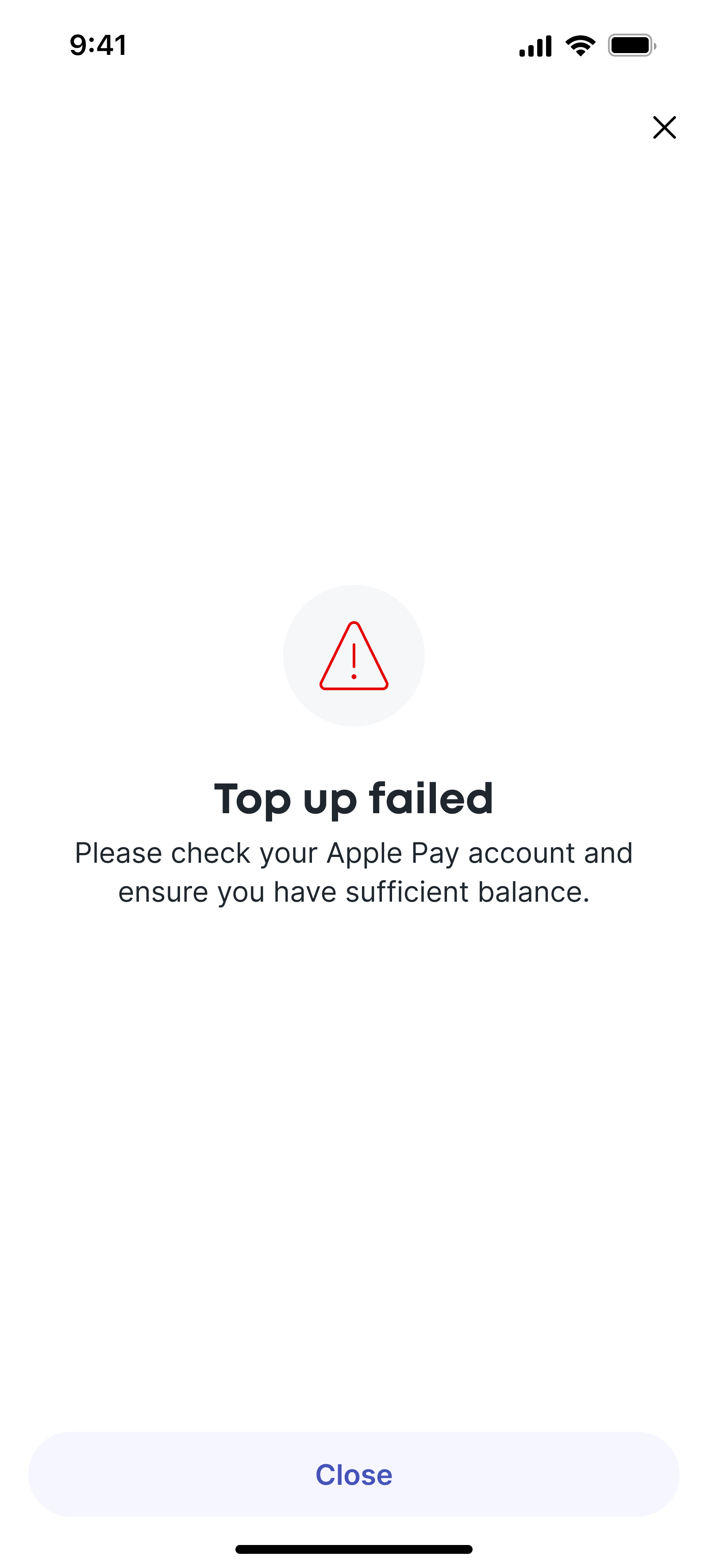
Not always a happy ending
Of course not every user journey always ends with success. As part of the interaction library I also designed error states and notifications.
The summary screen was modular, and could deliver any status required by tweaking a few variables - the icon, message, and any next steps.
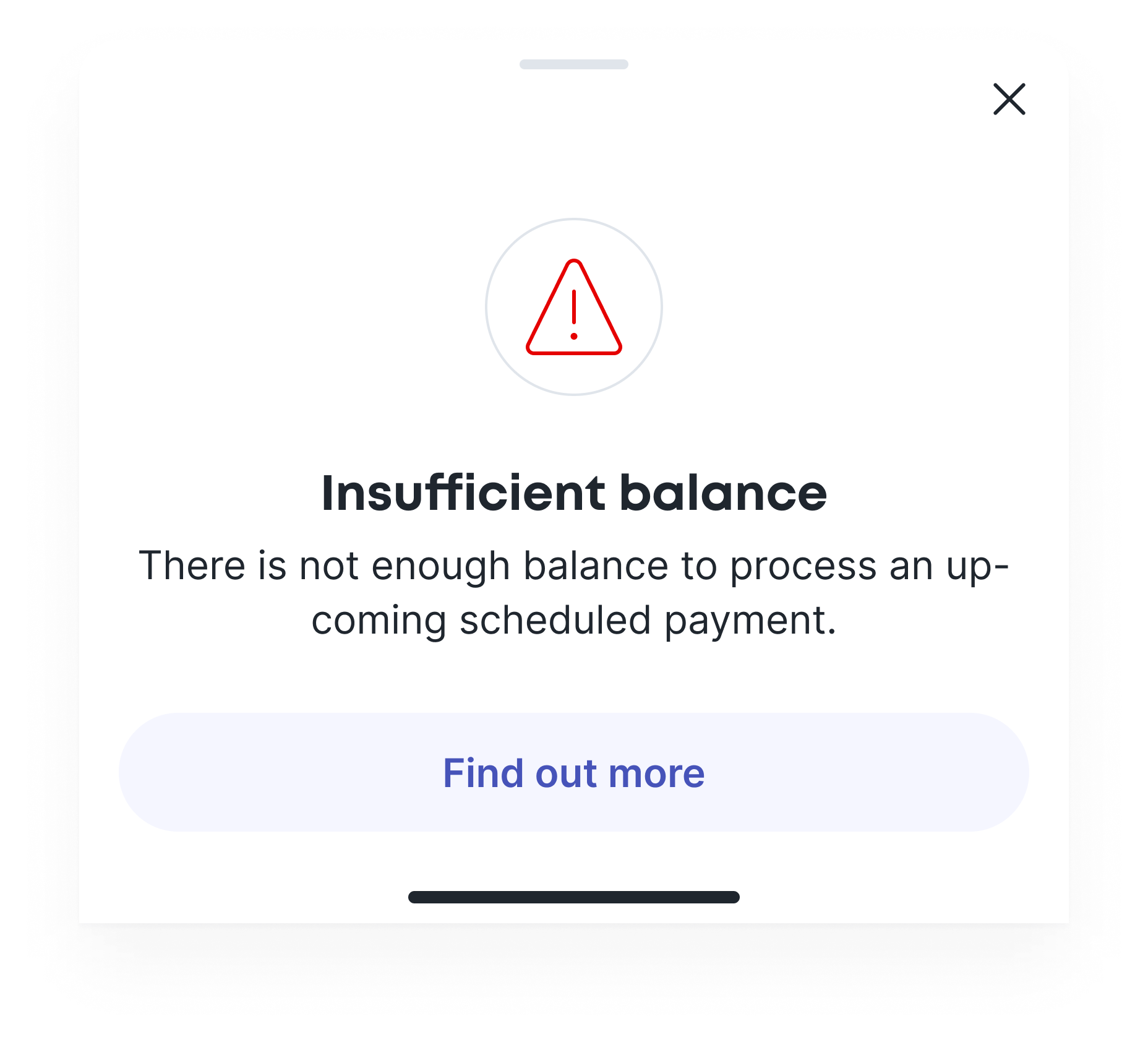
A nice bottom
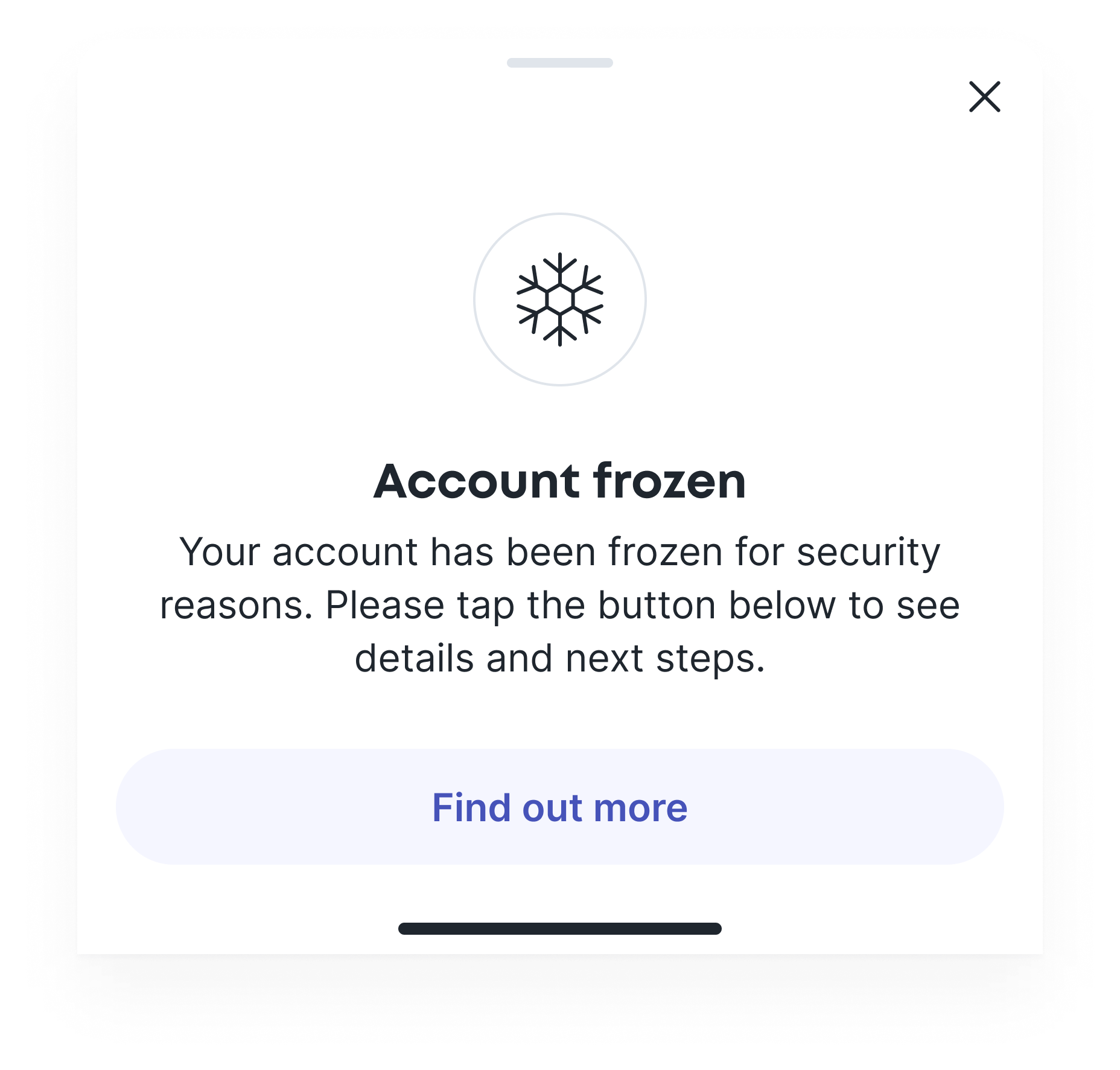
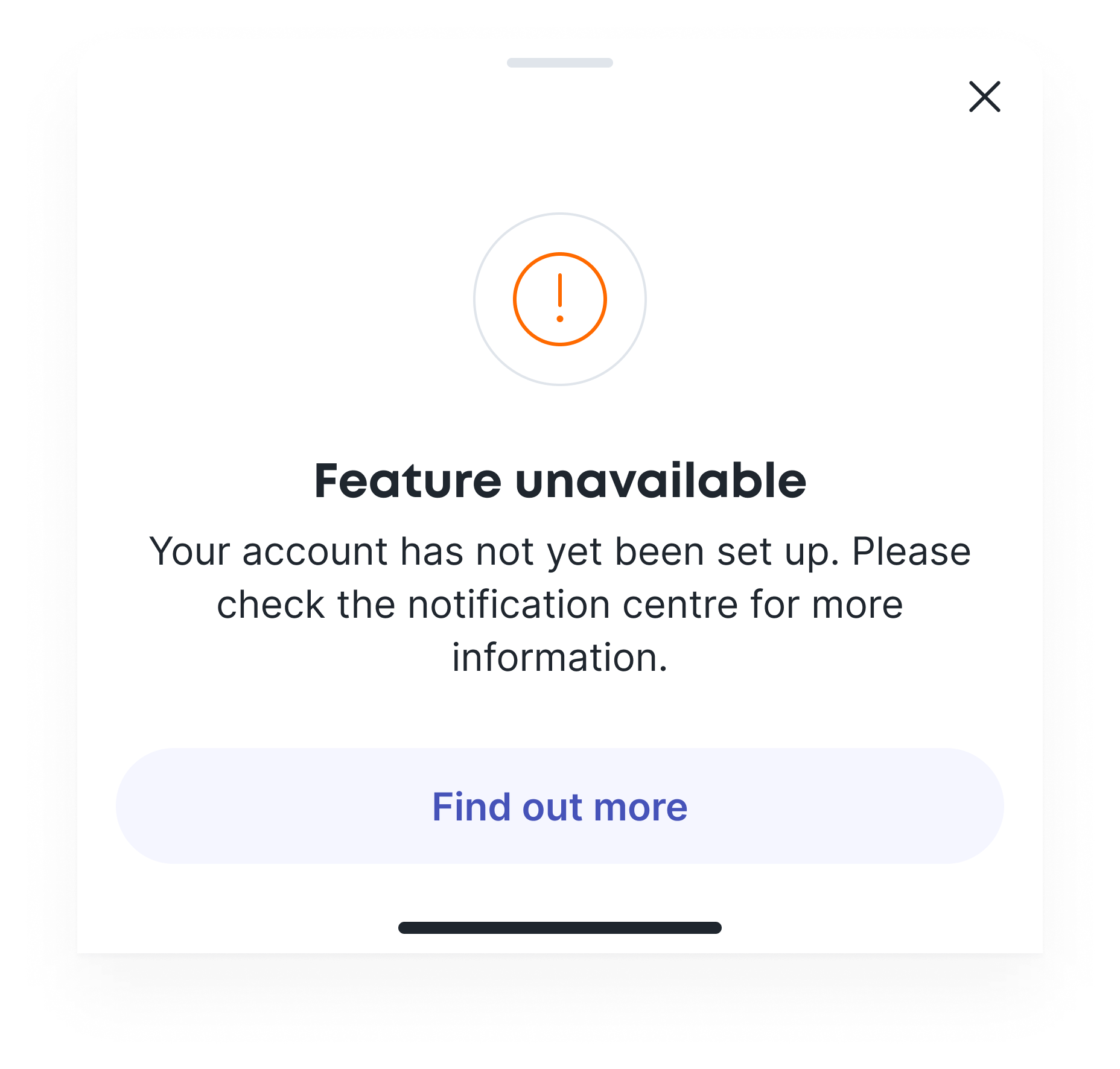
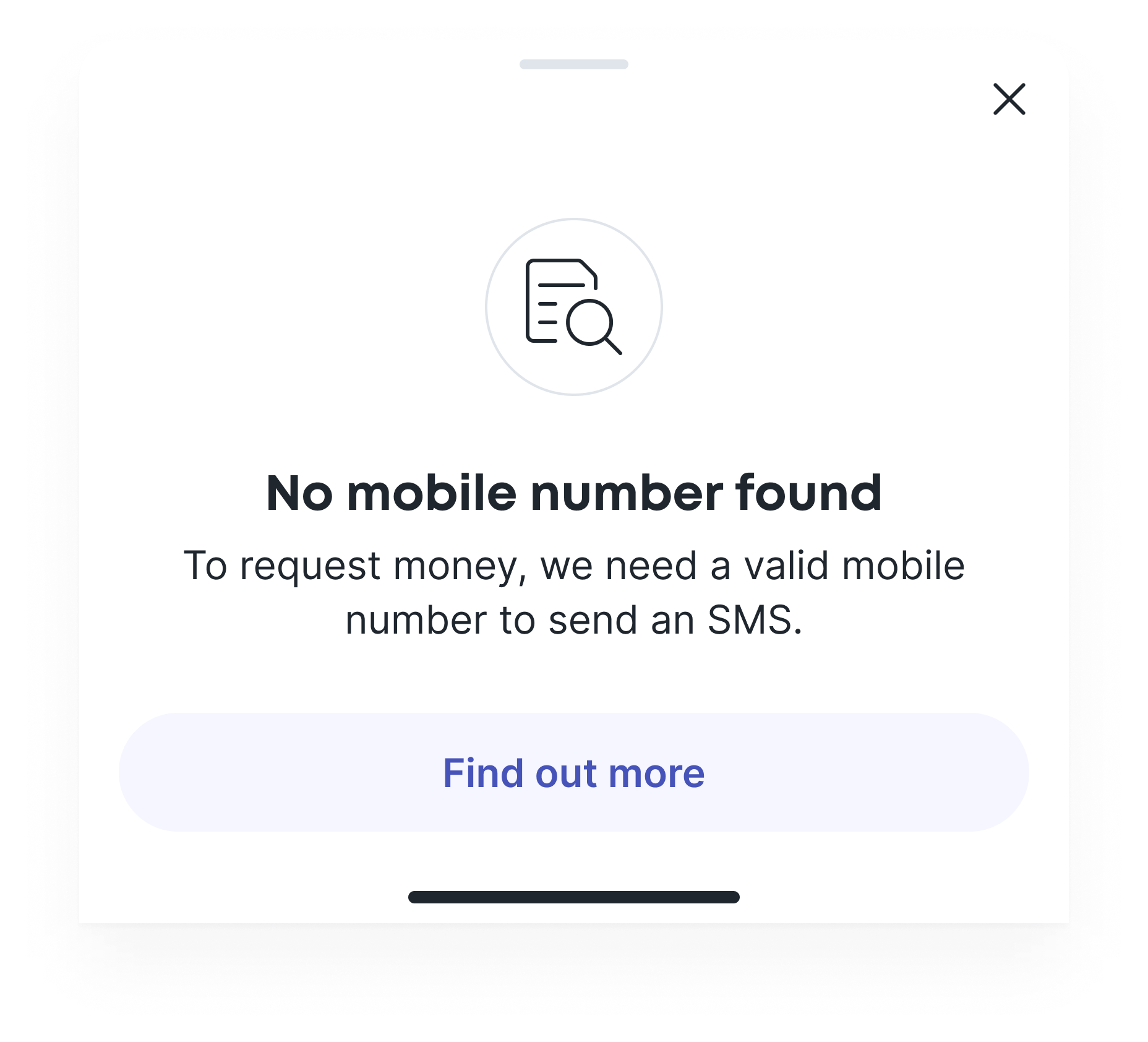
System or account status can't only be delivered via end states, so I also utilised bottom-sheets to deliver rich, contextual status updates.
Toast of the town
And for more subtle notifications I utilised toasts and in-line notifications. Toasts appear briefly after a task or action has been initiated or completed. In-line notifications sit within the UI, providing contextual insights where they matter.


Documentation and structure
Below is a small selection of layouts from the component library, illustrating the level of documentation and variants for each asset. This was a work in progress that would eventually become a live HTML resources with code snippets and implementation guidelines for engineers across iOS, Android and web.
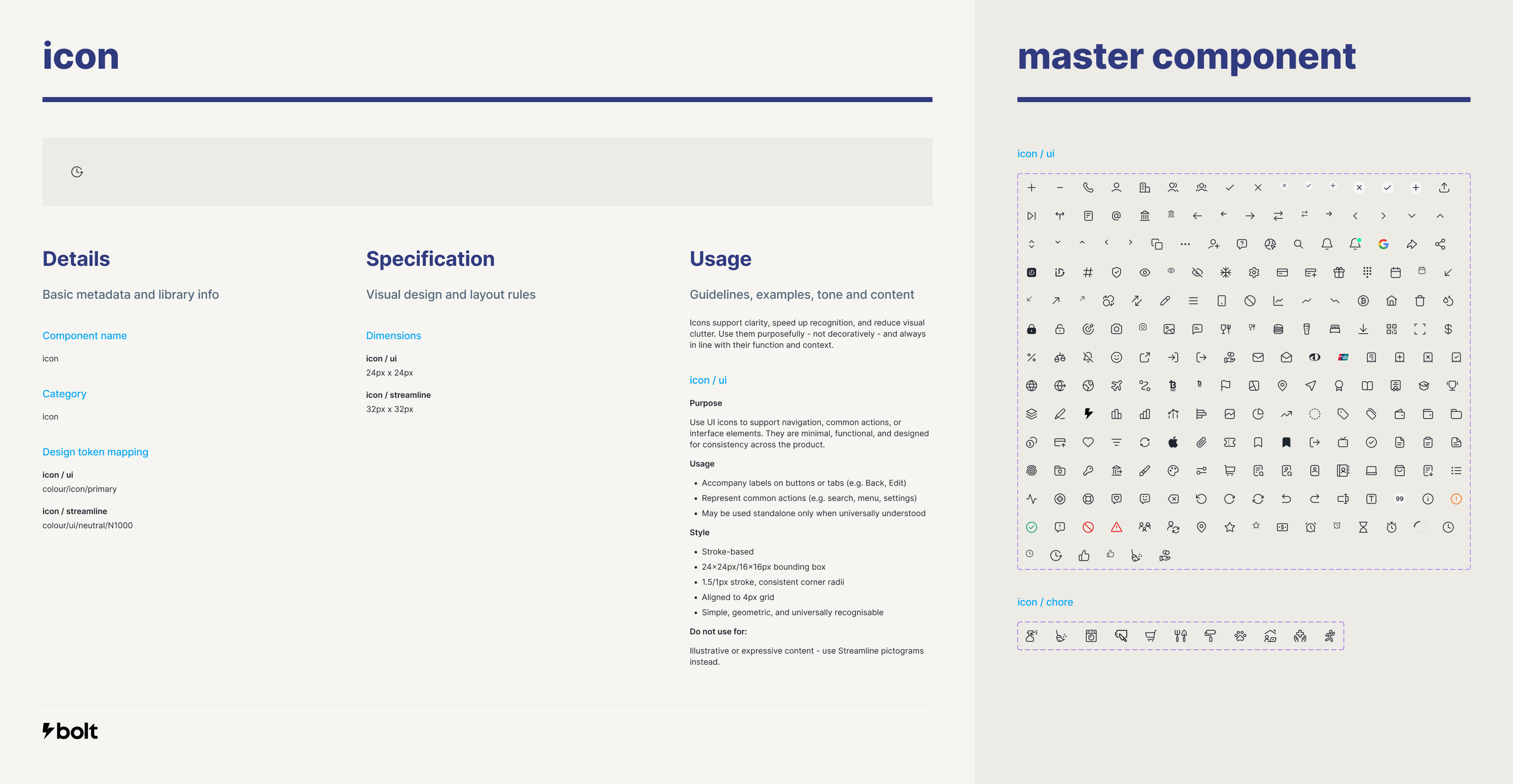
Showcase
Final designs
Selected final screens from across the app.
Home screen
FX
Cards
First time user
Pay someone
Success
Payment receipt
Request
Contacts
Selected Projects
AmaysimMobile app
Shift: Credit Limit IncreaseFintech
ABC iViewMobile app
Shift: Edit InstallmentsFintech
CBA DisputesNative Mobile App
NickelcloudSaaS platform (start-up)
Sydney Airport VIPResponsive web
P&O CruisesCruise booking website
All of UsMobile app (start-up)
Trade Finance AppStandard Chartered
Advice IntelligenceSaaS platform (start-up)
