SHIFT
Making adjusting repayments painless
Cloud data management portal
Cloud data management portal
Shift allows businesses to manage repayments through instalment schedules. However, the edit installments feature was creating confusion and anxiety, especially for customers trying to manage cashflow.
I led the redesign of this experience to make repayment changes clear, predictable, and trustworthy, while aligning with internal system and compliance requirements.
RESPONSIBILITIES
Creative Direction, Visual Design, Design Language, UX, Interaction Design
Business goals
This project was driven by both customer experience issues and operational inefficiencies.
- Reduce support calls related to repayment changes
- Increase adoption of self-serve repayment management
- Ensure all repayment changes remain compliant with lending regulations
- Maintain accuracy and integrity of repayment schedules and interest calculations
Constraints
- Changes to instalments required strict compliance and risk validation
- Repayment calculations depended on multiple backend services
- Any errors could impact financial outcomes and customer trust
- Messaging needed to clearly communicate financial implications (cost, interest, schedule)
Problem
The existing edit instalments experience made it difficult for businesses to confidently manage their repayments. Changing instalments is a high-stakes action - it directly impacts cashflow, costs, and financial planning. However, the product did not provide enough clarity or reassurance for users to feel in control of these decisions.
Key issues
- Users didn’t know if their changes had gone through
- There was no clear explanation of what would happen next
- The impact on repayments (schedule, cost, interest) was unclear
- Terminology was confusing and inconsistent
- System feedback was delayed or missing
Impact
- Hesitation when making changes
- Repeated actions or abandonment
- Increased support calls
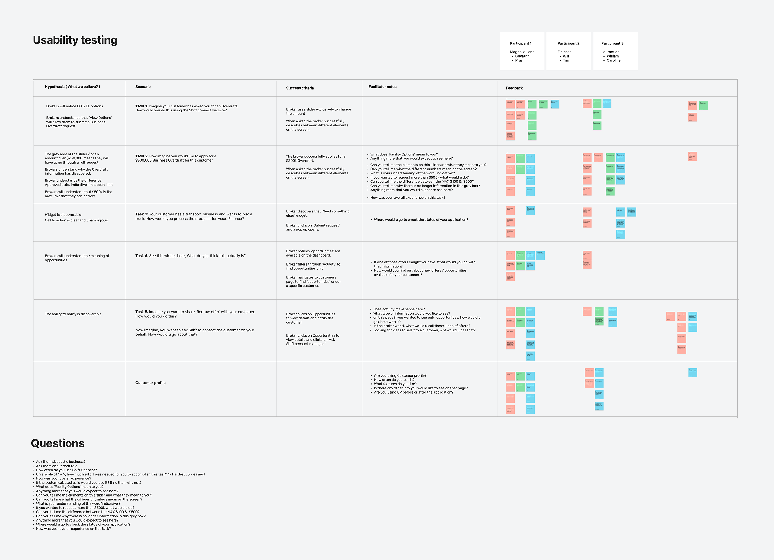
User research to unlock the problem space
Usability testing quickly exposed why users were feeling anxious about the edit installments process. People weren’t sure if their changes had gone through, what would happen next, or how adjustments would affect their payments.
Terminology was confusing, and poor system feedback led to hesitation or calls to customer support. The sessions made it clear this wasn’t just a UX flaw – it was a trust issue. The fix would be about restoring confidence through clearer messaging and real-time feedback.
Workshops surfaced the key pain points
Through a series of internal workshops, we unpacked user feedback to understand what really mattered to business owners needing to pause or adjust repayments. Many were dealing with unpredictable cashflow and wanted flexibility without feeling penalised or unsure of the impact.
The sessions revealed that users struggled to understand how a deferred payment would affect their schedule, total cost, and interest over time. Existing messaging was vague, and the process felt opaque and transactional. Mapping these issues alongside real customer scenarios helped the team see that the problem wasn’t just functional, it was emotional.
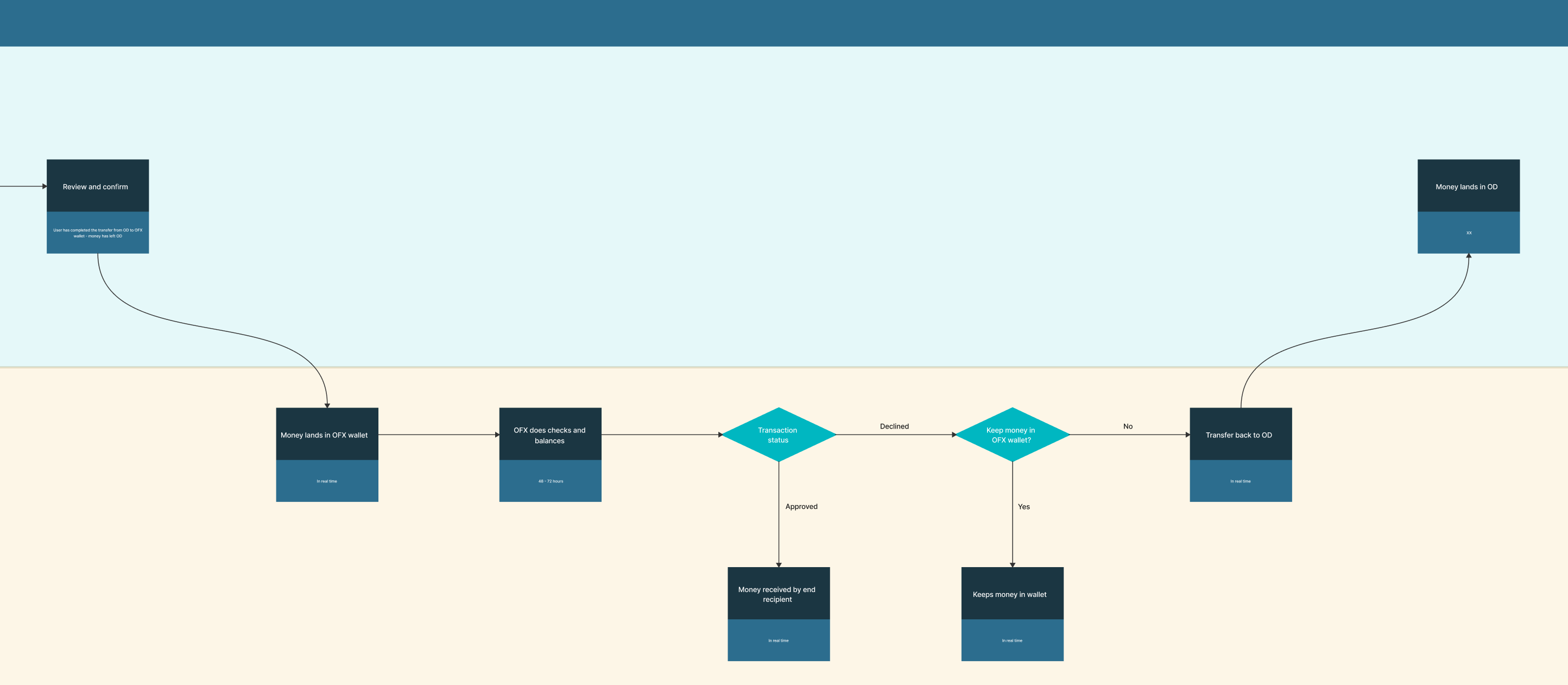
Journey mapping
To address the complexity of the existing edit installments flow, I created a series of detailed journey maps that captured every step, decision point, and system interaction within the process.
By mapping the journey across key states – request initiation, eligibility check, schedule recalculation, confirmation, and follow-up – I identified where users were losing confidence and where systems were introducing unnecessary friction. I simplified the flow by reducing system touchpoints, clarifying language, and introducing contextual feedback to make each stage predictable and transparent.
The revised maps were refined closely with engineering to align with existing notification and repayment frameworks, ensuring technical feasibility and consistency. This collaborative approach not only reduced delivery complexity but also created a scalable blueprint for future repayment-related journeys requiring similar transparency and reassurance.
Confirming friction points
Creating the journey map for the installments flow was a pivotal step in uncovering how fragmented and opaque the experience had become.
By mapping every touchpoint across user actions, system processes, and internal teams, I was able to visualise the full ecosystem and identify friction points that weren’t immediately visible in analytics or support feedback alone.
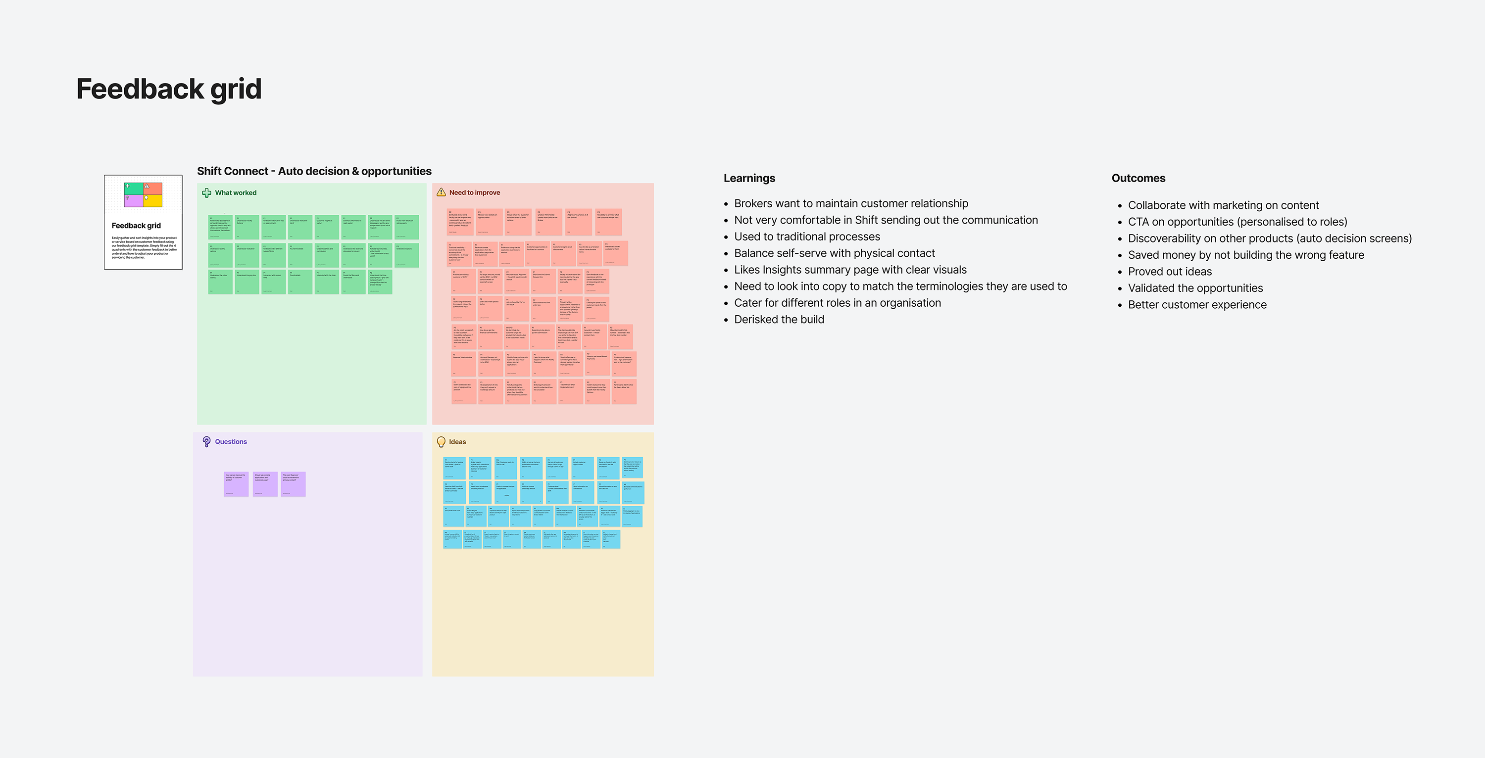
The mapping exercise revealed three key insights:
- Lack of transparency created hesitation.
Users were often unsure whether repayment changes had been processed successfully. The absence of real-time feedback and confirmation eroded trust, prompting unnecessary calls to customer support. - System touchpoints were unnecessarily complex.
Multiple back-end services were triggered sequentially, causing latency and inconsistent messaging. Simplifying the journey to reduce system dependencies improved both performance and user confidence. - Communication and compliance were out of sync.
Updates to repayment schedules required sign-off from compliance and risk teams, yet their input occurred late in the process. Bringing these stakeholders into early design stages helped ensure regulatory requirements were embedded from the start, rather than applied retroactively.
The refined journey map also emphasised the need for clearer system feedback and simplified messaging, which led to the introduction of a side-by-side comparison feature and an improved notification framework. These enhancements transformed a previously confusing process into a transparent, self-serve experience.
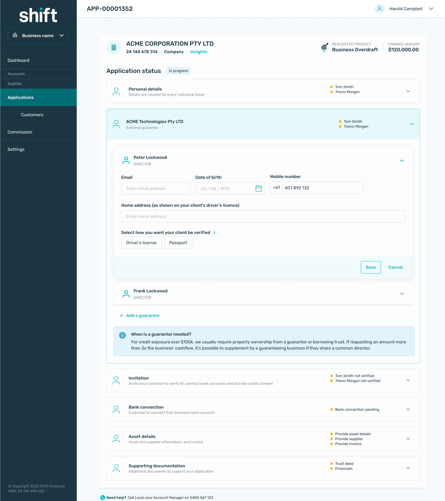
An updated component library
Implementing the new journeys highlighted several gaps within the existing component library. Many of the interface elements - particularly notifications, progress indicators, and status messages - lacked the flexibility to support the richer feedback and dynamic states introduced in the redesign.
To address this, I initiated an update of the component library, introducing new variants for banners, inline alerts, and confirmation patterns that could scale across both web and native platforms. These updates ensured consistency in how system feedback was surfaced, while also reducing reliance on ad-hoc design solutions.
This work formed part of a broader design language refresh I was championing across the product. The aim was to modernise the visual system, tighten typographic hierarchy, refine spacing and motion principles, and unify interaction behaviours. By evolving the library alongside the journey improvements, we created a more coherent and trustworthy design ecosystem - one capable of supporting future feature development with far greater speed and consistency.
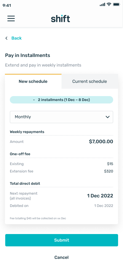
Side by side comparisons provide clarify
As part of simplifying the decision-making process, I introduced a side-by-side comparison feature that allowed users to clearly view the impact of their installments change before confirming. The interface presented the current and proposed payment schedules, repayment amounts, and interest figures in a concise, easy-to-scan layout.
This visual comparison removed the ambiguity that previously caused hesitation and confusion. By making the financial implications transparent upfront, users could quickly assess affordability and proceed with confidence. The design emphasised clarity through typographic hierarchy, colour cues, and consistent alignment with the refreshed design system.
Early testing showed a noticeable reduction in user uncertainty and a marked improvement in task completion rates, confirming that greater transparency and visual clarity were key to building trust in the journey.
Adapting for customers in any line of work
Analysis of user behaviour revealed that a significant proportion of customers accessed their accounts while on the move - outside work, travelling, or during short breaks - rather than from a desktop or laptop. Many limit changes were prompted by spontaneous needs such as booking travel, managing expenses, or handling unexpected costs, meaning accessibility and ease of use on mobile were essential.
To support this reality, I ensured the redesigned experience was fully responsive and mobile-optimised, maintaining the same clarity and functionality across all viewports. Key layouts, such as the new side-by-side comparison view, used adaptive design to implement tabs on smaller screens. Interactive elements were refined for touch input, with increased hit areas, improved spacing, and mobile-friendly feedback states.
This focus on a mobile-first experience not only aligned the design with real customer behaviour but also strengthened inclusivity and accessibility, ensuring users could manage their credit limits confidently wherever they were.
Collaboration
This project required close collaboration across engineering, credit, compliance, and product to ensure the experience was not only intuitive, but also technically feasible and compliant with financial regulations. Given the complexity of repayment logic and the risk associated with financial changes, alignment across teams was critical from early discovery through to delivery.
Engineering
- Simplified backend dependencies
- Improved system response times
- Aligned system states with UI
Credit and compliance
- Defined rules for repayment changes
- Ensured regulatory requirements were built into the flow
- Validated financial calculations and messaging
Product
- Prioritised scope and rollout
- Balanced speed with risk and compliance
Result
The redesigned experience significantly improved both user confidence and operational efficiency, addressing a core trust gap in how businesses managed their repayments.
Reduce hesitation and increase completion confidence
Users were able to clearly understand the impact of their changes before committing, which removed uncertainty at critical decision points.
Lower support volume and operational overhead
Previously, unclear outcomes and lack of feedback drove users to contact support for reassurance. By making system states, outcomes, and next steps explicit, the need for follow-up calls was reduced.
Increase trust in self-serve financial actions
Repayment changes directly impact a business’s cashflow, so even small moments of uncertainty can undermine confidence. The improved experience reinforced trust by making the system feel predictable and responsive. Real-time feedback, consistent messaging, and transparent outcomes helped users feel in control of their financial decisions rather than dependent on manual confirmation.
Improve alignment between user experience and financial accuracy
By integrating compliance and system logic earlier in the design process, the final experience accurately reflected real financial outcomes. This reduced the risk of misinterpretation and ensured users could rely on the platform when making decisions that affected cost, interest, and repayment schedules.
Enable scalable self-serve behaviour
The redesigned flow established a pattern for handling complex financial interactions in a clear and transparent way. This not only improved this specific feature but also created a foundation for scaling other self-serve financial capabilities, reducing long-term reliance on manual processes.
Final designs
Below is a selection of the final screens.
Control
Definition
Search results - desktop
Control Summary
Search results - desktop
Assessments
Search results - desktop
Selected Projects
AmaysimMobile app
ABC iViewMobile app
Shift: Credit Limit IncreaseFeature design
NickelcloudSaaS platform (start-up)
Shift: Edit InstalmentsPlatform redesign
P&O CruisesCruise booking website
All of UsMobile app (start-up)
Trade Finance AppStandard Chartered
Advice IntelligenceSaaS platform (start-up)
